- Chapter 4: CSS for Content Presentation

Содержание
- 2. Overview and Objectives (1 of 2) The motivation for CSS, and a little history The syntax,
- 3. Overview and Objectives (2 of 2) Some new HTML5 semantic elements: main, header, footer, nav, article,
- 4. What Is CSS? CSS (Cascading Style Sheets) is a language used to describe the presentational aspects
- 5. Summary of CSS Versions CSS 1 (1996): First official W3C recommendation CSS 2 (1998): A superset
- 6. Style Sheets and Style Rules In CSS a style sheet typically contains a collection of style
- 7. Examples of Simple Style Rules Here are two simple style rules: body {background-color: yellow;} h1 {color:
- 8. Style Rule Terminology and Syntax A slightly more complex style rule: h1 {color: blue; text-align: center;}
- 9. Style Rule Placement Recommended is the external level—placing all your styles in a single external style
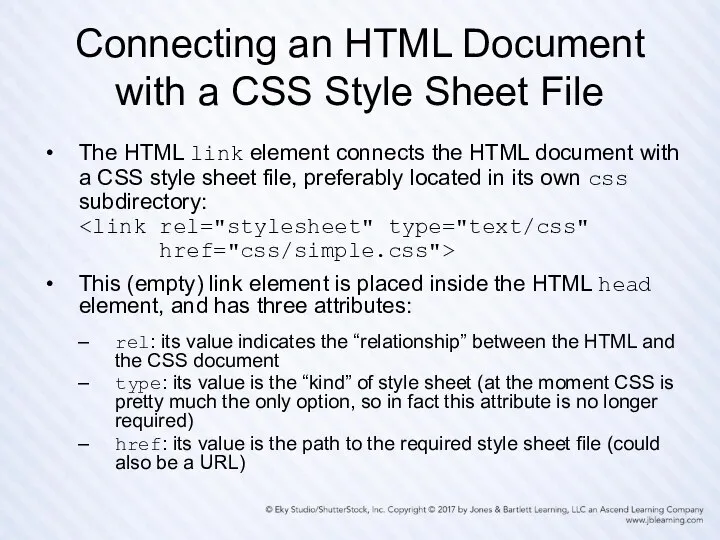
- 10. Connecting an HTML Document with a CSS Style Sheet File The HTML link element connects the
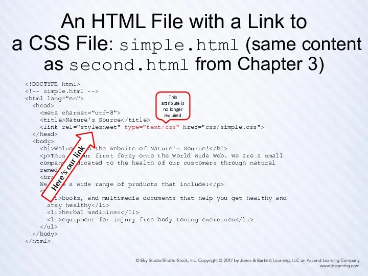
- 11. An HTML File with a Link to a CSS File: simple.html (same content as second.html from
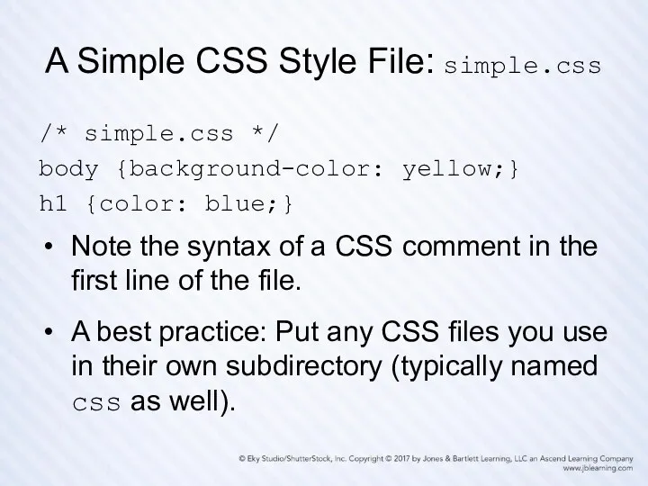
- 12. A Simple CSS Style File: simple.css /* simple.css */ body {background-color: yellow;} h1 {color: blue;} Note
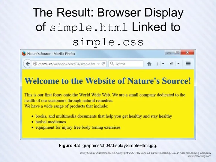
- 13. The Result: Browser Display of simple.html Linked to simple.css Figure 4.3 graphics/ch04/displaySimpleHtml.jpg.
- 14. More Style Rule Syntax Examples h1, h2, h3 {color: blue;} A comma-separated list of selectors requires
- 15. Generic Font Families Here are the five generic font families defined in CSS and HTML, with
- 16. Property Value Categories: Measurement Units Absolute units in (inches) mm (millimeters) and cm (centimeters) pt (points,
- 17. Property Value Categories: Measurement Keywords Absolute keywords xx-large (same font size as h1) x-large (same font
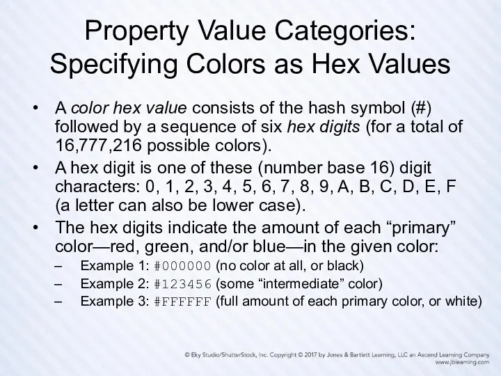
- 18. Property Value Categories: Specifying Colors as Hex Values A color hex value consists of the hash
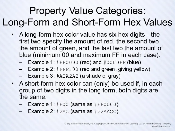
- 19. Property Value Categories: Long-Form and Short-Form Hex Values A long-form hex color value has six hex
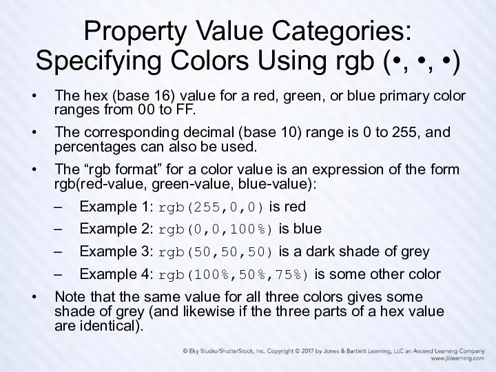
- 20. Property Value Categories: Specifying Colors Using rgb (•, •, •) The hex (base 16) value for
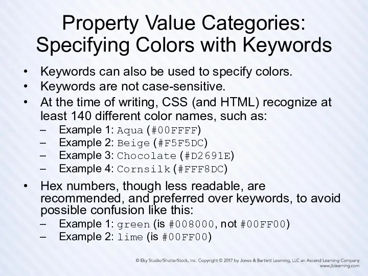
- 21. Property Value Categories: Specifying Colors with Keywords Keywords can also be used to specify colors. Keywords
- 22. Color Groupings: The 16 Standard CSS Colors
- 23. Color Groupings: The Web-Safe Palette Because of the ability of today’s monitors to display a very
- 24. Our CSS Style Sheet Structure, Comments, and Formatting Illustrated: mystyles.css /* mystyles.css for mystyles.html A few
- 25. Browser Display of mystyles.html Linked to mystyles.css Figure 4.5 graphics/ch04/displayMystylesHtml.jpg.
- 26. General Usage Guidelines for CSS Property Values Prefer relative measurement units for element properties on pages
- 27. Some Things We Can’t Do (Easily) (Yet) Apply a given style to some, but not all,
- 28. The Legacy HTML Grouping Elements: div and span The div and span HTML elements are used
- 29. Two Useful HTML Attributes: class and id The class and id attributes are core or standard
- 30. New HTML5 Semantic Elements vs. div HTML5 has added new semantic elements that are useful for
- 31. A Generic CSS Class Selector .BoldItalic { font-weight: bold; font-style: italic; } A generic class definition
- 32. A Restricted CSS Class Selector p.Standout { color: #FF0000; /* red */ background-color: #D3D3D3; /*lightgray*/ }
- 33. The CSS id Selector An id selector with a given value must be unique on a
- 34. Our Capitalization Conventions Both class and id names use camel notation (that is, in multiword names,
- 35. CSS Inheritance On a typical web page many elements are nested inside other elements. Example: A
- 36. The Cascade in CSS The cascade is the mechanism used to resolve conflicts when different styles
- 37. Browser Display of myclasses.html Figure 4.8 graphics/ch04/displayMyclassesHtml.jpg.
- 38. Markup from myclasses.html Nature's Source Welcome to the Website of Nature's Source! This is our first
- 39. CSS from myclasses.css (1 of 2) /* myclasses.css for myclasses.html */ /* Styles that apply to
- 40. CSS from myclasses.css (2 of 2) /* A "generic" class whose styles can be applied to
- 41. Validating Your CSS Recall how important it is to validate your HTML markup. It’s just as
- 42. Validating myclasses.css Figure 4.9 graphics/ch04/displayMyclassesCssToValidate.jpg.
- 43. Validation Report for myclasses.css Figure 4.10 graphics/ch04/displayMyclassesCssValidated.jpg.
- 44. The CSS Box Model Every HTML element, block or inline, that appears on a web page
- 45. A Diagram of the CSS Box Model Figure 4.11 graphics/ch04/BoxModel.jpg.
- 46. Three Nested Boxes Display of boxmodel.html Figure 4.12 graphics/ch04/displayBoxmodelHtml.jpg.
- 47. Three Nested Boxes Markup from boxmodel.html CSS Box Model This figure illustrates the CSS "box model".
- 48. Three Nested Boxes CSS from boxmodel.css /* boxmodel.css for boxmodel.html */ body { padding: 0; margin:
- 49. Padding and Margin Shorthand Styles For padding Example 1: Specifying same amount on all four sides
- 50. Border and Font Shorthand Styles For border Example (generic) border: width style color; Example (specific) border:
- 51. Using New HTML5 Semantic Elements for Structure Using HTML table elements for page structure and layout
- 52. The div Element Is Still Useful New HTML5 semantic elements should be used to contain those
- 53. Using CSS for Page Layout Positioning with the CSS float and clear Properties Since the new
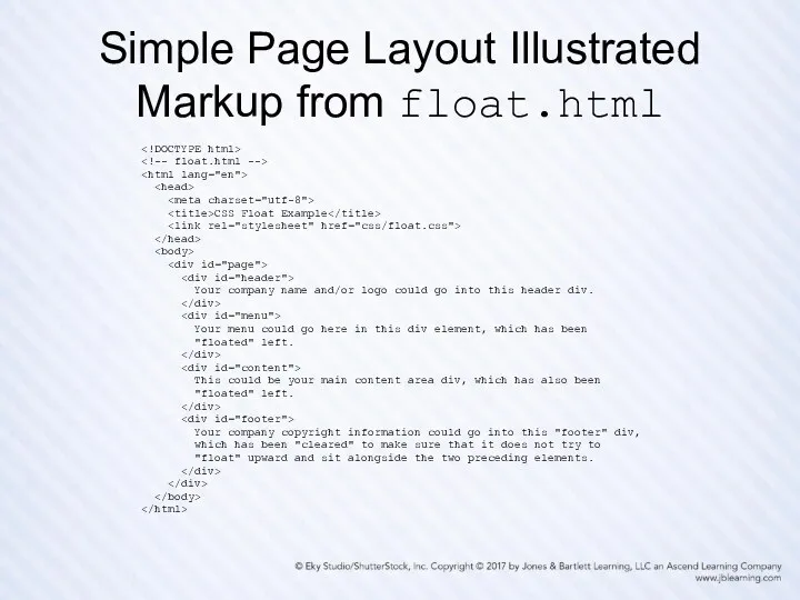
- 54. Simple Page Layout Illustrated Display of float.html Figure 4.15 graphics/ch04/displayFloatHtml.jpg.
- 55. Simple Page Layout Illustrated Markup from float.html CSS Float Example Your company name and/or logo could
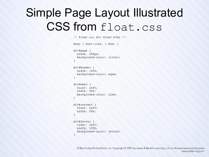
- 56. Simple Page Layout Illustrated CSS from float.css /* float.css for float.html */ body { font-size: 1.5em;
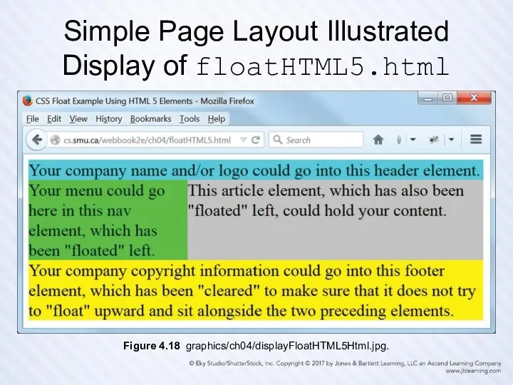
- 57. Simple Page Layout Illustrated Display of floatHTML5.html Figure 4.18 graphics/ch04/displayFloatHTML5Html.jpg.
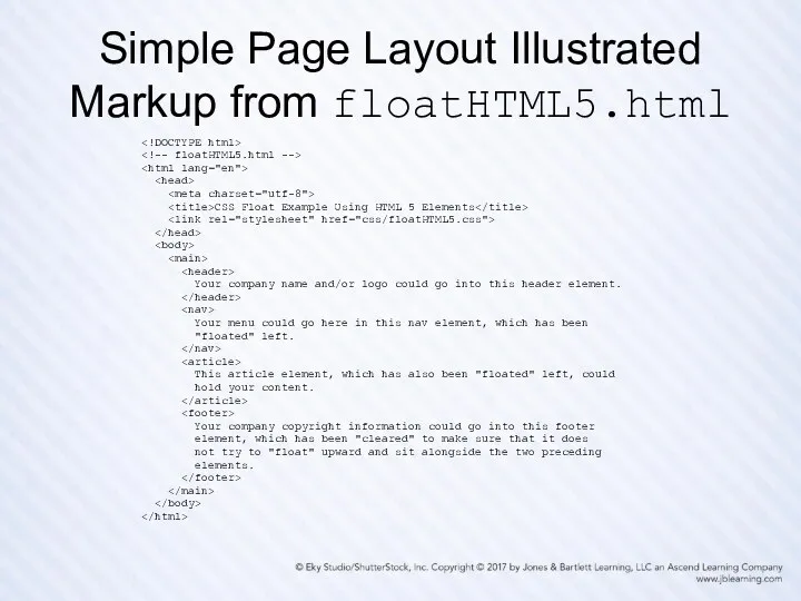
- 58. Simple Page Layout Illustrated Markup from floatHTML5.html CSS Float Example Using HTML 5 Elements Your company
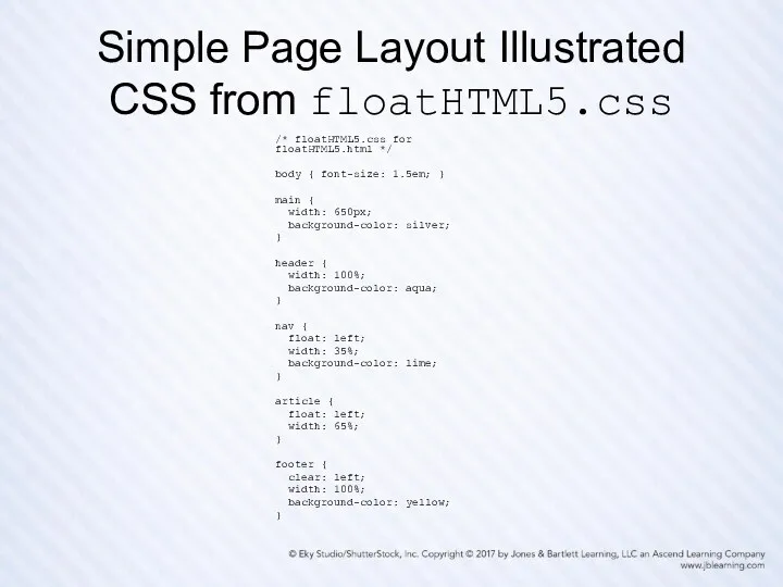
- 59. Simple Page Layout Illustrated CSS from floatHTML5.css /* floatHTML5.css for floatHTML5.html */ body { font-size: 1.5em;
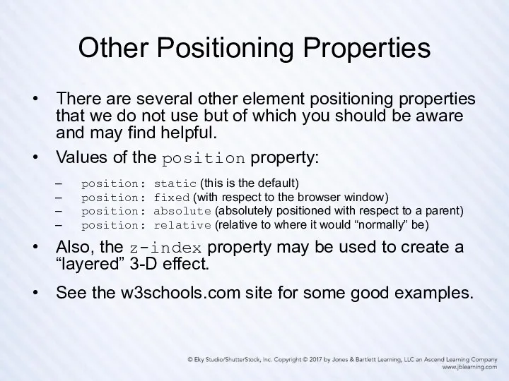
- 60. Other Positioning Properties There are several other element positioning properties that we do not use but
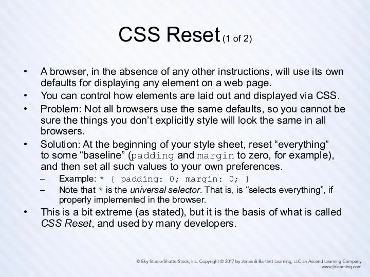
- 61. CSS Reset (1 of 2) A browser, in the absence of any other instructions, will use
- 62. CSS Reset (2 of 2) Not all developers will agree on exactly how a CSS Reset
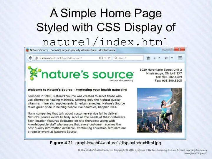
- 63. A Simple Home Page Styled with CSS Display of nature1/index.html Figure 4.21 graphics/ch04/nature1/displayIndexHtml.jpg.
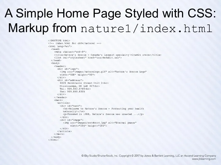
- 64. A Simple Home Page Styled with CSS: Markup from nature1/index.html Nature's Source - Canada's largest specialty
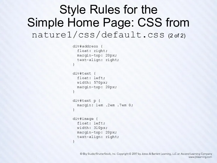
- 65. Style Rules for the Simple Home Page: CSS from nature1/css/default.css (1 of 2) /* default.css for
- 66. Style Rules for the Simple Home Page: CSS from nature1/css/default.css (2 of 2) div#address { float:
- 67. Some Good Advice for What Follows First, this advice relates to the following slides, which can
- 68. Preamble for the Remaining Slides First we show the home page of each of the three
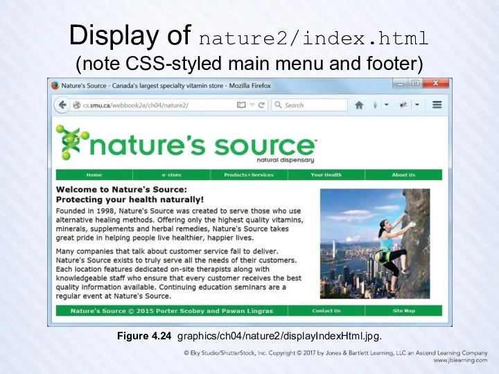
- 69. Display of nature2/index.html (note CSS-styled main menu and footer) Figure 4.24 graphics/ch04/nature2/displayIndexHtml.jpg.
- 70. Display of nature3/index.html (note re-designed menu and footer, and black border with rounded corners) (this is
- 71. Display of nature3/pages/estore.html (“desktop view” of a page with no sub-menu links) Figure 4.30 graphics/ch04/nature3/desktopEstoreHtml.jpg.
- 72. Display of nature3/pages/products.html (“desktop view” of a page with several sub-menu links) Figure 4.31 graphics/ch04/nature3/desktopProductsHtml.jpg.
- 73. Display of nature3/index.html (this is the “tablet view”) Figure 4.32 graphics/ch04/nature3/tabletIndexHtml.jpg.
- 74. Display of nature3/pages/estore.html (“tablet view” of a page with no sub-menu links) Figure 4.33 graphics/ch04/nature3/tabletEstoreHtml.jpg.
- 75. Display of nature3/pages/products.html (“tablet view” of a page with several sub-menu links) Figure 4.34 graphics/ch04/nature3/tabletProductsHtml.jpg.
- 76. Responsive Design Design your web pages so they can be viewed on multiple devices (desktop PCs,
- 77. Media Queries ch04/nature3/document_head.html media="screen and (max-width: 900px)"> Nature's Source - Canada's largest specialty vitamin store Note
- 79. Скачать презентацию
Overview and Objectives
(1 of 2)
The motivation for CSS, and a little
Overview and Objectives
(1 of 2)
The motivation for CSS, and a little
Overview and Objectives
(2 of 2)
Some new HTML5 semantic elements: main, header,
Overview and Objectives
(2 of 2)
Some new HTML5 semantic elements: main, header,
What Is CSS?
CSS (Cascading Style Sheets) is a language used to
What Is CSS?
CSS (Cascading Style Sheets) is a language used to
Summary of CSS Versions
CSS 1 (1996): First official W3C recommendation
CSS 2
Summary of CSS Versions
CSS 1 (1996): First official W3C recommendation
CSS 2
Style Sheets and Style Rules
In CSS a style sheet typically contains
Style Sheets and Style Rules
In CSS a style sheet typically contains
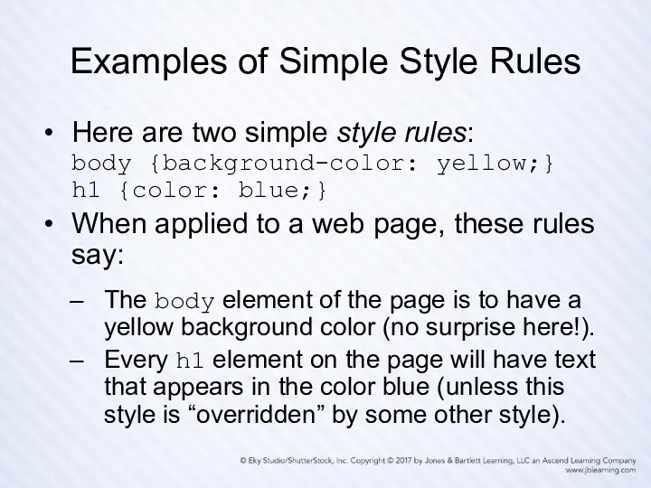
Examples of Simple Style Rules
Here are two simple style rules:
body {background-color:
Examples of Simple Style Rules
Here are two simple style rules: body {background-color:
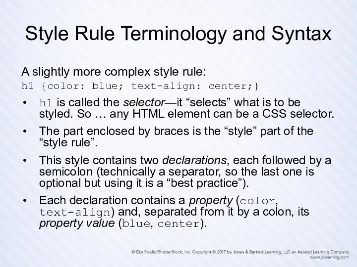
Style Rule Terminology and Syntax
A slightly more complex style rule:
h1 {color:
Style Rule Terminology and Syntax
A slightly more complex style rule: h1 {color:
Style Rule Placement
Recommended is the external level—placing all your styles in
Style Rule Placement
Recommended is the external level—placing all your styles in
Connecting an HTML Document
with a CSS Style Sheet File
The HTML link
Connecting an HTML Document
with a CSS Style Sheet File
The HTML link
An HTML File with a Link to
a CSS File: simple.html
An HTML File with a Link to a CSS File: simple.html
A Simple CSS Style File: simple.css
/* simple.css */
body {background-color: yellow;}
h1 {color:
A Simple CSS Style File: simple.css
/* simple.css */
body {background-color: yellow;}
h1 {color:
The Result: Browser Display
of simple.html Linked to simple.css
Figure 4.3 graphics/ch04/displaySimpleHtml.jpg.
The Result: Browser Display
of simple.html Linked to simple.css
Figure 4.3 graphics/ch04/displaySimpleHtml.jpg.
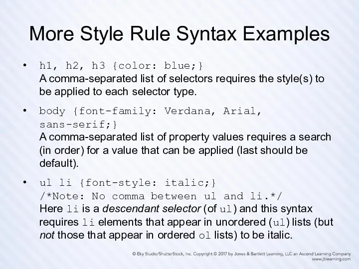
More Style Rule Syntax Examples
h1, h2, h3 {color: blue;}
A comma-separated list
More Style Rule Syntax Examples
h1, h2, h3 {color: blue;} A comma-separated list
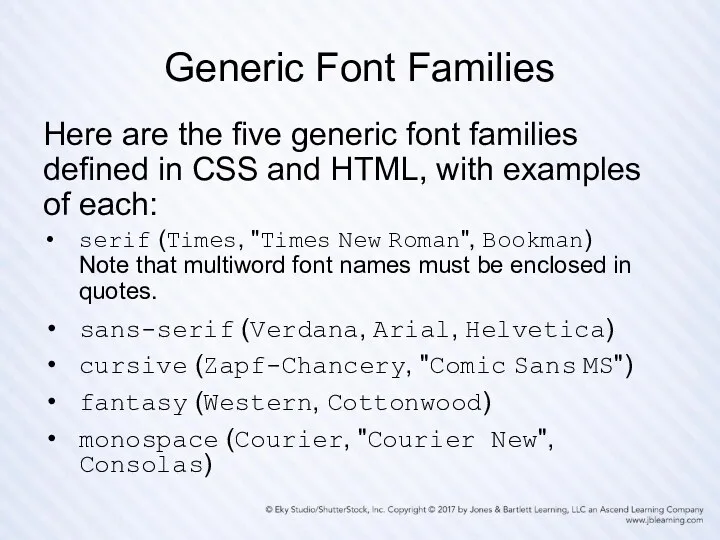
Generic Font Families
Here are the five generic font families defined in
Generic Font Families
Here are the five generic font families defined in
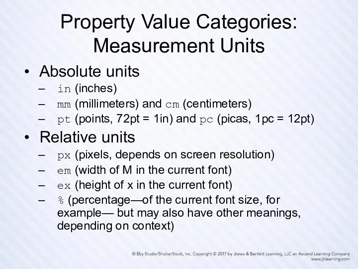
Property Value Categories: Measurement Units
Absolute units
in (inches)
mm (millimeters) and cm (centimeters)
pt
Property Value Categories: Measurement Units
Absolute units
in (inches)
mm (millimeters) and cm (centimeters)
pt
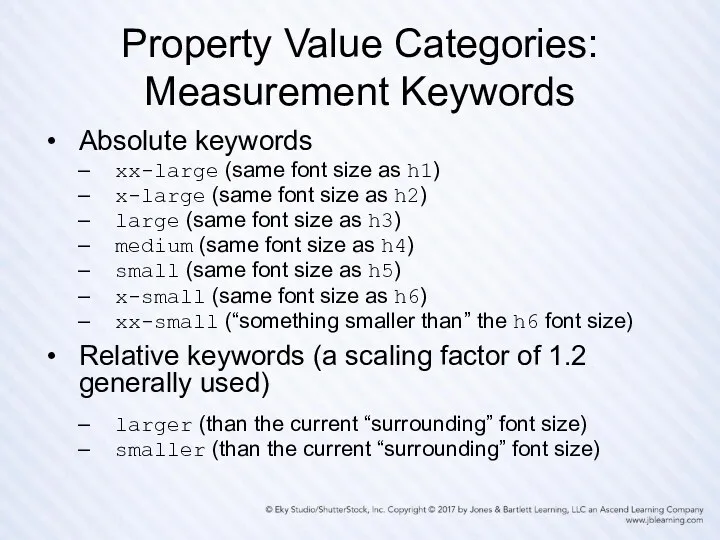
Property Value Categories: Measurement Keywords
Absolute keywords
xx-large (same font size as h1)
x-large
Property Value Categories: Measurement Keywords
Absolute keywords
xx-large (same font size as h1)
x-large
Property Value Categories:
Specifying Colors as Hex Values
A color hex value consists
Property Value Categories:
Specifying Colors as Hex Values
A color hex value consists
Property Value Categories:
Long-Form and Short-Form Hex Values
A long-form hex color value
Property Value Categories:
Long-Form and Short-Form Hex Values
A long-form hex color value
Property Value Categories:
Specifying Colors Using rgb (•, •, •)
The hex (base
Property Value Categories:
Specifying Colors Using rgb (•, •, •)
The hex (base
Property Value Categories:
Specifying Colors with Keywords
Keywords can also be used to
Property Value Categories:
Specifying Colors with Keywords
Keywords can also be used to
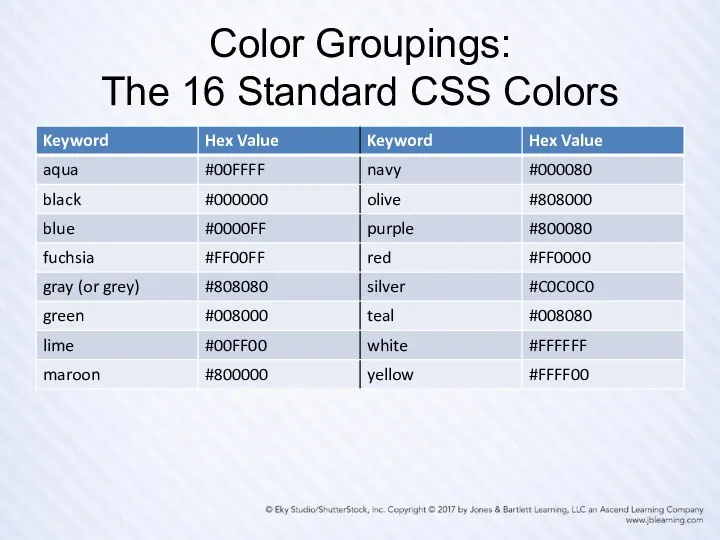
Color Groupings:
The 16 Standard CSS Colors
Color Groupings:
The 16 Standard CSS Colors
Color Groupings:
The Web-Safe Palette
Because of the ability of today’s monitors to
Color Groupings:
The Web-Safe Palette
Because of the ability of today’s monitors to
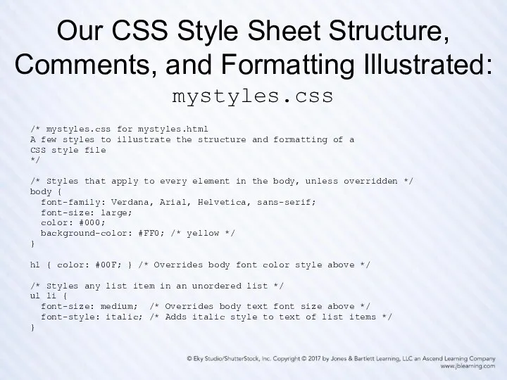
Our CSS Style Sheet Structure, Comments, and Formatting Illustrated: mystyles.css
/* mystyles.css
Our CSS Style Sheet Structure, Comments, and Formatting Illustrated: mystyles.css
/* mystyles.css
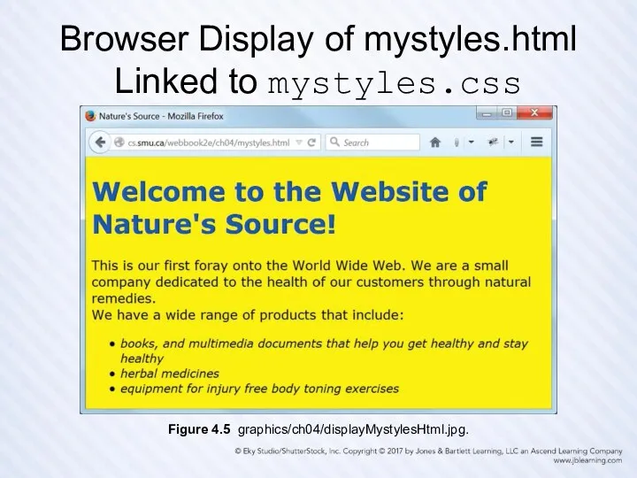
Browser Display of mystyles.html
Linked to mystyles.css
Figure 4.5 graphics/ch04/displayMystylesHtml.jpg.
Browser Display of mystyles.html
Linked to mystyles.css
Figure 4.5 graphics/ch04/displayMystylesHtml.jpg.
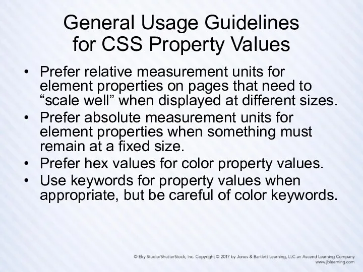
General Usage Guidelines
for CSS Property Values
Prefer relative measurement units for element
General Usage Guidelines
for CSS Property Values
Prefer relative measurement units for element
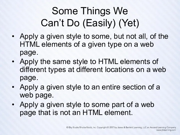
Some Things We
Can’t Do (Easily) (Yet)
Apply a given style to
Some Things We
Can’t Do (Easily) (Yet)
Apply a given style to
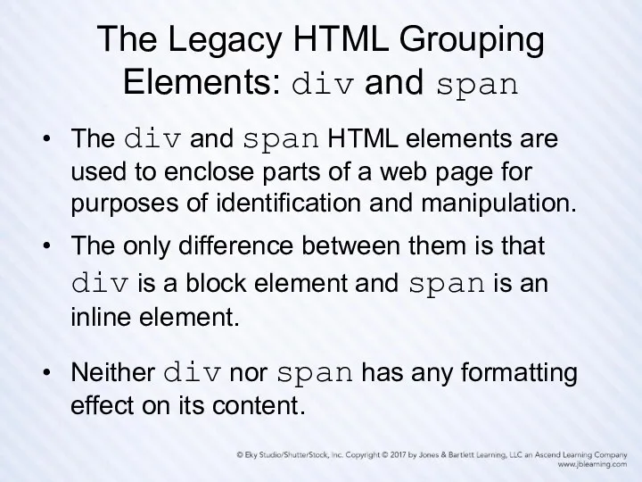
The Legacy HTML Grouping
Elements: div and span
The div and span
The Legacy HTML Grouping
Elements: div and span
The div and span
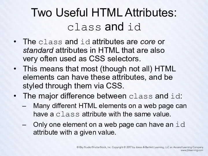
Two Useful HTML Attributes:
class and id
The class and id attributes are
Two Useful HTML Attributes:
class and id
The class and id attributes are
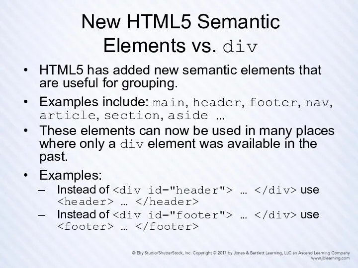
New HTML5 Semantic
Elements vs. div
HTML5 has added new semantic elements that
New HTML5 Semantic
Elements vs. div
HTML5 has added new semantic elements that
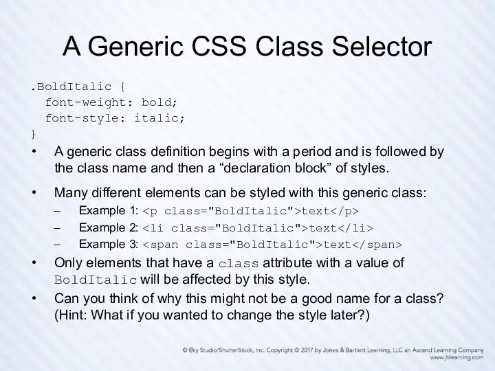
A Generic CSS Class Selector
.BoldItalic {
font-weight: bold;
font-style: italic;
}
A generic
A Generic CSS Class Selector
.BoldItalic {
font-weight: bold;
font-style: italic;
}
A generic
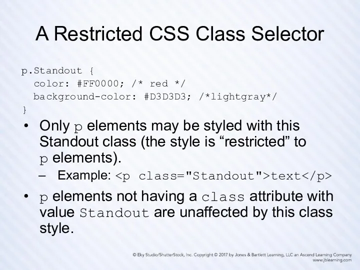
A Restricted CSS Class Selector
p.Standout {
color: #FF0000; /* red */
A Restricted CSS Class Selector
p.Standout {
color: #FF0000; /* red */
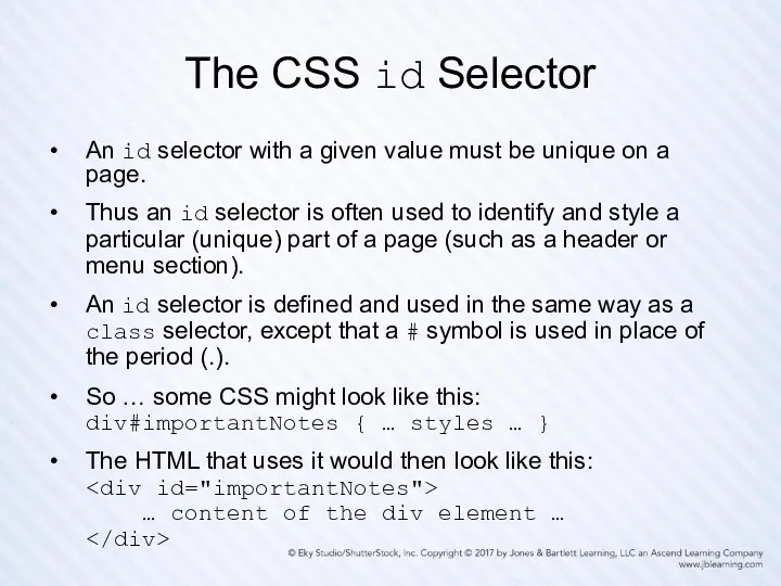
The CSS id Selector
An id selector with a given value must
The CSS id Selector
An id selector with a given value must
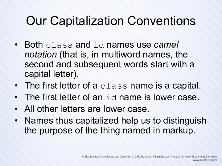
Our Capitalization Conventions
Both class and id names use camel notation (that
Our Capitalization Conventions
Both class and id names use camel notation (that
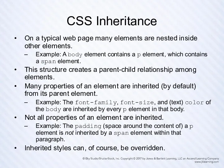
CSS Inheritance
On a typical web page many elements are nested inside
CSS Inheritance
On a typical web page many elements are nested inside
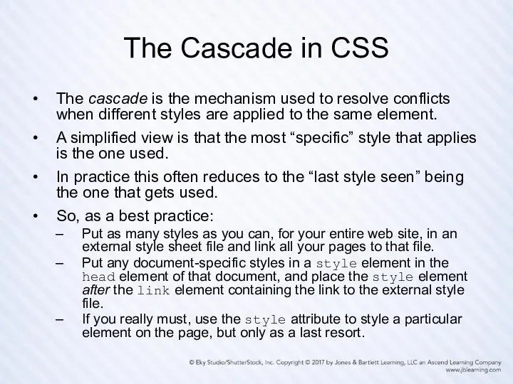
The Cascade in CSS
The cascade is the mechanism used to resolve
The Cascade in CSS
The cascade is the mechanism used to resolve
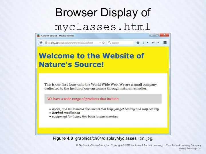
Browser Display of myclasses.html
Figure 4.8 graphics/ch04/displayMyclassesHtml.jpg.
Browser Display of myclasses.html
Figure 4.8 graphics/ch04/displayMyclassesHtml.jpg.
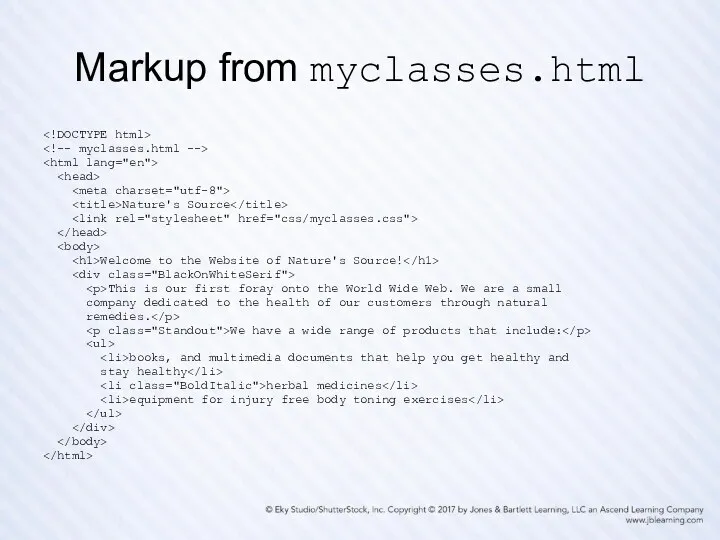
Markup from myclasses.html
Nature's</div></h2><div class="slides-content">Source
Welcome to the Website of Nature's Source!
This is our first foray onto the World Wide Web. We are a small
company dedicated to the health of our customers through natural
remedies.
We have a wide range of products that include:
- books, and multimedia documents that help you get healthy and
stay healthy
- herbal medicines
- equipment for injury free body toning exercises
Markup from myclasses.html
Welcome to the Website of Nature's Source!
This is our first foray onto the World Wide Web. We are a small
company dedicated to the health of our customers through natural
remedies.
We have a wide range of products that include:
- books, and multimedia documents that help you get healthy and
stay healthy - herbal medicines
- equipment for injury free body toning exercises
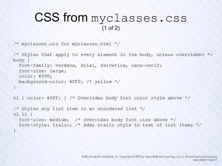
CSS from myclasses.css
(1 of 2)
/* myclasses.css for myclasses.html */
/* Styles that
CSS from myclasses.css
(1 of 2)
/* myclasses.css for myclasses.html */
/* Styles that
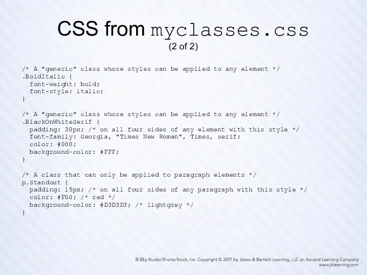
CSS from myclasses.css
(2 of 2)
/* A "generic" class whose styles can
CSS from myclasses.css
(2 of 2)
/* A "generic" class whose styles can
Validating Your CSS
Recall how important it is to validate your HTML
Validating Your CSS
Recall how important it is to validate your HTML
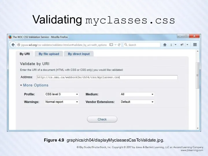
Validating myclasses.css
Figure 4.9 graphics/ch04/displayMyclassesCssToValidate.jpg.
Validating myclasses.css
Figure 4.9 graphics/ch04/displayMyclassesCssToValidate.jpg.
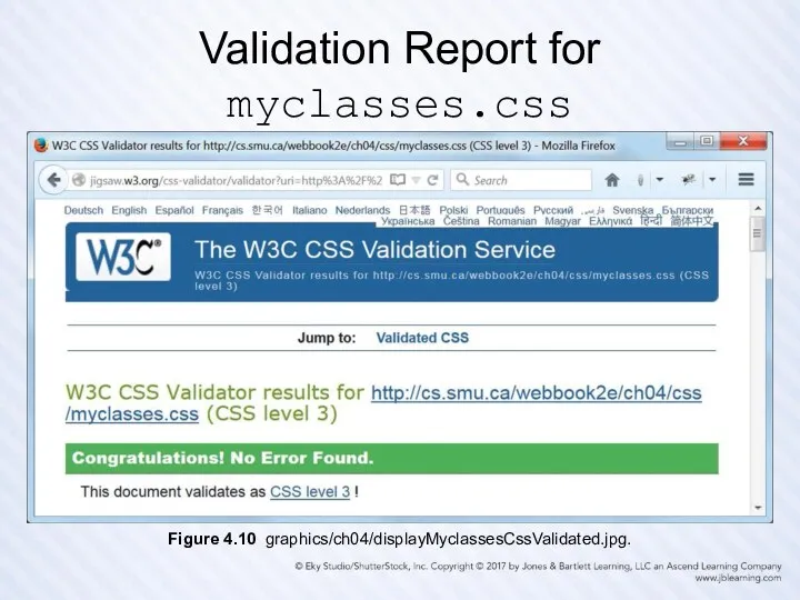
Validation Report for myclasses.css
Figure 4.10 graphics/ch04/displayMyclassesCssValidated.jpg.
Validation Report for myclasses.css
Figure 4.10 graphics/ch04/displayMyclassesCssValidated.jpg.
The CSS Box Model
Every HTML element, block or inline, that appears
The CSS Box Model
Every HTML element, block or inline, that appears
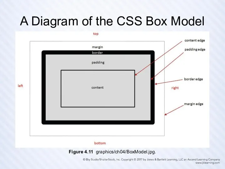
A Diagram of the CSS Box Model
Figure 4.11 graphics/ch04/BoxModel.jpg.
A Diagram of the CSS Box Model
Figure 4.11 graphics/ch04/BoxModel.jpg.
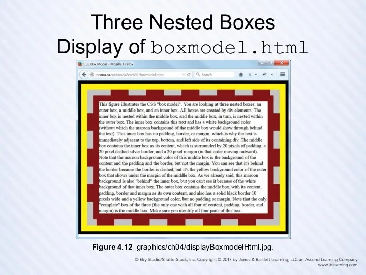
Three Nested Boxes
Display of boxmodel.html
Figure 4.12 graphics/ch04/displayBoxmodelHtml.jpg.
Three Nested Boxes
Display of boxmodel.html
Figure 4.12 graphics/ch04/displayBoxmodelHtml.jpg.
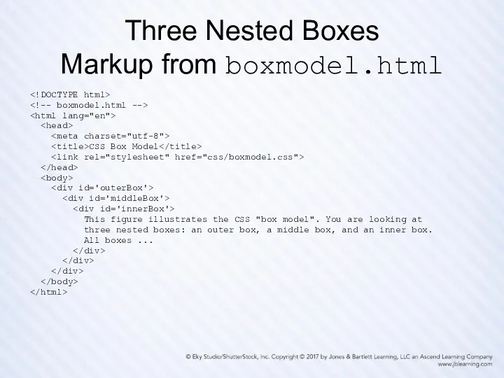
Three Nested Boxes
Markup from boxmodel.html
Three Nested Boxes
Markup from boxmodel.html
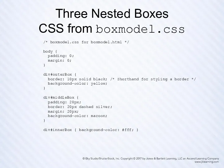
Three Nested Boxes
CSS from boxmodel.css
/* boxmodel.css for boxmodel.html */
body {
padding:
Three Nested Boxes
CSS from boxmodel.css
/* boxmodel.css for boxmodel.html */
body {
padding:
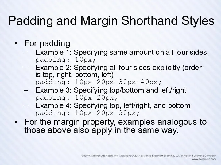
Padding and Margin Shorthand Styles
For padding
Example 1: Specifying same amount on
Padding and Margin Shorthand Styles
For padding
Example 1: Specifying same amount on
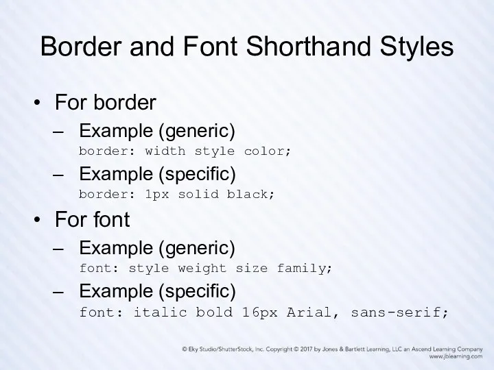
Border and Font Shorthand Styles
For border
Example (generic)
border: width style color;
Example (specific)
border:
Border and Font Shorthand Styles
For border
Example (generic)
border: width style color;
Example (specific)
border:
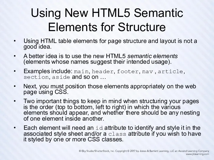
Using New HTML5 Semantic Elements for Structure
Using HTML table elements for
Using New HTML5 Semantic Elements for Structure
Using HTML table elements for
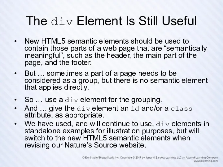
The div Element Is Still Useful
New HTML5 semantic elements should be
The div Element Is Still Useful
New HTML5 semantic elements should be
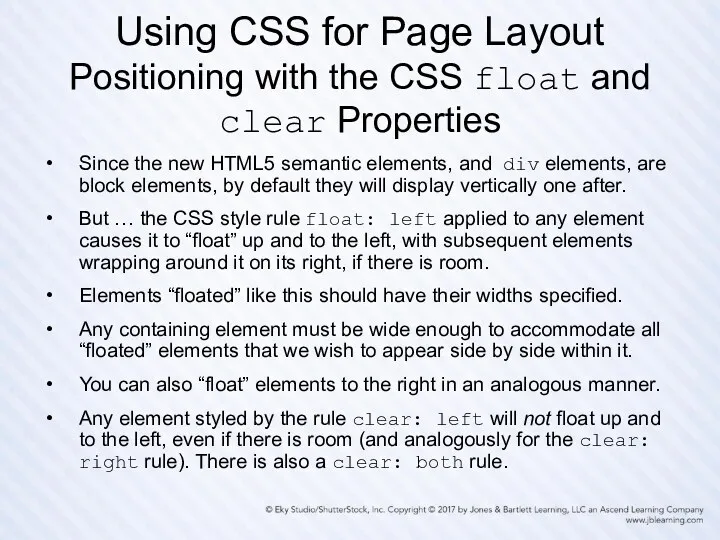
Using CSS for Page Layout
Positioning with the CSS float and clear
Using CSS for Page Layout Positioning with the CSS float and clear
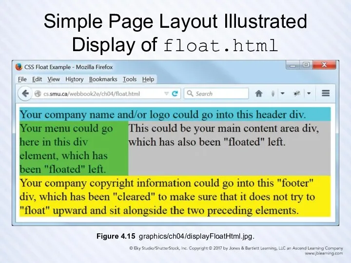
Simple Page Layout Illustrated
Display of float.html
Figure 4.15 graphics/ch04/displayFloatHtml.jpg.
Simple Page Layout Illustrated
Display of float.html
Figure 4.15 graphics/ch04/displayFloatHtml.jpg.
Simple Page Layout Illustrated
Markup from float.html
Simple Page Layout Illustrated
Markup from float.html
Simple Page Layout Illustrated
CSS from float.css
/* float.css for float.html */
body {
Simple Page Layout Illustrated
CSS from float.css
/* float.css for float.html */
body {
Simple Page Layout Illustrated
Display of floatHTML5.html
Figure 4.18 graphics/ch04/displayFloatHTML5Html.jpg.
Simple Page Layout Illustrated
Display of floatHTML5.html
Figure 4.18 graphics/ch04/displayFloatHTML5Html.jpg.
Simple Page Layout Illustrated
Markup from floatHTML5.html
Simple Page Layout Illustrated
Markup from floatHTML5.html
Simple Page Layout Illustrated
CSS from floatHTML5.css
/* floatHTML5.css for floatHTML5.html */
body {
Simple Page Layout Illustrated
CSS from floatHTML5.css
/* floatHTML5.css for floatHTML5.html */
body {
Other Positioning Properties
There are several other element positioning properties that we
Other Positioning Properties
There are several other element positioning properties that we
CSS Reset (1 of 2)
A browser, in the absence of any
CSS Reset (1 of 2)
A browser, in the absence of any
CSS Reset (2 of 2)
Not all developers will agree on exactly
CSS Reset (2 of 2)
Not all developers will agree on exactly
A Simple Home Page
Styled with CSS Display of
nature1/index.html
Figure 4.21 graphics/ch04/nature1/displayIndexHtml.jpg.
A Simple Home Page
Styled with CSS Display of
nature1/index.html
Figure 4.21 graphics/ch04/nature1/displayIndexHtml.jpg.
A Simple Home Page Styled with CSS:
Markup from nature1/index.html
Nature's Source - Canada's largest specialty vitamin store
 width="608" height="90">
5029 Hurontario Street Unit 2
Mississauga, ON L4Z 3X7
Tel: 905.502.6789
Fax: 905.890.8305
Welcome to Nature's Source - Protecting your health
naturally!
Founded in 1998, Nature's Source was created ...
 width="256" height="256">
A Simple Home Page Styled with CSS:
Markup from nature1/index.html
width="608" height="90">5029 Hurontario Street Unit 2
Mississauga, ON L4Z 3X7
Tel: 905.502.6789
Fax: 905.890.8305
Welcome to Nature's Source - Protecting your health
naturally!
Founded in 1998, Nature's Source was created ...
width="256" height="256">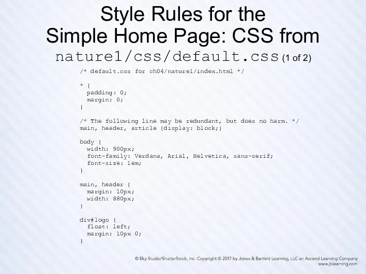
Style Rules for the
Simple Home Page: CSS from nature1/css/default.css (1
Style Rules for the Simple Home Page: CSS from nature1/css/default.css (1
Style Rules for the
Simple Home Page: CSS from nature1/css/default.css (2
Style Rules for the Simple Home Page: CSS from nature1/css/default.css (2
Some Good Advice for What Follows
First, this advice relates to the
Some Good Advice for What Follows
First, this advice relates to the
Preamble for the Remaining Slides
First we show the home page of
Preamble for the Remaining Slides
First we show the home page of
Display of nature2/index.html
(note CSS-styled main menu and footer)
Figure 4.24 graphics/ch04/nature2/displayIndexHtml.jpg.
Display of nature2/index.html
(note CSS-styled main menu and footer)
Figure 4.24 graphics/ch04/nature2/displayIndexHtml.jpg.
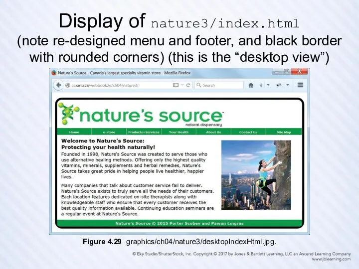
Display of nature3/index.html
(note re-designed menu and footer, and black border with
Display of nature3/index.html (note re-designed menu and footer, and black border with
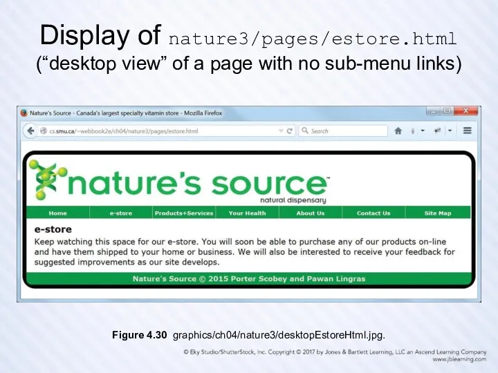
Display of nature3/pages/estore.html
(“desktop view” of a page with no sub-menu links)
Figure 4.30
Display of nature3/pages/estore.html
(“desktop view” of a page with no sub-menu links)
Figure 4.30
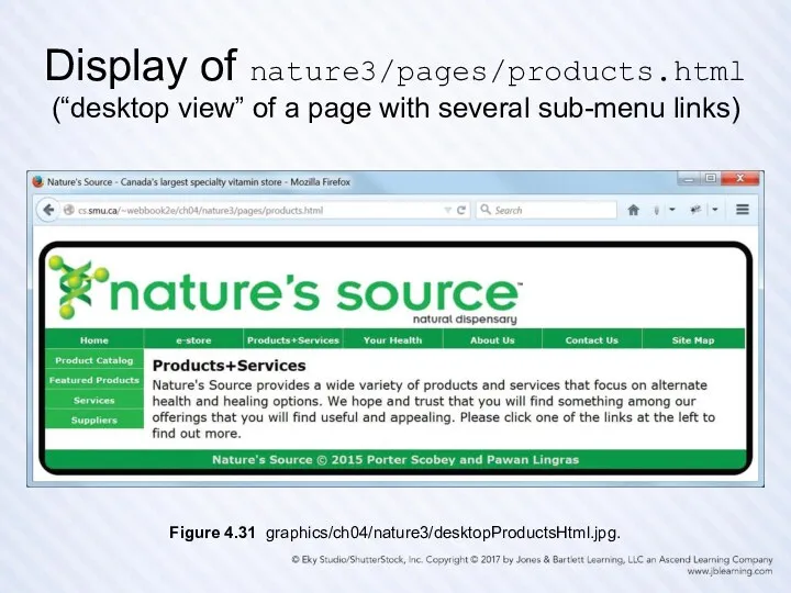
Display of nature3/pages/products.html
(“desktop view” of a page with several sub-menu links)
Figure 4.31
Display of nature3/pages/products.html
(“desktop view” of a page with several sub-menu links)
Figure 4.31
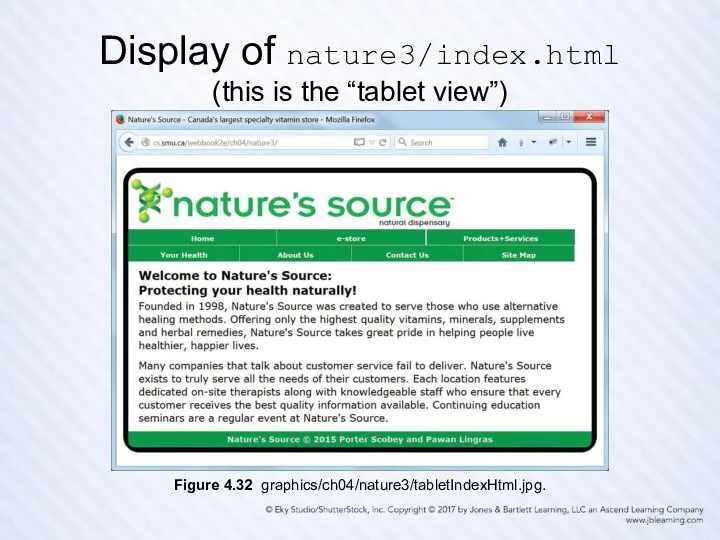
Display of nature3/index.html
(this is the “tablet view”)
Figure 4.32 graphics/ch04/nature3/tabletIndexHtml.jpg.
Display of nature3/index.html
(this is the “tablet view”)
Figure 4.32 graphics/ch04/nature3/tabletIndexHtml.jpg.
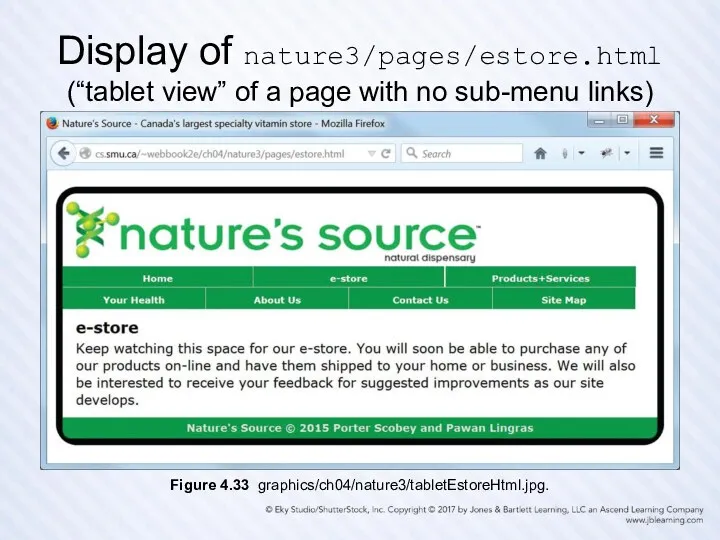
Display of nature3/pages/estore.html
(“tablet view” of a page with no sub-menu links)
Figure 4.33
Display of nature3/pages/estore.html
(“tablet view” of a page with no sub-menu links)
Figure 4.33
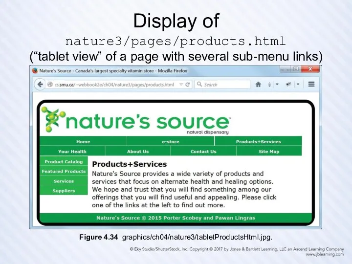
Display of nature3/pages/products.html
(“tablet view” of a page with several sub-menu links)
Figure 4.34
Display of nature3/pages/products.html
(“tablet view” of a page with several sub-menu links)
Figure 4.34
Responsive Design
Design your web pages so they can be viewed on
Responsive Design
Design your web pages so they can be viewed on
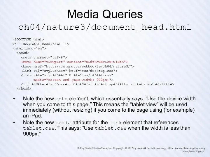
Media Queries
ch04/nature3/document_head.html
Media Queries
ch04/nature3/document_head.html
 Диаграмма классов
 List of keywords
 Сервис развития словарного запаса uSpeech
 Информатика 3-4 класс. По материалам Инфознайки.
 Сервисы для интерактивного взаимодействия
 Установка и настройка DNS-сервера
 Программное обеспечение компьютера (8 класс)
 Представление и кодирование информации в компьютере. Понятие информации
 Створення в автоматичному режимі макросів та їх використання
 Power BI
 Цифровая обработка сигналов
 Модернизация системы абонентского доступа к сети предприятия ООО Экспресс-Авто-Запад
 Диалоговые панели
 Алгоритм. Свойства алгоритма
 Экспертные системы
 Создание запросов на выборку в базе данных
 Характеристики відмінної вимоги. (Лекція 3.2)
 Современные тенденции развития информационных технологий и ресурсов
 Современная структура и динамика медиасистемы
 Безопасность в интернете
 Детский правовой сайт
 Создание текстовых документов. 7 класс
 Работа с базами данных научных публикаций
 Kofax Transformation Modules 5. Module 2 – Product Overview
 Инструкция по работе с модулем карт в Sales Works
 Информационные технологии в сфере туризма
 Управление проектами в бизнес-коммуникациях
 Доработка замещающих планов