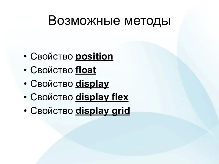
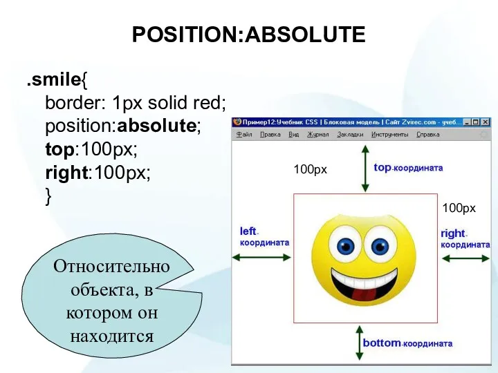
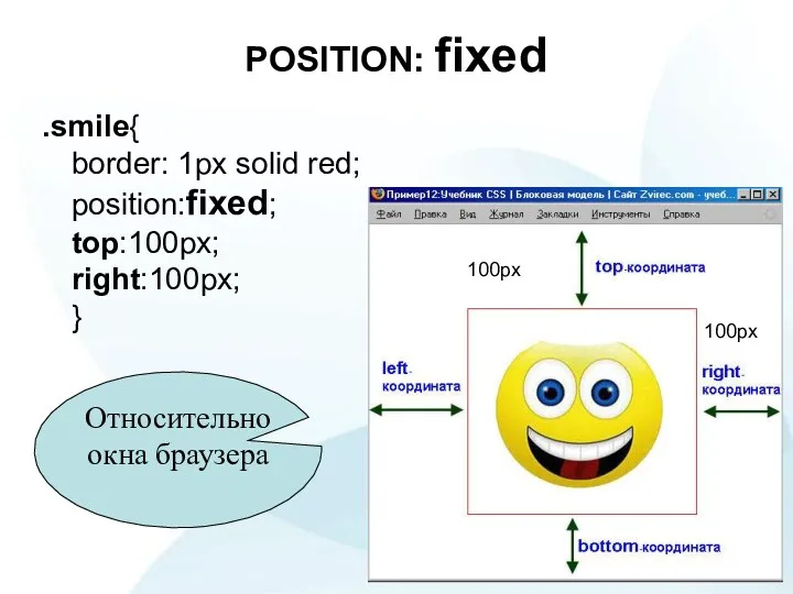
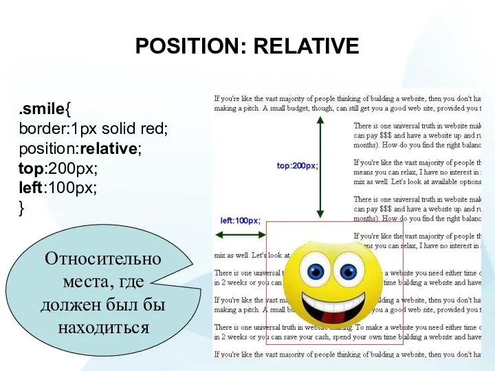
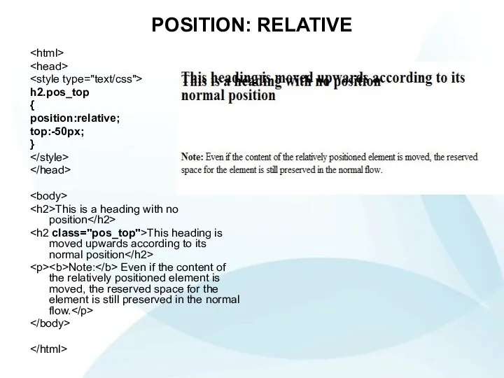
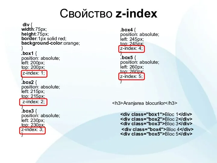
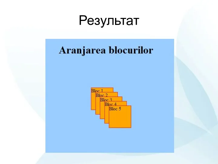
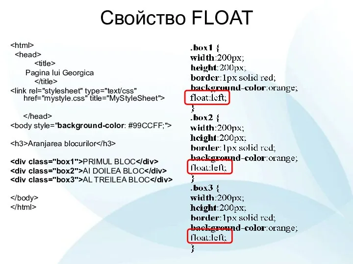
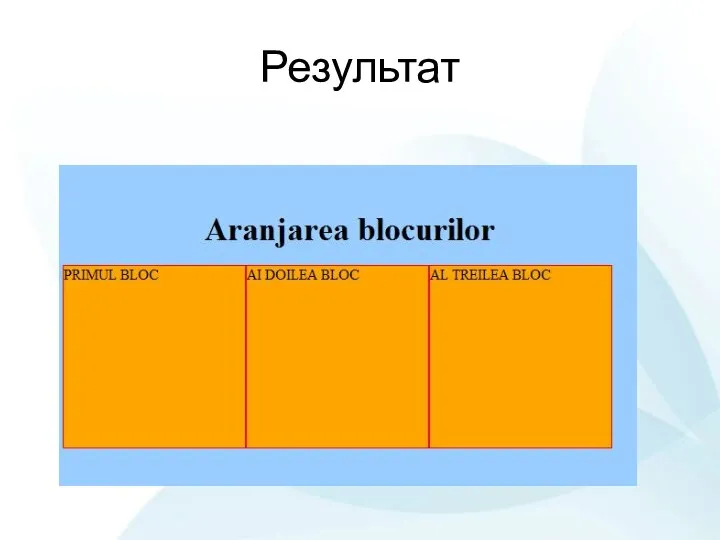
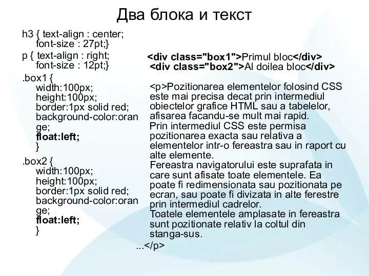
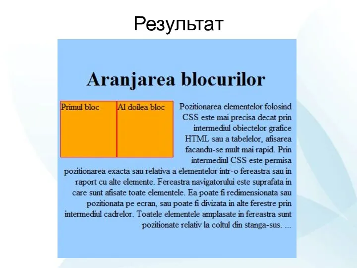
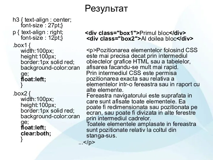
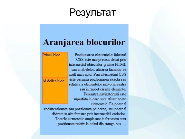
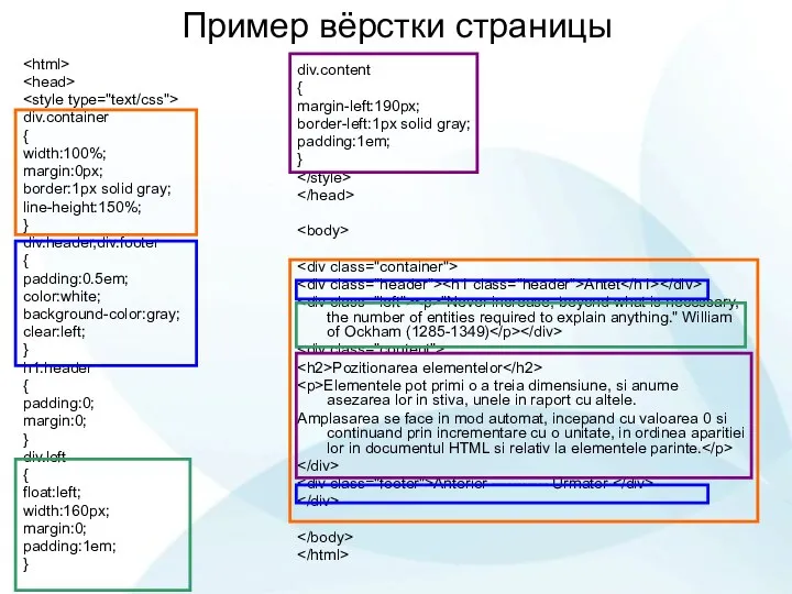
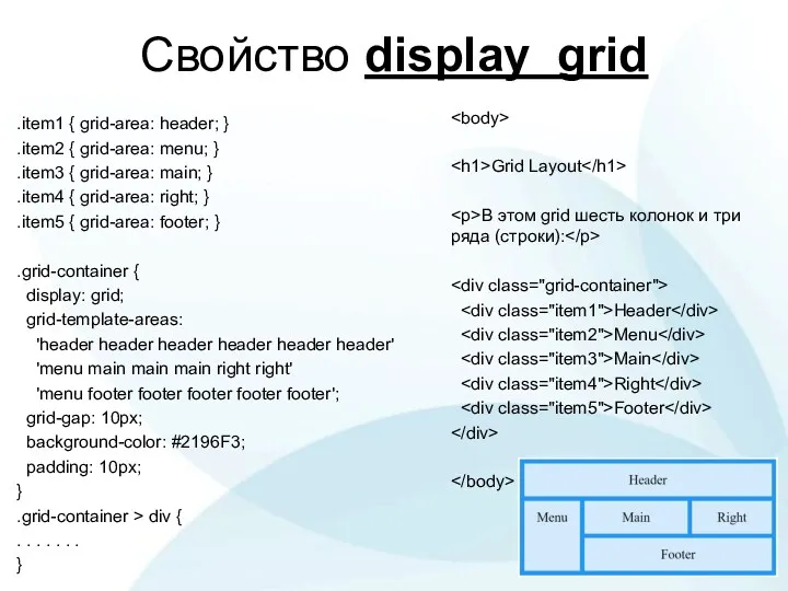
Pozitionarea elementelor
Elementele pot primi o a treia dimensiune, si anume asezarea lor in stiva, unele in raport cu altele.
Amplasarea se face in mod automat, incepand cu valoarea 0 si continuand prin incrementare cu o unitate, in ordinea aparitiei lor in documentul HTML si relativ la elementele parinte.
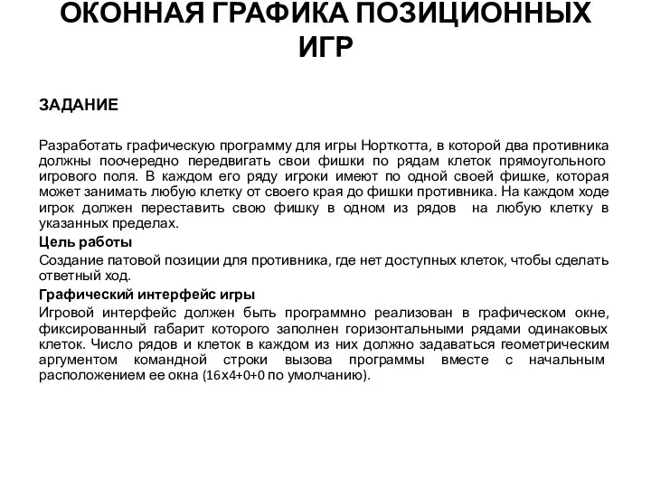 Оконная графика позиционных игр. Программа для игры Норткотта
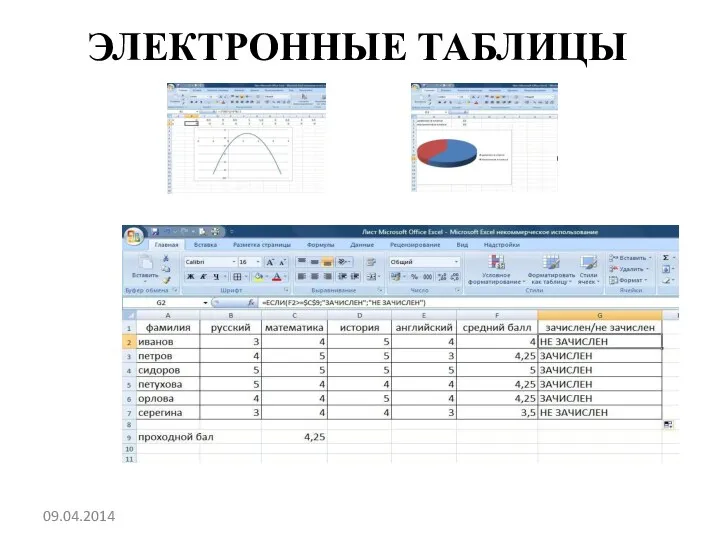 Электронная таблица Excel
 Моделирование и формализация для 5-7 классов
 IT in The City
 Turbo Pascal. Операторы
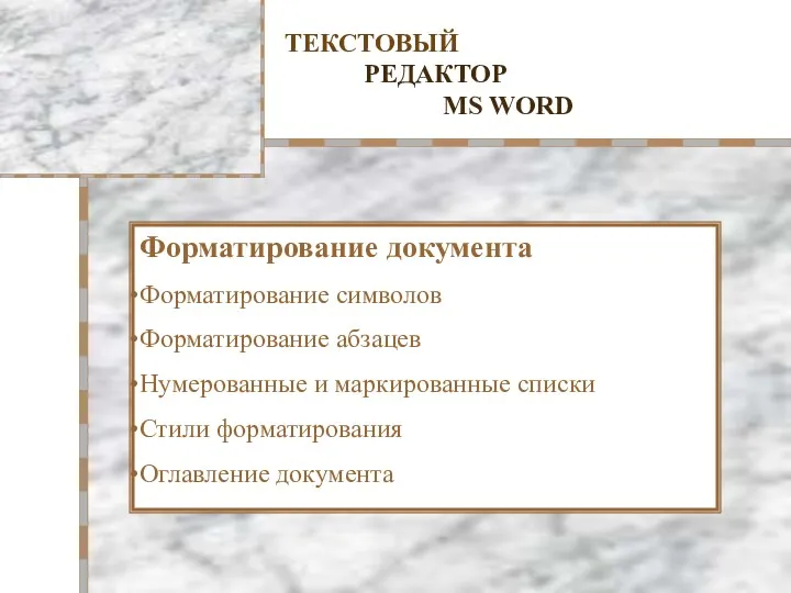 Текстовый редактор MS Word. Форматирование документа
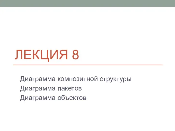 Диаграмма композитной структуры. Диаграмма пакетов. Диаграмма объектов
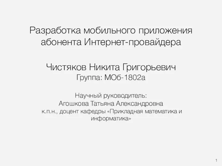 Разработка мобильного приложения абонента Интернет-провайдера
 Язык программирования Pascal
 Базы данных. Язык запросов SQL. Введение
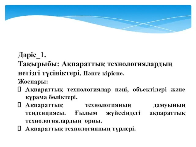 Ақпараттық технологиялардың негізгі түсініктері. Пәнге кіріспе
 Авантелеком - Цифровая платформа управления коммуникациями для государственных и муниципальных унитарных предприятий
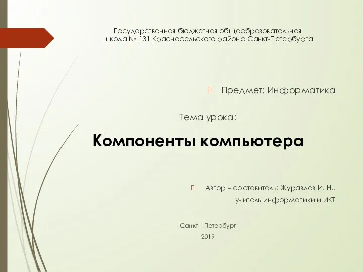 Компоненты компьютера
 Методика структурного анализа потоков данных DFD (Data Flow Diagrams)
 Перевірка кваліфікаційних робіт на академічний плагіат
 Поиск информации в интернете
 Простейшие способы шифрования текста. Основы программирования Лабораторная работа №11
 Презентация по информатике на тему _Антивирусные программы_
 Компьютерные сети. Сетевой уровень. (Тема 4)
 Стройэксперт презентация
 HTML работа с текстом текст
 Steam. About Steam. History. User Interface. Games
 Статистичні методи і обробка інформації у суспільній географії. (Лекція 1)
 Учет поступивших в библиотеку документов в схемах и таблицах
 Lecture02
 Построение и исследование информационных моделей
 Диаграмма развертывания языка UML 2 (Лекция 8)
 Информационное обеспечение ИС. Внутримашинное ИО. Информационные хранилища. (Тема 8. Лекция 20)