Understanding CSS. Essentials: layouts, managing text flow, managing the graphical interface презентация
- Understanding CSS. Essentials: layouts, managing text flow, managing the graphical interface

Содержание
- 2. Agenda UI design Traditional CSS Box model Block-level and inline element Parent/child relationships Vendor prefixes CSS
- 3. Vendor Prefixes CSS3 specification is still in draft format and undergoing modifications Need to use vendor
- 4. Two CSS box models Box models In the W3C box model, the width of an element
- 5. http://jsfiddle.net/koldovsky/e1984en9/1/ Box model sample
- 6. Inherited Properties A parent box can contain one or more child boxes. A child can inherit
- 7. Browser Default Styles Web browsers have default CSS styles for HTML elements, consider sample: http://plnkr.co/edit/QgapgI8yuc328XV888Q8?p=preview Also
- 8. Media Queries A media query consists of a media type and at least one expression that
- 9. UI Challenges Developers have used float property for relative positioning of UI elements for years CSS3
- 10. CSS Flexbox Box Model Good for controls, toolbars, menus, and forms that resize and reposition automatically
- 11. CSS Flexbox Model Reordering Sample http://jsfiddle.net/koldovsky/jb5h57jw/
- 12. CSS3 Grid Layout Model Gives developers greater control over complex layouts than the flexbox model Lets
- 13. Multi-column Layout Create columns by dividing text across multiple columns Specify the amount of space that
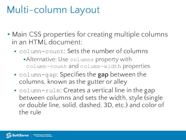
- 14. Multi-column Layout Main CSS properties for creating multiple columns in an HTML document: column-count: Sets the
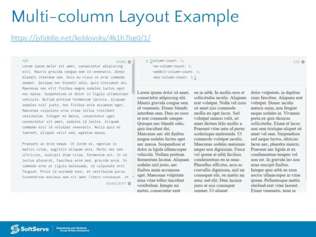
- 15. Multi-column Layout Example https://jsfiddle.net/koldovsky/4k1h7bg0/1/
- 16. Practice Task: Explore http://learnlayout.com/ Use different approaches to create leyouts
- 17. Hyphenation The process of connecting two words with a hyphen mark (-) or breaking words between
- 18. Language Declaration W3C requires a language declaration for correct automatic hyphenation to occur: or xml:lang="en" lang="en">
- 19. border-radius Property Creates rounded corners around layout elements, like headers, footers, sidebars, graphics boxes, and outlines
- 20. border-radius Example
- 21. border-radius Example
- 22. box-shadow Property Creates drop shadows around layout elements CSS syntax for creating a shadow: box-shadow: h-shadow
- 23. box-shadow Example
- 24. Opacity and Transparency An opaque item does not let light pass through, whereas you can see
- 25. Transparency Example
- 26. CSS Gradients Gradient is a smooth change of colors, within the same hue or starting with
- 27. Gradient Examples Radial gradient: radial-gradient(50% 50%, 70% 70%, #99CCFF, #3D5266); Linear gradient: background: linear-gradient(black, white);
- 28. 2D and 3D Transformations A transform is an effect that lets you change the size, shape,
- 29. http://jsfiddle.net/koldovsky/2m2Zb/36/ Transformations Sample
- 30. CSS Transition A transition is a change from one thing to another; in CSS, a transition
- 31. http://jsfiddle.net/koldovsky/PkJaD/357/ Transition Sample
- 32. CSS animations animates transitions between CSS styles to another. Consist of two components: a style describing
- 33. http://jsfiddle.net/koldovsky/e2tt2mao/56/ Simple Animation Example
- 34. https://jsfiddle.net/koldovsky/HDsw2/11/ Details: https://www.smashingmagazine.com/2014/04/understanding-css-timing-functions/ Timing Functions
- 35. Small file sizes that compress well Scales to any size without losing clarity (except very tiny)
- 36. http://webdesign.tutsplus.com/tutorials/bring-your-forms-up-to-date-with-css3-and-html5-validation--webdesign-4738 Styling forms
- 37. http://www.w3schools.com/css/css_table.asp Styling Tables
- 38. Practice Task
- 39. Advanced Topics
- 40. CSS Regions Feature allows developers to dynamically flow content across multiple boxes, or containers, in HTML
- 41. Content Flow with CSS Regions
- 42. CSS Exclusions Formerly referred to as positioned floats Enables positioning of images, text, and boxes anywhere
- 43. CSS Exclusions Example 1 Screen shot from Internet Explorer 10 Test Drive Web page
- 44. CSS Exclusions Properties wrap-flow:both displays content on all sides of the exclusion wrap-flow:clear displays content above
- 45. CSS Exclusions Example 2
- 46. CSS Exclusions Step-by-step
- 47. border-radius Property, Single Corners Rounding a single corner of a box: border-top-left-radius border-top-right-radius border-bottom-right-radius border-bottom-left-radius
- 48. CSS Gradient Methods CSS3 gradient methods: linear-gradient: Creates a gradient from top to bottom or vice
- 49. Gradient Color Interpolation and Color Stops CSS gradients support color interpolation in the alpha color space
- 50. 2D Translation To translate an element means to move it without rotating, skewing, or otherwise turning
- 51. 2D Translation Example
- 52. 2D Translation Example
- 53. 2D Scaling To scale an element is to increase or decrease its size. Use the scale()
- 54. 2D Scaling Example
- 55. 2D Scaling Example
- 56. 2D Rotation To rotate an element turns it clockwise by a specified number of degrees. Use
- 57. 2D Rotation Example
- 58. 2D Example
- 59. 3D Rotation 3D rotation uses the rotateX() and rotateY() methods. rotateX(): Element rotates around its x-axis
- 60. 2D Skewing To skew an element is to stretch it in one or more directions. Use
- 61. 2D Skewing Example
- 62. 2D Skewing Example
- 63. 3D Skewing 3D skewing uses the skewX() and skewY() methods to skew an element around its
- 64. 3D Perspective The CSS3 3D perspective property defines how a browser renders the depth of a
- 65. Transition Example
- 66. Transition Example
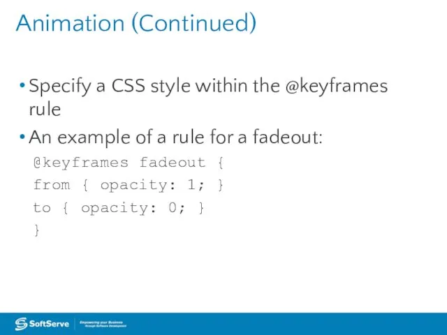
- 67. Animation (Continued) Specify a CSS style within the @keyframes rule An example of a rule for
- 68. Animation (Continued) Code snippet that configures animation properties for a fadeout: div { animation-duration: 3s; animation-delay:
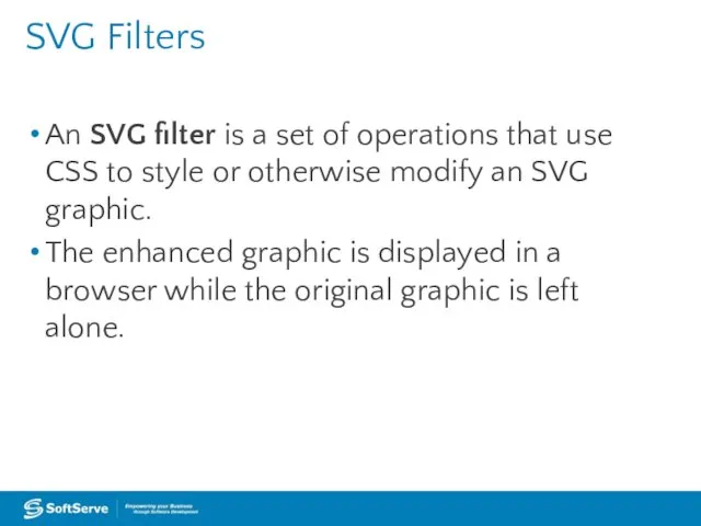
- 69. SVG Filters An SVG filter is a set of operations that use CSS to style or
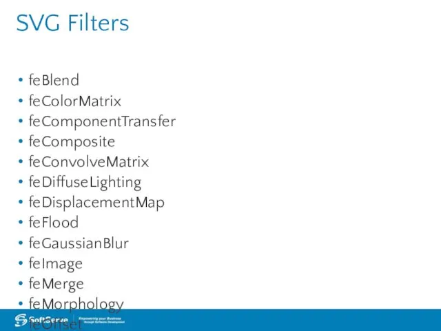
- 70. SVG Filters feBlend feColorMatrix feComponentTransfer feComposite feConvolveMatrix feDiffuseLighting feDisplacementMap feFlood feGaussianBlur feImage feMerge feMorphology feOffset feTile
- 71. SVG Filters Gaussian Blur Example
- 72. SVG Filters Offset Example
- 73. Canvas Use canvas to draw pixel-based shapes. The canvas element accepts only two attributes—height and width.
- 74. Canvas Example 1
- 75. Canvas Example 2 context.rotate(20*Math. PI/180);
- 76. Canvas Example 3
- 78. Скачать презентацию
Agenda
UI design
Traditional CSS Box model
Block-level and inline element
Parent/child relationships
Vendor prefixes
CSS Flexbox
Agenda
UI design
Traditional CSS Box model
Block-level and inline element
Parent/child relationships
Vendor prefixes
CSS Flexbox
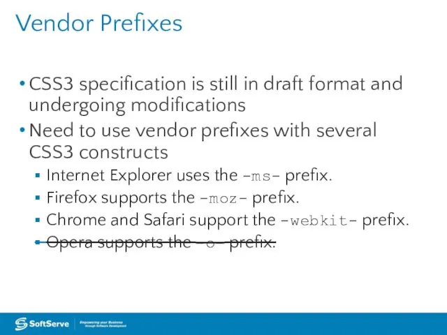
Vendor Prefixes
CSS3 specification is still in draft format and undergoing modifications
Need
Vendor Prefixes
CSS3 specification is still in draft format and undergoing modifications
Need
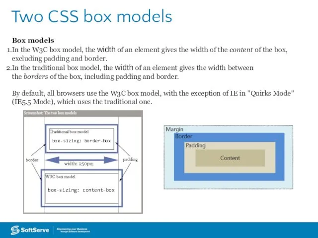
Two CSS box models
Box models
In the W3C box model, the width of an
Two CSS box models
Box models
In the W3C box model, the width of an
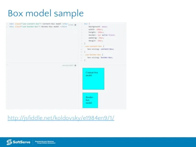
http://jsfiddle.net/koldovsky/e1984en9/1/
Box model sample
http://jsfiddle.net/koldovsky/e1984en9/1/
Box model sample
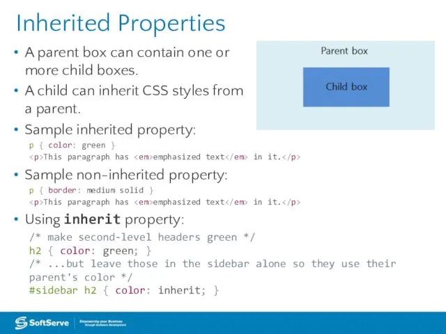
Inherited Properties
A parent box can contain one or
more child boxes.
A
Inherited Properties
A parent box can contain one or
more child boxes.
A
Browser Default Styles
Web browsers have default CSS styles for HTML elements,
Browser Default Styles
Web browsers have default CSS styles for HTML elements,
Media Queries
A media query consists of a media type and at least one
Media Queries
A media query consists of a media type and at least one
UI Challenges
Developers have used float property for relative positioning of UI
UI Challenges
Developers have used float property for relative positioning of UI
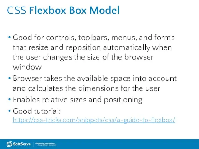
CSS Flexbox Box Model
Good for controls, toolbars, menus, and forms that
CSS Flexbox Box Model
Good for controls, toolbars, menus, and forms that
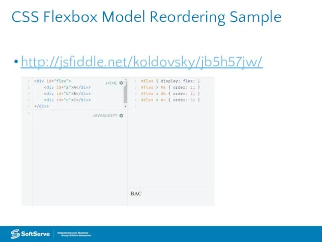
CSS Flexbox Model Reordering Sample
http://jsfiddle.net/koldovsky/jb5h57jw/
CSS Flexbox Model Reordering Sample
http://jsfiddle.net/koldovsky/jb5h57jw/
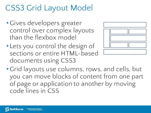
CSS3 Grid Layout Model
Gives developers greater
control over complex layouts
than
CSS3 Grid Layout Model
Gives developers greater control over complex layouts than
Multi-column Layout
Create columns by dividing text across multiple columns
Specify the amount
Multi-column Layout
Create columns by dividing text across multiple columns
Specify the amount
Multi-column Layout
Main CSS properties for creating multiple columns in an HTML
Multi-column Layout
Main CSS properties for creating multiple columns in an HTML
Multi-column Layout Example
https://jsfiddle.net/koldovsky/4k1h7bg0/1/
Multi-column Layout Example
https://jsfiddle.net/koldovsky/4k1h7bg0/1/

Practice Task:
Explore http://learnlayout.com/
Use different approaches to create leyouts
Practice Task:
Explore http://learnlayout.com/
Use different approaches to create leyouts
Hyphenation
The process of connecting two words with a hyphen mark (-)
Hyphenation
The process of connecting two words with a hyphen mark (-)
Language Declaration
W3C requires a language declaration for correct automatic hyphenation to
Language Declaration
W3C requires a language declaration for correct automatic hyphenation to
border-radius Property
Creates rounded corners around layout elements, like headers, footers, sidebars,
border-radius Property
Creates rounded corners around layout elements, like headers, footers, sidebars,
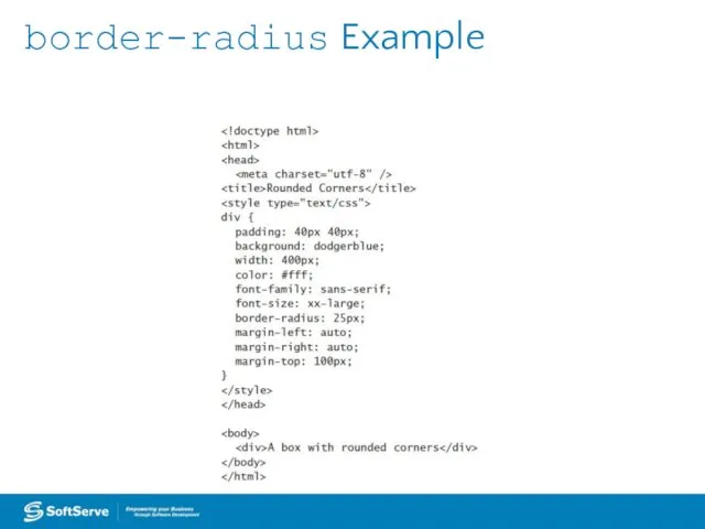
border-radius Example
border-radius Example
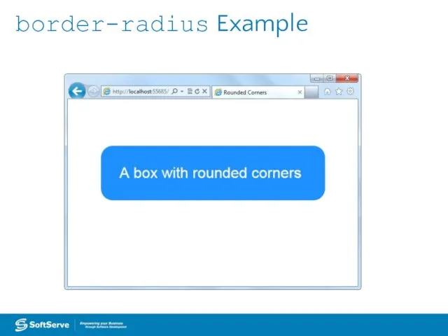
border-radius Example
border-radius Example
box-shadow Property
Creates drop shadows around layout elements
CSS syntax for creating a
box-shadow Property
Creates drop shadows around layout elements
CSS syntax for creating a
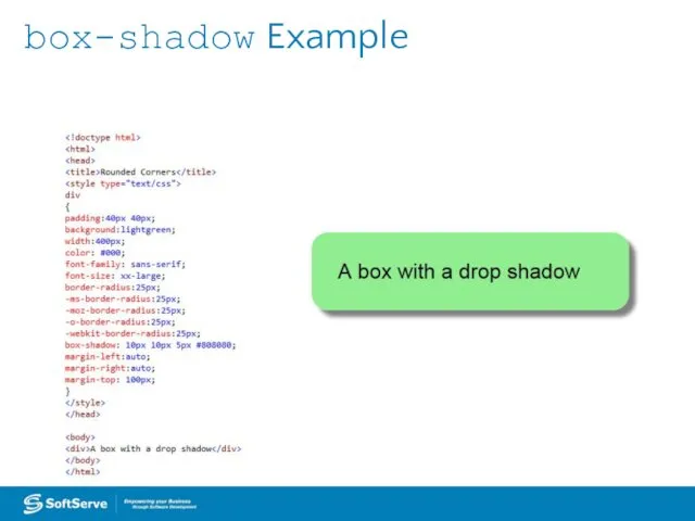
box-shadow Example
box-shadow Example
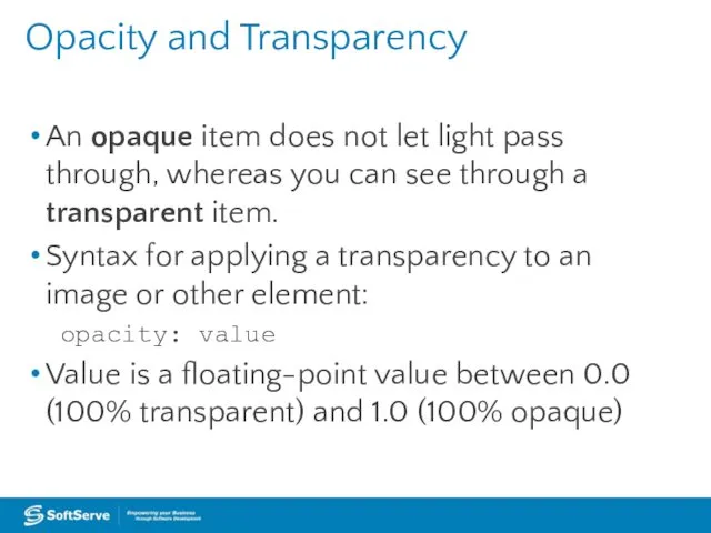
Opacity and Transparency
An opaque item does not let light pass through,
Opacity and Transparency
An opaque item does not let light pass through,
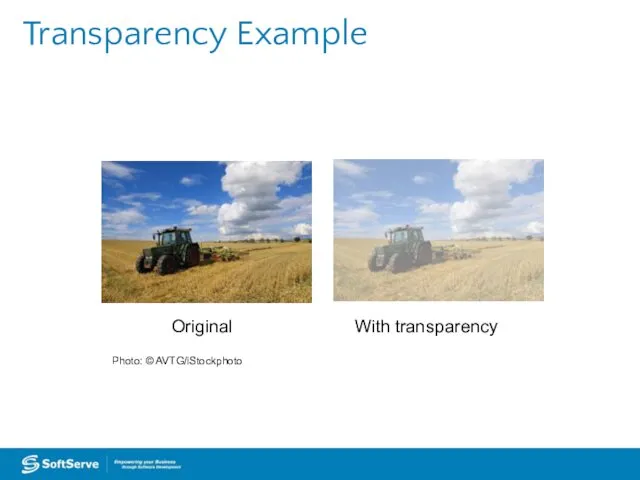
Transparency Example
Transparency Example
CSS Gradients
Gradient is a smooth change of colors, within the same
CSS Gradients
Gradient is a smooth change of colors, within the same
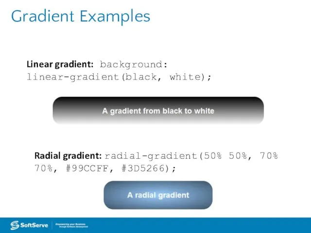
Gradient Examples
Radial gradient: radial-gradient(50% 50%, 70% 70%, #99CCFF, #3D5266);
Linear gradient: background:
Gradient Examples
Radial gradient: radial-gradient(50% 50%, 70% 70%, #99CCFF, #3D5266);
Linear gradient: background:
2D and 3D Transformations
A transform is an effect that lets you
2D and 3D Transformations
A transform is an effect that lets you
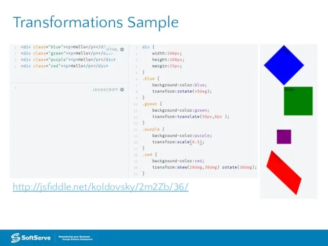
http://jsfiddle.net/koldovsky/2m2Zb/36/
Transformations Sample
http://jsfiddle.net/koldovsky/2m2Zb/36/
Transformations Sample
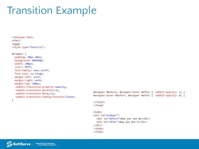
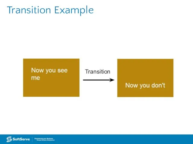
CSS Transition
A transition is a change from one thing to another;
CSS Transition
A transition is a change from one thing to another;
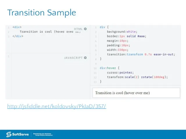
http://jsfiddle.net/koldovsky/PkJaD/357/
Transition Sample
http://jsfiddle.net/koldovsky/PkJaD/357/
Transition Sample
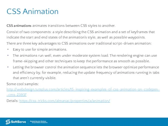
CSS animations animates transitions between CSS styles to another.
Consist of
CSS animations animates transitions between CSS styles to another.
Consist of
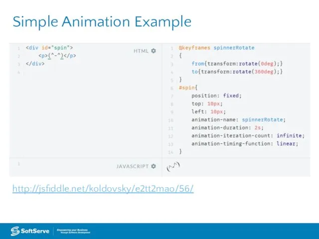
http://jsfiddle.net/koldovsky/e2tt2mao/56/
Simple Animation Example
http://jsfiddle.net/koldovsky/e2tt2mao/56/
Simple Animation Example
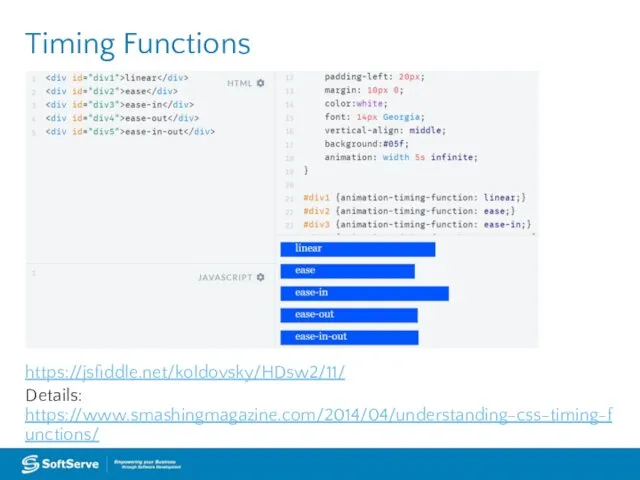
https://jsfiddle.net/koldovsky/HDsw2/11/
Details: https://www.smashingmagazine.com/2014/04/understanding-css-timing-functions/
Timing Functions
https://jsfiddle.net/koldovsky/HDsw2/11/
Details: https://www.smashingmagazine.com/2014/04/understanding-css-timing-functions/
Timing Functions
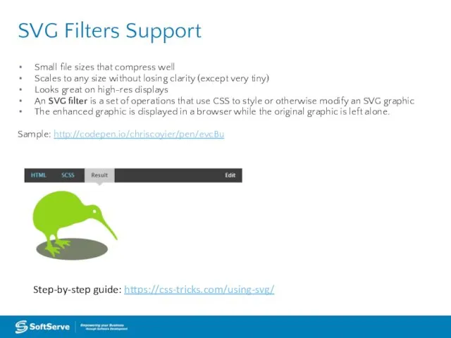
Small file sizes that compress well
Scales to any size without losing
Small file sizes that compress well
Scales to any size without losing
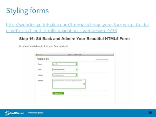
http://webdesign.tutsplus.com/tutorials/bring-your-forms-up-to-date-with-css3-and-html5-validation--webdesign-4738
Styling forms
http://webdesign.tutsplus.com/tutorials/bring-your-forms-up-to-date-with-css3-and-html5-validation--webdesign-4738
Styling forms
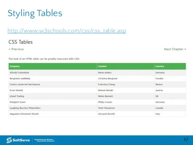
http://www.w3schools.com/css/css_table.asp
Styling Tables
http://www.w3schools.com/css/css_table.asp
Styling Tables

Practice Task
Practice Task

Advanced Topics
Advanced Topics
CSS Regions
Feature allows developers to dynamically flow content across multiple boxes,
CSS Regions
Feature allows developers to dynamically flow content across multiple boxes,
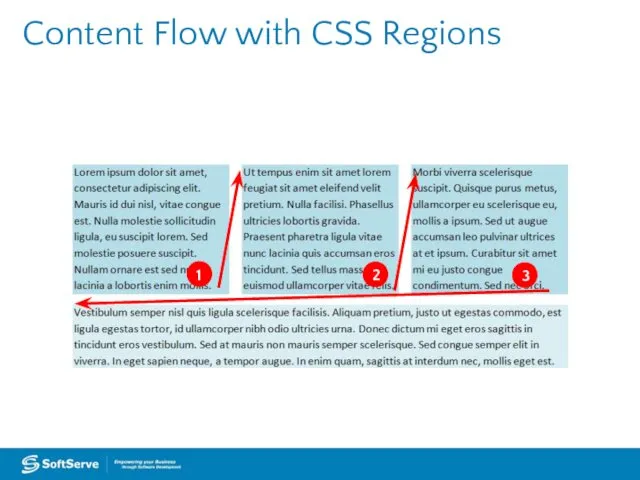
Content Flow with CSS Regions
Content Flow with CSS Regions
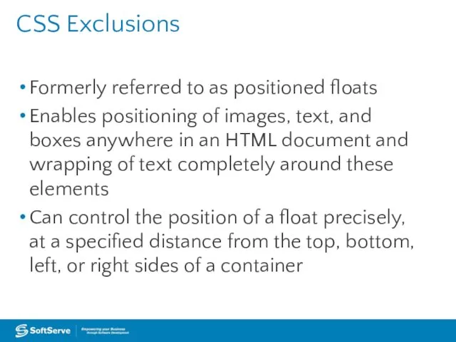
CSS Exclusions
Formerly referred to as positioned floats
Enables positioning of images, text,
CSS Exclusions
Formerly referred to as positioned floats
Enables positioning of images, text,
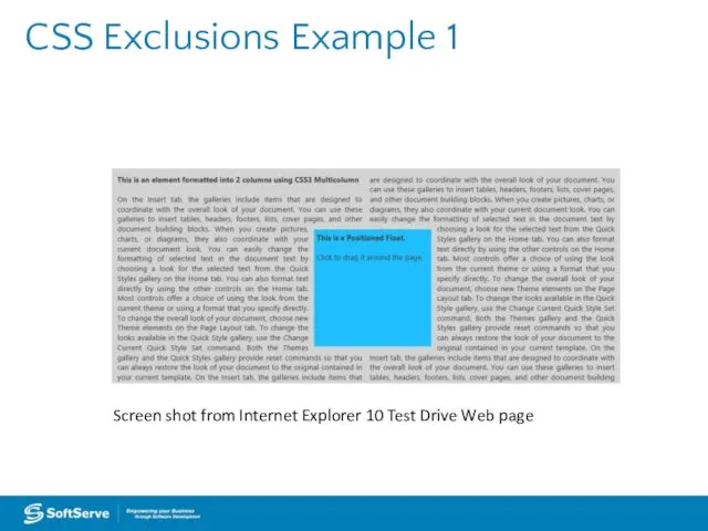
CSS Exclusions Example 1
Screen shot from Internet Explorer 10 Test Drive
CSS Exclusions Example 1
Screen shot from Internet Explorer 10 Test Drive
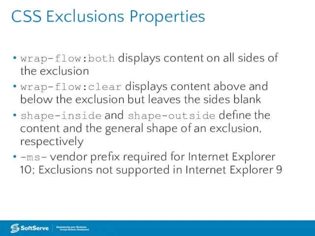
CSS Exclusions Properties
wrap-flow:both displays content on all sides of the exclusion
wrap-flow:clear
CSS Exclusions Properties
wrap-flow:both displays content on all sides of the exclusion
wrap-flow:clear
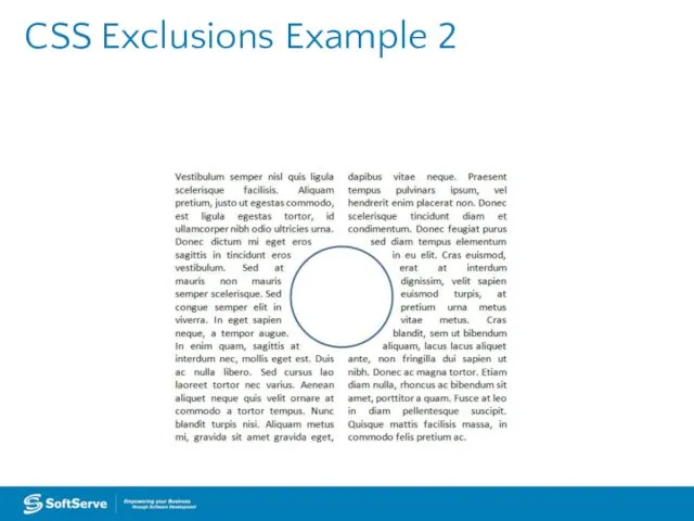
CSS Exclusions Example 2
CSS Exclusions Example 2
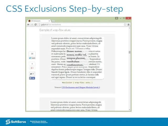
CSS Exclusions Step-by-step
CSS Exclusions Step-by-step
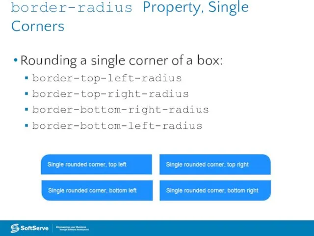
border-radius Property, Single Corners
Rounding a single corner of a box:
border-top-left-radius
border-top-right-radius
border-bottom-right-radius
border-bottom-left-radius
border-radius Property, Single Corners
Rounding a single corner of a box:
border-top-left-radius
border-top-right-radius
border-bottom-right-radius
border-bottom-left-radius
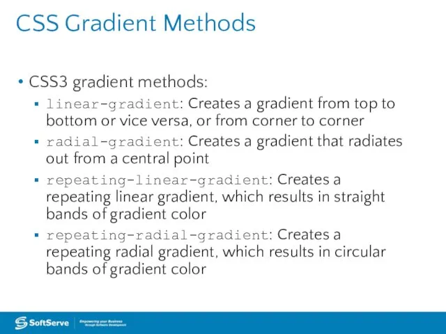
CSS Gradient Methods
CSS3 gradient methods:
linear-gradient: Creates a gradient from top to
CSS Gradient Methods
CSS3 gradient methods:
linear-gradient: Creates a gradient from top to
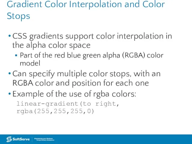
Gradient Color Interpolation and Color Stops
CSS gradients support color interpolation in
Gradient Color Interpolation and Color Stops
CSS gradients support color interpolation in
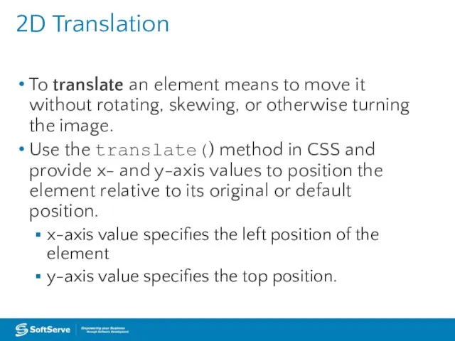
2D Translation
To translate an element means to move it without rotating,
2D Translation
To translate an element means to move it without rotating,
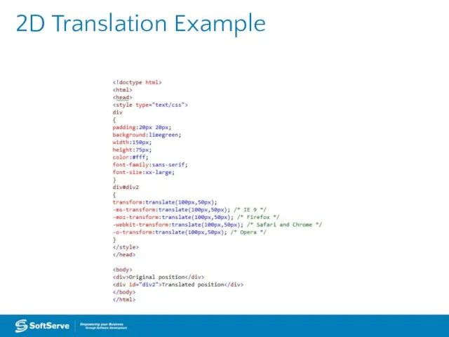
2D Translation Example
2D Translation Example
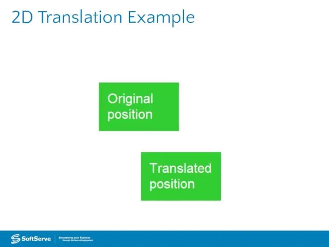
2D Translation Example
2D Translation Example
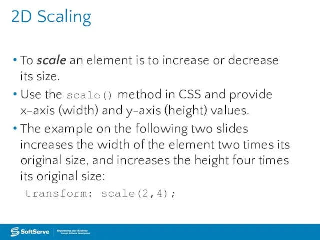
2D Scaling
To scale an element is to increase or decrease its
2D Scaling
To scale an element is to increase or decrease its
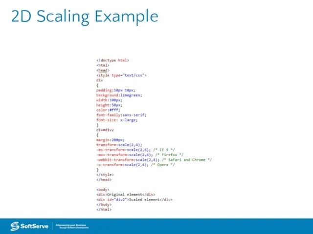
2D Scaling Example
2D Scaling Example
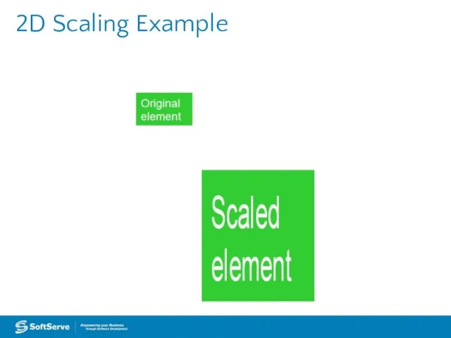
2D Scaling Example
2D Scaling Example
2D Rotation
To rotate an element turns it clockwise by a specified
2D Rotation
To rotate an element turns it clockwise by a specified

2D Rotation Example
2D Rotation Example
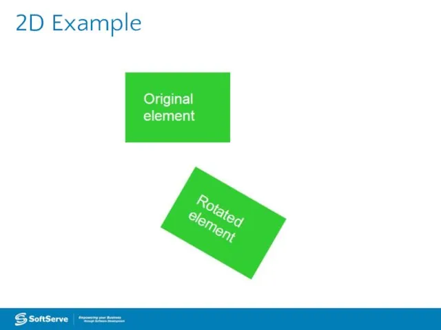
2D Example
2D Example
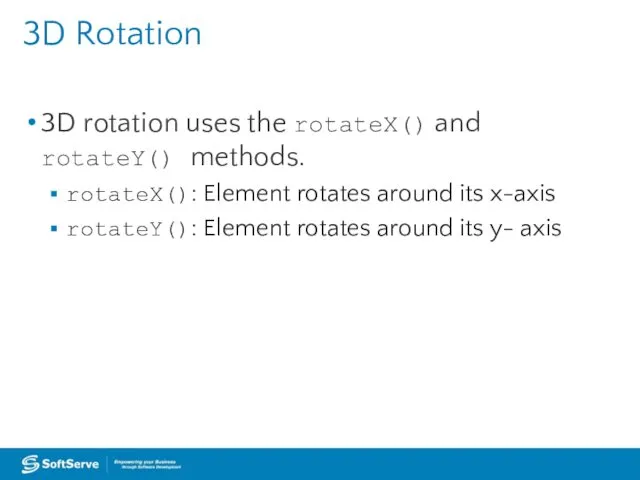
3D Rotation
3D rotation uses the rotateX() and rotateY() methods.
rotateX(): Element rotates
3D Rotation
3D rotation uses the rotateX() and rotateY() methods.
rotateX(): Element rotates
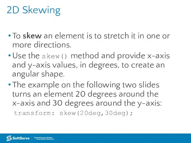
2D Skewing
To skew an element is to stretch it in one
2D Skewing
To skew an element is to stretch it in one
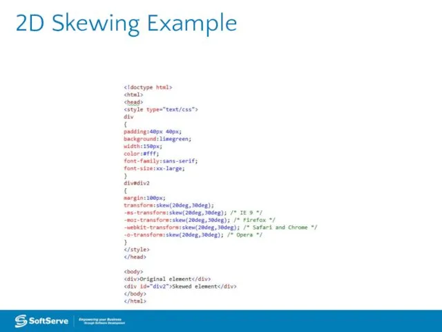
2D Skewing Example
2D Skewing Example
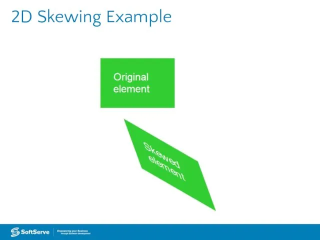
2D Skewing Example
2D Skewing Example

3D Skewing
3D skewing uses the skewX() and skewY() methods to skew
3D Skewing
3D skewing uses the skewX() and skewY() methods to skew
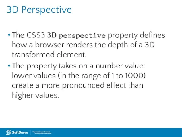
3D Perspective
The CSS3 3D perspective property defines how a browser renders
3D Perspective
The CSS3 3D perspective property defines how a browser renders
Transition Example
Transition Example
Transition Example
Transition Example
Animation (Continued)
Specify a CSS style within the @keyframes rule
An example of
Animation (Continued)
Specify a CSS style within the @keyframes rule
An example of
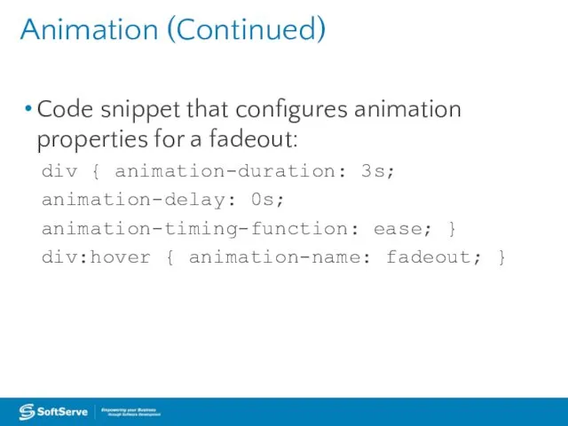
Animation (Continued)
Code snippet that configures animation properties for a fadeout:
div {
Animation (Continued)
Code snippet that configures animation properties for a fadeout:
div {
SVG Filters
An SVG filter is a set of operations that use
SVG Filters
An SVG filter is a set of operations that use
SVG Filters
feBlend
feColorMatrix
feComponentTransfer
feComposite
feConvolveMatrix
feDiffuseLighting
feDisplacementMap
feFlood
feGaussianBlur
feImage
feMerge
feMorphology
feOffset
feTile
feTurbulence
feDistantLight
fePointLight
feSpecularLighting
feSpotLight
SVG Filters
feBlend
feColorMatrix
feComponentTransfer
feComposite
feConvolveMatrix
feDiffuseLighting
feDisplacementMap
feFlood
feGaussianBlur
feImage
feMerge
feMorphology
feOffset
feTile
feTurbulence
feDistantLight
fePointLight
feSpecularLighting
feSpotLight
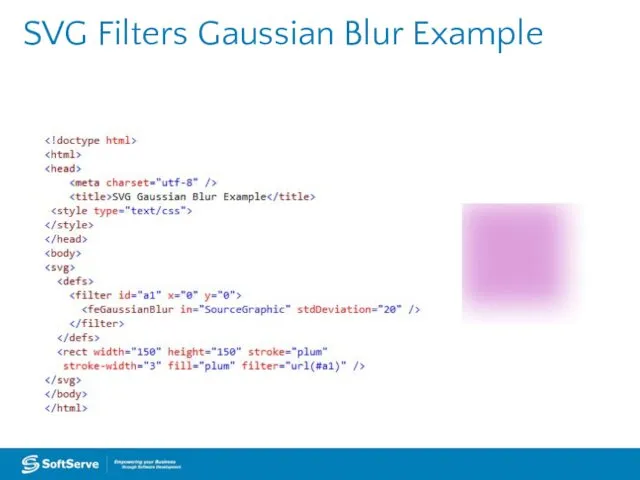
SVG Filters Gaussian Blur Example
SVG Filters Gaussian Blur Example
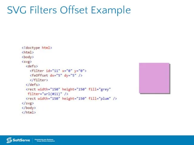
SVG Filters Offset Example
SVG Filters Offset Example
Canvas
Use canvas to draw pixel-based shapes.
The canvas element accepts only two
Canvas
Use canvas to draw pixel-based shapes.
The canvas element accepts only two
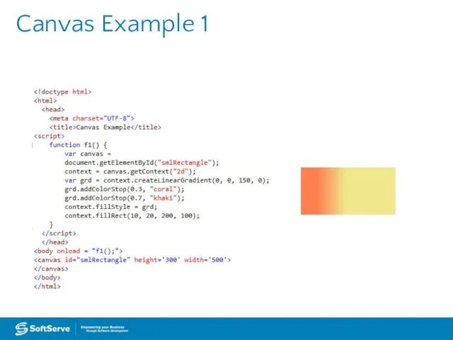
Canvas Example 1
Canvas Example 1
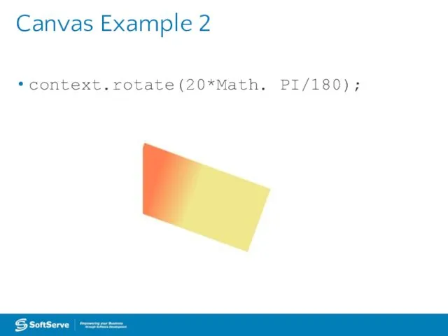
Canvas Example 2
context.rotate(20*Math. PI/180);
Canvas Example 2
context.rotate(20*Math. PI/180);
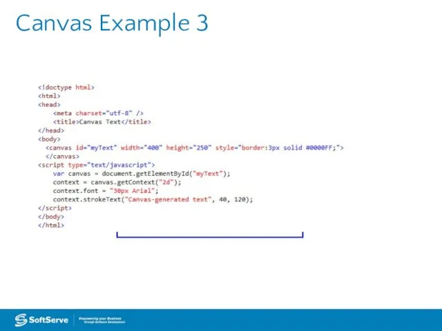
Canvas Example 3
Canvas Example 3
 Подготовка к ГИА. Задания Excel
 Технология создания мультимедийной презентации
 Оценка деятельности служб защиты информации
 Лекция 7. Моделирование технологических процессов. Травление, литография, проявление
 Agile аrchitecture scketches - 4C approach
 1С: Предприятие
 Современная журналистика. Блогинг. Занятие 2
 Обеспечение информационной безопасности в образовательных организациях с применением средств криптографической защиты информации
 Содержательный подход к измерению количества информации
 Тест: Программа подготовки презентаций Microsoft PowerPoint
 Буквы, графема, шрифты
 Всемирная паутина, поисковые системы
 Системный анализ: Кибернетические модели. Экономико-математические модели. Нормативные операционные модели
 Программирование Python. Введение в ООП
 Веселый тест
 Язык программирования Си
 САПР технологических процессов. Введение. Лекция 1
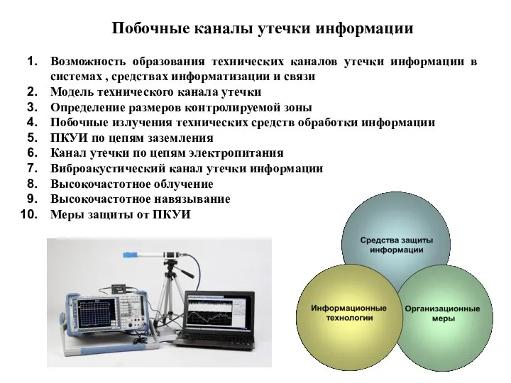 Побочные каналы утечки информации
 Медиапланирование как основа деятельности пресс-службы
 Управление процессами
 Двоичные Б-деревья (ДБД) m=1
 Web - Регистратор
 Построение диаграмм с помощью табличного процессора MS Excel
 Интеграция бренда Tiret в приложения
 задачи
 Boinc - программный комплекс для быстрой организации распределённых вычислений
 Структурный подход к синтезу и анализу сложных систем при имитационном моделировании
 Хостинг. Хостинг-провайдер