- Design. Visual Design

Содержание
- 2. agenda principles of good design grid and layout feedback, feedforward, affordance visual hierarchy typography
- 3. Good design is innovative Possibilities always there Technology pushes the edges of possible, so design should
- 4. Good design makes a product useful A product is bought to be used. It has to
- 5. Good design is aesthetic The aesthetic quality of a product is integral to its usefulness because
- 6. Good design makes a product understandable It clarifies the product’s structure. Better still, it can make
- 7. Good design is unobtrusive Products fulfilling a purpose are like tools. They are neither decorative objects
- 8. Good design is honest It does not make a product more innovative, powerful or valuable than
- 9. Good design is long-lasting It avoids being fashionable and therefore never appears antiquated. Unlike fashionable design,
- 10. Good design is thorough down to the last detail Nothing must be arbitrary or left to
- 11. Good design is environmentally-friendly Design makes an important contribution to the preservation of the environment. It
- 12. Good design is as little design as possible Less, but better – because it concentrates on
- 13. Precedence (Guiding the Eye) Visual weight of parts of design and navigation of the eye Position
- 14. Spacing Empty space seemed wasteful. In fact the opposite is true. Line Spacing – too little
- 15. Navigation One of the most frustrating experiences: failing to figure out where to go or where
- 16. Design to Build Can it actually be done? – feasibility (tech, css) What happens when a
- 17. Typography The most common element in design of UI Font Choices – modern, retro, old, futuristic
- 18. Usability (we learned a lot here) Design is about how it works, not how it looks.
- 19. Alignment Grid and layout
- 20. Clarity (Sharpness) Keeping the design crisp and sharp Edges – snapped to the pixels Anti-aliasing in
- 21. Consistency making everything match. Heading sizes, font choices, coloring, button styles, spacing, design elements, illustration styles,
- 25. Line things up
- 26. Balance the page & leave some white space
- 27. Use designer fonts
- 28. Texts should not be very long
- 29. Left-align in most cases (center for unity)
- 30. USE COLORS TO COMMUNICATE & MAKE THINGS POP DON’T USE THEM FRIVOLOUSLY
- 31. TAKE ADVANTAGE OF GOOGLE IMAGE SEARCH & FLICKR (be tasteful)
- 32. Rules Are Made To Be Broken
- 34. Скачать презентацию
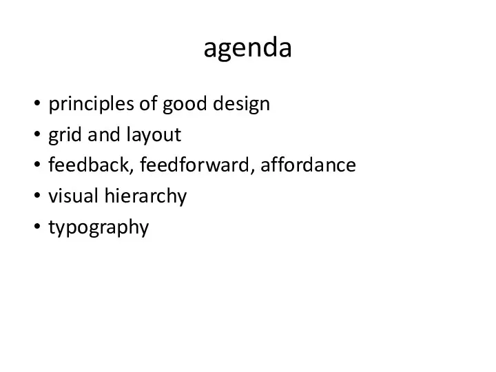
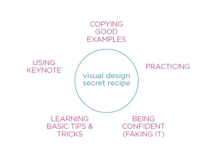
agenda
principles of good design
grid and layout
feedback, feedforward, affordance
visual hierarchy
typography
agenda
principles of good design
grid and layout
feedback, feedforward, affordance
visual hierarchy
typography
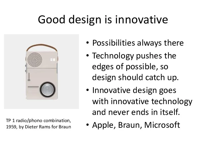
Good design is innovative
Possibilities always there
Technology pushes the edges of
Good design is innovative
Possibilities always there
Technology pushes the edges of
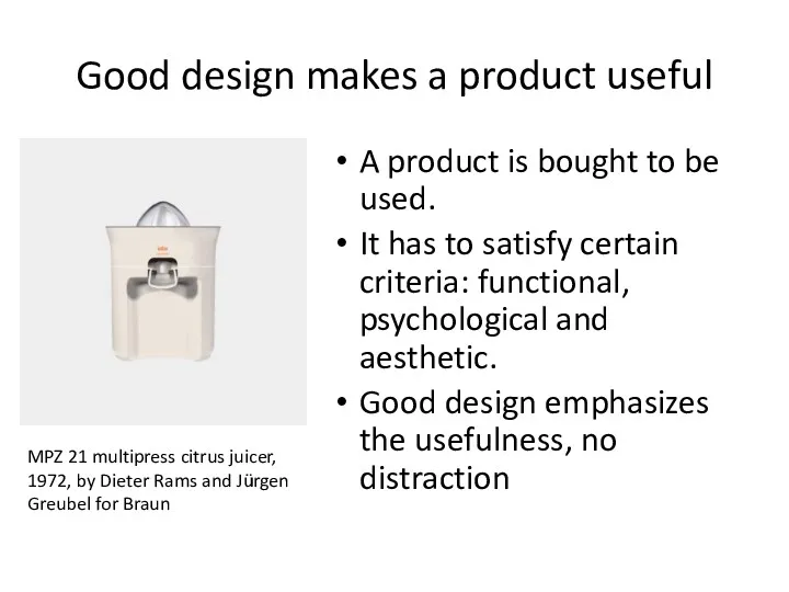
Good design makes a product useful
A product is bought to be
Good design makes a product useful
A product is bought to be
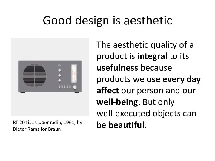
Good design is aesthetic
The aesthetic quality of a product is integral
Good design is aesthetic
The aesthetic quality of a product is integral
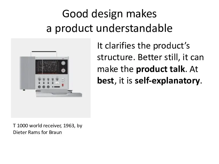
Good design makes
a product understandable
It clarifies the product’s structure. Better
Good design makes
a product understandable
It clarifies the product’s structure. Better
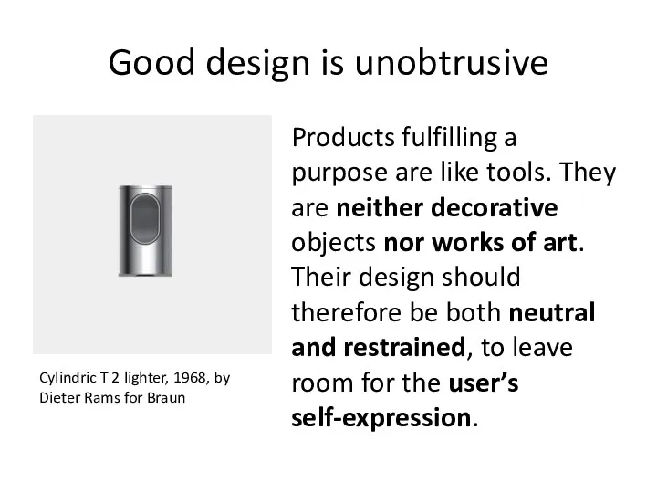
Good design is unobtrusive
Products fulfilling a purpose are like tools. They
Good design is unobtrusive
Products fulfilling a purpose are like tools. They
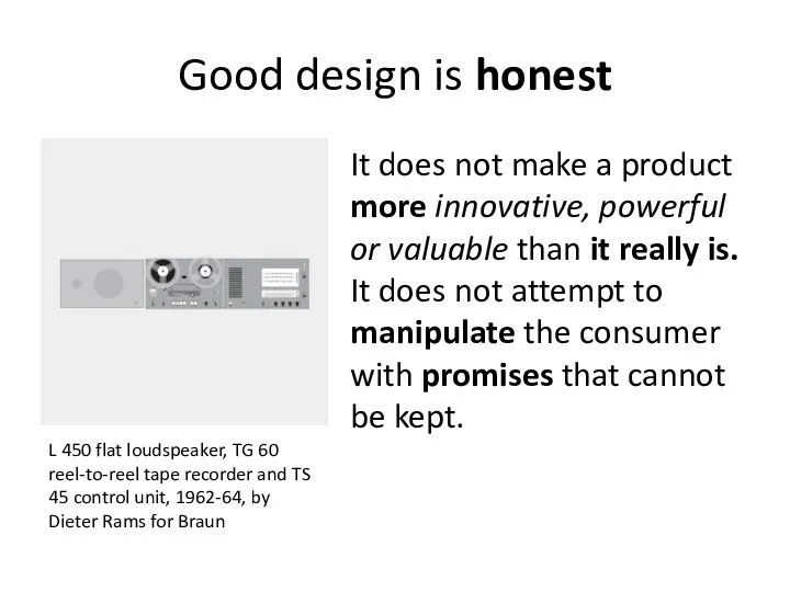
Good design is honest
It does not make a product more innovative,
Good design is honest
It does not make a product more innovative,
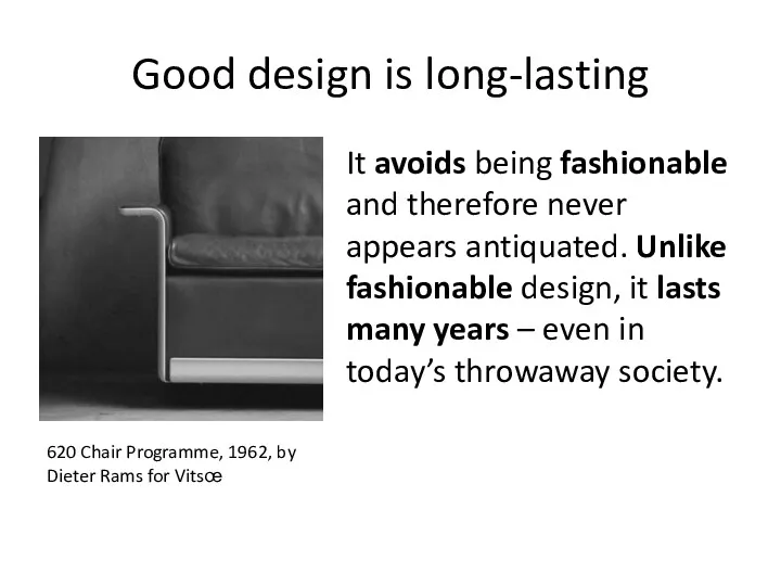
Good design is long-lasting
It avoids being fashionable and therefore never appears
Good design is long-lasting
It avoids being fashionable and therefore never appears
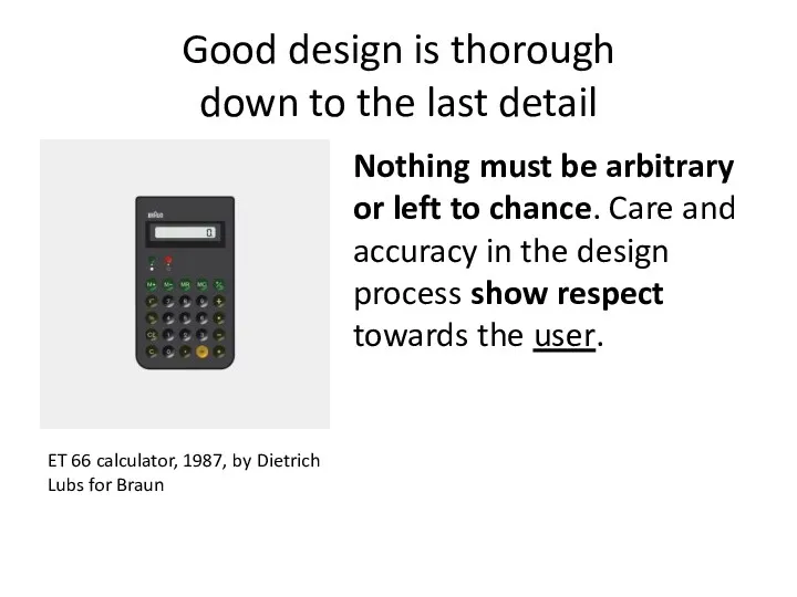
Good design is thorough
down to the last detail
Nothing must be
Good design is thorough
down to the last detail
Nothing must be
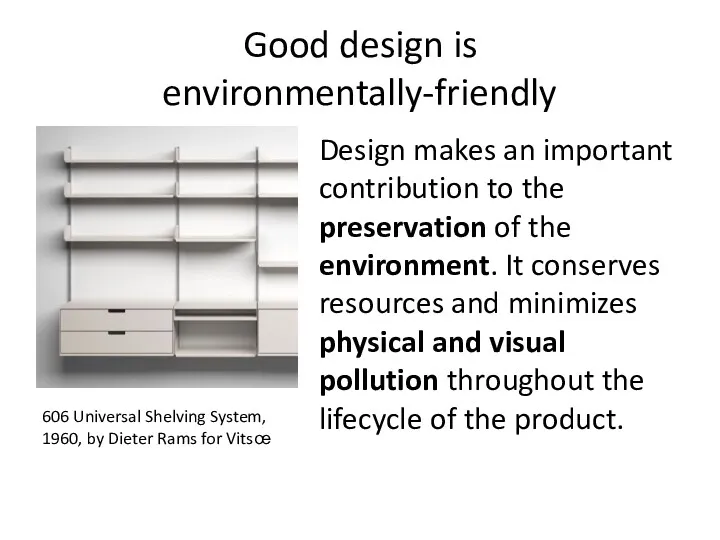
Good design is
environmentally-friendly
Design makes an important contribution to the preservation
Good design is
environmentally-friendly
Design makes an important contribution to the preservation
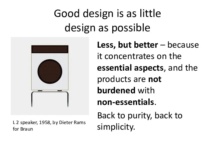
Good design is as little
design as possible
Less, but better –
Good design is as little
design as possible
Less, but better –
Precedence (Guiding the Eye)
Visual weight of parts of design and navigation
Precedence (Guiding the Eye)
Visual weight of parts of design and navigation
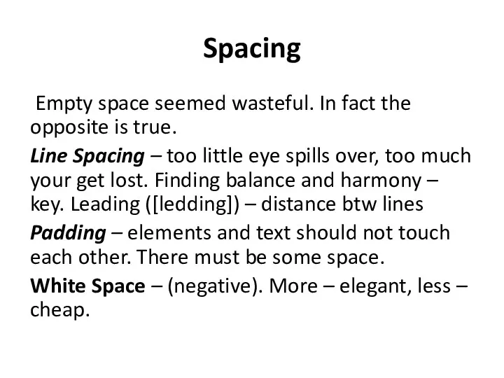
Spacing
Empty space seemed wasteful. In fact the opposite is true.
Line Spacing
Spacing
Empty space seemed wasteful. In fact the opposite is true.
Line Spacing
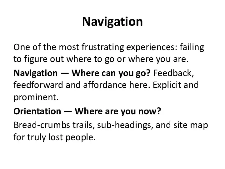
Navigation
One of the most frustrating experiences: failing to figure out where
Navigation
One of the most frustrating experiences: failing to figure out where
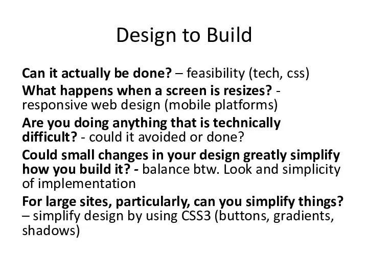
Design to Build
Can it actually be done? – feasibility (tech, css)
What
Design to Build
Can it actually be done? – feasibility (tech, css)
What
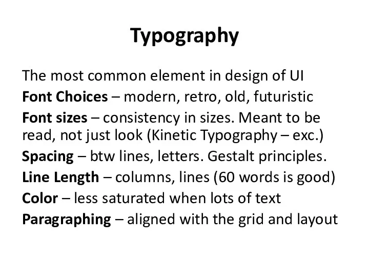
Typography
The most common element in design of UI
Font Choices – modern,
Typography
The most common element in design of UI
Font Choices – modern,
Usability (we learned a lot here)
Design is about how it works,
Usability (we learned a lot here)
Design is about how it works,
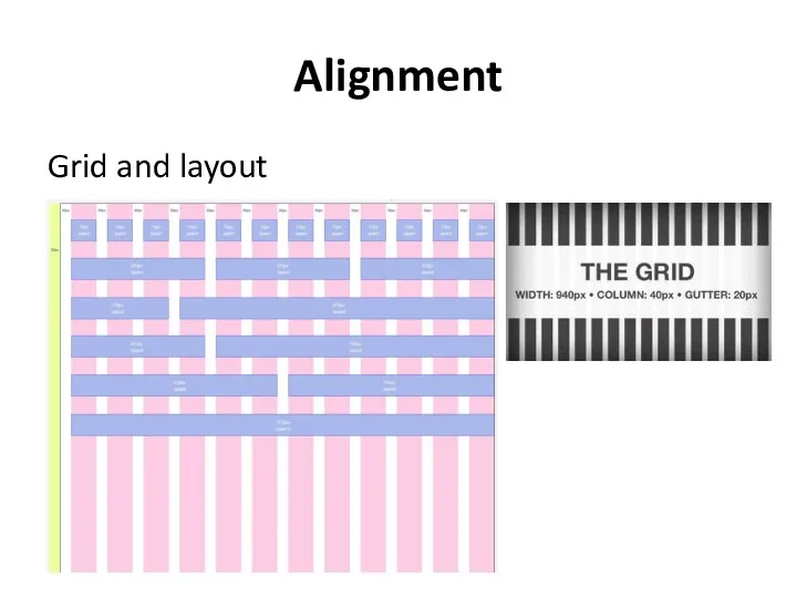
Alignment
Grid and layout
Alignment
Grid and layout
Clarity (Sharpness)
Keeping the design crisp and sharp
Edges – snapped to
Clarity (Sharpness)
Keeping the design crisp and sharp
Edges – snapped to
Consistency
making everything match. Heading sizes, font choices, coloring, button styles, spacing,
Consistency
making everything match. Heading sizes, font choices, coloring, button styles, spacing,
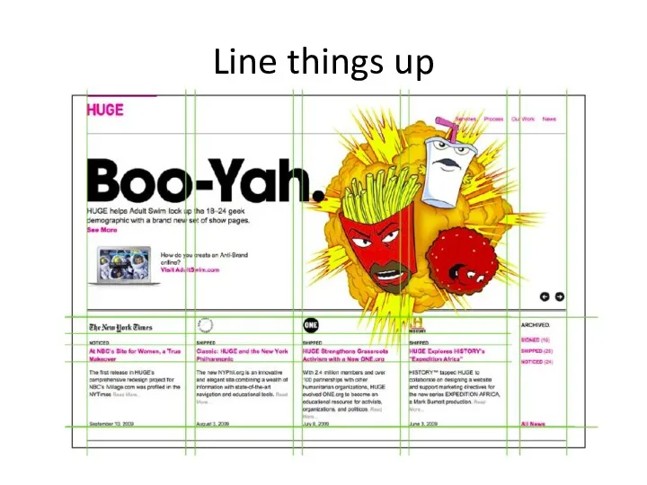
Line things up
Line things up
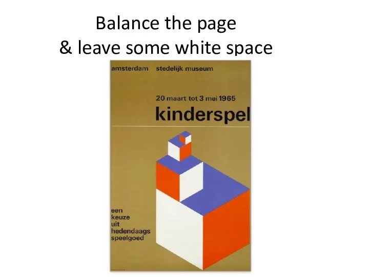
Balance the page
& leave some white space
Balance the page
& leave some white space
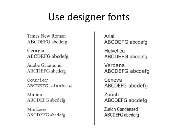
Use designer fonts
Use designer fonts
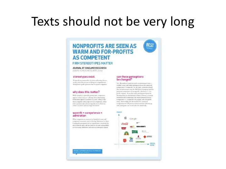
Texts should not be very long
Texts should not be very long
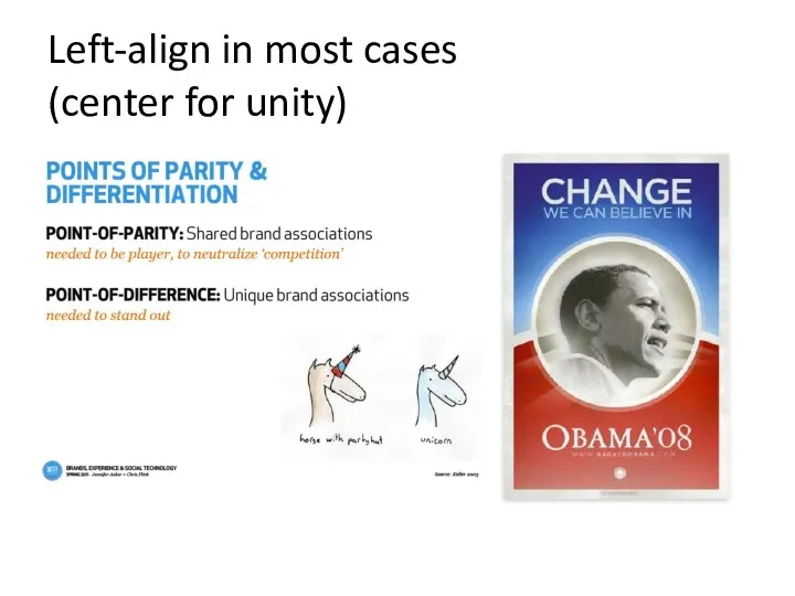
Left-align in most cases
(center for unity)
Left-align in most cases
(center for unity)
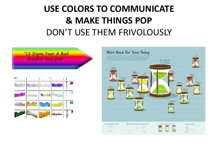
USE COLORS TO COMMUNICATE
& MAKE THINGS POP
DON’T USE THEM
USE COLORS TO COMMUNICATE & MAKE THINGS POP DON’T USE THEM
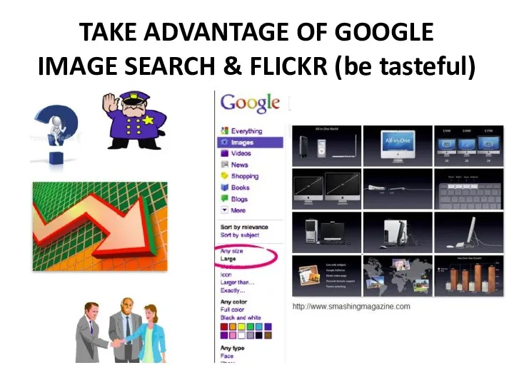
TAKE ADVANTAGE OF GOOGLE
IMAGE SEARCH & FLICKR (be tasteful)
TAKE ADVANTAGE OF GOOGLE
IMAGE SEARCH & FLICKR (be tasteful)
Rules Are Made To Be Broken
Rules Are Made To Be Broken
 Театр – синтетический вид искусства
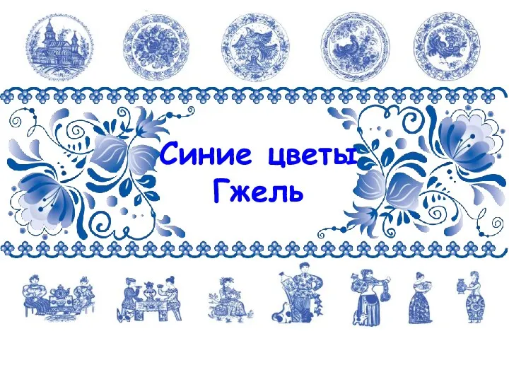 Синие цветы Гжель
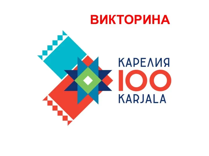 Викторина 100 лет Карелии
 Жизнь каждого дня - большая тема в искусстве
 Характер линий
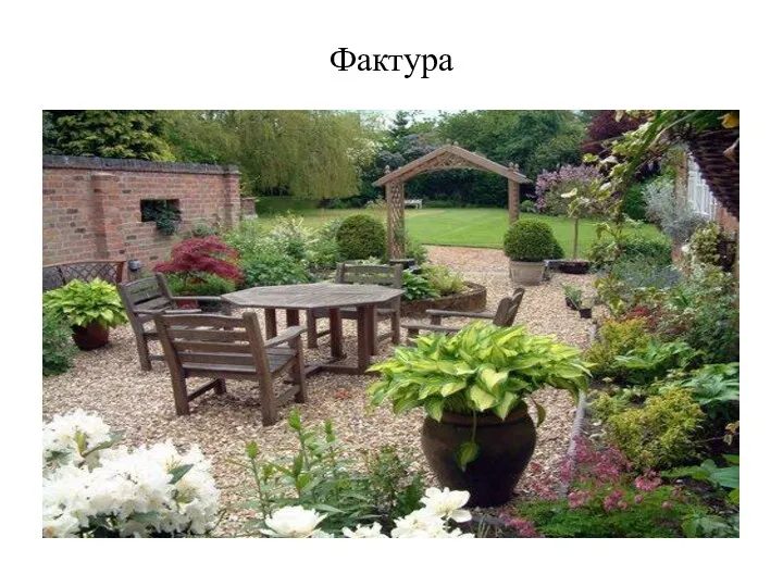 Фактура. Фактура в ландшафтном дизайне
 Декоративно-ужиткове мистецтво
 Съемка с двумя источниками света
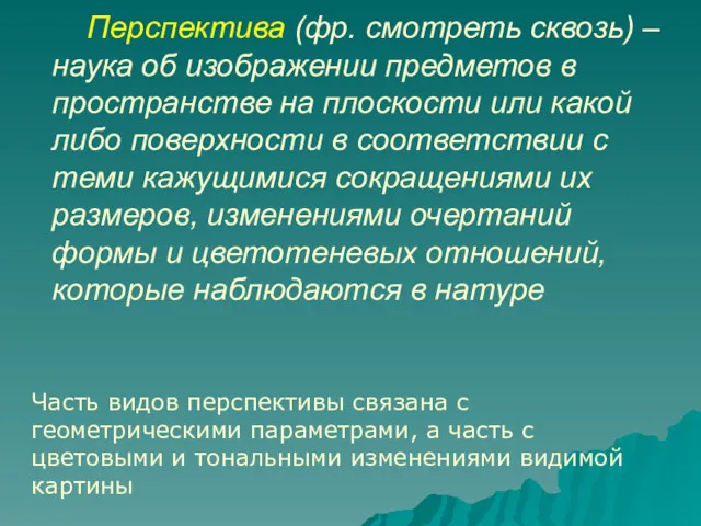 Перспектива. Тональная и воздушная, геометрическая перспективы
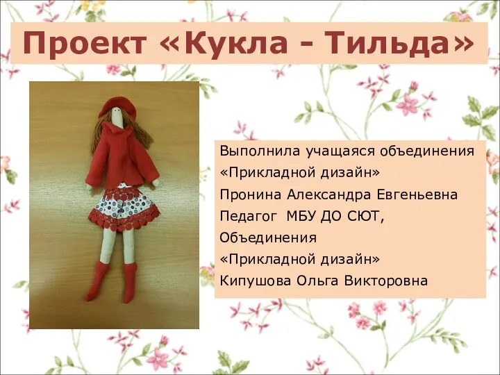 Кукла Тильда. Прикладной дизайн
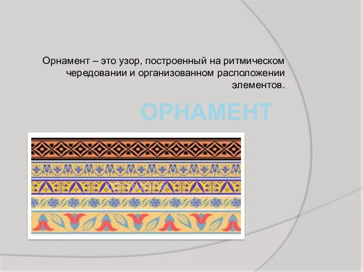 Орнамент в полосе
 Цумами Канзаши
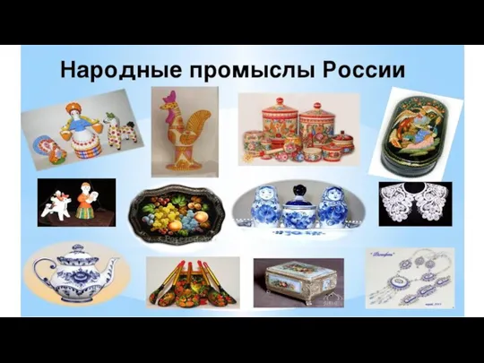 Народные промыслы России
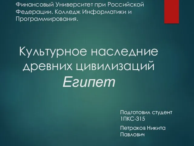 Культурное наследние древних цивилизаций. Египет
 Міський шик. Стиль одягу
 Портфолио обучающегося
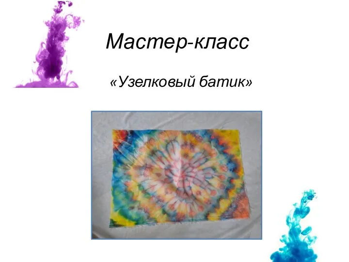 Узелковый батик
 Козеро́г (лат. Capricornus, Сapra - коза, Cornu рог) — зодиакальное созвездие южного полушария неба
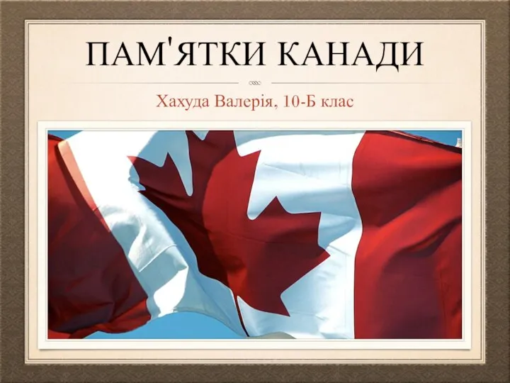 Пам'ятки Канади
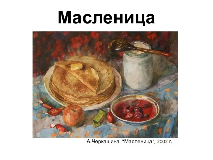 Широкая масленица
 Новый год в Тайване
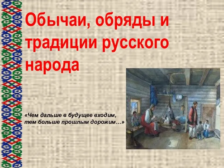 Обычаи, обряды и традиции русского народа Чем дальше в будущее входим, тем больше прошлым дорожим…
 Сочетание традиций и инноваций в дизайне Японии
 Жанры живописи (для дошкольников)
 Серебряный век русской культуры
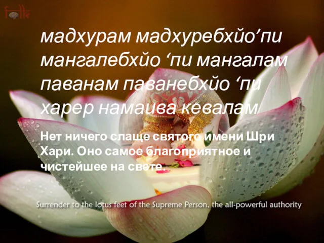 Утренние бхаджаны
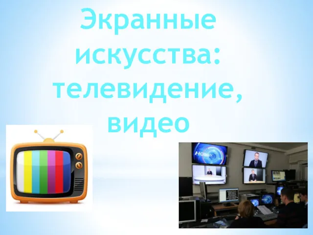 Экранные искусства. Телевидение
 Свет в фотографии