- UWP app templates for phones

Содержание
- 2. How to use the Toolkit Save a copy of this deck. Don’t save over the original!
- 3. Helpful tip Did you know PowerPoint had a layer panel? You can find it under the
- 4. Resources Use the type styles and color swatches on Slides 6-7. For guidance on how to
- 5. Type Styles Copy and paste these styles into your comps to conform to the standard type
- 6. Color Swatches Use these colors for your text and UI elements. Note: These are light theme
- 7. Color Swatches (continued) Use these colors for your text and UI elements. Note: These are light
- 9. Скачать презентацию
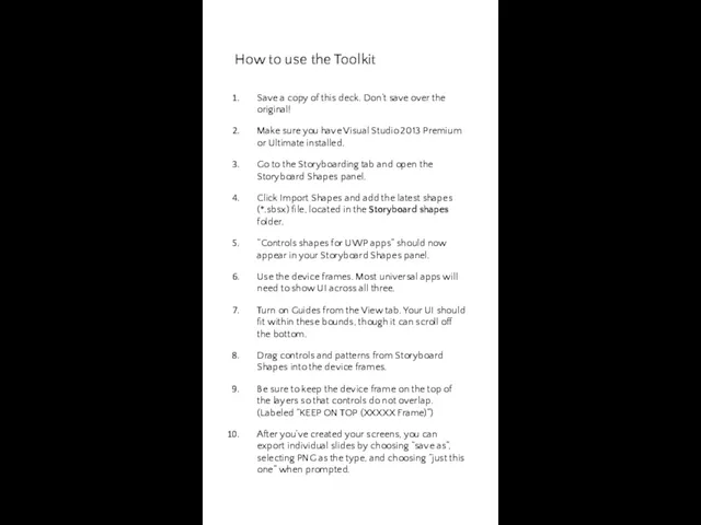
How to use the Toolkit
Save a copy of this deck. Don’t
How to use the Toolkit
Save a copy of this deck. Don’t
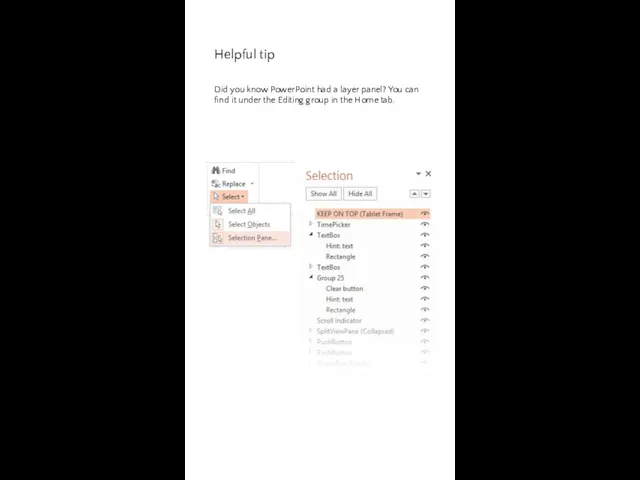
Helpful tip
Did you know PowerPoint had a layer panel? You can
Helpful tip
Did you know PowerPoint had a layer panel? You can
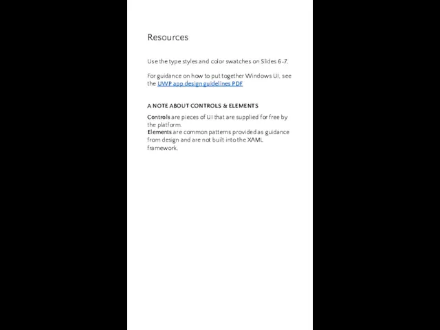
Resources
Use the type styles and color swatches on Slides 6-7.
For
Resources
Use the type styles and color swatches on Slides 6-7.
For
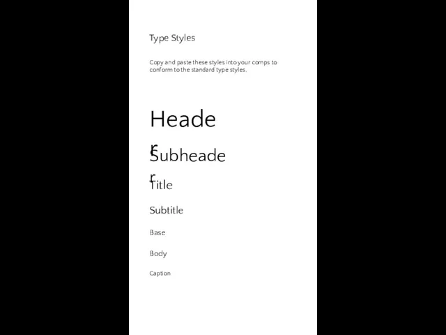
Type Styles
Copy and paste these styles into your comps to conform
Type Styles
Copy and paste these styles into your comps to conform
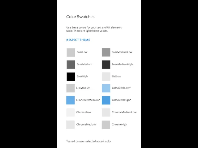
Color Swatches
Use these colors for your text and UI elements. Note:
Color Swatches
Use these colors for your text and UI elements. Note:
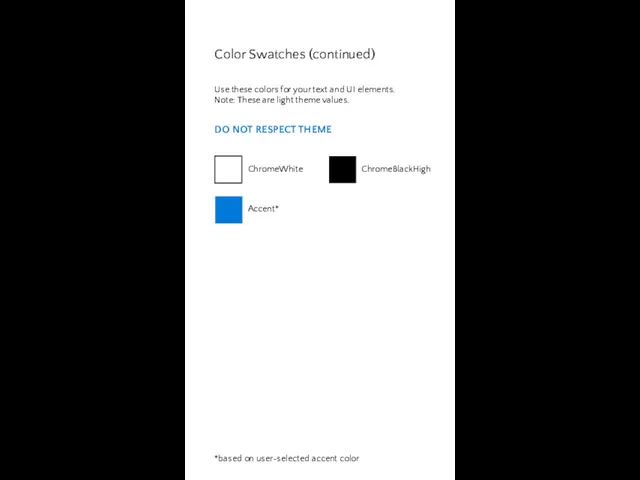
Color Swatches (continued)
Use these colors for your text and UI elements.
Color Swatches (continued)
Use these colors for your text and UI elements.
 Геотехнологии горного дела. Технологические схемы проведения горизонтальных и наклонных горных выработок. (Лекция 4)
 проект Сказки дедушки Корнея
 Презентация. Планета Толерантности
 ШАБЛОН ДЛЯ ПРЕЗ
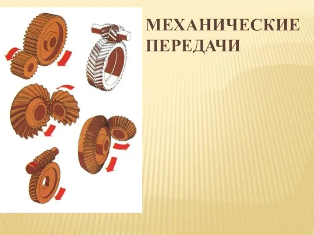 Механические передачи
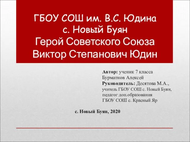 Герой Советского Союза Виктор Степанович Юдин
 Геометрические построения
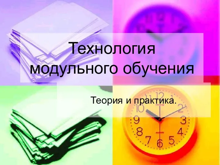 Презентация к выступлению Технология модульного обучения.Теория и практика
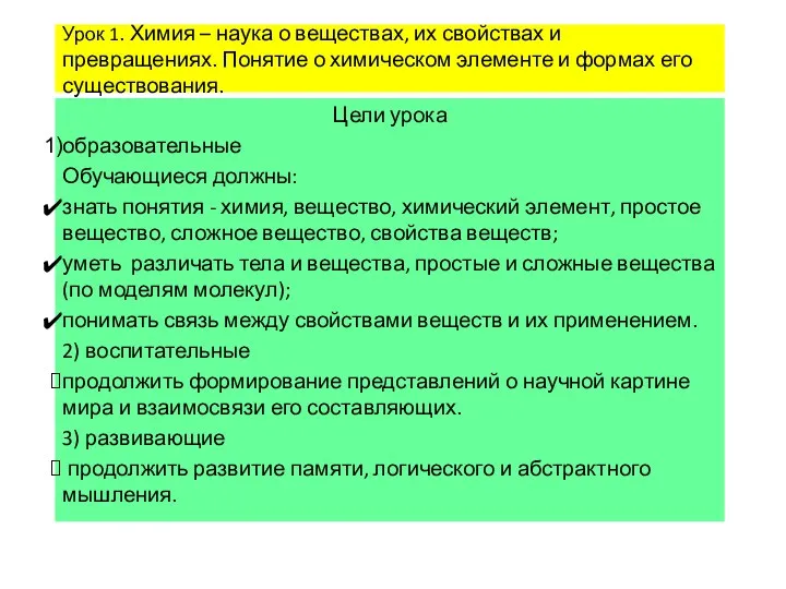 Презентации к урокам химии 8 класс О.С. Габриелян
 Булгаков Михаил Афанасьевич
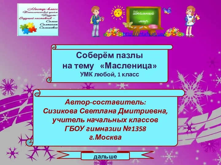 Соберём пазлы на тему:Масленица. 1 класс.
 Слагаемые успеха в бизнесе
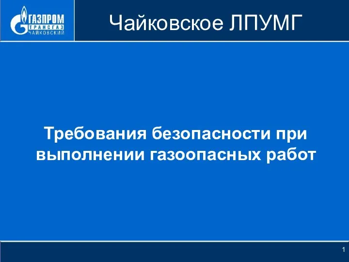 Требования безопасности при выполнении газоопасных работ
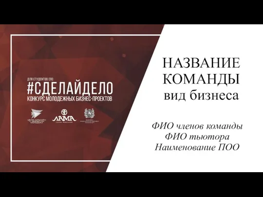 Шаблон. Конкурс молодежных проектов
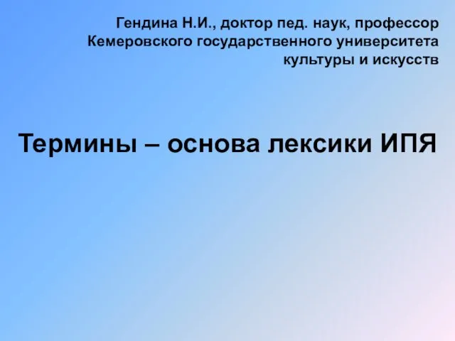 Термины – основа лексики ИПЯ
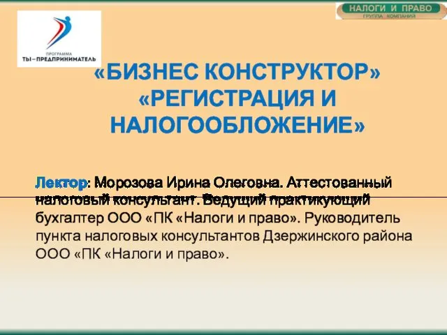 Регистрация и налогообложение. Бизнес конструктор
 Проектирование контрольно-измерительных инструментов в образовании
 Автономные преобразователи
 Птицы Урала. Загадки.
 Основы живописи. Правила линейной и воздушной перспективы
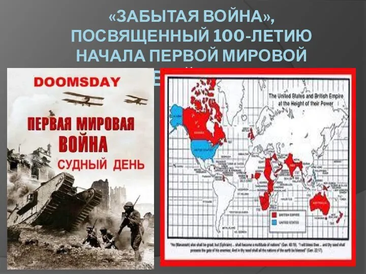 Забытая война, посвященный 100-летию начала Первой мировой войны
 Ученые эпохи возрождения о природе света
 Фоновые, предраковые и злокачественные заболевания женской половой сферы
 Структура содержания дошкольного образования
 Особенности бухгалтерского учета и налогообложения на предприятиях малого бизнеса на примере ООО Спецстрой
 Optical Fiber. What is Optical Fiber
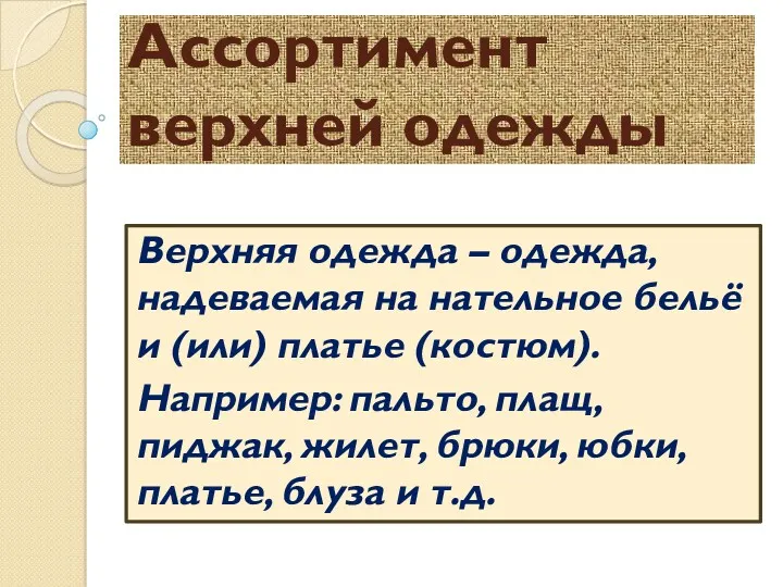 Ассортимент верхней одежды
 Сенсорные системы. Болевой анализатор