- Business Statistics. Organizing and Visualizing Data

Содержание
- 2. Organizing and Visualizing Data Chap 2-
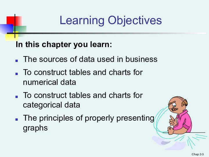
- 3. Chap 2- Learning Objectives In this chapter you learn: The sources of data used in business
- 4. GOALS 1.Organize qualitative data into a frequency table. 2.Present a frequency table as a bar chart
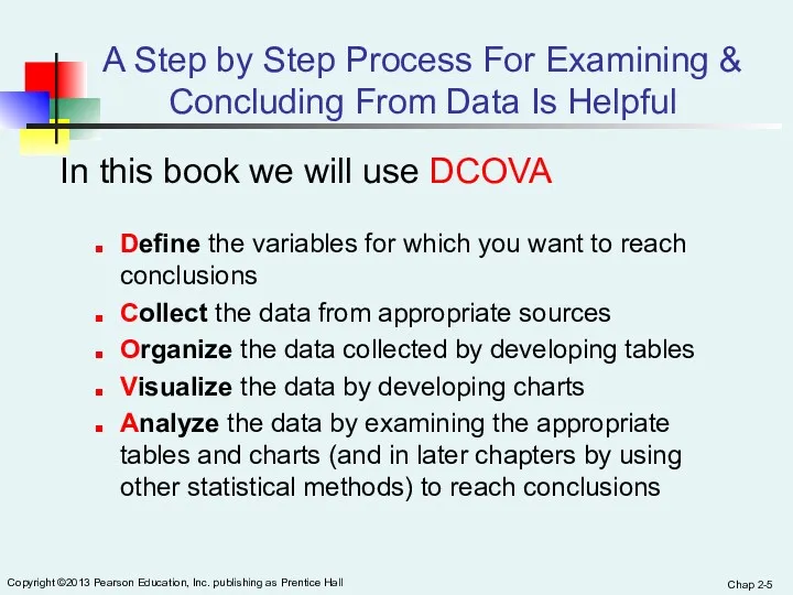
- 5. Chap 2- Copyright ©2013 Pearson Education, Inc. publishing as Prentice Hall A Step by Step Process
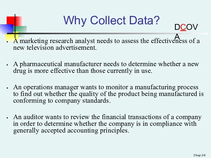
- 6. Chap 2- Why Collect Data? A marketing research analyst needs to assess the effectiveness of a
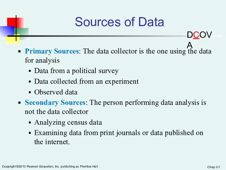
- 7. Chap 2- Copyright ©2013 Pearson Education, Inc. publishing as Prentice Hall Sources of Data Primary Sources:
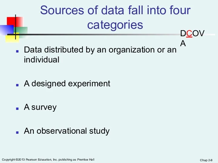
- 8. Chap 2- Copyright ©2013 Pearson Education, Inc. publishing as Prentice Hall Sources of data fall into
- 9. Chap 2- Copyright ©2013 Pearson Education, Inc. publishing as Prentice Hall Examples Of Data Distributed By
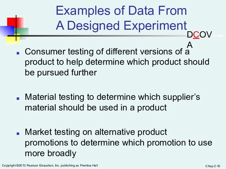
- 10. Chap 2- Copyright ©2013 Pearson Education, Inc. publishing as Prentice Hall Examples of Data From A
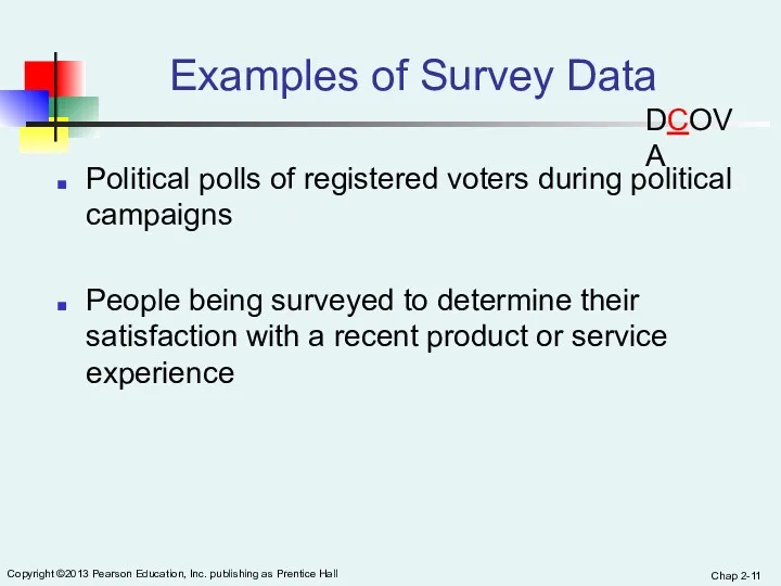
- 11. Chap 2- Copyright ©2013 Pearson Education, Inc. publishing as Prentice Hall Examples of Survey Data Political
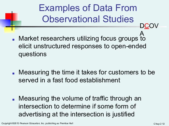
- 12. Chap 2- Copyright ©2013 Pearson Education, Inc. publishing as Prentice Hall Examples of Data From Observational
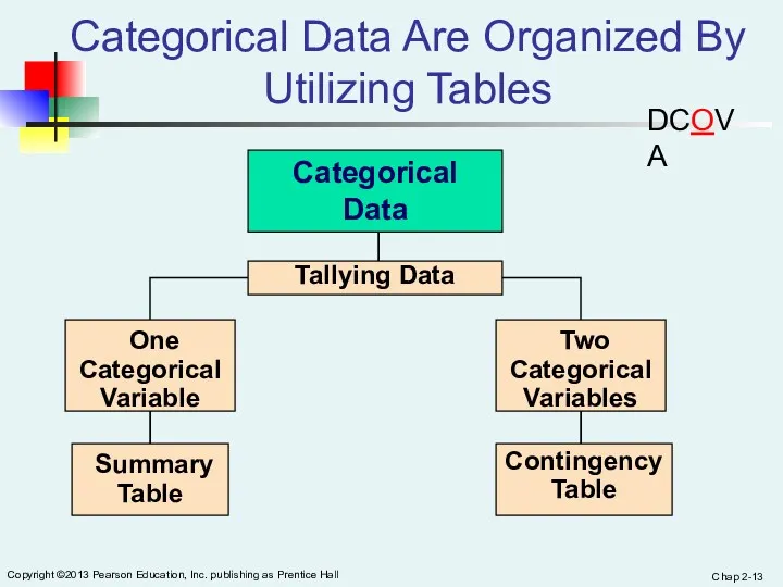
- 13. Chap 2- Copyright ©2013 Pearson Education, Inc. publishing as Prentice Hall Categorical Data Are Organized By
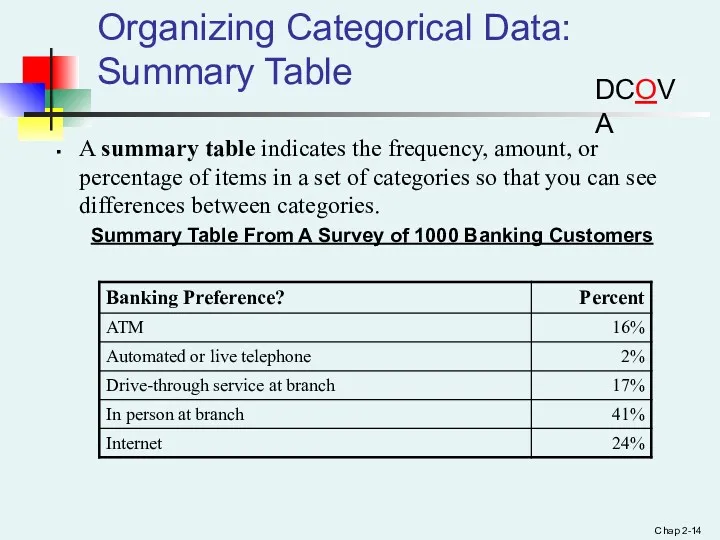
- 14. Chap 2- Organizing Categorical Data: Summary Table A summary table indicates the frequency, amount, or percentage
- 15. Organizing Categorical Data: Summary Table A summary table tallies the frequencies or percentages of items in
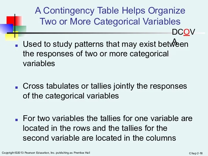
- 16. Chap 2- Copyright ©2013 Pearson Education, Inc. publishing as Prentice Hall A Contingency Table Helps Organize
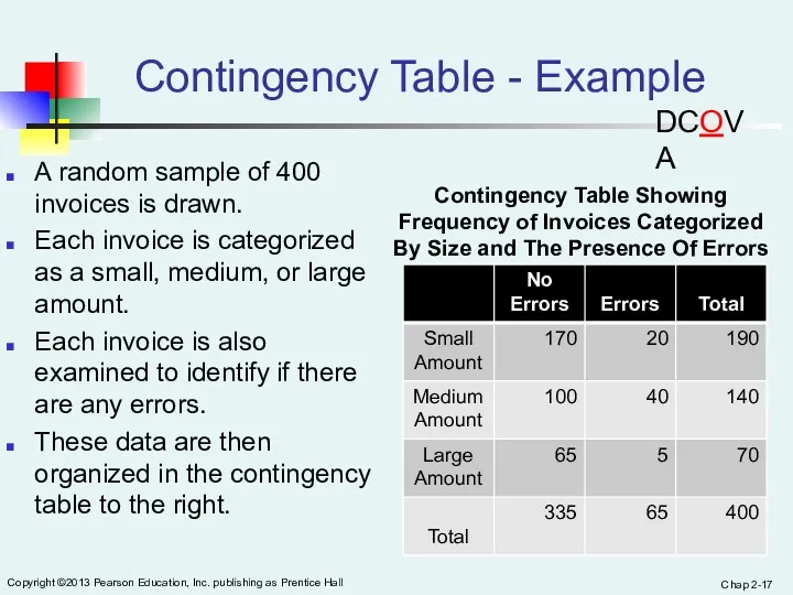
- 17. Chap 2- Copyright ©2013 Pearson Education, Inc. publishing as Prentice Hall Contingency Table - Example A
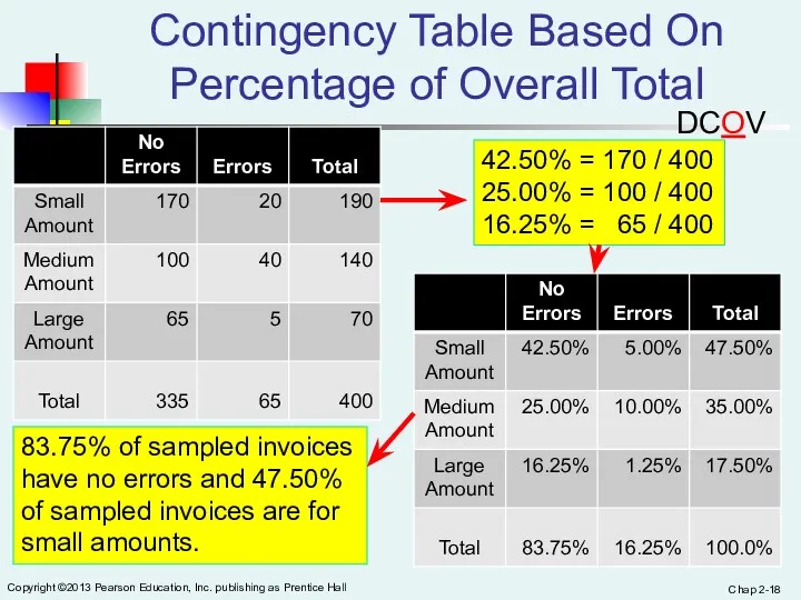
- 18. Chap 2- Copyright ©2013 Pearson Education, Inc. publishing as Prentice Hall Contingency Table Based On Percentage
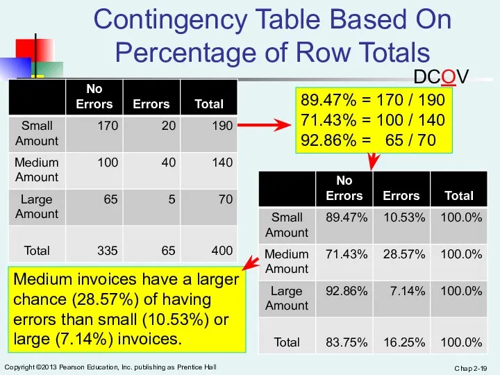
- 19. Chap 2- Copyright ©2013 Pearson Education, Inc. publishing as Prentice Hall Contingency Table Based On Percentage
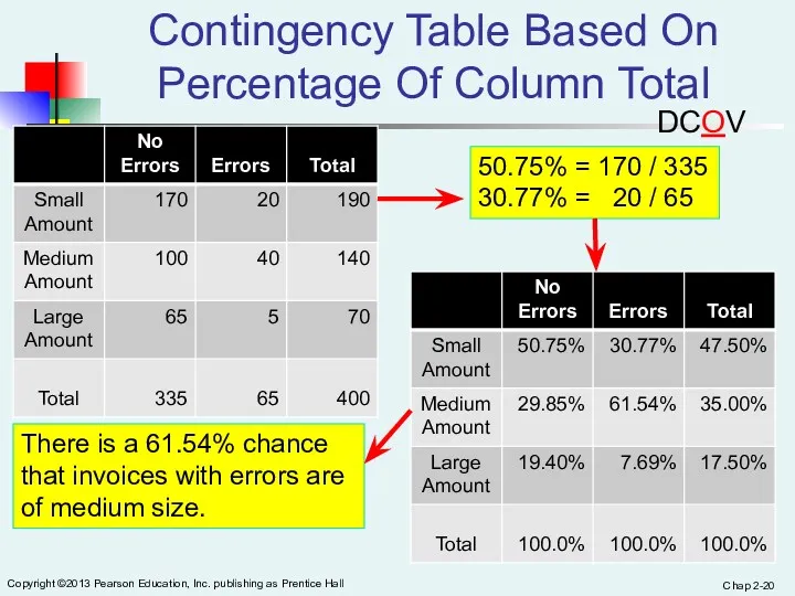
- 20. Chap 2- Copyright ©2013 Pearson Education, Inc. publishing as Prentice Hall Contingency Table Based On Percentage
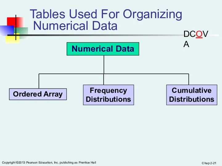
- 21. Chap 2- Copyright ©2013 Pearson Education, Inc. publishing as Prentice Hall Tables Used For Organizing Numerical
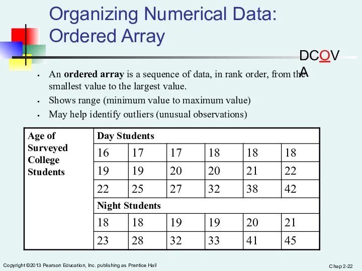
- 22. Chap 2- Copyright ©2013 Pearson Education, Inc. publishing as Prentice Hall Organizing Numerical Data: Ordered Array
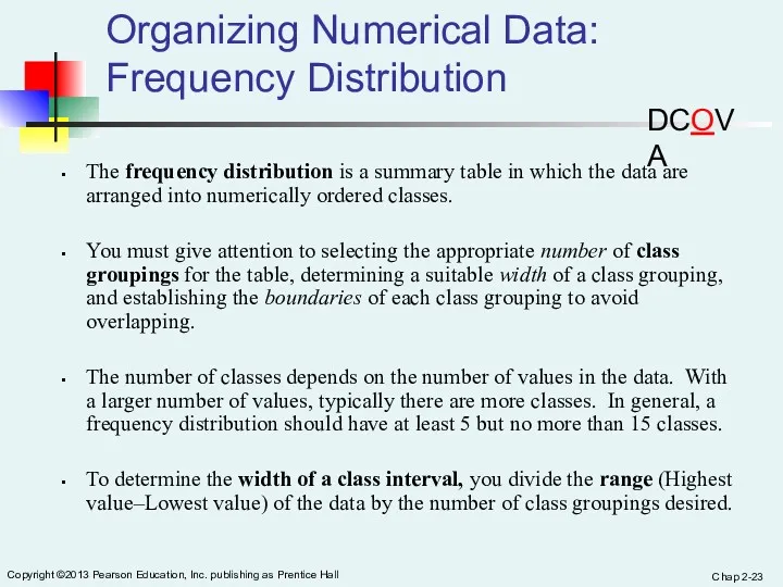
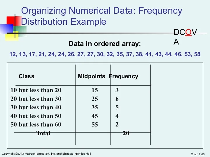
- 23. Chap 2- Copyright ©2013 Pearson Education, Inc. publishing as Prentice Hall Organizing Numerical Data: Frequency Distribution
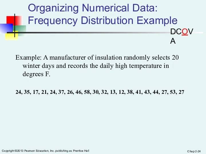
- 24. Chap 2- Copyright ©2013 Pearson Education, Inc. publishing as Prentice Hall Organizing Numerical Data: Frequency Distribution
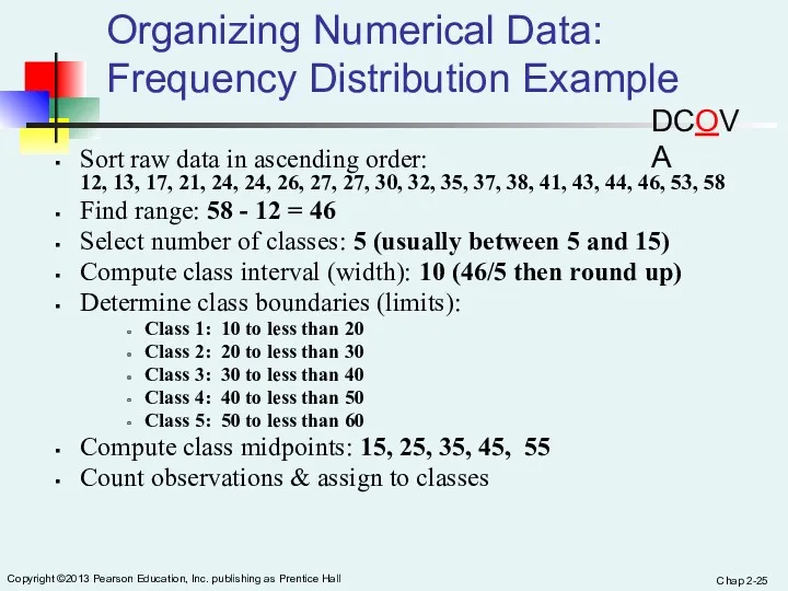
- 25. Chap 2- Copyright ©2013 Pearson Education, Inc. publishing as Prentice Hall Organizing Numerical Data: Frequency Distribution
- 26. Chap 2- Copyright ©2013 Pearson Education, Inc. publishing as Prentice Hall Organizing Numerical Data: Frequency Distribution
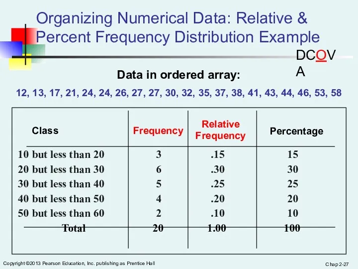
- 27. Chap 2- Copyright ©2013 Pearson Education, Inc. publishing as Prentice Hall Organizing Numerical Data: Relative &
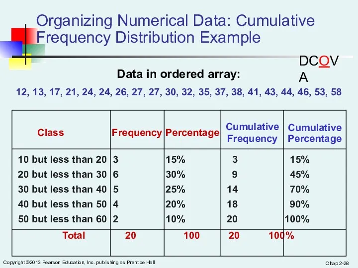
- 28. Chap 2- Copyright ©2013 Pearson Education, Inc. publishing as Prentice Hall Organizing Numerical Data: Cumulative Frequency
- 29. Chap 2- Copyright ©2013 Pearson Education, Inc. publishing as Prentice Hall Why Use a Frequency Distribution?
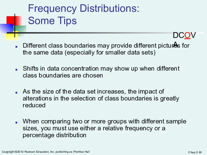
- 30. Chap 2- Copyright ©2013 Pearson Education, Inc. publishing as Prentice Hall Frequency Distributions: Some Tips Different
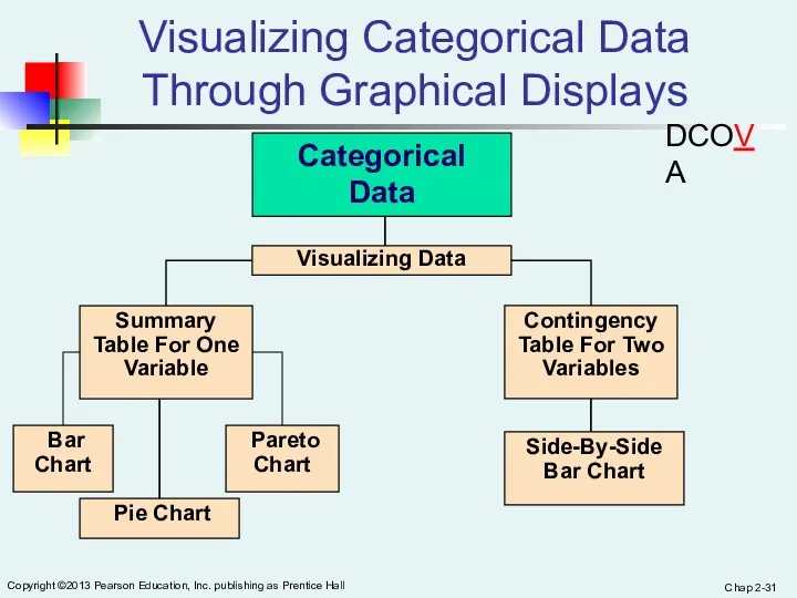
- 31. Chap 2- Copyright ©2013 Pearson Education, Inc. publishing as Prentice Hall Visualizing Categorical Data Through Graphical
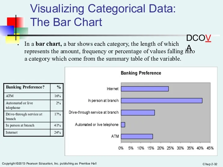
- 32. Chap 2- Copyright ©2013 Pearson Education, Inc. publishing as Prentice Hall Visualizing Categorical Data: The Bar
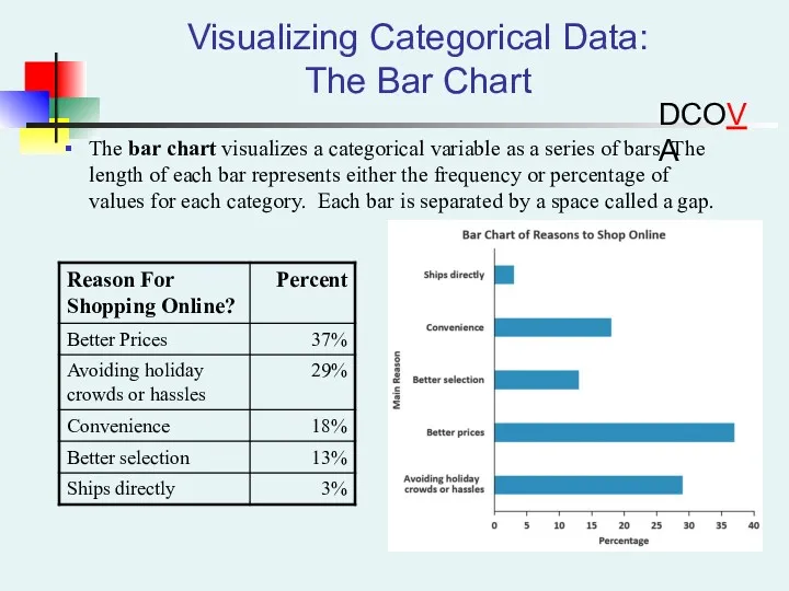
- 33. Visualizing Categorical Data: The Bar Chart The bar chart visualizes a categorical variable as a series
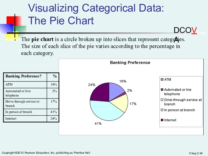
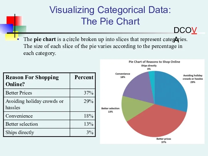
- 34. Chap 2- Copyright ©2013 Pearson Education, Inc. publishing as Prentice Hall Visualizing Categorical Data: The Pie
- 35. Visualizing Categorical Data: The Pie Chart The pie chart is a circle broken up into slices
- 36. Chap 2- Copyright ©2013 Pearson Education, Inc. publishing as Prentice Hall Visualizing Categorical Data: The Pareto
- 37. Chap 2- Copyright ©2013 Pearson Education, Inc. publishing as Prentice Hall Visualizing Categorical Data: The Pareto
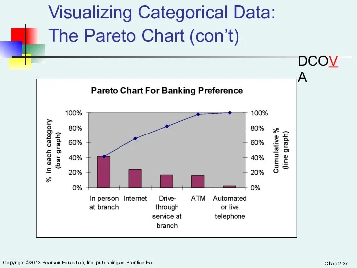
- 38. Visualizing Categorical Data: The Pareto Chart (con’t) DCOVA The “Vital Few”
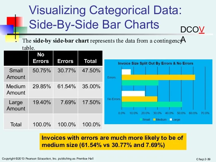
- 39. Chap 2- Copyright ©2013 Pearson Education, Inc. publishing as Prentice Hall Visualizing Categorical Data: Side-By-Side Bar
- 40. Chap 2- Copyright ©2013 Pearson Education, Inc. publishing as Prentice Hall Visualizing Numerical Data By Using
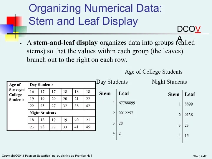
- 41. Chap 2- Copyright ©2013 Pearson Education, Inc. publishing as Prentice Hall Stem-and-Leaf Display A simple way
- 42. Chap 2- Copyright ©2013 Pearson Education, Inc. publishing as Prentice Hall Organizing Numerical Data: Stem and
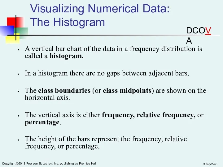
- 43. Chap 2- Copyright ©2013 Pearson Education, Inc. publishing as Prentice Hall Visualizing Numerical Data: The Histogram
- 44. Chap 2- Copyright ©2013 Pearson Education, Inc. publishing as Prentice Hall Visualizing Numerical Data: The Histogram
- 45. Chap 2- Copyright ©2013 Pearson Education, Inc. publishing as Prentice Hall Visualizing Numerical Data: The Polygon
- 46. Visualizing Numerical Data: The Percentage Polygon DCOVA Useful When Comparing Two or More Groups
- 47. Visualizing Numerical Data: The Percentage Polygon DCOVA
- 48. Chap 2- Copyright ©2013 Pearson Education, Inc. publishing as Prentice Hall Visualizing Numerical Data: The Frequency
- 49. Chap 2- Copyright ©2013 Pearson Education, Inc. publishing as Prentice Hall Visualizing Numerical Data: The Ogive
- 50. Visualizing Two Numerical Variables By Using Graphical Displays DCOVA
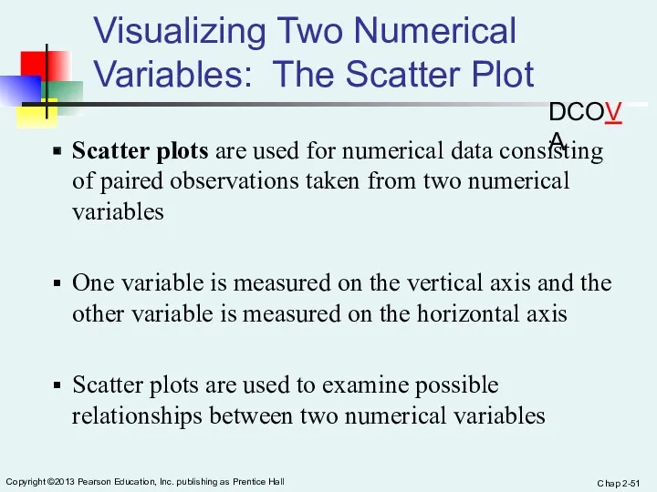
- 51. Chap 2- Copyright ©2013 Pearson Education, Inc. publishing as Prentice Hall Visualizing Two Numerical Variables: The
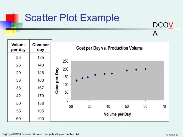
- 52. Chap 2- Copyright ©2013 Pearson Education, Inc. publishing as Prentice Hall Scatter Plot Example DCOVA
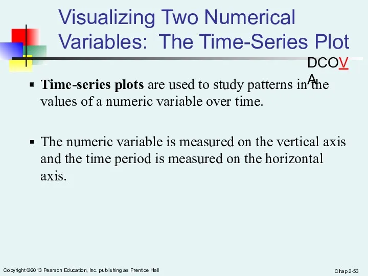
- 53. Chap 2- Copyright ©2013 Pearson Education, Inc. publishing as Prentice Hall Visualizing Two Numerical Variables: The
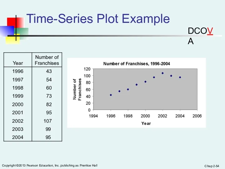
- 54. Chap 2- Copyright ©2013 Pearson Education, Inc. publishing as Prentice Hall Time-Series Plot Example DCOVA
- 55. Chap 2- Copyright ©2013 Pearson Education, Inc. publishing as Prentice Hall Exploring Multidimensional Data Can be
- 56. Chap 2- Copyright ©2013 Pearson Education, Inc. publishing as Prentice Hall Pivot Table Version of Contingency
- 57. Chap 2- Copyright ©2013 Pearson Education, Inc. publishing as Prentice Hall Can Easily Convert To An
- 58. Chap 2- Copyright ©2013 Pearson Education, Inc. publishing as Prentice Hall Can Easily Add Variables To
- 59. Chap 2- Copyright ©2013 Pearson Education, Inc. publishing as Prentice Hall Can Easily Change The Statistic
- 60. Chap 2- Copyright ©2013 Pearson Education, Inc. publishing as Prentice Hall Tables Can Compute & Display
- 61. Chap 2- Copyright ©2013 Pearson Education, Inc. publishing as Prentice Hall Principles of Excellent Graphs The
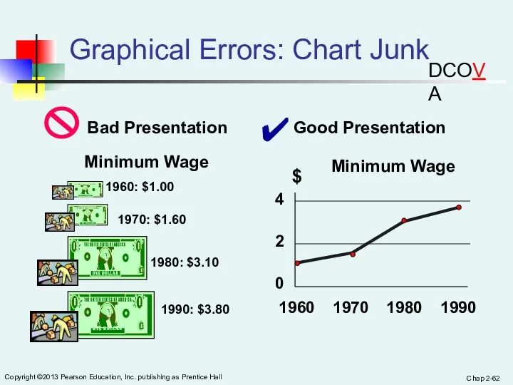
- 62. Chap 2- Copyright ©2013 Pearson Education, Inc. publishing as Prentice Hall Graphical Errors: Chart Junk Minimum
- 63. Graphical Errors: Chart Junk, Can You Identify The Junk? DCOVA
- 64. Graphical Errors: Chart Junk, Can You Identify The Junk? DCOVA
- 65. Graphical Errors: Chart Junk, Can You Identify The Junk? DCOVA
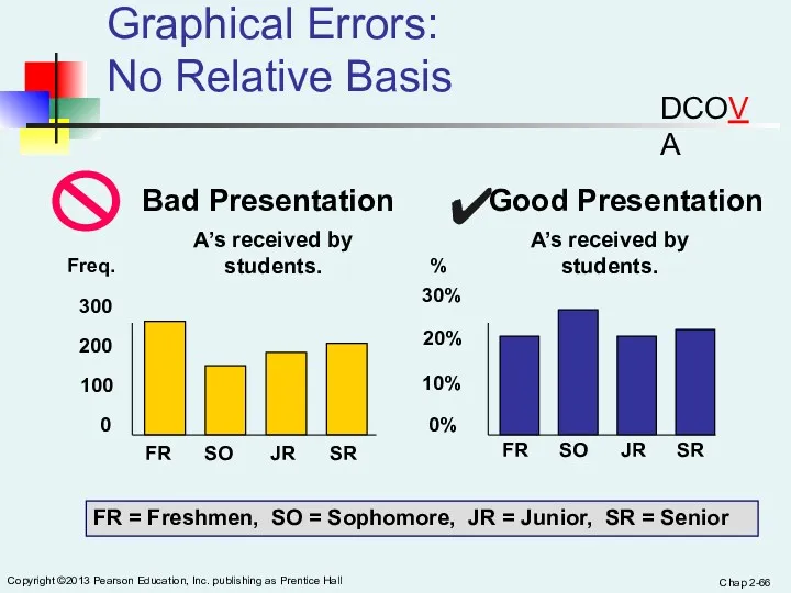
- 66. Chap 2- Copyright ©2013 Pearson Education, Inc. publishing as Prentice Hall Graphical Errors: No Relative Basis
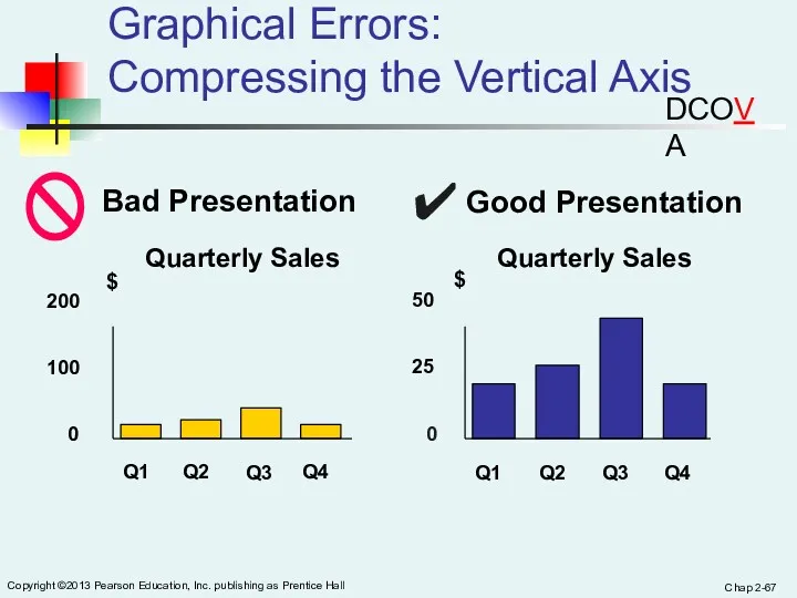
- 67. Chap 2- Copyright ©2013 Pearson Education, Inc. publishing as Prentice Hall Graphical Errors: Compressing the Vertical
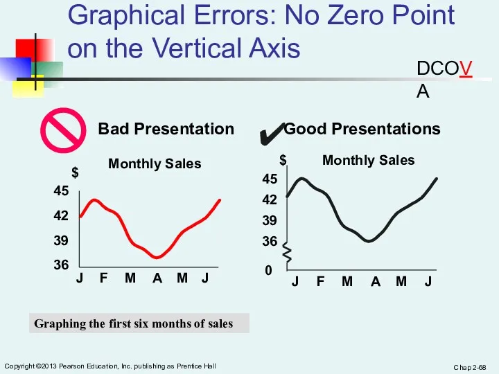
- 68. Chap 2- Copyright ©2013 Pearson Education, Inc. publishing as Prentice Hall Graphical Errors: No Zero Point
- 69. In Excel It Is Easy To Inadvertently Create Distortions Excel often will create a graph where
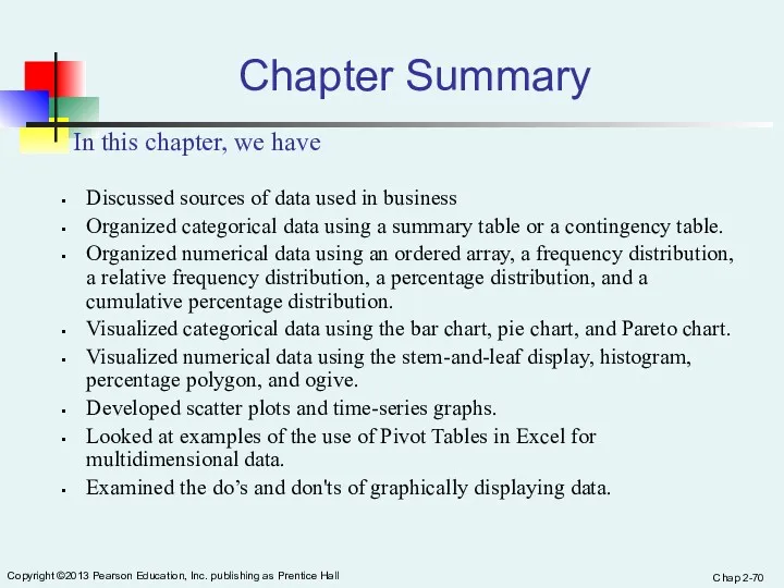
- 70. Chap 2- Copyright ©2013 Pearson Education, Inc. publishing as Prentice Hall Chapter Summary Discussed sources of
- 71. 1. An insurance company evaluates many numerical variables about a person before deciding on an appropriate
- 72. Referring to Table 2-1, how many drivers are represented in the sample? ( ) 2. Referring
- 73. 3. A type of vertical bar chart in which the categories are plotted in the descending
- 74. 4. The width of each bar in a histogram corresponds to the( ) a) differences between
- 75. 5. When constructing charts, the following is plotted at the class midpoints: A. frequency histograms. B.
- 76. COUNTIF (range, criteria)
- 77. Slide 3- Copyright © 2011 Pearson Education, Inc. Active Learning Lecture Slides For use with Classroom
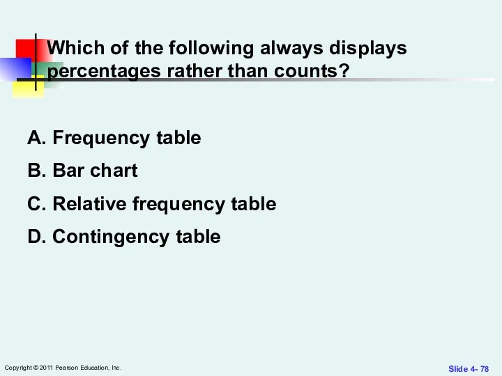
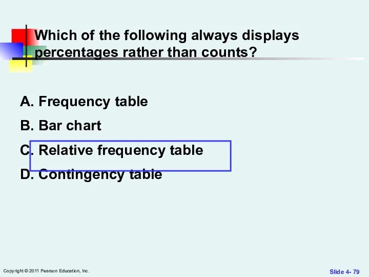
- 78. Slide 4- Copyright © 2011 Pearson Education, Inc. Which of the following always displays percentages rather
- 79. Slide 4- Copyright © 2011 Pearson Education, Inc. Which of the following always displays percentages rather
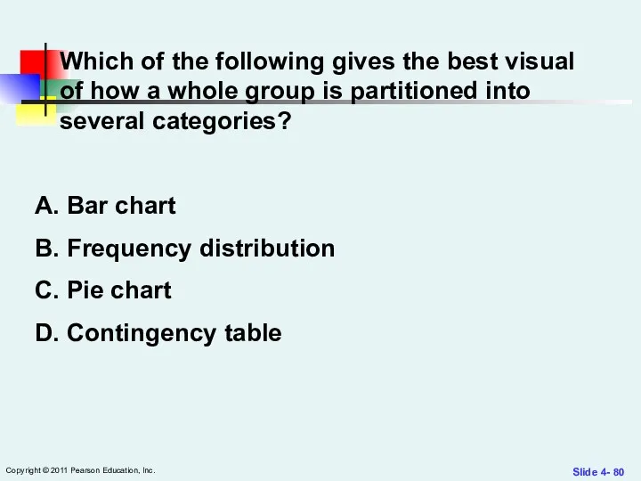
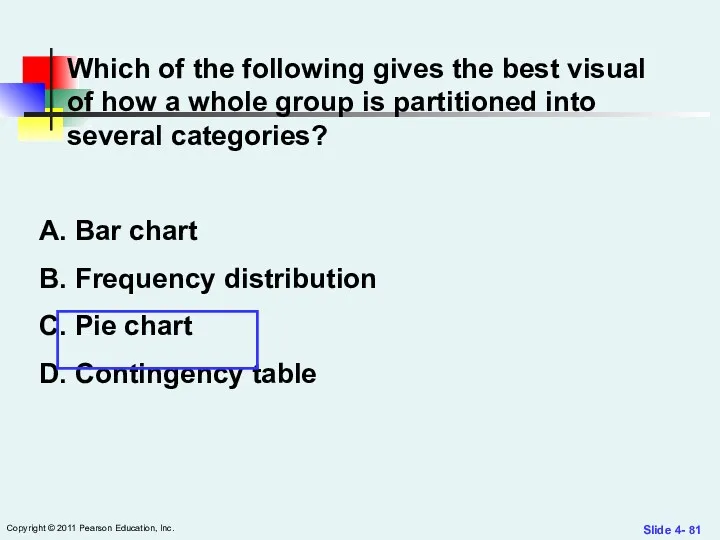
- 80. Slide 4- Copyright © 2011 Pearson Education, Inc. Which of the following gives the best visual
- 81. Slide 4- Copyright © 2011 Pearson Education, Inc. Which of the following gives the best visual
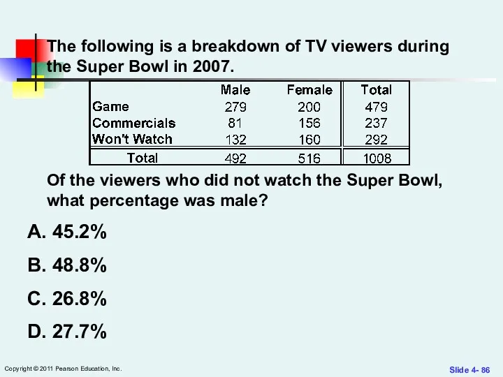
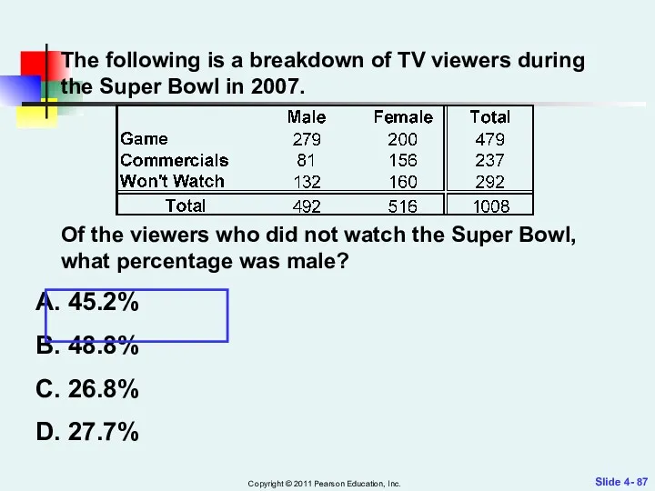
- 82. Slide 4- Copyright © 2011 Pearson Education, Inc. The following is a breakdown of TV viewers
- 83. Slide 4- Copyright © 2011 Pearson Education, Inc. The following is a breakdown of TV viewers
- 84. Slide 4- Copyright © 2011 Pearson Education, Inc. The following is a breakdown of TV viewers
- 85. Slide 4- Copyright © 2011 Pearson Education, Inc. The following is a breakdown of TV viewers
- 86. Slide 4- Copyright © 2011 Pearson Education, Inc. The following is a breakdown of TV viewers
- 87. Slide 4- Copyright © 2011 Pearson Education, Inc. The following is a breakdown of TV viewers
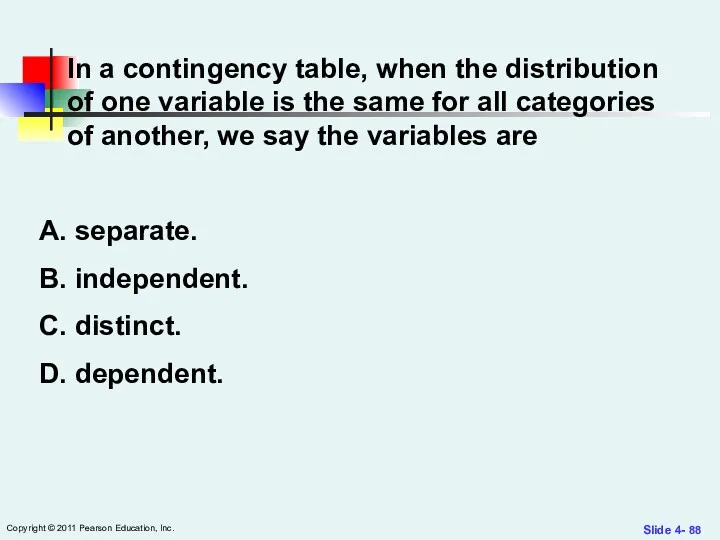
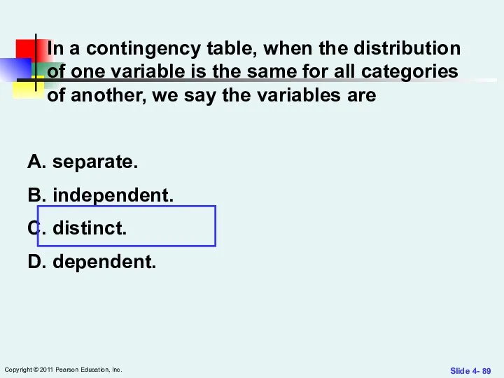
- 88. Slide 4- Copyright © 2011 Pearson Education, Inc. In a contingency table, when the distribution of
- 89. Slide 4- Copyright © 2011 Pearson Education, Inc. In a contingency table, when the distribution of
- 90. Slide 5- Copyright © 2011 Pearson Education, Inc. You should use a histogram to display categorical
- 91. Slide 5- Copyright © 2011 Pearson Education, Inc. You should use a histogram to display categorical
- 93. Скачать презентацию
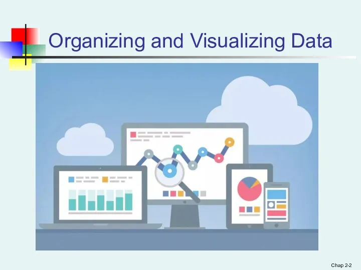
Organizing and Visualizing Data
Chap 2-
Organizing and Visualizing Data
Chap 2-
Chap 2-
Learning Objectives
In this chapter you learn:
The sources of data
Chap 2-
Learning Objectives
In this chapter you learn:
The sources of data
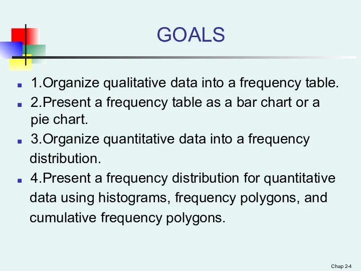
GOALS
1.Organize qualitative data into a frequency table.
2.Present a frequency table as
GOALS
1.Organize qualitative data into a frequency table.
2.Present a frequency table as
Chap 2-
Copyright ©2013 Pearson Education, Inc. publishing as Prentice Hall
A
Chap 2-
Copyright ©2013 Pearson Education, Inc. publishing as Prentice Hall
A
Chap 2-
Why Collect Data?
A marketing research analyst needs to assess the
Chap 2-
Why Collect Data?
A marketing research analyst needs to assess the
Chap 2-
Copyright ©2013 Pearson Education, Inc. publishing as Prentice Hall
Sources
Chap 2-
Copyright ©2013 Pearson Education, Inc. publishing as Prentice Hall
Sources
Chap 2-
Copyright ©2013 Pearson Education, Inc. publishing as Prentice Hall
Sources
Chap 2-
Copyright ©2013 Pearson Education, Inc. publishing as Prentice Hall
Sources
Chap 2-
Copyright ©2013 Pearson Education, Inc. publishing as Prentice Hall
Examples
Chap 2-
Copyright ©2013 Pearson Education, Inc. publishing as Prentice Hall
Examples
Chap 2-
Copyright ©2013 Pearson Education, Inc. publishing as Prentice Hall
Examples
Chap 2-
Copyright ©2013 Pearson Education, Inc. publishing as Prentice Hall
Examples
Chap 2-
Copyright ©2013 Pearson Education, Inc. publishing as Prentice Hall
Examples
Chap 2-
Copyright ©2013 Pearson Education, Inc. publishing as Prentice Hall
Examples
Chap 2-
Copyright ©2013 Pearson Education, Inc. publishing as Prentice Hall
Examples
Chap 2-
Copyright ©2013 Pearson Education, Inc. publishing as Prentice Hall
Examples
Chap 2-
Copyright ©2013 Pearson Education, Inc. publishing as Prentice Hall
Categorical
Chap 2-
Copyright ©2013 Pearson Education, Inc. publishing as Prentice Hall
Categorical
Chap 2-
Organizing Categorical Data: Summary Table
A summary table indicates the frequency,
Chap 2-
Organizing Categorical Data: Summary Table
A summary table indicates the frequency,
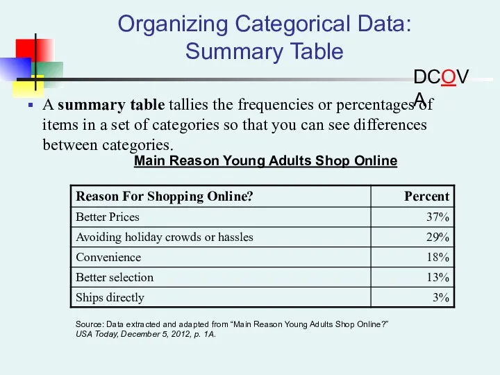
Organizing Categorical Data: Summary Table
A summary table tallies the frequencies or
Organizing Categorical Data: Summary Table
A summary table tallies the frequencies or
Chap 2-
Copyright ©2013 Pearson Education, Inc. publishing as Prentice Hall
A
Chap 2-
Copyright ©2013 Pearson Education, Inc. publishing as Prentice Hall
A
Chap 2-
Copyright ©2013 Pearson Education, Inc. publishing as Prentice Hall
Contingency
Chap 2-
Copyright ©2013 Pearson Education, Inc. publishing as Prentice Hall
Contingency
Chap 2-
Copyright ©2013 Pearson Education, Inc. publishing as Prentice Hall
Contingency
Chap 2-
Copyright ©2013 Pearson Education, Inc. publishing as Prentice Hall
Contingency
Chap 2-
Copyright ©2013 Pearson Education, Inc. publishing as Prentice Hall
Contingency
Chap 2-
Copyright ©2013 Pearson Education, Inc. publishing as Prentice Hall
Contingency
Chap 2-
Copyright ©2013 Pearson Education, Inc. publishing as Prentice Hall
Contingency
Chap 2-
Copyright ©2013 Pearson Education, Inc. publishing as Prentice Hall
Contingency
Chap 2-
Copyright ©2013 Pearson Education, Inc. publishing as Prentice Hall
Tables
Chap 2-
Copyright ©2013 Pearson Education, Inc. publishing as Prentice Hall
Tables
Chap 2-
Copyright ©2013 Pearson Education, Inc. publishing as Prentice Hall
Organizing
Chap 2-
Copyright ©2013 Pearson Education, Inc. publishing as Prentice Hall
Organizing
Chap 2-
Copyright ©2013 Pearson Education, Inc. publishing as Prentice Hall
Organizing
Chap 2-
Copyright ©2013 Pearson Education, Inc. publishing as Prentice Hall
Organizing
Chap 2-
Copyright ©2013 Pearson Education, Inc. publishing as Prentice Hall
Organizing
Chap 2-
Copyright ©2013 Pearson Education, Inc. publishing as Prentice Hall
Organizing
Chap 2-
Copyright ©2013 Pearson Education, Inc. publishing as Prentice Hall
Organizing
Chap 2-
Copyright ©2013 Pearson Education, Inc. publishing as Prentice Hall
Organizing
Chap 2-
Copyright ©2013 Pearson Education, Inc. publishing as Prentice Hall
Organizing
Chap 2-
Copyright ©2013 Pearson Education, Inc. publishing as Prentice Hall
Organizing
Chap 2-
Copyright ©2013 Pearson Education, Inc. publishing as Prentice Hall
Organizing
Chap 2-
Copyright ©2013 Pearson Education, Inc. publishing as Prentice Hall
Organizing
Chap 2-
Copyright ©2013 Pearson Education, Inc. publishing as Prentice Hall
Organizing
Chap 2-
Copyright ©2013 Pearson Education, Inc. publishing as Prentice Hall
Organizing
Chap 2-
Copyright ©2013 Pearson Education, Inc. publishing as Prentice Hall
Why
Chap 2-
Copyright ©2013 Pearson Education, Inc. publishing as Prentice Hall
Why
Chap 2-
Copyright ©2013 Pearson Education, Inc. publishing as Prentice Hall
Frequency
Chap 2-
Copyright ©2013 Pearson Education, Inc. publishing as Prentice Hall
Frequency
Chap 2-
Copyright ©2013 Pearson Education, Inc. publishing as Prentice Hall
Visualizing
Chap 2-
Copyright ©2013 Pearson Education, Inc. publishing as Prentice Hall
Visualizing
Chap 2-
Copyright ©2013 Pearson Education, Inc. publishing as Prentice Hall
Visualizing
Chap 2-
Copyright ©2013 Pearson Education, Inc. publishing as Prentice Hall
Visualizing
Visualizing Categorical Data:
The Bar Chart
The bar chart visualizes a categorical
Visualizing Categorical Data:
The Bar Chart
The bar chart visualizes a categorical
Chap 2-
Copyright ©2013 Pearson Education, Inc. publishing as Prentice Hall
Visualizing
Chap 2-
Copyright ©2013 Pearson Education, Inc. publishing as Prentice Hall
Visualizing
Visualizing Categorical Data:
The Pie Chart
The pie chart is a circle
Visualizing Categorical Data:
The Pie Chart
The pie chart is a circle
Chap 2-
Copyright ©2013 Pearson Education, Inc. publishing as Prentice Hall
Visualizing
Chap 2-
Copyright ©2013 Pearson Education, Inc. publishing as Prentice Hall
Visualizing
Chap 2-
Copyright ©2013 Pearson Education, Inc. publishing as Prentice Hall
Visualizing
Chap 2-
Copyright ©2013 Pearson Education, Inc. publishing as Prentice Hall
Visualizing
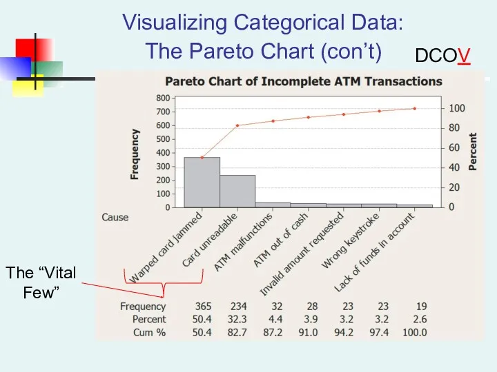
Visualizing Categorical Data:
The Pareto Chart (con’t)
DCOVA
The “Vital
Few”
Visualizing Categorical Data:
The Pareto Chart (con’t)
DCOVA
The “Vital
Few”
Chap 2-
Copyright ©2013 Pearson Education, Inc. publishing as Prentice Hall
Visualizing
Chap 2-
Copyright ©2013 Pearson Education, Inc. publishing as Prentice Hall
Visualizing
Chap 2-
Copyright ©2013 Pearson Education, Inc. publishing as Prentice Hall
Visualizing
Chap 2-
Copyright ©2013 Pearson Education, Inc. publishing as Prentice Hall
Visualizing
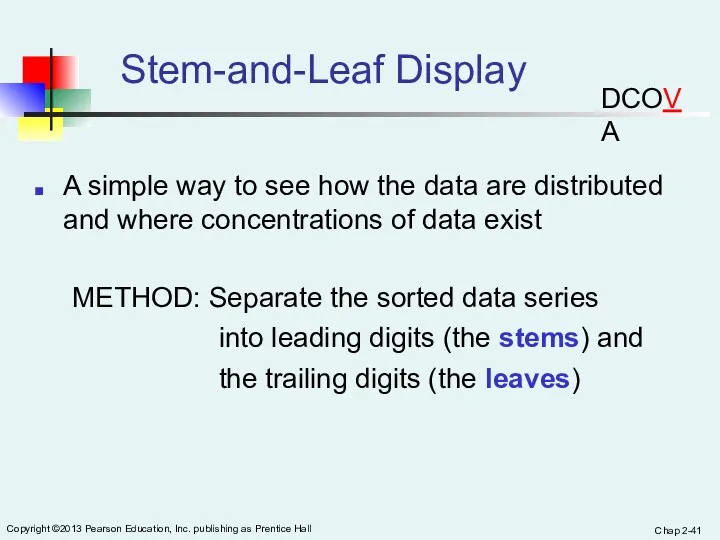
Chap 2-
Copyright ©2013 Pearson Education, Inc. publishing as Prentice Hall
Stem-and-Leaf
Chap 2-
Copyright ©2013 Pearson Education, Inc. publishing as Prentice Hall
Stem-and-Leaf
Chap 2-
Copyright ©2013 Pearson Education, Inc. publishing as Prentice Hall
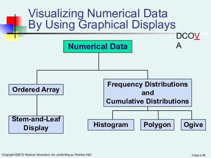
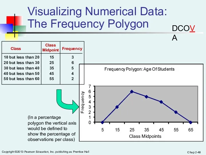
Organizing
Chap 2-
Copyright ©2013 Pearson Education, Inc. publishing as Prentice Hall
Organizing
Chap 2-
Copyright ©2013 Pearson Education, Inc. publishing as Prentice Hall
Visualizing
Chap 2-
Copyright ©2013 Pearson Education, Inc. publishing as Prentice Hall
Visualizing
Chap 2-
Copyright ©2013 Pearson Education, Inc. publishing as Prentice Hall
Visualizing
Chap 2-
Copyright ©2013 Pearson Education, Inc. publishing as Prentice Hall
Visualizing
Chap 2-
Copyright ©2013 Pearson Education, Inc. publishing as Prentice Hall
Visualizing
Chap 2-
Copyright ©2013 Pearson Education, Inc. publishing as Prentice Hall
Visualizing
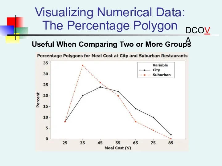
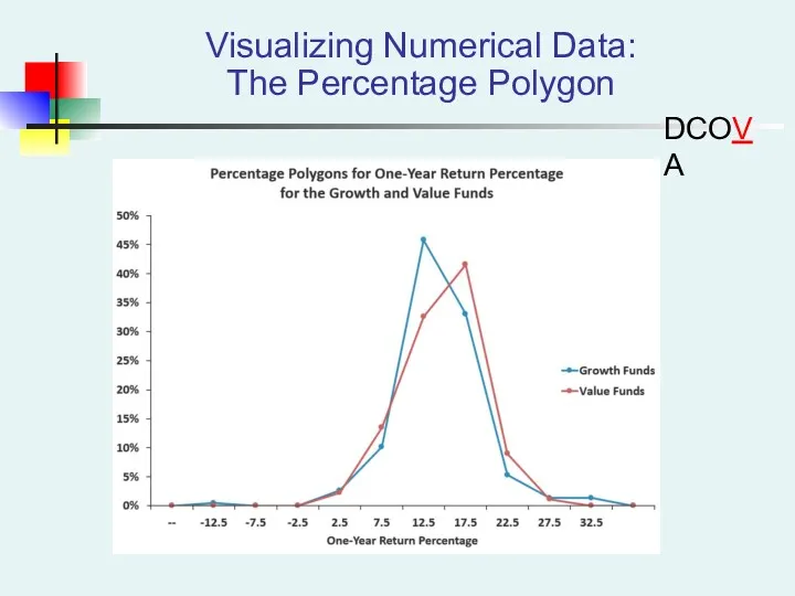
Visualizing Numerical Data:
The Percentage Polygon
DCOVA
Useful When Comparing Two or More
Visualizing Numerical Data:
The Percentage Polygon
DCOVA
Useful When Comparing Two or More
Visualizing Numerical Data:
The Percentage Polygon
DCOVA
Visualizing Numerical Data:
The Percentage Polygon
DCOVA
Chap 2-
Copyright ©2013 Pearson Education, Inc. publishing as Prentice Hall
Visualizing
Chap 2-
Copyright ©2013 Pearson Education, Inc. publishing as Prentice Hall
Visualizing
Chap 2-
Copyright ©2013 Pearson Education, Inc. publishing as Prentice Hall
Visualizing
Chap 2-
Copyright ©2013 Pearson Education, Inc. publishing as Prentice Hall
Visualizing
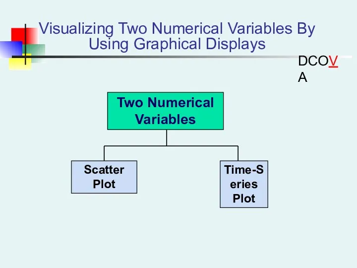
Visualizing Two Numerical Variables By Using Graphical Displays
DCOVA
Visualizing Two Numerical Variables By Using Graphical Displays
DCOVA
Chap 2-
Copyright ©2013 Pearson Education, Inc. publishing as Prentice Hall
Visualizing
Chap 2-
Copyright ©2013 Pearson Education, Inc. publishing as Prentice Hall
Visualizing
Chap 2-
Copyright ©2013 Pearson Education, Inc. publishing as Prentice Hall
Scatter
Chap 2-
Copyright ©2013 Pearson Education, Inc. publishing as Prentice Hall
Scatter
Chap 2-
Copyright ©2013 Pearson Education, Inc. publishing as Prentice Hall
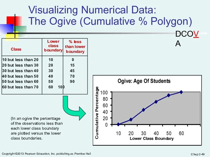
Visualizing
Chap 2-
Copyright ©2013 Pearson Education, Inc. publishing as Prentice Hall
Visualizing
Chap 2-
Copyright ©2013 Pearson Education, Inc. publishing as Prentice Hall
Time-Series
Chap 2-
Copyright ©2013 Pearson Education, Inc. publishing as Prentice Hall
Time-Series
Chap 2-
Copyright ©2013 Pearson Education, Inc. publishing as Prentice Hall
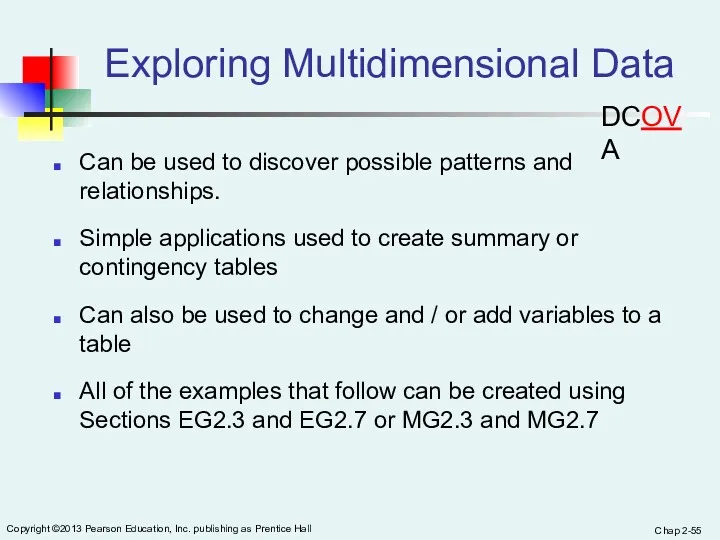
Exploring
Chap 2-
Copyright ©2013 Pearson Education, Inc. publishing as Prentice Hall
Exploring
Chap 2-
Copyright ©2013 Pearson Education, Inc. publishing as Prentice Hall
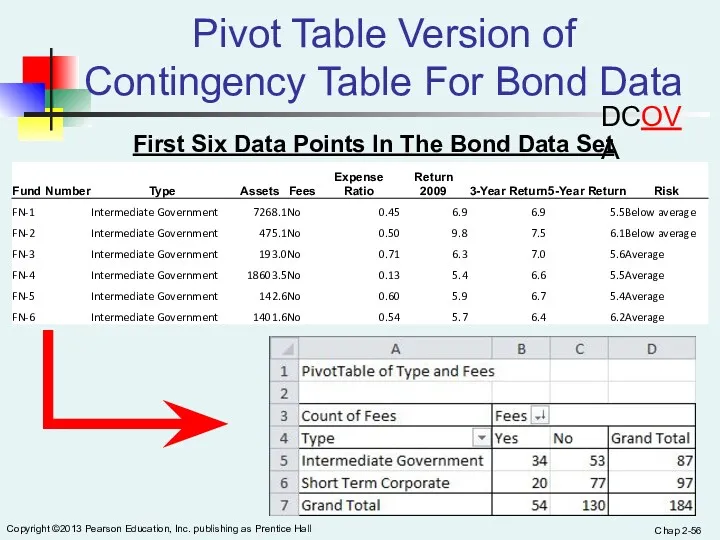
Pivot
Chap 2-
Copyright ©2013 Pearson Education, Inc. publishing as Prentice Hall
Pivot
Chap 2-
Copyright ©2013 Pearson Education, Inc. publishing as Prentice Hall
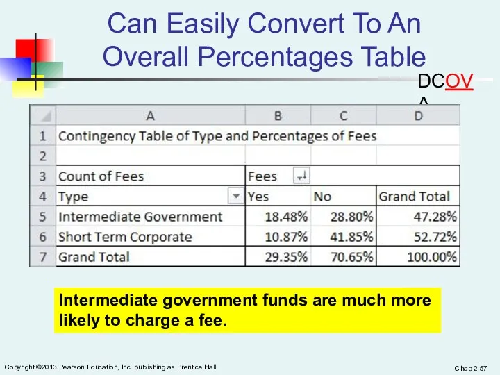
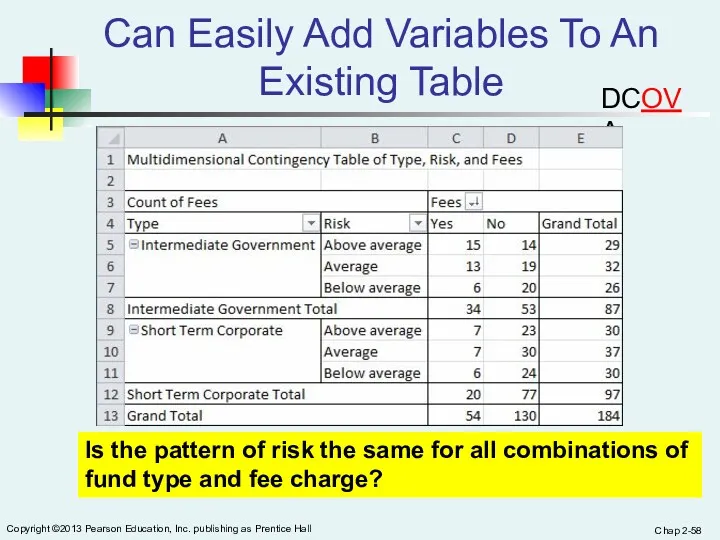
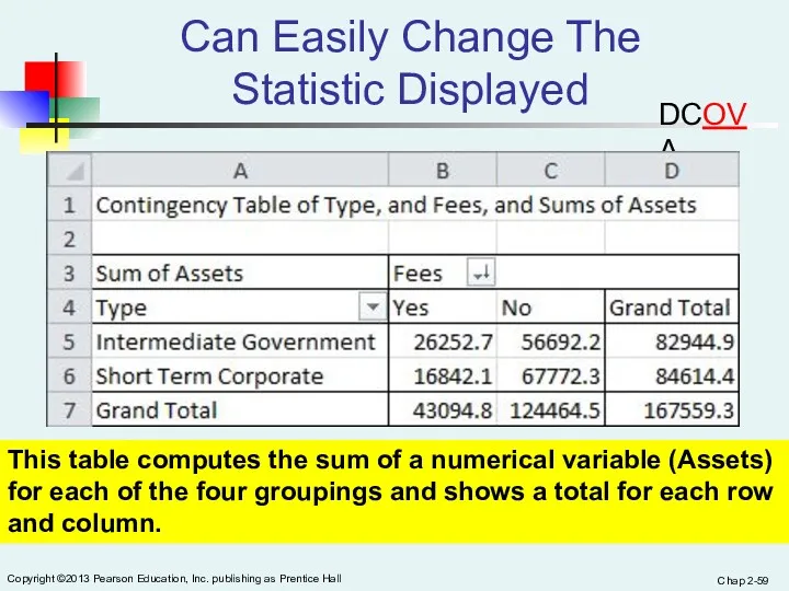
Can
Chap 2-
Copyright ©2013 Pearson Education, Inc. publishing as Prentice Hall
Can
Chap 2-
Copyright ©2013 Pearson Education, Inc. publishing as Prentice Hall
Can
Chap 2-
Copyright ©2013 Pearson Education, Inc. publishing as Prentice Hall
Can
Chap 2-
Copyright ©2013 Pearson Education, Inc. publishing as Prentice Hall
Can
Chap 2-
Copyright ©2013 Pearson Education, Inc. publishing as Prentice Hall
Can
Chap 2-
Copyright ©2013 Pearson Education, Inc. publishing as Prentice Hall
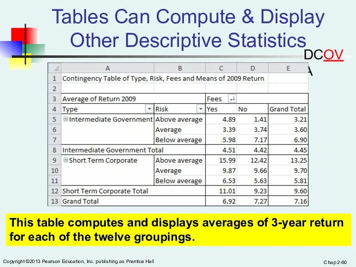
Tables
Chap 2-
Copyright ©2013 Pearson Education, Inc. publishing as Prentice Hall
Tables
Chap 2-
Copyright ©2013 Pearson Education, Inc. publishing as Prentice Hall
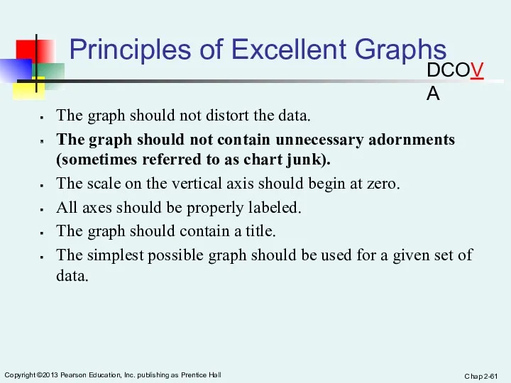
Principles
Chap 2-
Copyright ©2013 Pearson Education, Inc. publishing as Prentice Hall
Principles
Chap 2-
Copyright ©2013 Pearson Education, Inc. publishing as Prentice Hall
Graphical
Chap 2-
Copyright ©2013 Pearson Education, Inc. publishing as Prentice Hall
Graphical
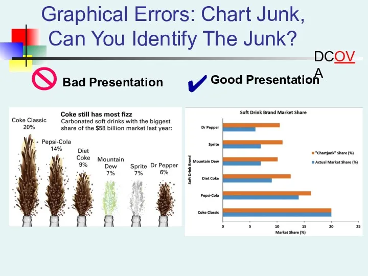
Graphical Errors: Chart Junk, Can You Identify The Junk?
DCOVA
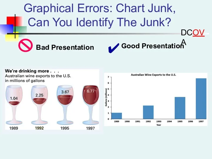
Graphical Errors: Chart Junk, Can You Identify The Junk?
DCOVA
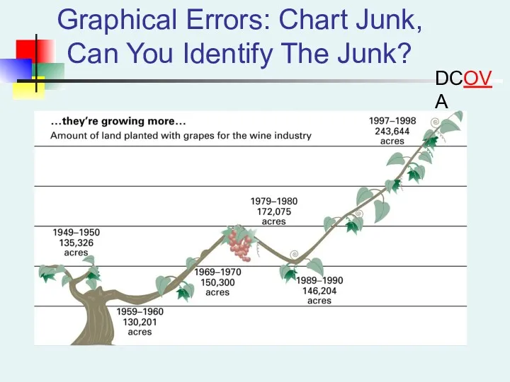
Graphical Errors: Chart Junk, Can You Identify The Junk?
DCOVA
Graphical Errors: Chart Junk, Can You Identify The Junk?
DCOVA
Graphical Errors: Chart Junk, Can You Identify The Junk?
DCOVA
Graphical Errors: Chart Junk, Can You Identify The Junk?
DCOVA
Chap 2-
Copyright ©2013 Pearson Education, Inc. publishing as Prentice Hall
Graphical
Chap 2-
Copyright ©2013 Pearson Education, Inc. publishing as Prentice Hall
Graphical
Chap 2-
Copyright ©2013 Pearson Education, Inc. publishing as Prentice Hall
Graphical
Chap 2-
Copyright ©2013 Pearson Education, Inc. publishing as Prentice Hall
Graphical
Chap 2-
Copyright ©2013 Pearson Education, Inc. publishing as Prentice Hall
Graphical
Chap 2-
Copyright ©2013 Pearson Education, Inc. publishing as Prentice Hall
Graphical
In Excel It Is Easy To Inadvertently Create Distortions
Excel often will
In Excel It Is Easy To Inadvertently Create Distortions
Excel often will
Chap 2-
Copyright ©2013 Pearson Education, Inc. publishing as Prentice Hall
Chapter
Chap 2-
Copyright ©2013 Pearson Education, Inc. publishing as Prentice Hall
Chapter
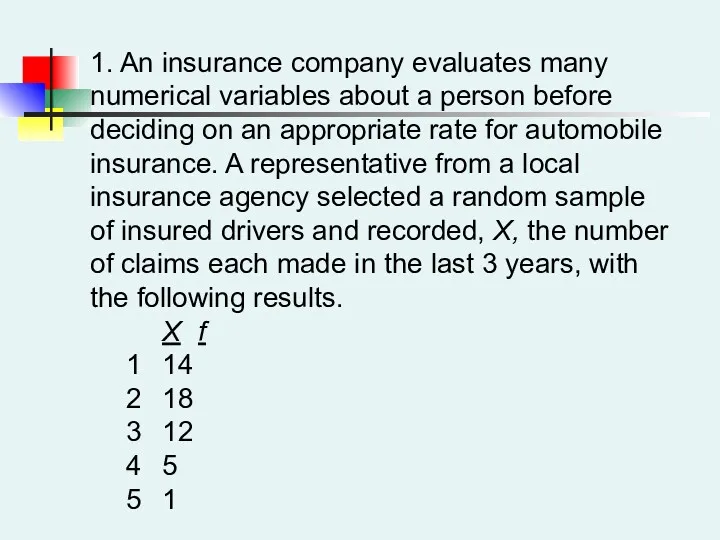
1. An insurance company evaluates many numerical variables about a person
1. An insurance company evaluates many numerical variables about a person
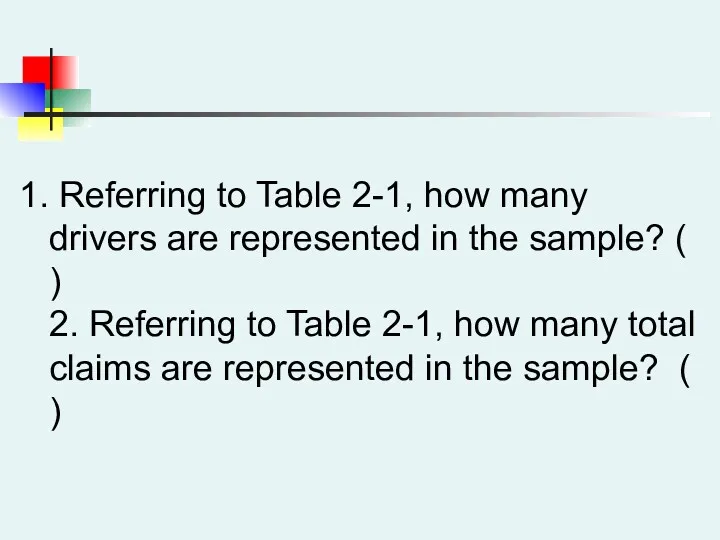
Referring to Table 2-1, how many drivers are represented in the
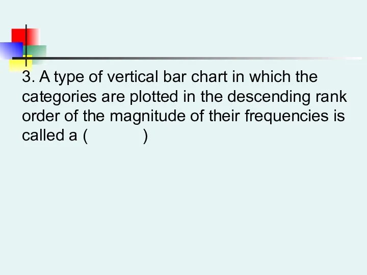
3. A type of vertical bar chart in which the categories
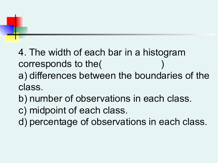
4. The width of each bar in a histogram corresponds to
4. The width of each bar in a histogram corresponds to
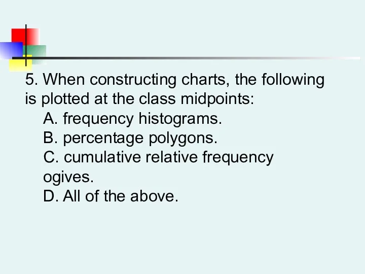
5. When constructing charts, the following is plotted at the class
COUNTIF (range, criteria)
Slide 3-
Copyright © 2011 Pearson Education, Inc.
Active Learning Lecture
Slide 3-
Copyright © 2011 Pearson Education, Inc.
Active Learning Lecture
Slide 4-
Copyright © 2011 Pearson Education, Inc.
Which of the
Slide 4-
Copyright © 2011 Pearson Education, Inc.
Which of the
Slide 4-
Copyright © 2011 Pearson Education, Inc.
Which of the
Slide 4-
Copyright © 2011 Pearson Education, Inc.
Which of the
Slide 4-
Copyright © 2011 Pearson Education, Inc.
Which of the
Slide 4-
Copyright © 2011 Pearson Education, Inc.
Which of the
Slide 4-
Copyright © 2011 Pearson Education, Inc.
Which of the
Slide 4-
Copyright © 2011 Pearson Education, Inc.
Which of the
Slide 4-
Copyright © 2011 Pearson Education, Inc.
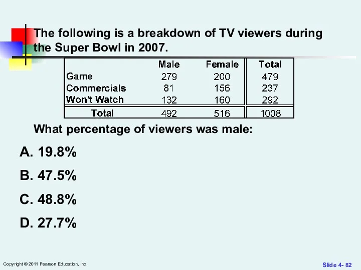
The following is
Slide 4-
Copyright © 2011 Pearson Education, Inc.
The following is
Slide 4-
Copyright © 2011 Pearson Education, Inc.
The following is
Slide 4-
Copyright © 2011 Pearson Education, Inc.
The following is
Slide 4-
Copyright © 2011 Pearson Education, Inc.
The following is
Slide 4-
Copyright © 2011 Pearson Education, Inc.
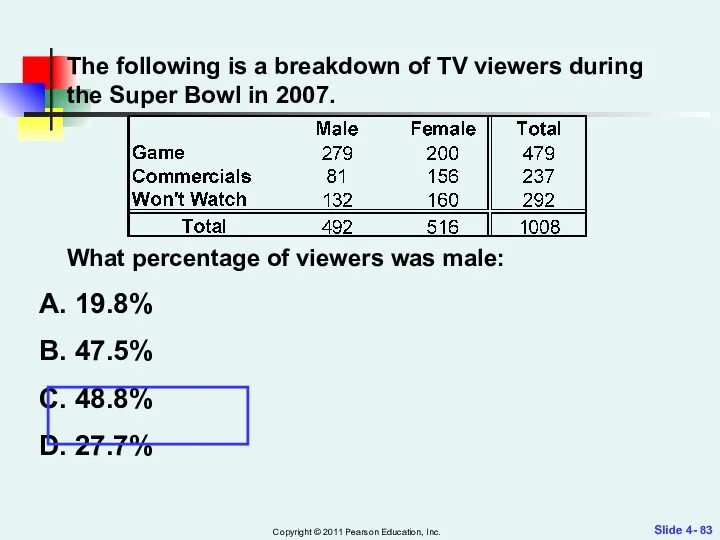
The following is
Slide 4-
Copyright © 2011 Pearson Education, Inc.
The following is
Slide 4-
Copyright © 2011 Pearson Education, Inc.
The following is
Slide 4-
Copyright © 2011 Pearson Education, Inc.
The following is
Slide 4-
Copyright © 2011 Pearson Education, Inc.
The following is
Slide 4-
Copyright © 2011 Pearson Education, Inc.
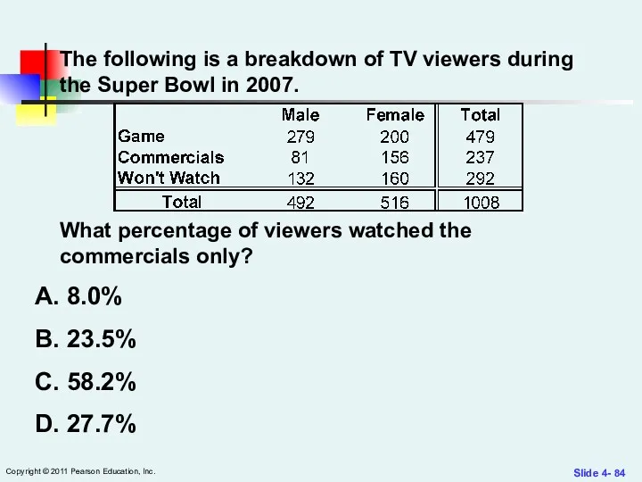
The following is
Slide 4-
Copyright © 2011 Pearson Education, Inc.
The following is
Slide 4-
Copyright © 2011 Pearson Education, Inc.
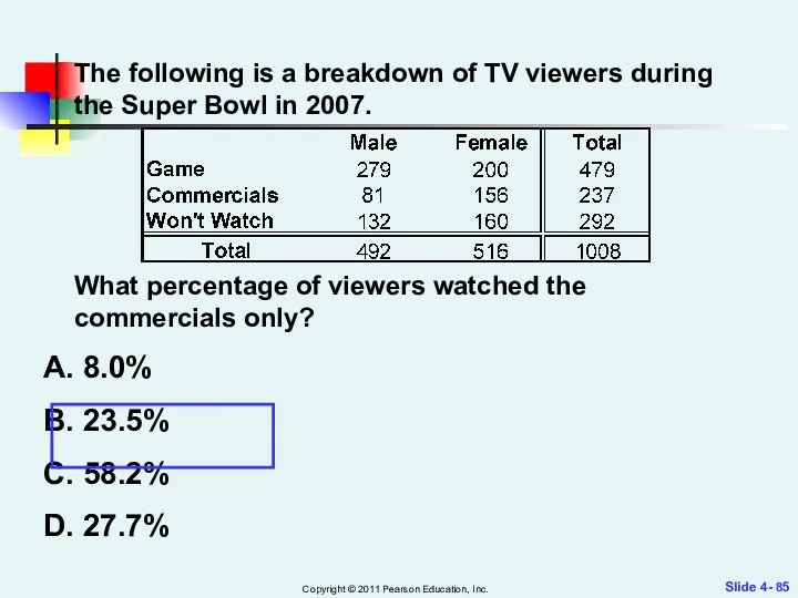
In a contingency
Slide 4-
Copyright © 2011 Pearson Education, Inc.
In a contingency
Slide 4-
Copyright © 2011 Pearson Education, Inc.
In a contingency
Slide 4-
Copyright © 2011 Pearson Education, Inc.
In a contingency
Slide 5-
Copyright © 2011 Pearson Education, Inc.
You should use a
Slide 5-
Copyright © 2011 Pearson Education, Inc.
You should use a
Slide 5-
Copyright © 2011 Pearson Education, Inc.
You should use a
Slide 5-
Copyright © 2011 Pearson Education, Inc.
You should use a
 Конкурс бизнес-проектов Ценим прошлое, инвестируем в будущее. Бизнес-проект Химчистка
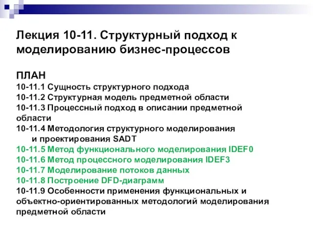 Структурный подход к моделированию бизнес-процессов
 Аппарат по продаже воды на розлив в тару покупателя
 Загальні правила підбору посуду та подачі чаю
 Предпринимательская деятельность
 Социальное предпринимательство: от идеи к бизнес-идее
 Бизнес-идея фреш-бара Аскерöм юан
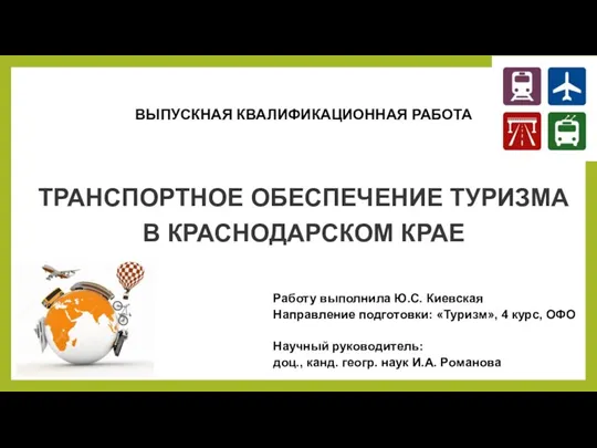 Транспортное обеспечение туризма в Краснодарском крае
 Ты - предприниматель. Школа юного предпринимателя
 Бизнес-план
 Смыслы, ценности и позиционирование клуба
 Restaurant and tourism industry was forgotten in the 2021 budget (Finland)
 Завдання 2 (робота в групі). Історія успіху стартапа: бізнес-модель
 Кәсіпкерлік қызметтегі тәуекелдер
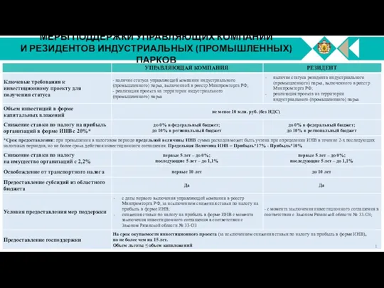 Меры поддержки управляющих компаний и резидентов индустриальных (промышленных) парков управляющая компания
 Организация и ведение бизнеса
 Меры поддержки субъектов малого и среднего предпринимательства: федеральный и региональный опыт
 Крафт бар мясорубка
 Шағын бизнес және орта бизнесті реттеу
 Государственное регулирование предпринимательской деятельности в Республике Беларусь
 Концепция развития розничной сети
 Меры поддержки
 Бизнес-идея и методы выхода на бизнес-идею
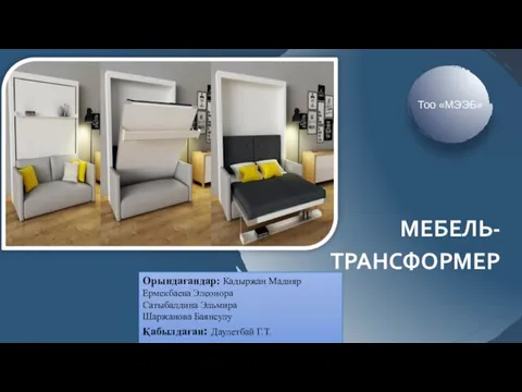 Мебель-трансформер. Бизнес-идея
 Экономический потенциал малого и среднего бизнеса
 Бизнес–план Блинный островок
 Salida del Sol. Ассортимент продукции
 AZIMUT Отель Олимпик Москва 4*