- Organizing data graphical and nabular descriptive techniques

Содержание
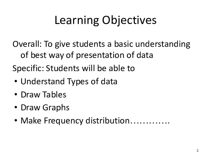
- 2. Learning Objectives Overall: To give students a basic understanding of best way of presentation of data
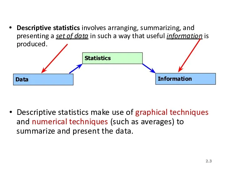
- 3. 2. Descriptive statistics involves arranging, summarizing, and presenting a set of data in such a way
- 4. DATA MINING Most companies routinely collect data – at the cash register for each purchase, on
- 5. DATA MINING is a collection of methods for obtaining useful knowledge by analyzing large amounts of
- 6. 1. Marketing and sales: companies have lots of information about past contacts with potential customers and
- 7. Finance: Mining of financial data can be useful in forming and evaluating investment strategies and in
- 8. Statistical methods, such as hypothesis testing, are helpful as part of data mining distinguish random from
- 9. 3. Product design: What particular combinations of features are customers ordering in larger-than-expected quantities? The answers
- 10. 4. Production Imagine a factory running 24/7 with thousands of partially completed units, each with its
- 11. 5. Fraud detections: Fraud can affect many areas of business, including consumer finance, insurance, and networks
- 12. YOU once received a telephone call from your credit card company asking you to verify recent
- 13. Data mining is a large task that involves combining resources from many fields. Here is how
- 14. Statistics: All of the basic activities of statistics are involved: a design for collecting the data,
- 15. Some specialized statistical methods are particularly useful, including classification analysis (also called discriminant analysis) to assign
- 16. Computer science: Efficient algorithms (computer instructions) are needed for collecting, maintaining, organizing, and analyzing data. Creative
- 17. Optimization: These methods help you achieve a goal, which might be very specific such as maximizing
- 18. Alternatively, the goal might be more vague such as obtaining a better understanding of the different
- 19. WHAT IS PROBABILITY? Probability is a what if tool for understanding risk and uncertainty. Probability shows
- 20. You might learn, for example, that an international project has only an 8% chance of success
- 21. Here are additional examples of situations where finding the appropriate answer requires computing or estimating a
- 22. 3. What are the chances that a foreign country (where you have a manufacturing plant) will
- 23. Probability is the inverse of statistics. Whereas statistics helps you go from observed data to generalizations
- 24. Probability also works together with statistics by providing a solid foundation for statistical inference. When there
- 26. 2. Definitions… A variable [Typically called a “random” variable since we do not know it’s value
- 27. 2. We Deal with “2” Types of Data Numerical/Quantitative Data [Real Numbers]: * height * weight
- 28. 2. Quantitative/Numerical Data… Quantitative Data is further broken down into Continuous Data – Data can be
- 29. 2. Qualitative/Categorical Data Nominal Data [has no natural order to the values]. E.g. responses to questions
- 30. 2. Graphical & Tabular Techniques for Nominal Data… The only allowable calculation on nominal data is
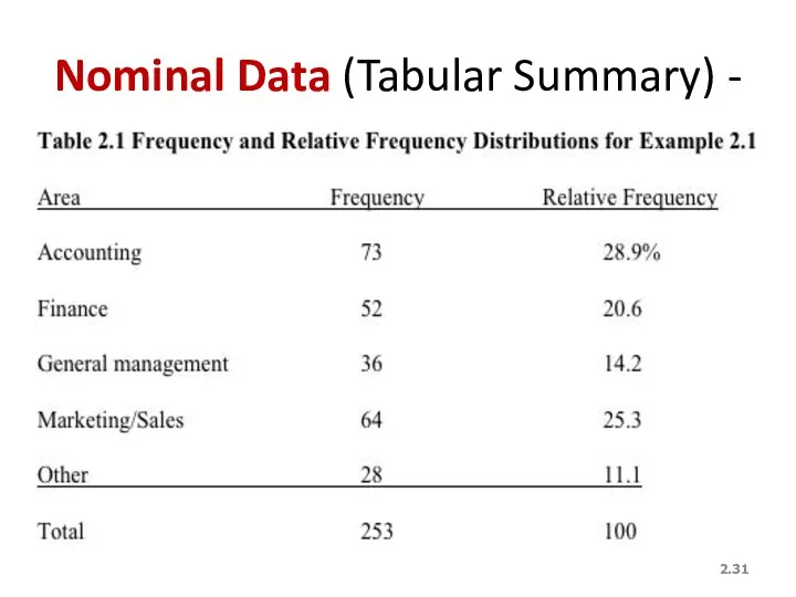
- 31. 2. Nominal Data (Tabular Summary) -
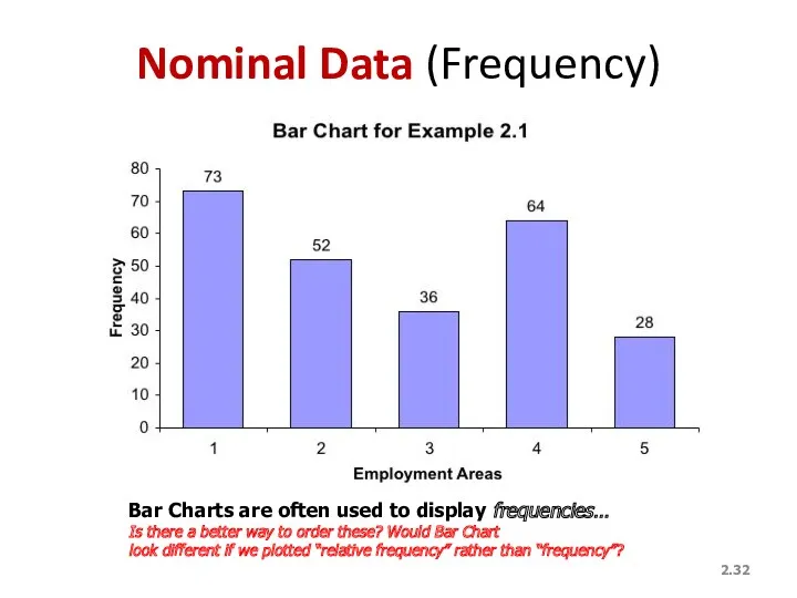
- 32. 2. Nominal Data (Frequency) Bar Charts are often used to display frequencies… Is there a better
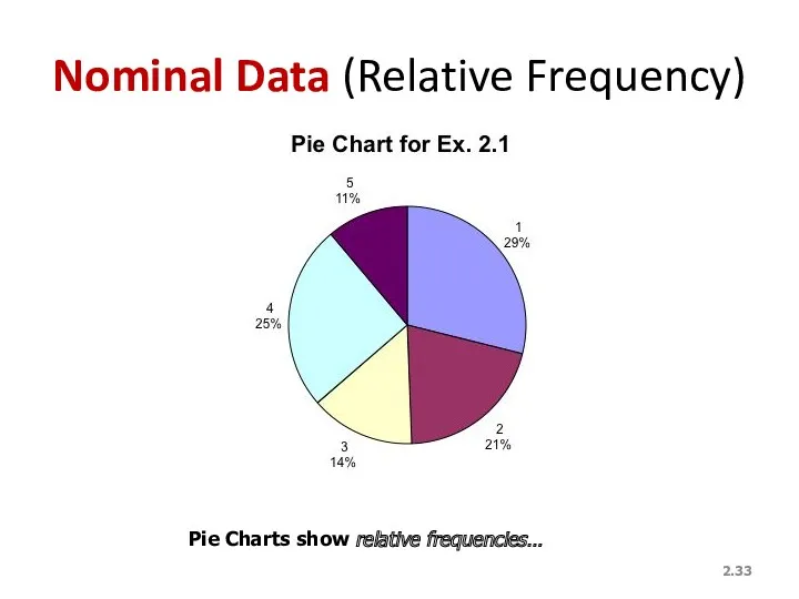
- 33. 2. Nominal Data (Relative Frequency) Pie Charts show relative frequencies…
- 34. Frequency Distributions Definition A frequency distribution for qualitative data lists all categories and the number of
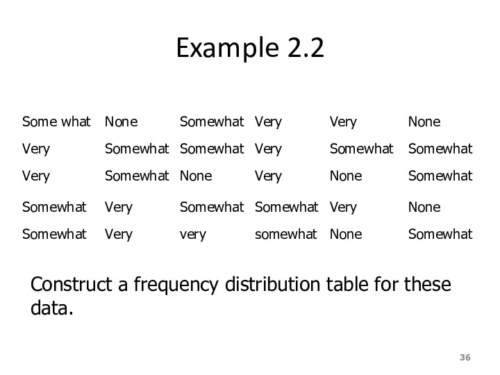
- 35. Example 2.2 A sample of 30 employees from large companies was selected, and these employees were
- 36. Example 2.2 Construct a frequency distribution table for these data.
- 37. Solution 2.2 Table 2.2 Frequency Distribution of Stress on Job
- 38. Relative Frequency and Percentage Distributions Calculating Relative Frequency of a Category
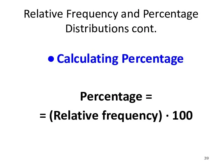
- 39. Relative Frequency and Percentage Distributions cont. Calculating Percentage Percentage = = (Relative frequency) · 100
- 40. Example 2.3 Determine the relative frequency and percentage for the data in Table 2.4.
- 41. Solution 2-2 Table 2.3 Relative Frequency and Percentage Distributions of Stress on Job
- 42. Graphical Presentation of Qualitative Data Definition A graph made of bars whose heights represent the frequencies
- 43. Figure 2.2 Bar graph for the frequency distribution of Table 2.3
- 44. Graphical Presentation of Qualitative Data cont. Definition A circle divided into portions that represent the relative
- 45. Table 2.4 Calculating Angle Sizes for the Pie Chart
- 46. Figure 2.4 Pie chart for the percentage distribution of Table 2.5.
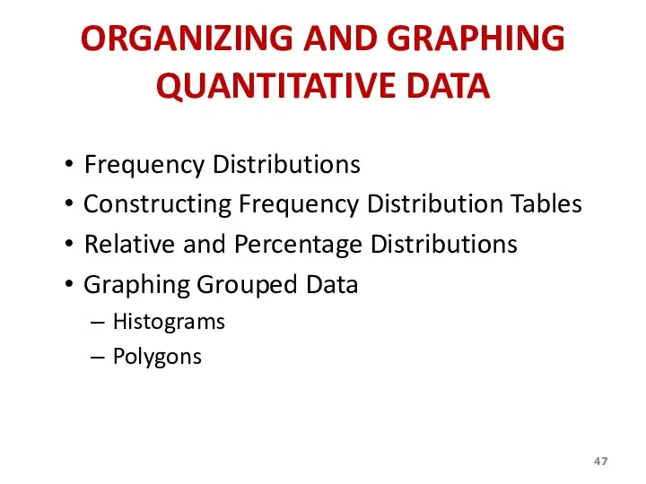
- 47. ORGANIZING AND GRAPHING QUANTITATIVE DATA Frequency Distributions Constructing Frequency Distribution Tables Relative and Percentage Distributions Graphing
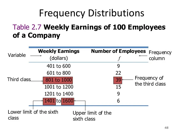
- 48. Frequency Distributions Table 2.7 Weekly Earnings of 100 Employees of a Company Variable Third class Lower
- 49. Frequency Distributions cont. Definition A frequency distribution for quantitative data lists all the classes and the
- 50. Essential Question : How do we construct a frequency distribution table?
- 51. Process of Constructing a Frequency Table STEP 1: Determine the range. R = Highest Value –
- 52. STEP 2. Determine the tentative number of classes (k) k = 1 + 3.322 log N
- 53. STEP 3. Find the class width by dividing the range by the number of classes. (Always
- 54. STEP 4. Write the classes or categories starting with the lowest score. Stop when the class
- 55. STEP 5. Determine the frequency for each class by referring to the tally columns and present
- 56. When constructing frequency tables, the following guidelines should be followed. The classes must be mutually exclusive.
- 57. 3. All classes should have the same width, although it is sometimes impossible to avoid open
- 58. Let’s Try!!! Time magazine collected information on all 464 people who died from gunfire in the
- 59. 19 18 30 40 41 33 73 25 23 25 21 33 65 17 20 76
- 60. Determine the range. R = Highest Value – Lowest Value R = 76 – 16 =
- 61. Determine the tentative number of classes (K). K = 1 + 3. 322 log N =
- 62. Find the class width (c). * Round – off the quotient if the decimal part exceeds
- 63. Write the classes starting with lowest score.
- 64. Using Table: What is the lower class limit of the highest class? Upper class limit of
- 66. Example Table 2.9 gives the total home runs hit by all players of each of the
- 67. Table 2.9 Home Runs Hit by Major League Baseball Teams During the 2012 Season
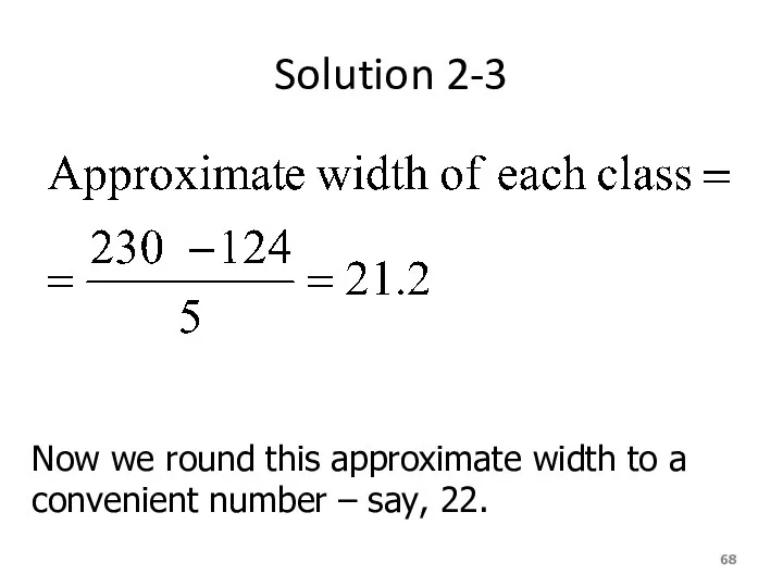
- 68. Solution 2-3 Now we round this approximate width to a convenient number – say, 22.
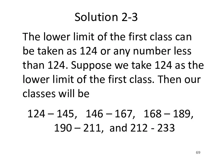
- 69. Solution 2-3 The lower limit of the first class can be taken as 124 or any
- 70. Table 2.10 Frequency Distribution for the Data of Table 2.9
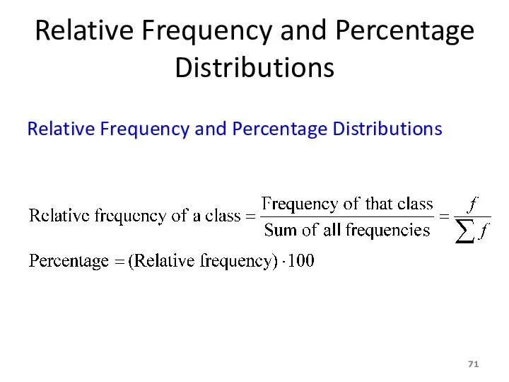
- 71. Relative Frequency and Percentage Distributions Relative Frequency and Percentage Distributions
- 72. Example 2-4 Calculate the relative frequencies and percentages for Table 2.10
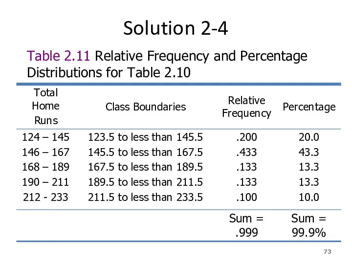
- 73. Solution 2-4 Table 2.11 Relative Frequency and Percentage Distributions for Table 2.10
- 74. Graphing Grouped Data Definition A histogram is a graph in which classes are marked on the
- 75. Figure 2.3 Frequency histogram for Table 2.10. 124 - 145 146 - 167 168 - 189
- 76. Figure 2.4 Relative frequency histogram for Table 2.10. 124 - 145 146 - 167 168 -
- 77. Graphing Grouped Data cont. Definition A graph formed by joining the midpoints of the tops of
- 78. Figure 2.5 Frequency polygon for Table 2.10. 124 - 145 146 - 167 168 - 189
- 79. Figure 2.6 Frequency Distribution curve Frequency x
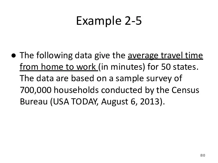
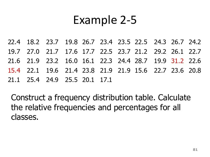
- 80. Example 2-5 The following data give the average travel time from home to work (in minutes)
- 81. Example 2-5 Construct a frequency distribution table. Calculate the relative frequencies and percentages for all classes.
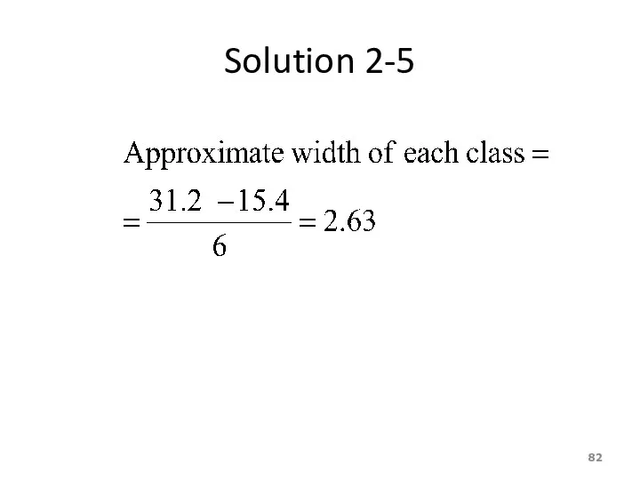
- 82. Solution 2-5
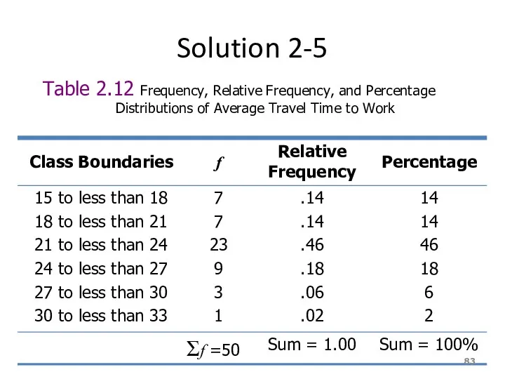
- 83. Solution 2-5 Table 2.12 Frequency, Relative Frequency, and Percentage Distributions of Average Travel Time to Work
- 84. Example 2-6 The administration in a large city wanted to know the distribution of vehicles owned
- 85. Solution 2-6 Table 2.13 Frequency Distribution of Vehicles Owned
- 86. Figure 2.7 Bar graph for Table 2.13.
- 87. Ogive The ogive is a graph that represents the cumulative frequencies for the classes in a
- 88. Ogive
- 90. Скачать презентацию
Learning Objectives
Overall: To give students a basic understanding of best way
Learning Objectives
Overall: To give students a basic understanding of best way
2.
Descriptive statistics involves arranging, summarizing, and presenting a set of data
2.
Descriptive statistics involves arranging, summarizing, and presenting a set of data
DATA MINING
Most companies routinely collect data – at the cash register
DATA MINING
Most companies routinely collect data – at the cash register
DATA MINING is a collection of methods for obtaining useful knowledge
DATA MINING is a collection of methods for obtaining useful knowledge
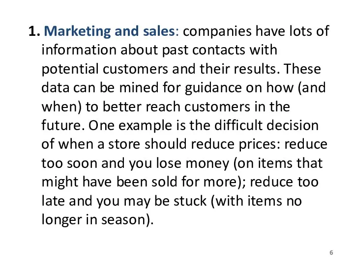
1. Marketing and sales: companies have lots of information about past
1. Marketing and sales: companies have lots of information about past
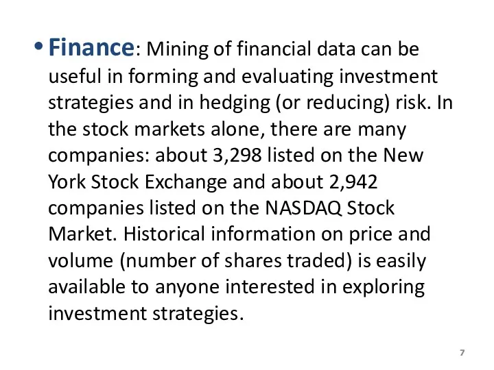
Finance: Mining of financial data can be useful in forming and
Finance: Mining of financial data can be useful in forming and
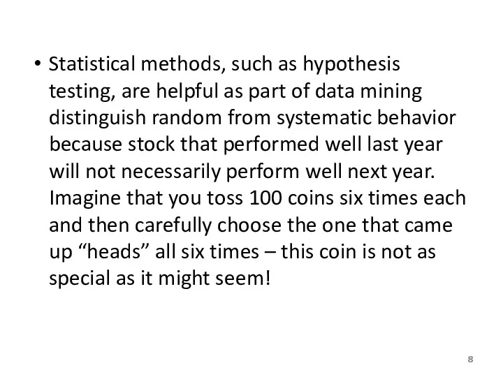
Statistical methods, such as hypothesis testing, are helpful as part of
Statistical methods, such as hypothesis testing, are helpful as part of
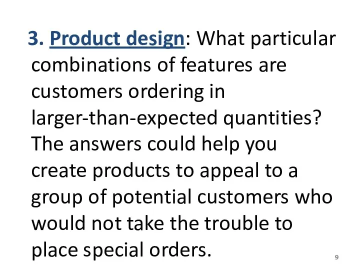
3. Product design: What particular combinations of features are customers
3. Product design: What particular combinations of features are customers
4. Production
Imagine a factory running 24/7 with thousands of partially
4. Production
Imagine a factory running 24/7 with thousands of partially
5. Fraud detections:
Fraud can affect many areas of business, including
5. Fraud detections:
Fraud can affect many areas of business, including
YOU once received a telephone call from your credit card company
YOU once received a telephone call from your credit card company
Data mining is a large task that involves combining resources from
Data mining is a large task that involves combining resources from
Statistics: All of the basic activities of statistics are involved: a
Statistics: All of the basic activities of statistics are involved: a
Some specialized statistical methods are particularly useful, including classification analysis (also
Some specialized statistical methods are particularly useful, including classification analysis (also
Computer science: Efficient algorithms (computer instructions) are needed for collecting, maintaining,
Computer science: Efficient algorithms (computer instructions) are needed for collecting, maintaining,
Optimization:
These methods help you achieve a goal, which might be very
Optimization:
These methods help you achieve a goal, which might be very
Alternatively, the goal might be more vague such as obtaining a
Alternatively, the goal might be more vague such as obtaining a
WHAT IS PROBABILITY?
Probability is a what if tool for understanding risk
WHAT IS PROBABILITY?
Probability is a what if tool for understanding risk
You might learn, for example, that an international project has only
You might learn, for example, that an international project has only
Here are additional examples of situations where finding the appropriate answer
Here are additional examples of situations where finding the appropriate answer
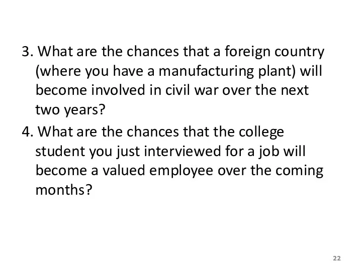
3. What are the chances that a foreign country (where you
3. What are the chances that a foreign country (where you
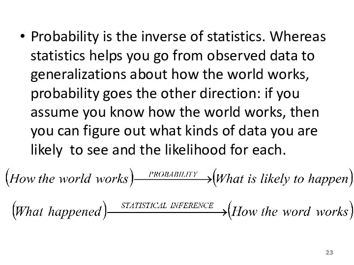
Probability is the inverse of statistics. Whereas statistics helps you go
Probability is the inverse of statistics. Whereas statistics helps you go
Probability also works together with statistics by providing a solid foundation
Probability also works together with statistics by providing a solid foundation

2.
Definitions…
A variable [Typically called a “random” variable since we do not
2.
Definitions…
A variable [Typically called a “random” variable since we do not
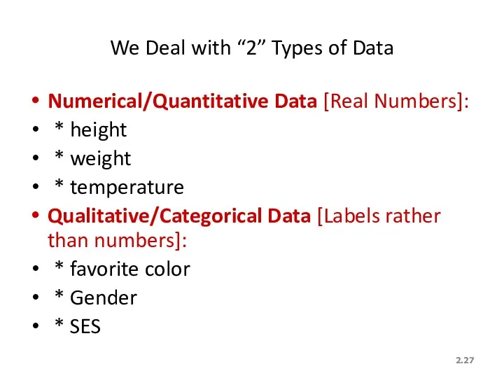
2.
We Deal with “2” Types of Data
Numerical/Quantitative Data [Real Numbers]:
* height
*
2.
We Deal with “2” Types of Data
Numerical/Quantitative Data [Real Numbers]:
* height
*
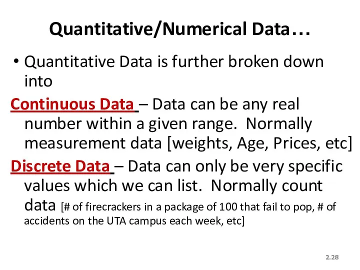
2.
Quantitative/Numerical Data…
Quantitative Data is further broken down into
Continuous Data – Data
2.
Quantitative/Numerical Data…
Quantitative Data is further broken down into
Continuous Data – Data
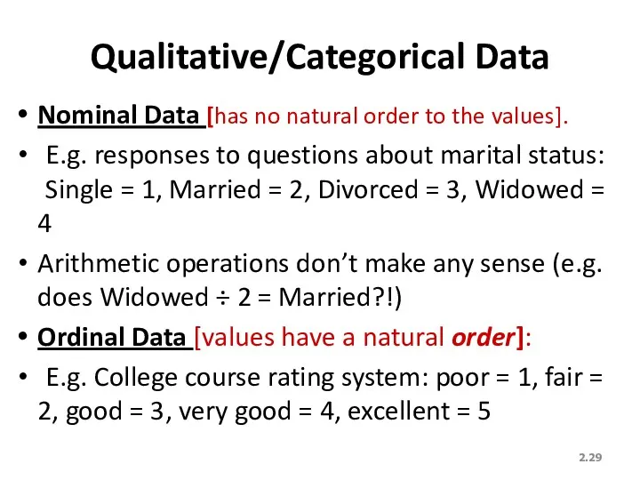
2.
Qualitative/Categorical Data
Nominal Data [has no natural order to the values].
E.g.
2.
Qualitative/Categorical Data
Nominal Data [has no natural order to the values].
E.g.
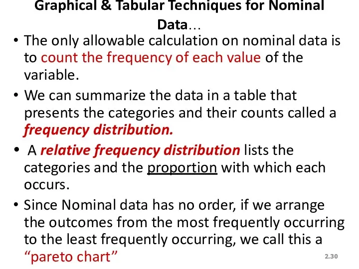
2.
Graphical & Tabular Techniques for Nominal Data…
The only allowable calculation on
2.
Graphical & Tabular Techniques for Nominal Data…
The only allowable calculation on
2.
Nominal Data (Tabular Summary) -
2.
Nominal Data (Tabular Summary) -
2.
Nominal Data (Frequency)
Bar Charts are often used to display frequencies…
Is there
2.
Nominal Data (Frequency)
Bar Charts are often used to display frequencies…
Is there
2.
Nominal Data (Relative Frequency)
Pie Charts show relative frequencies…
2.
Nominal Data (Relative Frequency)
Pie Charts show relative frequencies…
Frequency Distributions
Definition
A frequency distribution for qualitative data lists all categories and
Frequency Distributions
Definition
A frequency distribution for qualitative data lists all categories and
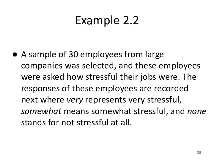
Example 2.2
A sample of 30 employees from large companies was selected,
Example 2.2
A sample of 30 employees from large companies was selected,
Example 2.2
Construct a frequency distribution table for these data.
Example 2.2
Construct a frequency distribution table for these data.
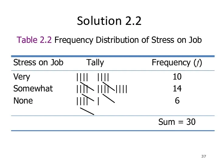
Solution 2.2
Table 2.2 Frequency Distribution of Stress on Job
Solution 2.2
Table 2.2 Frequency Distribution of Stress on Job
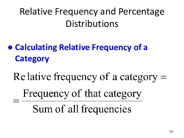
Relative Frequency and Percentage Distributions
Calculating Relative Frequency of a Category
Relative Frequency and Percentage Distributions
Calculating Relative Frequency of a Category
Relative Frequency and Percentage Distributions cont.
Calculating Percentage
Percentage =
= (Relative frequency)
Relative Frequency and Percentage Distributions cont.
Calculating Percentage
Percentage =
= (Relative frequency)
Example 2.3
Determine the relative frequency and percentage for the data in
Example 2.3
Determine the relative frequency and percentage for the data in
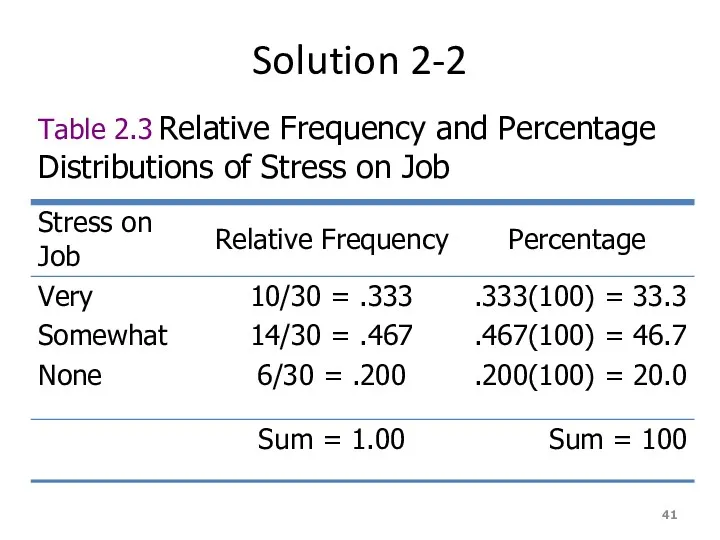
Solution 2-2
Table 2.3 Relative Frequency and Percentage Distributions of Stress on
Solution 2-2
Table 2.3 Relative Frequency and Percentage Distributions of Stress on
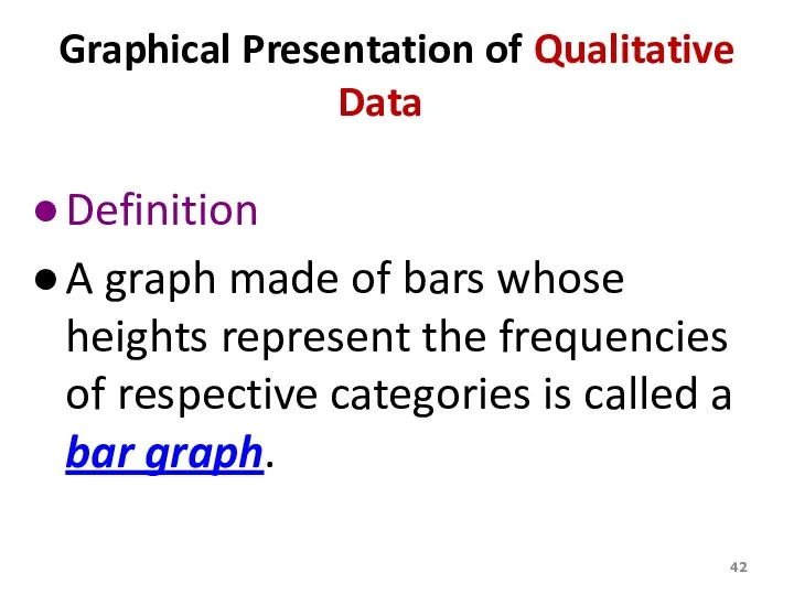
Graphical Presentation of Qualitative Data
Definition
A graph made of bars whose heights
Graphical Presentation of Qualitative Data
Definition
A graph made of bars whose heights
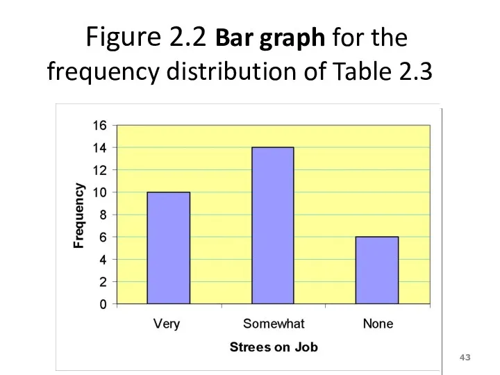
Figure 2.2 Bar graph for the frequency distribution of Table 2.3
Figure 2.2 Bar graph for the frequency distribution of Table 2.3
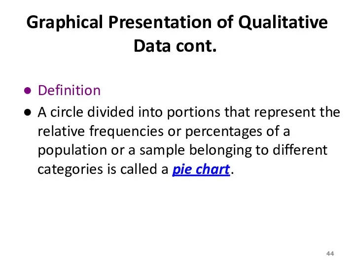
Graphical Presentation of Qualitative Data cont.
Definition
A circle divided into portions that
Graphical Presentation of Qualitative Data cont.
Definition
A circle divided into portions that
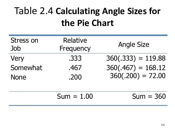
Table 2.4 Calculating Angle Sizes for the Pie Chart
Table 2.4 Calculating Angle Sizes for the Pie Chart
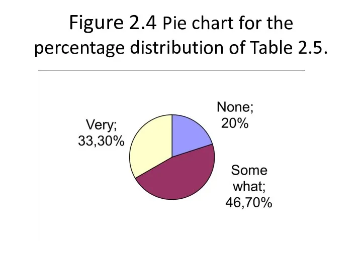
Figure 2.4 Pie chart for the percentage distribution of Table 2.5.
Figure 2.4 Pie chart for the percentage distribution of Table 2.5.
ORGANIZING AND GRAPHING QUANTITATIVE DATA
Frequency Distributions
Constructing Frequency Distribution Tables
Relative and Percentage
ORGANIZING AND GRAPHING QUANTITATIVE DATA
Frequency Distributions
Constructing Frequency Distribution Tables
Relative and Percentage
Frequency Distributions
Table 2.7 Weekly Earnings of 100 Employees of a Company
Variable
Frequency Distributions
Table 2.7 Weekly Earnings of 100 Employees of a Company
Variable
Frequency Distributions cont.
Definition
A frequency distribution for quantitative data lists all
Frequency Distributions cont.
Definition
A frequency distribution for quantitative data lists all
Essential Question :
How do we construct a frequency distribution table?
Essential Question :
How do we construct a frequency distribution table?
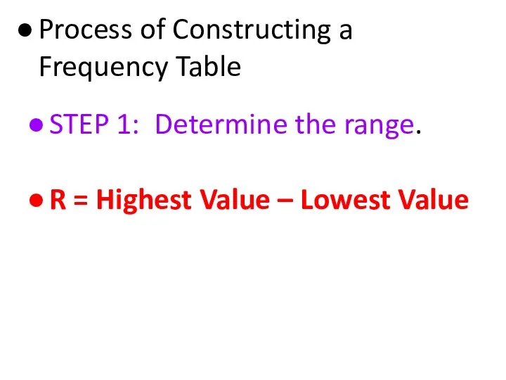
Process of Constructing a Frequency Table
STEP 1: Determine the range.
Process of Constructing a Frequency Table
STEP 1: Determine the range.
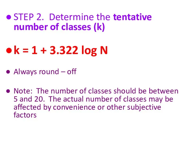
STEP 2. Determine the tentative number of classes (k)
k = 1
STEP 2. Determine the tentative number of classes (k)
k = 1
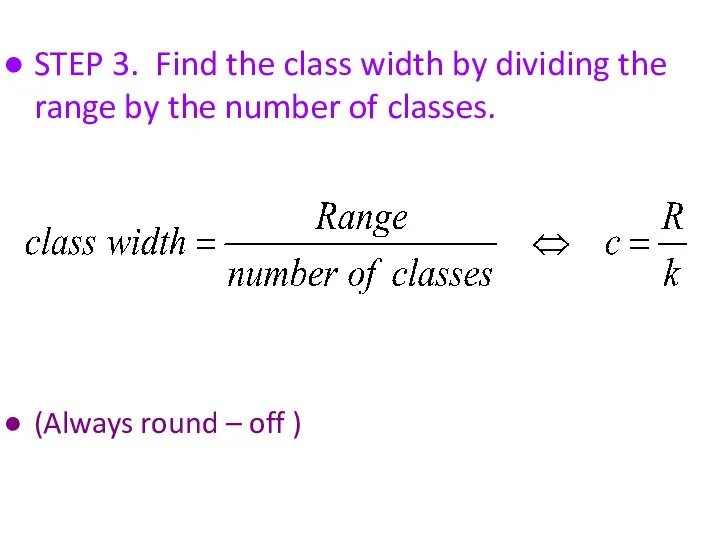
STEP 3. Find the class width by dividing the range by
STEP 3. Find the class width by dividing the range by
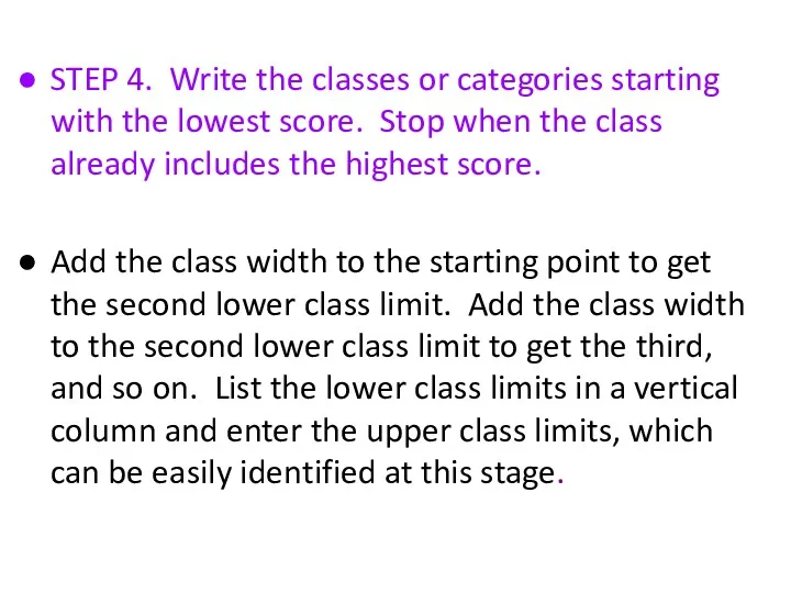
STEP 4. Write the classes or categories starting with the lowest
STEP 4. Write the classes or categories starting with the lowest
STEP 5. Determine the frequency for each class by referring to
STEP 5. Determine the frequency for each class by referring to
When constructing frequency tables, the following guidelines should be followed.
The classes
When constructing frequency tables, the following guidelines should be followed.
The classes
3. All classes should have the same width, although it is
3. All classes should have the same width, although it is
Let’s Try!!!
Time magazine collected information on all 464 people who
Let’s Try!!!
Time magazine collected information on all 464 people who
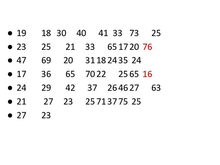
19 18 30 40 41 33 73 25
23 25 21 33 65 17 20
19 18 30 40 41 33 73 25
23 25 21 33 65 17 20
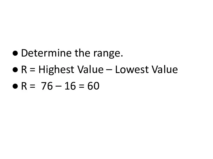
Determine the range.
R = Highest Value – Lowest Value
R = 76
Determine the range.
R = Highest Value – Lowest Value
R = 76
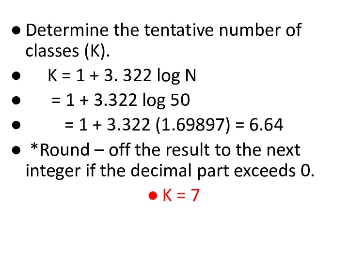
Determine the tentative number of classes (K).
K = 1 +
Determine the tentative number of classes (K).
K = 1 +
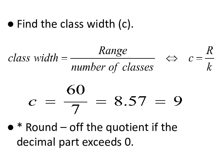
Find the class width (c).
* Round – off the quotient if
Find the class width (c).
* Round – off the quotient if
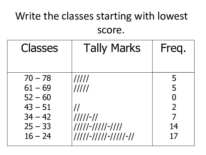
Write the classes starting with lowest score.
Write the classes starting with lowest score.
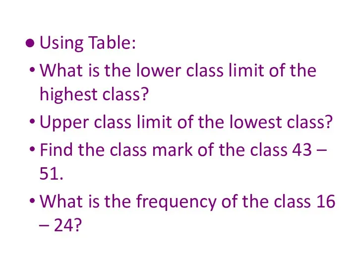
Using Table:
What is the lower class limit of the highest class?
Using Table:
What is the lower class limit of the highest class?

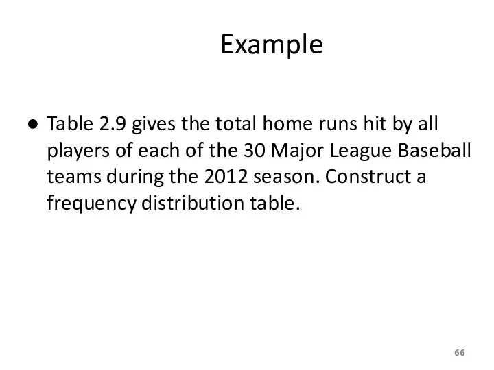
Example
Table 2.9 gives the total home runs hit by all
Example
Table 2.9 gives the total home runs hit by all
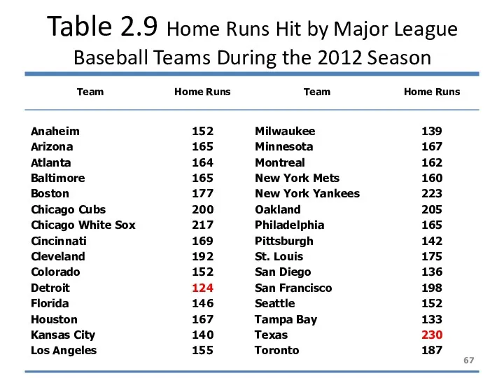
Table 2.9 Home Runs Hit by Major League Baseball Teams During
Table 2.9 Home Runs Hit by Major League Baseball Teams During
Solution 2-3
Now we round this approximate width to a convenient number
Solution 2-3
Now we round this approximate width to a convenient number
Solution 2-3
The lower limit of the first class can be taken
Solution 2-3
The lower limit of the first class can be taken
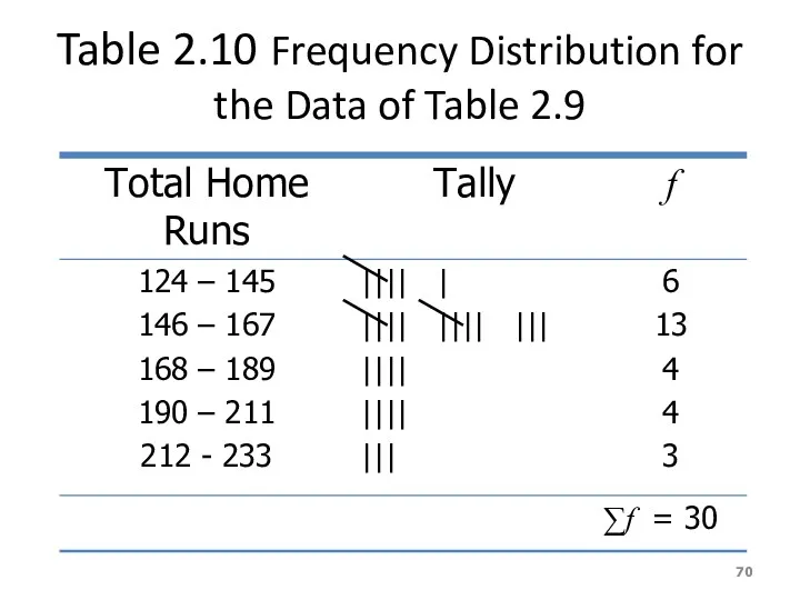
Table 2.10 Frequency Distribution for the Data of Table 2.9
Table 2.10 Frequency Distribution for the Data of Table 2.9
Relative Frequency and Percentage Distributions
Relative Frequency and Percentage Distributions
Relative Frequency and Percentage Distributions
Relative Frequency and Percentage Distributions
Example 2-4
Calculate the relative frequencies and percentages for Table 2.10
Example 2-4
Calculate the relative frequencies and percentages for Table 2.10
Solution 2-4
Table 2.11 Relative Frequency and Percentage Distributions for Table 2.10
Solution 2-4
Table 2.11 Relative Frequency and Percentage Distributions for Table 2.10
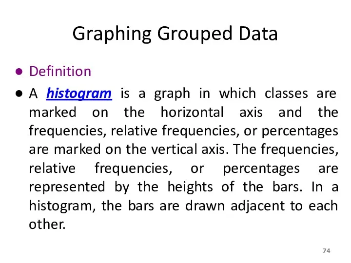
Graphing Grouped Data
Definition
A histogram is a graph in which classes are
Graphing Grouped Data
Definition
A histogram is a graph in which classes are
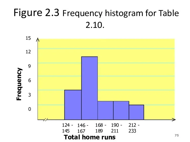
Figure 2.3 Frequency histogram for Table 2.10.
124 - 145
146 - 167
168
Figure 2.3 Frequency histogram for Table 2.10.
124 - 145
146 - 167
168
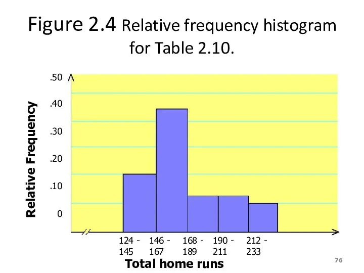
Figure 2.4 Relative frequency histogram for Table 2.10.
124 - 145
146 -
Figure 2.4 Relative frequency histogram for Table 2.10.
124 - 145
146 -
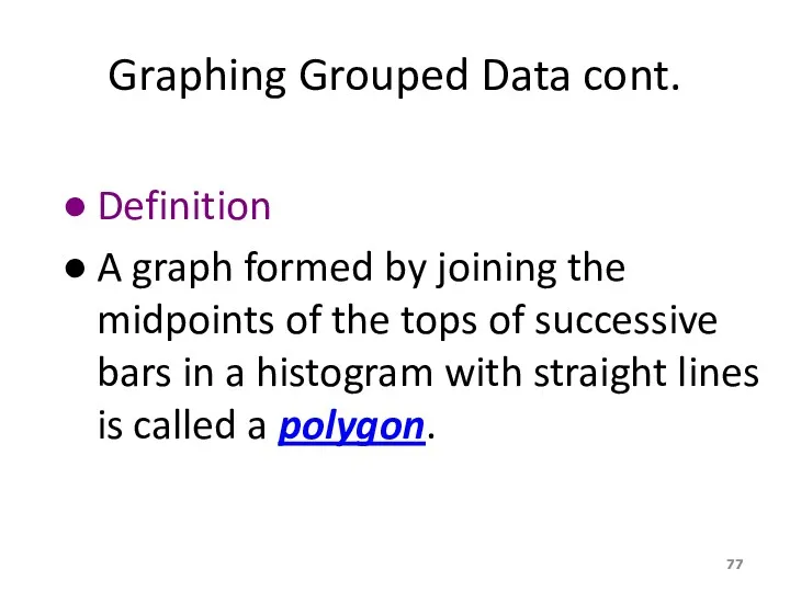
Graphing Grouped Data cont.
Definition
A graph formed by joining the midpoints of
Graphing Grouped Data cont.
Definition
A graph formed by joining the midpoints of
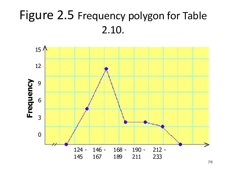
Figure 2.5 Frequency polygon for Table 2.10.
124 - 145
146 - 167
168
Figure 2.5 Frequency polygon for Table 2.10.
124 - 145
146 - 167
168
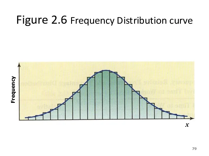
Figure 2.6 Frequency Distribution curve
Frequency
x
Figure 2.6 Frequency Distribution curve
Frequency
x
Example 2-5
The following data give the average travel time from home
Example 2-5
The following data give the average travel time from home
Example 2-5
Construct a frequency distribution table. Calculate the relative frequencies
Example 2-5
Construct a frequency distribution table. Calculate the relative frequencies
Solution 2-5
Solution 2-5
Solution 2-5
Table 2.12 Frequency, Relative Frequency, and Percentage Distributions of Average
Solution 2-5
Table 2.12 Frequency, Relative Frequency, and Percentage Distributions of Average
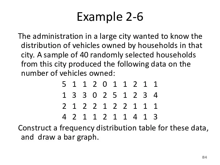
Example 2-6
The administration in a large city wanted to know
Example 2-6
The administration in a large city wanted to know
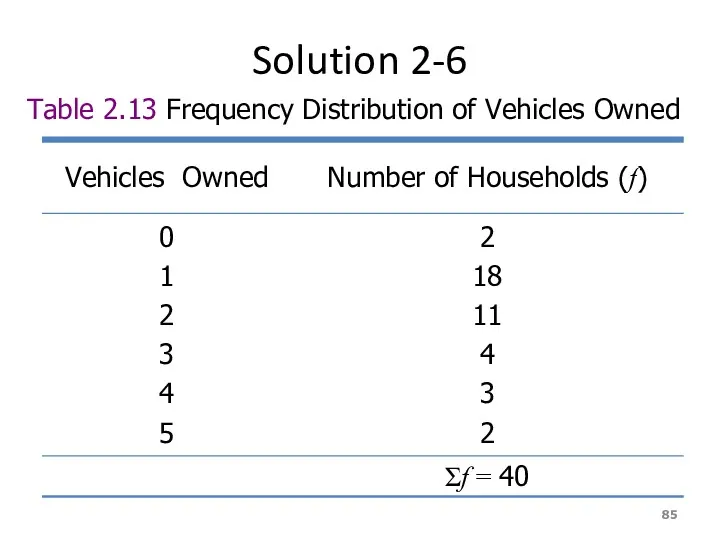
Solution 2-6
Table 2.13 Frequency Distribution of Vehicles Owned
Solution 2-6
Table 2.13 Frequency Distribution of Vehicles Owned
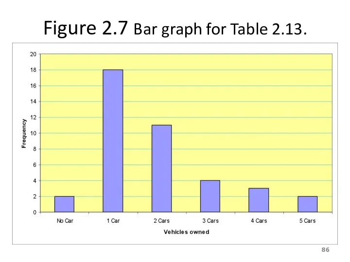
Figure 2.7 Bar graph for Table 2.13.
Figure 2.7 Bar graph for Table 2.13.
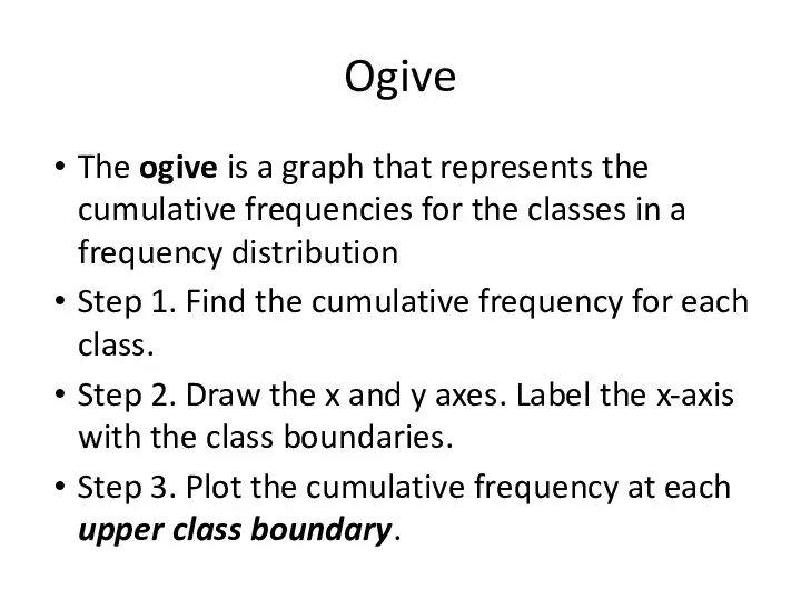
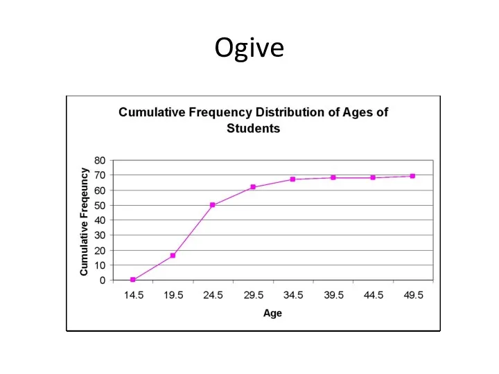
Ogive
The ogive is a graph that represents the cumulative frequencies for
Ogive
The ogive is a graph that represents the cumulative frequencies for
Ogive
Ogive
 Кібербулінг. Запобігання впливу шкідливої інформації
 Энциклопедия вопросов
 Cookie. Лекция 3
 WEB - программирование. Передача данных на сервер
 Выполнении вызова F(11)
 Классификация информационных систем
 Работа с аудиоредактором звуковых файлов Audacity
 Условия профессиональной деятельности журналиста. Должное и реальное в журналистике
 Cloud Service Models
 Дворец в Worde
 Сущность администрирования. Лекция 4.1
 Редактирование инструментами 3D-графики
 Внешняя, долговременная память
 Hashtag my day. User story
 Базовые понятия в программировании
 Форми побудови умов. Складні умови. Взаємодія персонажів та сцени у Scratch
 Архитектура ЭВМ. Компьютерная организация
 Всемирная паутина. Файловые архивы
 Основы JS. (Тема 7)
 Устройство персонального компьютера
 Поняття моделі. Типи моделей
 СУБД. Назначение и функции
 Информатика. Историческое введение в предмет
 Назначение и классификация программных средств обработки информации
 Алгоритмы в нашей жизни
 Погодный бот
 Вводный урок по теме Создание и использование текстового редактора
 27 февраля 2015 года. Городской конкурс Учитель года. 8 класс. Программирование линейных алгоритмов Задачи урока: Тип урока: Методы и технологии: План урока (хронометраж - 30 минут)