used as part of a program or platform name but must adhere to the following guidelines:
Follow this style guide in use of colors and fonts.
“GGV” must always be in bold, all caps with the rest of the program name in non-bold, lowercase and immediately following the “GGV” letters with no spaces in English and Chinese. “GGV” should not be italicized or slanted. This ensures that “GGV” is emphasized in all materials. For example: GGVconnect.
The program name must be consistently applied and should not appear in different formats or typefaces.
GGVxxx may not be part of an image.
GGVxxx is not a replacement for the GGV logo.
The wordmark (logo) must appear within the same screen view as a GGVxxx program name.
NAMING WITH “GGV”

 Как увеличить выручку на 30% с помощью персонализации интернет-магазина
 Программа маркетинга в ресторане Арм Премьер
 Страховая Компания ООО Селекта
 Экспертиза и оценка качества лакокрасочных материалов, реализуемых в розничной торговой сети
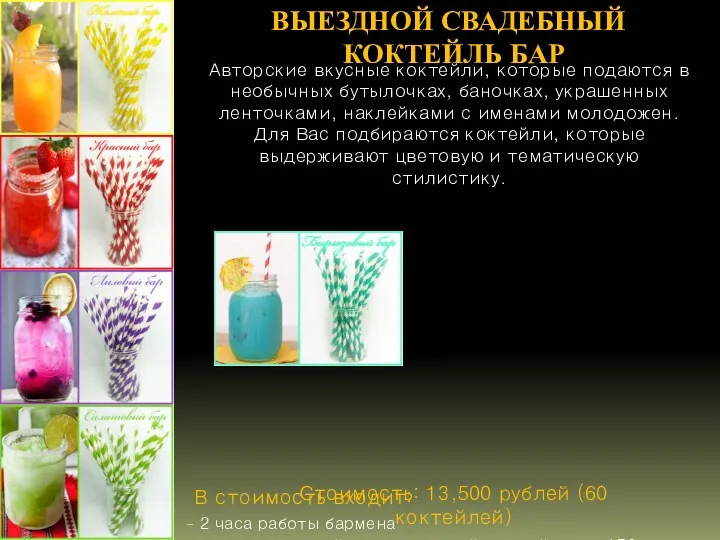 Выездной свадебный коктейль бар
 Новинки декоративной косметики
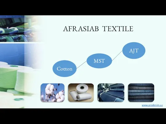 Afrasiab textile eng for yarn
 Перманентный краситель CRIOXIDIL
 Примеры из Истории рекламы и СО
 Spa tex. Удовольствие от сна
 Сравнение матрасов Аскона и Орматек
 Коммерческое предложение для компании Lonsdale London
 Маркетинг взаимоотношений: цели, задачи, содержание
 Маркетинг Riches Company
 Aruna кофе. Оборот продаж кофе
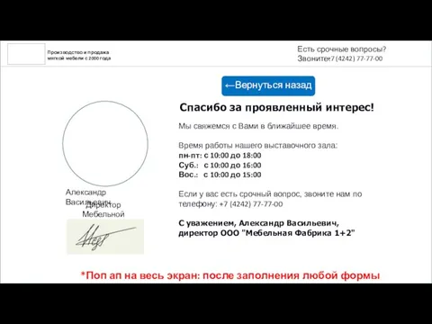 Производство и продажа мягкой мебели с 2000 года
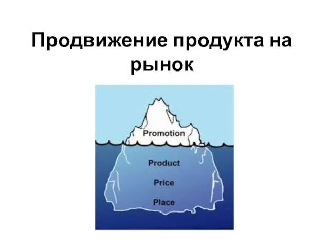 Продвижение продукта на рынок
 Маркетинг в управлении качеством
 Введение в маркетинг
 Основные виды реструктуризации предприятий. Особенности реструктуризации в РФ
 Курьерская служба ДэлС выполняет доставку документов, грузов и товаров из интернет магазинов в любую точку мира
 Уход за окрашенными волосами на примере фирмы Londa Proffesional и Kerastase
 Дома SIP под ключ
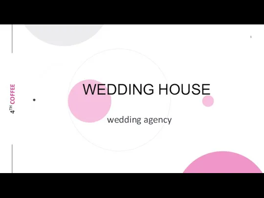 Свадебное агенство Wedding House
 Описание страховых продуктов АО ОТП Банк
 Сегментирование и позиционирование рынка
 Страховой рынок РФ как объект маркетинговых исследований: история развития и современное состояние российского страхового рынка
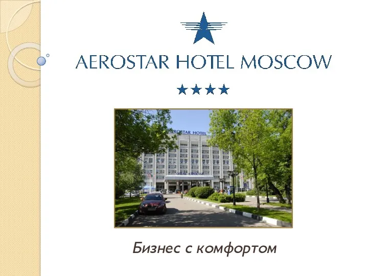 Гостиница Аэростар