- Techniques in Print & Billboard Advertising

Содержание
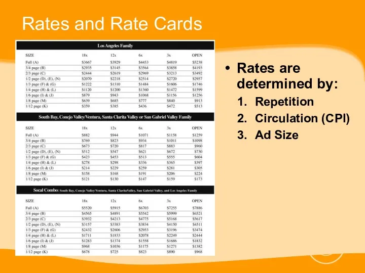
- 2. Rates and Rate Cards Rates are determined by: Repetition Circulation (CPI) Ad Size
- 3. Basic Elements of a Print Ad Visual Focus (Photo) Headline Body Copy Logo
- 4. Introduction Effective ad design and layout starts with a clear understanding of a project’s goals and
- 5. Basic Design Strategies Keep your layouts simple E.g. Large picture at the top, headline underneath, body
- 6. Headline Body Content or Photo Company Logo Asymmetrical
- 7. Basic Design Strategies Create Unity Have one central focus or focal point where the eye has
- 8. Symmetrical
- 10. Basic Design Strategies Create Contrast Using contrasting sizes, shapes, lines, typestyles and figures draw attention to
- 11. Basic Design Strategies Create Emphasis through Proportion Important ideas or figures should be emphasized by making
- 12. Advanced Design Strategies Make an easy path for the eye to follow Make effective use of
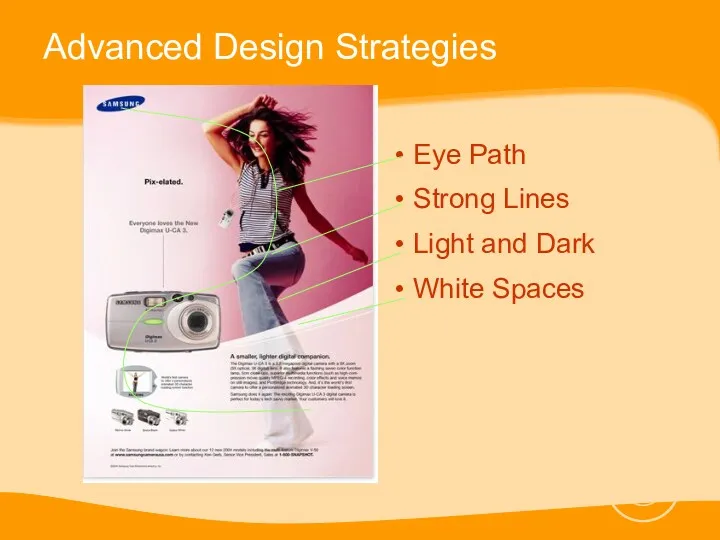
- 13. Advanced Design Strategies Eye Path Strong Lines Light and Dark White Spaces
- 14. Advanced Design Strategies Use variety to spice up your ads Visual boredom occurs when predictability and
- 15. Basic Design Strategies The golden rectangle is a visually balanced geometric shape with the primary ratio
- 16. Basic Design Strategies
- 17. Visual Flow according to the golden rectangle Focal Point
- 18. Grouping Design Strategies Group by using similar shapes, sizes, textures and colors Break up long lists
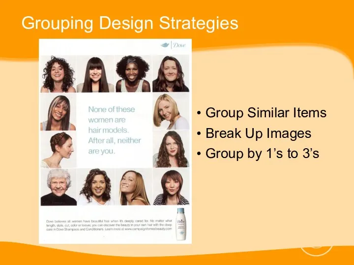
- 19. Grouping Design Strategies Group Similar Items Break Up Images Group by 1’s to 3’s
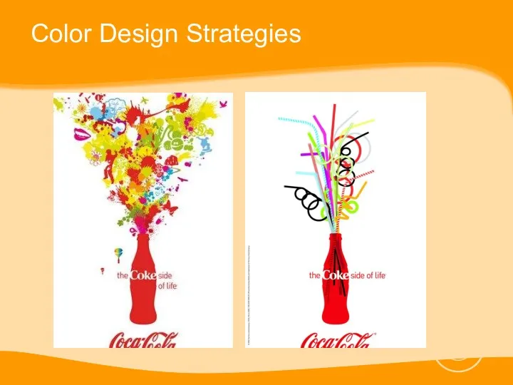
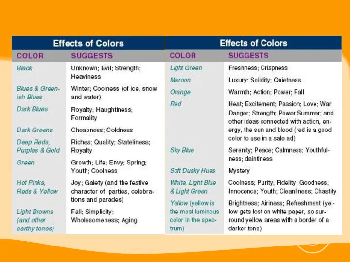
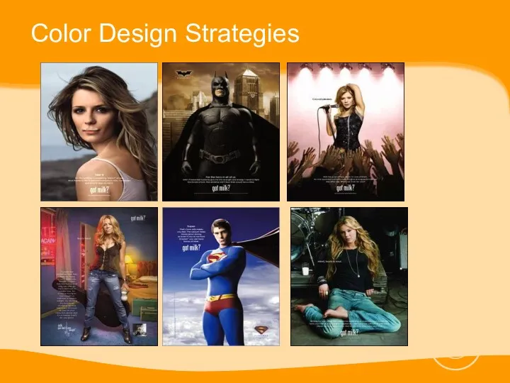
- 20. Color Design Strategies Black and white is boring. Color is EXCITING. Excessive color detracts from copy
- 21. Color Design Strategies
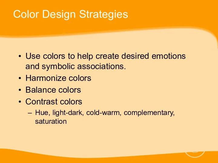
- 22. Color Design Strategies Use colors to help create desired emotions and symbolic associations. Harmonize colors Balance
- 24. Color Design Strategies
- 25. Photo Design Strategies Photo design and layout strategies center on two ideas: Make the mind group
- 26. Photo Design Strategies
- 27. Photo Design Strategies Visual Flow Color Groups and Selective Focus
- 28. Photo Design Strategies Before taking a shot decide on: The best shape and proportion for your
- 29. Photo Design Strategies Cling to one idea Use the rule of thirds when taking a photograph
- 30. Photo Design Strategies
- 31. Photo Design Strategies Choose the right background color Gray is the best all-around background for color
- 32. Photo Design Strategies This ad has a simple composition with a black background and high contrast
- 33. Photo Design Strategies Use visual stepping stones to draw attention to the inner details of the
- 34. Photo Design Strategies
- 35. Photo Design Strategies Include people in photos of products Give people in photos looking space Look
- 36. Photo Design Strategies
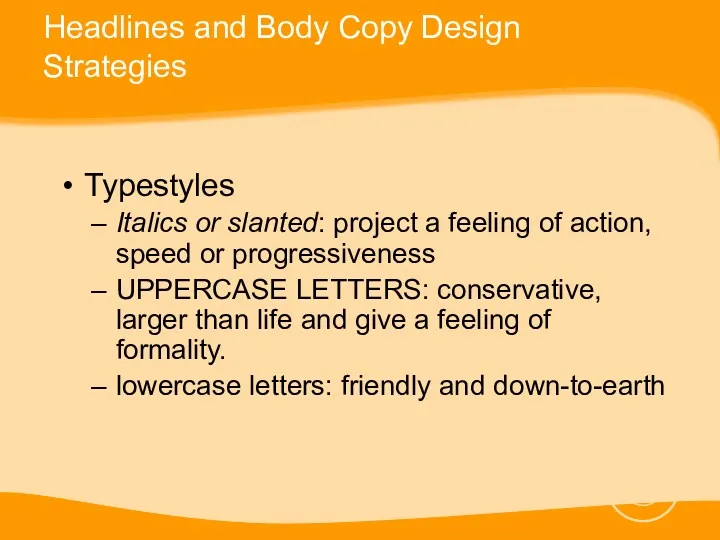
- 37. Headlines and Body Copy Design Strategies Readability comes first, Style or visual appeal second Use the
- 38. Headlines and Body Copy Design Strategies Typestyles Italics or slanted: project a feeling of action, speed
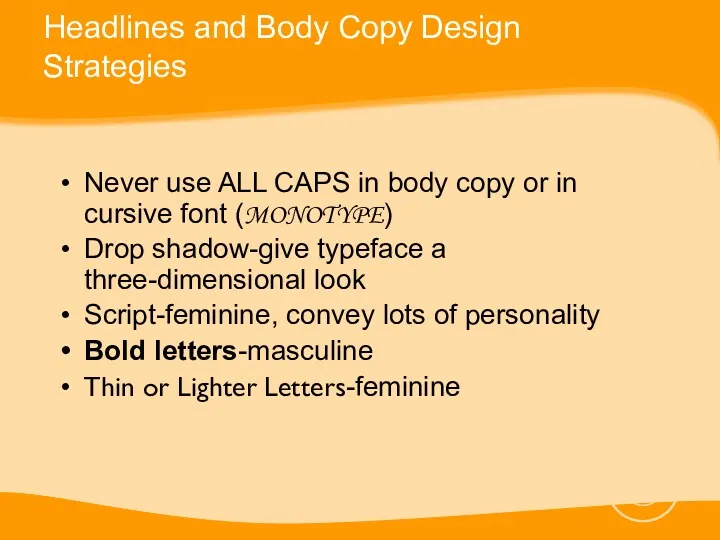
- 39. Headlines and Body Copy Design Strategies Never use ALL CAPS in body copy or in cursive
- 40. Headlines and Body Copy Design Strategies Use the type size appropriate to the content of the
- 41. Headlines and Body Copy Design Strategies Use clear readable typeface for body copy Body copy type
- 42. Use graphic accents to emphasize key phrases UNDERLINE CAPITAL, indented paragraphs, bold, italic, colored, arrows?, yellow
- 43. Reminders Don’t make your ad look too much like everybody else’s ad Place your logo at
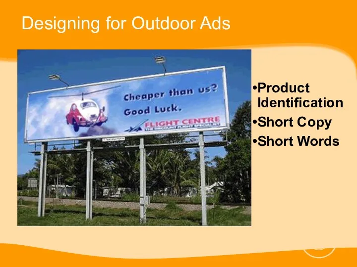
- 44. Designing for Outdoor Ads Product Identification Is the product clearly visible? Short Copy Is the basic
- 45. Designing for Outdoor Ads Product Identification Short Copy Short Words
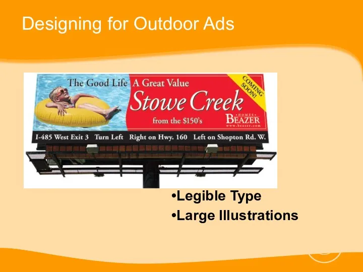
- 46. Designing for Outdoor Ads Legible Type Is the copy legible while moving? Large Illustrations Do the
- 47. Designing for Outdoor Ads Legible Type Large Illustrations
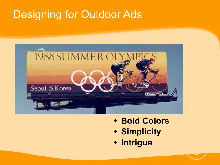
- 48. Designing for Outdoor Ads Bold Colors Do the colors have impact and complement each other? Use
- 49. Designing for Outdoor Ads Bold Colors Simplicity Intrigue
- 50. Guidelines for Legibility Color
- 51. Guidelines for Legibility Typestyle Upper and lower case type is easier to read than all capitals
- 52. Guidelines for Legibility Typestyle Too little spacing between letters makes them merge together
- 53. Guidelines for Legibility Typestyle At long distance, very heavy letters become blobs, and very thin letters
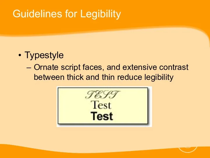
- 54. Guidelines for Legibility Typestyle Ornate script faces, and extensive contrast between thick and thin reduce legibility
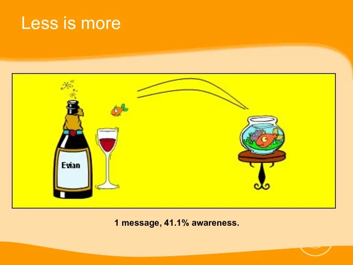
- 55. Less is more
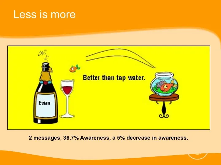
- 56. Less is more
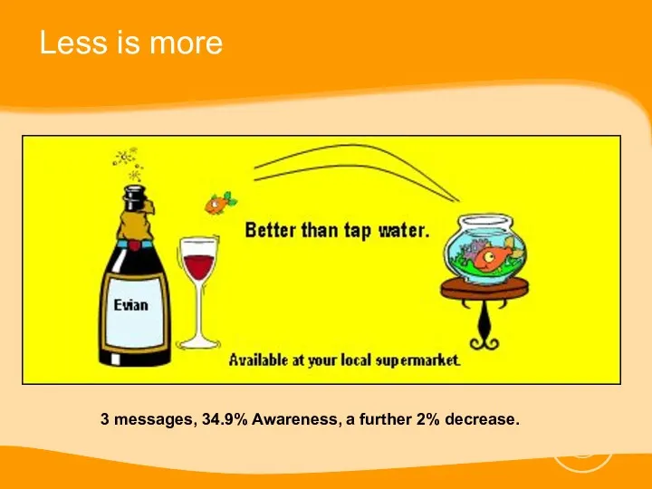
- 57. Less is more
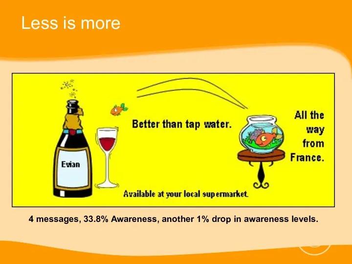
- 58. Less is more
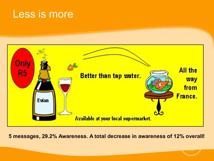
- 59. Less is more
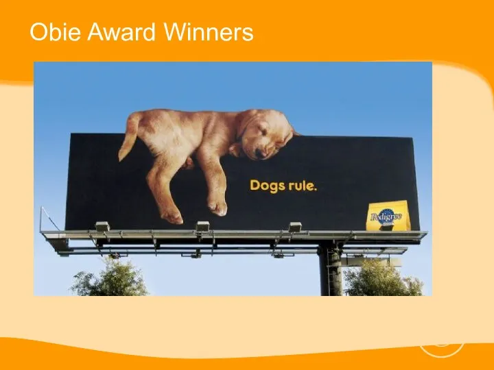
- 60. Obie Award Winners
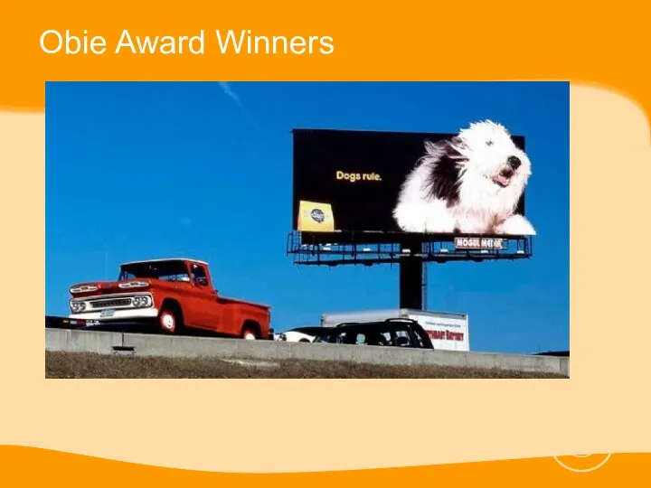
- 61. Obie Award Winners
- 63. Скачать презентацию
Rates and Rate Cards
Rates are determined by:
Repetition
Circulation (CPI)
Ad Size
Rates and Rate Cards
Rates are determined by:
Repetition
Circulation (CPI)
Ad Size
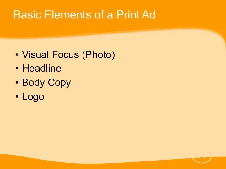
Basic Elements of a Print Ad
Visual Focus (Photo)
Headline
Body Copy
Logo
Basic Elements of a Print Ad
Visual Focus (Photo)
Headline
Body Copy
Logo
Introduction
Effective ad design and layout starts with a clear understanding of
Introduction
Effective ad design and layout starts with a clear understanding of
Basic Design Strategies
Keep your layouts simple
E.g. Large picture at the
Basic Design Strategies
Keep your layouts simple
E.g. Large picture at the
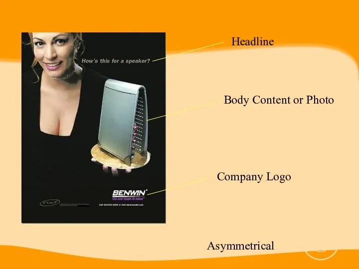
Headline
Body Content or Photo
Company Logo
Asymmetrical
Headline
Body Content or Photo
Company Logo
Asymmetrical
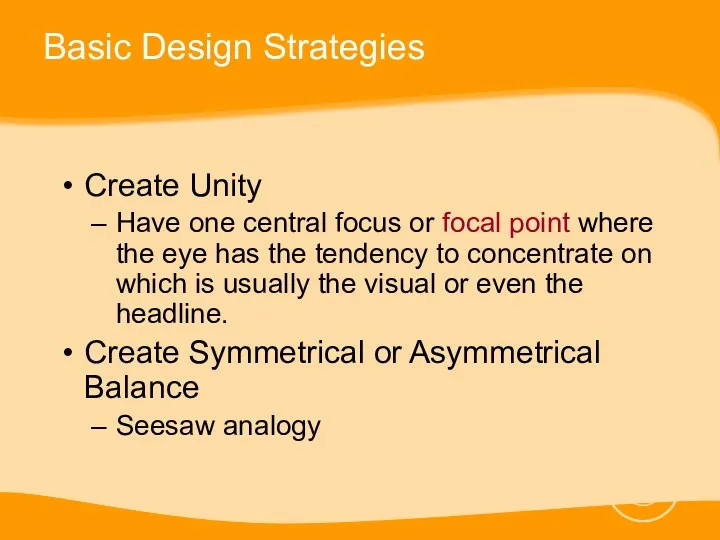
Basic Design Strategies
Create Unity
Have one central focus or focal point where
Basic Design Strategies
Create Unity
Have one central focus or focal point where
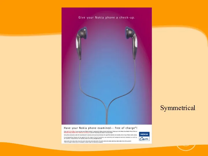
Symmetrical
Symmetrical
Basic Design Strategies
Create Contrast
Using contrasting sizes, shapes, lines, typestyles and figures
Basic Design Strategies
Create Contrast
Using contrasting sizes, shapes, lines, typestyles and figures
Basic Design Strategies
Create Emphasis through Proportion
Important ideas or figures should be
Basic Design Strategies
Create Emphasis through Proportion
Important ideas or figures should be
Advanced Design Strategies
Make an easy path for the eye to follow
Make
Advanced Design Strategies
Make an easy path for the eye to follow
Make
Advanced Design Strategies
Eye Path
Strong Lines
Light and Dark
White
Advanced Design Strategies
Eye Path
Strong Lines
Light and Dark
White
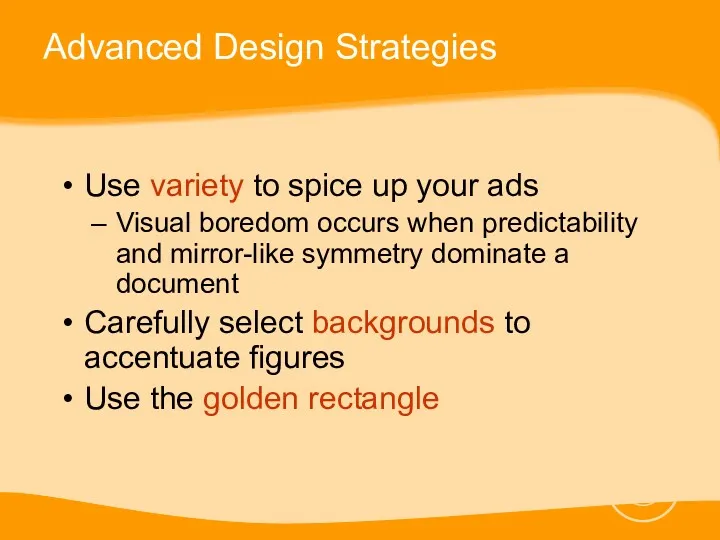
Advanced Design Strategies
Use variety to spice up your ads
Visual boredom occurs
Advanced Design Strategies
Use variety to spice up your ads
Visual boredom occurs
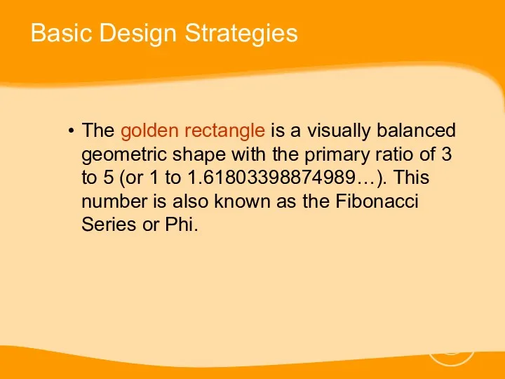
Basic Design Strategies
The golden rectangle is a visually balanced geometric shape
Basic Design Strategies
The golden rectangle is a visually balanced geometric shape
Basic Design Strategies
Basic Design Strategies
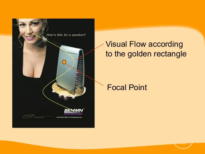
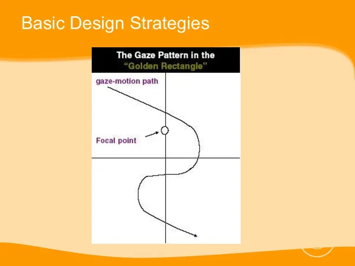
Visual Flow according to the golden rectangle
Focal Point
Visual Flow according to the golden rectangle
Focal Point
Grouping Design Strategies
Group by using similar shapes, sizes, textures and colors
Break
Grouping Design Strategies
Group by using similar shapes, sizes, textures and colors
Break
Grouping Design Strategies
Group Similar Items
Break Up Images
Group by
Grouping Design Strategies
Group Similar Items
Break Up Images
Group by
Color Design Strategies
Black and white is boring. Color is EXCITING.
Excessive color
Color Design Strategies
Black and white is boring. Color is EXCITING.
Excessive color
Color Design Strategies
Color Design Strategies
Color Design Strategies
Use colors to help create desired emotions and symbolic
Color Design Strategies
Use colors to help create desired emotions and symbolic
Color Design Strategies
Color Design Strategies
Photo Design Strategies
Photo design and layout strategies center on two ideas:
Make
Photo Design Strategies
Photo design and layout strategies center on two ideas:
Make
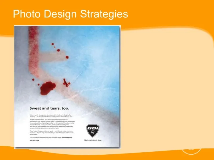
Photo Design Strategies
Photo Design Strategies
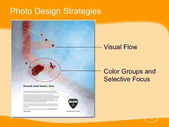
Photo Design Strategies
Visual Flow
Color Groups and Selective Focus
Photo Design Strategies
Visual Flow
Color Groups and Selective Focus
Photo Design Strategies
Before taking a shot decide on:
The best shape and
Photo Design Strategies
Before taking a shot decide on:
The best shape and
Photo Design Strategies
Cling to one idea
Use the rule of thirds when
Photo Design Strategies
Cling to one idea
Use the rule of thirds when
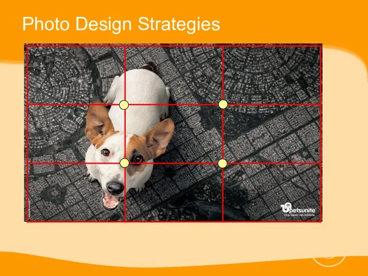
Photo Design Strategies
Photo Design Strategies
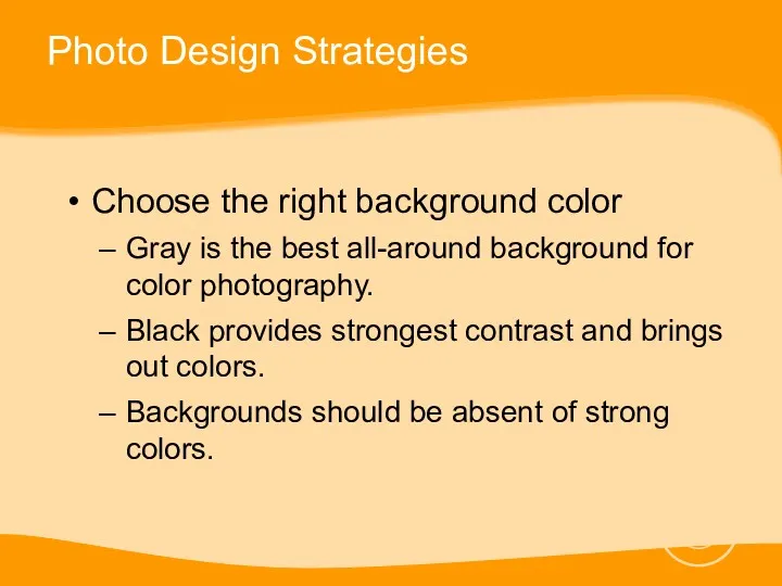
Photo Design Strategies
Choose the right background color
Gray is the best all-around
Photo Design Strategies
Choose the right background color
Gray is the best all-around
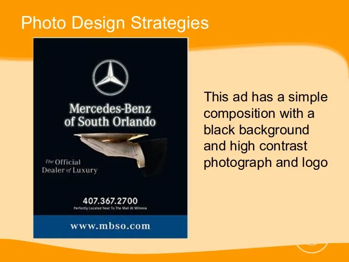
Photo Design Strategies
This ad has a simple composition with a black
Photo Design Strategies
This ad has a simple composition with a black
Photo Design Strategies
Use visual stepping stones to draw attention to the
Photo Design Strategies
Use visual stepping stones to draw attention to the
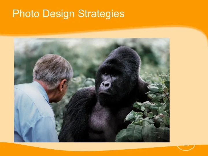
Photo Design Strategies
Photo Design Strategies
Photo Design Strategies
Include people in photos of products
Give people in photos
Photo Design Strategies
Include people in photos of products
Give people in photos
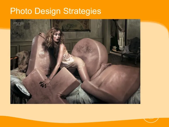
Photo Design Strategies
Photo Design Strategies
Headlines and Body Copy Design Strategies
Readability comes first, Style or visual
Headlines and Body Copy Design Strategies
Readability comes first, Style or visual
Headlines and Body Copy Design Strategies
Typestyles
Italics or slanted: project a feeling
Headlines and Body Copy Design Strategies
Typestyles
Italics or slanted: project a feeling
Headlines and Body Copy Design Strategies
Never use ALL CAPS in body
Headlines and Body Copy Design Strategies
Never use ALL CAPS in body
Headlines and Body Copy Design Strategies
Use the type size appropriate to
Headlines and Body Copy Design Strategies
Use the type size appropriate to
Headlines and Body Copy Design Strategies
Use clear readable typeface for body
Headlines and Body Copy Design Strategies
Use clear readable typeface for body
Use graphic accents to emphasize key phrases
UNDERLINE CAPITAL, indented paragraphs, bold,
Use graphic accents to emphasize key phrases
UNDERLINE CAPITAL, indented paragraphs, bold,
Reminders
Don’t make your ad look too much like everybody else’s ad
Place
Reminders
Don’t make your ad look too much like everybody else’s ad
Place
Designing for Outdoor Ads
Product Identification Is the product clearly visible?
Short Copy
Designing for Outdoor Ads
Product Identification Is the product clearly visible?
Short Copy
Designing for Outdoor Ads
Product Identification
Short Copy
Short Words
Designing for Outdoor Ads
Product Identification
Short Copy
Short Words
Designing for Outdoor Ads
Legible Type Is the copy legible while moving?
Large
Designing for Outdoor Ads
Legible Type Is the copy legible while moving?
Large
Designing for Outdoor Ads
Legible Type
Large Illustrations
Designing for Outdoor Ads
Legible Type
Large Illustrations
Designing for Outdoor Ads
Bold Colors Do the colors have impact and
Designing for Outdoor Ads
Bold Colors Do the colors have impact and
Designing for Outdoor Ads
Bold Colors
Simplicity
Intrigue
Designing for Outdoor Ads
Bold Colors
Simplicity
Intrigue
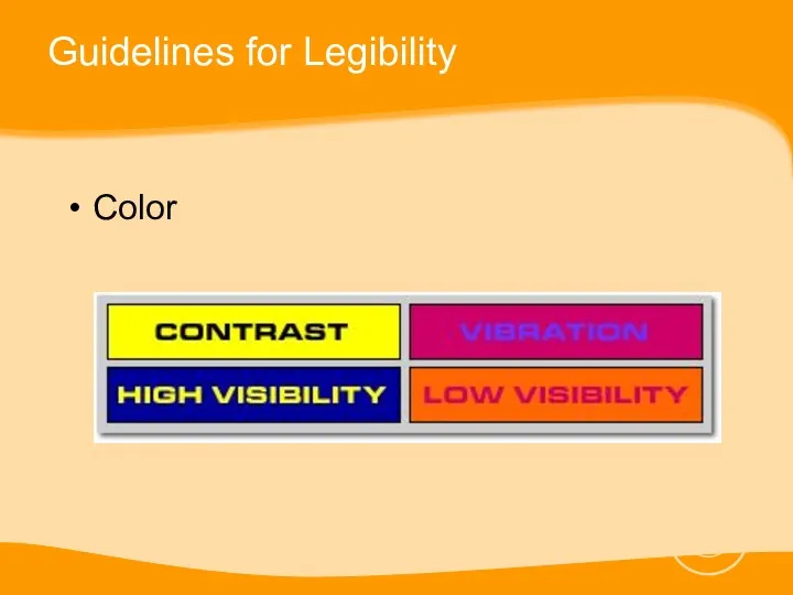
Guidelines for Legibility
Color
Guidelines for Legibility
Color
Guidelines for Legibility
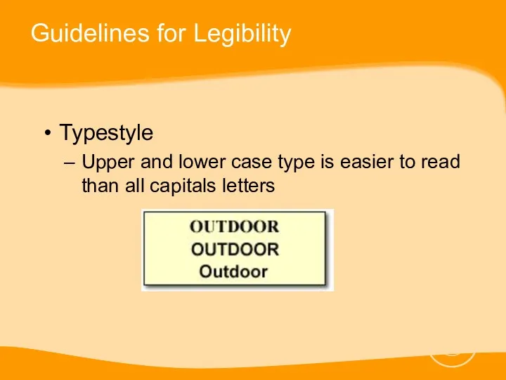
Typestyle
Upper and lower case type is easier to read
Guidelines for Legibility
Typestyle
Upper and lower case type is easier to read
Guidelines for Legibility
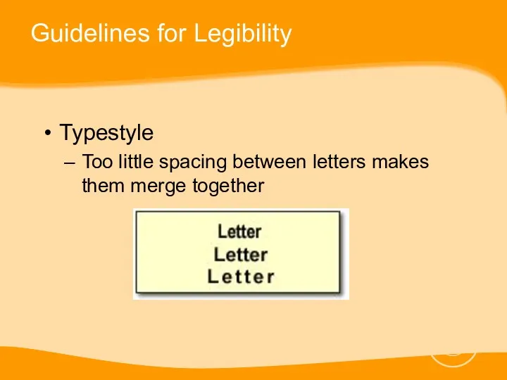
Typestyle
Too little spacing between letters makes them merge together
Guidelines for Legibility
Typestyle
Too little spacing between letters makes them merge together
Guidelines for Legibility
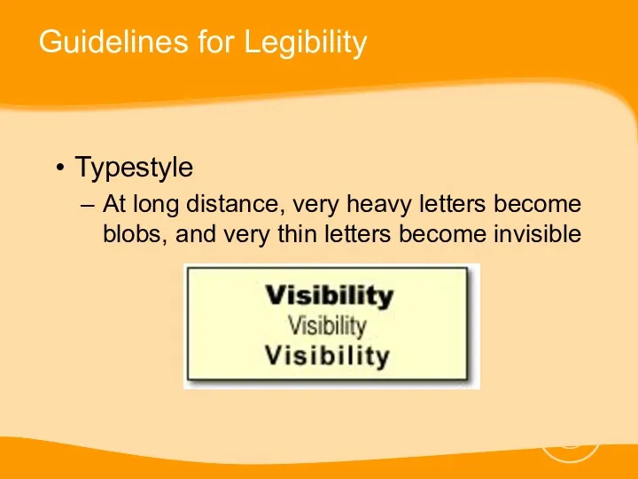
Typestyle
At long distance, very heavy letters become blobs, and
Guidelines for Legibility
Typestyle
At long distance, very heavy letters become blobs, and
Guidelines for Legibility
Typestyle
Ornate script faces, and extensive contrast between thick and
Guidelines for Legibility
Typestyle
Ornate script faces, and extensive contrast between thick and
Less is more
Less is more
Less is more
Less is more
Less is more
Less is more
Less is more
Less is more
Less is more
Less is more
Obie Award Winners
Obie Award Winners
Obie Award Winners
Obie Award Winners
 ООО Виктория Эксклюзивные украшения. Ручная работа
 Участие в торгах на онлайн-площадках
 Аналитика рекламной кампании Спортивные товары
 Marketing w restauracji
 Московская область, Варшавское шоссе, Восточное бутово. Управление коммерческой недвижимости
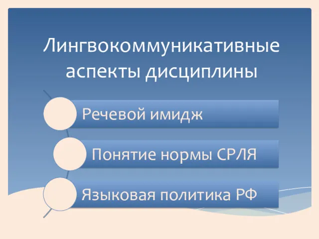 Лингвокоммуникативные аспекты дисциплины
 Сеть магазинов самообслуживания, специализирующихся на розничной торговле ООО Темп
 Тариф Избранный. Предложение по заправке автотранспорта с использованием топливной карты Вездеход Online
 EGV – Series Vertical ID/OD Grinder
 Аминокислотное выпрямление и восстановление волос VIVIANE ARAUJO
 Азбука эффективных продаж
 Просування в соціальних мережах Vkontakte та Facebook
 Реклама на Яндекс.Картах. Коммерческое предложение
 Выкладка хлебобулочных изделий. Витрина хлебобулочного отдела сельского магазина потребительской кооперации
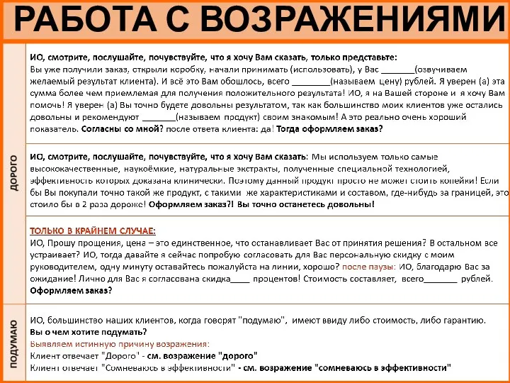 Работа с возражениями
 Денсаулық сақтау жүйесіндегі маркетинг
 Маркетинговый план компании Дана
 Coffee design. Инженерная поэзия. Эксклюзивные игры для интерьера и объектов архитектуры. Живое общение
 Ресторан Високий Замок
 Управление бизнес-проектами
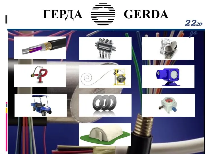 Проектно-инжиниринговая компания Герда
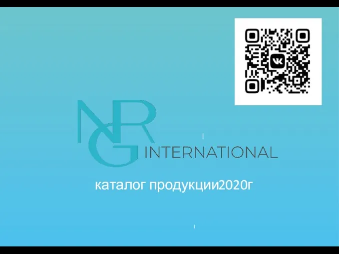 NRG international. Каталог продукции
 Национален празник „Сабантуй“
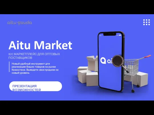 Aitu Market
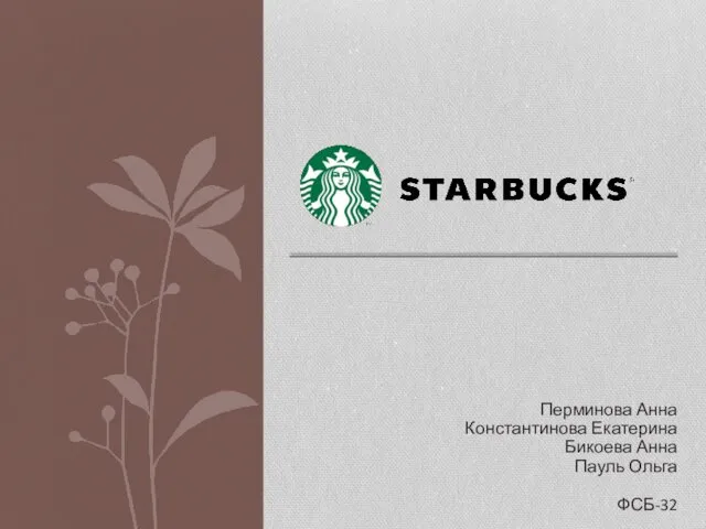 Кофейная компания Starbucks
 Прототип сайта
 Препараты респираторной группы компании Бионорика СЕ, Германия
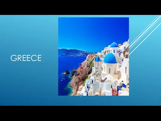 Greece. Swot analysis