- How to describe a bar chart

Содержание
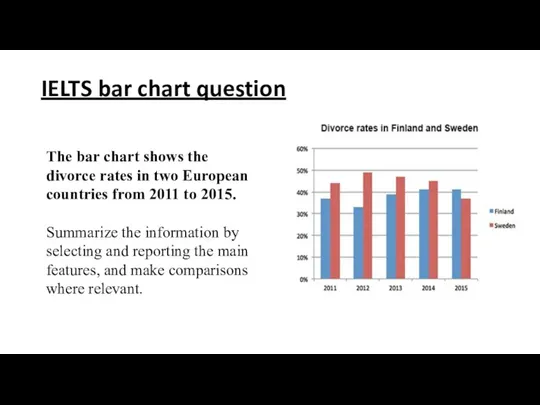
- 2. IELTS bar chart question The bar chart shows the divorce rates in two European countries from
- 3. IELTS Band 9 Answer Structure
- 4. IELTS bar chart answering strategy: 1. Introduction The first paragraph you write is an introduction. The
- 5. 2. General Overview The second paragraph of your answer is a general overview, where you briefly
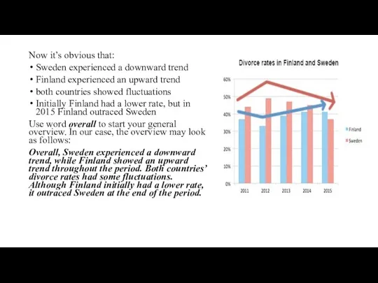
- 6. Now it’s obvious that: Sweden experienced a downward trend Finland experienced an upward trend both countries
- 7. Now include the information you've gathered from the chart into your overview. Always start your general
- 8. 3. Specific details After we’ve written the introduction and general overview, it’s time to give the
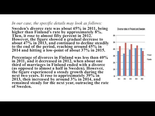
- 9. In our case, the specific details may look as follows: Sweden’s divorce rate was about 45%
- 11. Скачать презентацию
IELTS bar chart question
The bar chart shows the divorce rates in
IELTS bar chart question
The bar chart shows the divorce rates in
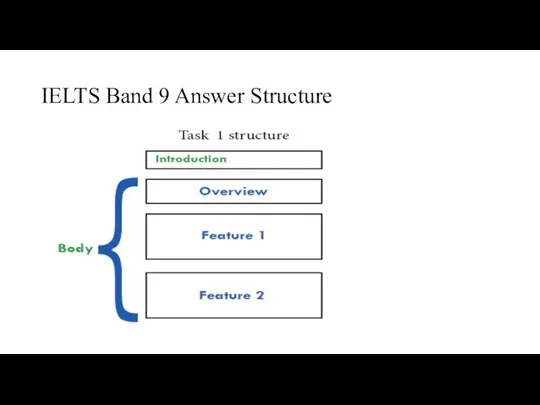
IELTS Band 9 Answer Structure
IELTS Band 9 Answer Structure
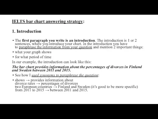
IELTS bar chart answering strategy:
1. Introduction
The first paragraph you write is an
IELTS bar chart answering strategy:
1. Introduction
The first paragraph you write is an
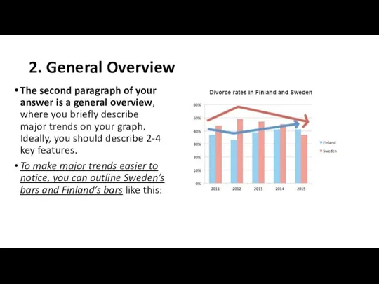
2. General Overview
The second paragraph of your answer is a general
2. General Overview
The second paragraph of your answer is a general
Now it’s obvious that:
Sweden experienced a downward trend
Finland experienced an upward
Now it’s obvious that:
Sweden experienced a downward trend
Finland experienced an upward
Now include the information you've gathered from the chart into your
Now include the information you've gathered from the chart into your
3. Specific details
After we’ve written the introduction and general overview, it’s
3. Specific details
After we’ve written the introduction and general overview, it’s
In our case, the specific details may look as follows:
Sweden’s divorce
In our case, the specific details may look as follows:
Sweden’s divorce
 Оперативная урология. Введение
 Технология определения хим.свойств мочи
 Травматический шок
 Несахарный диабет
 Дәріханада шешім қабылдау үшін қажет ділелдемелер. Дәлелді медицинаны фармацияда қолдану алғышарттары
 Ведение пациента с фибрилляцией предсердий в амбулаторных условиях
 Российская компания Эдас. Производство гомеопатических препаратов
 Анемии. Классификация анемий
 Антигипертензивная терапия при тяжелой гипертензии у беременных
 Физикальные и лабораторно-инструментальные методы исследования пищеварительной и мочевыделительной систем. Лекция №5
 Кисломолочные продукты
 Вплив наушників на слух людини
 Роль пациентской организации в повышении качества жизни больных с хроническими заболеваниями почек
 Оперативный доступ к шее при флегмонах и абсцессах
 Констрацептивтік заттарды босанудан кейінгі таңдау ерекшеліктері
 Современные требования к назначению, оформлению рецептов, требований на ЛП и МИ и их отпуску из аптечных организаций
 Допомога при фатальних пароксизмальних аритміях та брадиаритміях на госпітальному етапі
 Анализ мировых тенденций в применении инновационных технологий медико-биологического, психологического сопровождения спортсменов
 Іріңді паротит. Мастит. Парапроктит, лимфангаит, лимфаденит, тромбофлебит
 Послеродовые гнойно-септические заболевания
 Роль сестринского персонала в реабилитации пациентов с заболеванием остеоартроз
 Ветряная оспа
 Рак желудка. Эпидемиология рака желудка
 Ақшқ аурулары бар балаларды диагностикалау әдістері
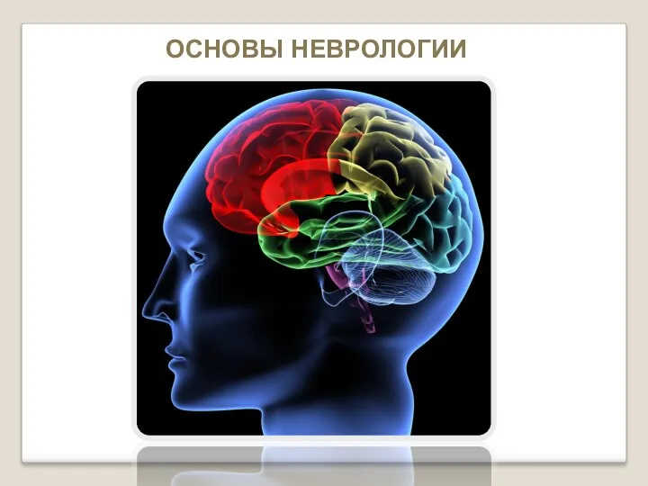 Основы неврологии
 Эндокард фиброэластозы. Абрамов-Фидлер идиопатиялық оқшауланған қатерлі миокардит. Жалпы сипатттамасы
 Доброкачественные опухоли желудка
 Профилактика инфекционных болезней