- diagram description

Содержание
- 2. NEVER USE/DO Personal phrases ( I/we can see, You may notice, Do you understand?, If I’m
- 3. ALWAYS DO/USE Paraphrase the topic fully but precisely Elicit the main trend of the diagram Mention
- 4. Paraphrase the topics The bar chart shows the number of overseas students enrolled in a third
- 5. Brainstorm the vocabulary Upward trends Downward trends Going up and down Not changing Big changes Small
- 7. Скачать презентацию
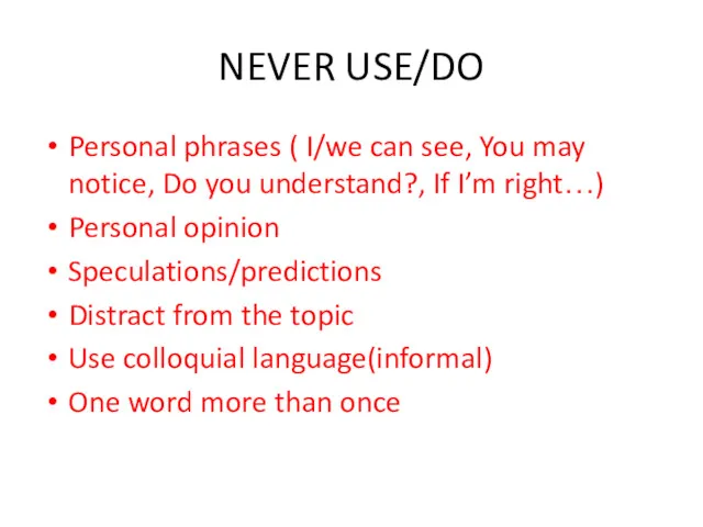
NEVER USE/DO
Personal phrases ( I/we can see, You may notice, Do
NEVER USE/DO
Personal phrases ( I/we can see, You may notice, Do
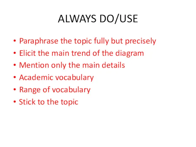
ALWAYS DO/USE
Paraphrase the topic fully but precisely
Elicit the main trend of
ALWAYS DO/USE
Paraphrase the topic fully but precisely
Elicit the main trend of
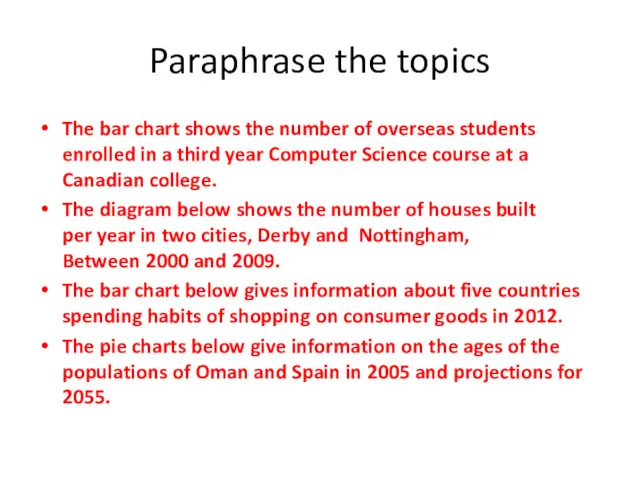
Paraphrase the topics
The bar chart shows the number of overseas students
Paraphrase the topics
The bar chart shows the number of overseas students
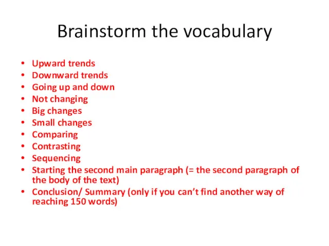
Brainstorm the vocabulary
Upward trends
Downward trends
Going up and down
Not changing
Big changes
Small changes
Comparing
Contrasting
Sequencing
Starting
Brainstorm the vocabulary
Upward trends
Downward trends
Going up and down
Not changing
Big changes
Small changes
Comparing
Contrasting
Sequencing
Starting
 Диаграмма Парето
 Понятие и этапы планирования потребности в персонале
 Маленькие хитрости большого бизнеса (2). Дружелюбное отношение руководства с сотрудниками в Макдональдс
 ВКР: Разработка прототипа информационной системы производственной логистики промышленного предприятия
 Система сбалансированных показателей, ключевые показатели результативности
 Бережливое производство
 Creative heritage of F.W. Taylor and main provisions of Taylorism
 Путевые листы
 Документационное обеспечение управления
 Категорийный менеджмент
 Методы планировнаия на предприятии. (Часть 3)
 Лидер и лидерство
 Подбор. Кто нужен, где и как искать
 Substantiation of the efficient use of land plots situated in the historical center of Saint Petersburg
 Определение деловых коммуникаций
 Екологічна якість продукту та екоконцепція
 Управление качеством продукции
 Транспортная логистика
 Роль менеджера в процессе коммуникаций
 Организация ресторанного бизнеса
 Загальні принципи управління якістю. Теорія Всезагальногоуправління якістю (TQM)
 What would happen if you quit texting for a week?
 Основы управления персоналом
 Развитие деловых качеств менеджера
 Технологическая стандартизация и унификация
 Коучинг - технология повышения эффективности персонала
 Основы изменений в организации
 Философия и концепция управления персоналом