- Reading Graphs

Содержание
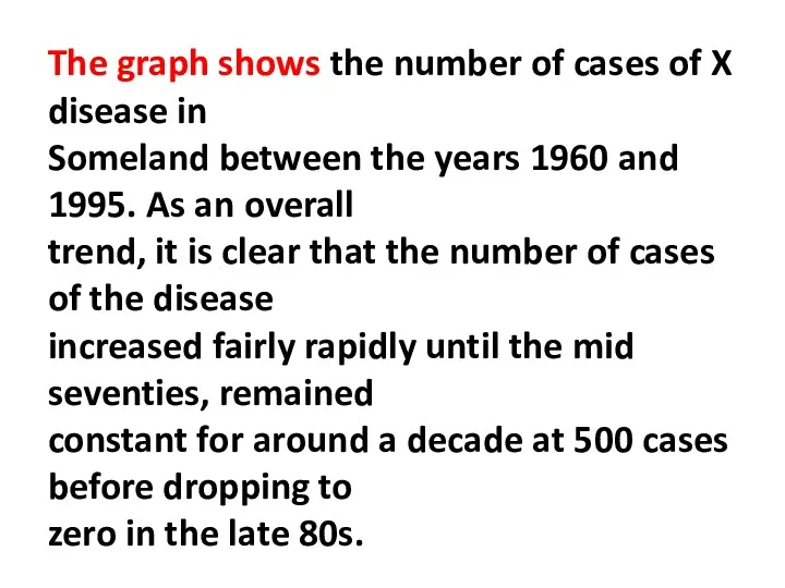
- 2. The graph shows the number of cases of X disease in Someland between the years 1960
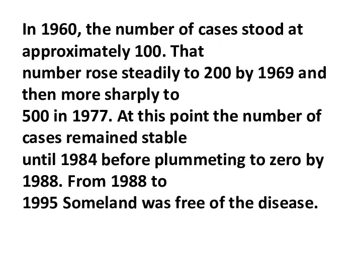
- 3. In 1960, the number of cases stood at approximately 100. That number rose steadily to 200
- 4. In conclusion, the graph shows that the disease was increasingly prevalent until the 1980s when it
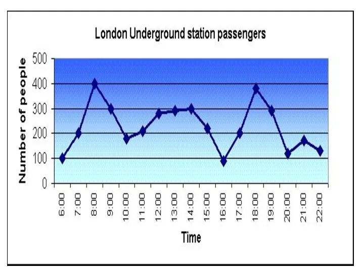
- 6. Underground Station Passenger Numbers The graph shows the fluctuation in the number of people at a
- 7. In the afternoon, numbers decline, with less than 100 using the station at 4 pm. There
- 8. The busiest time of the day is in the morning. There is a sharp increase between
- 9. Overall, the graph shows that the station is most crowded in the early morning and early
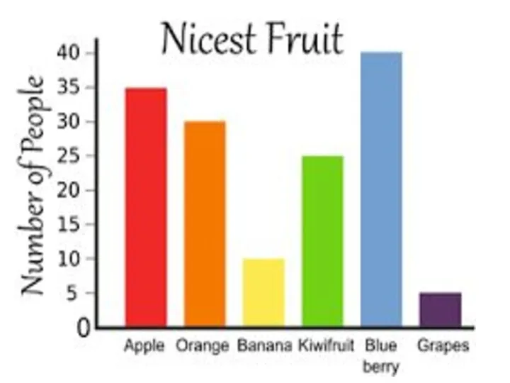
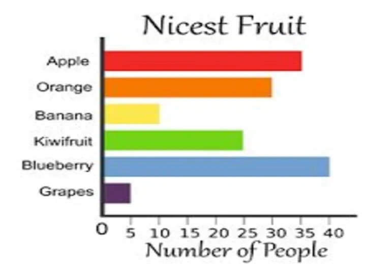
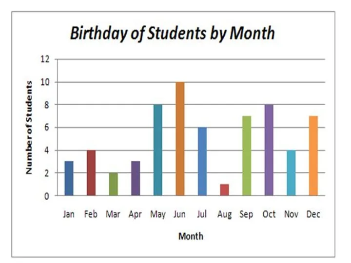
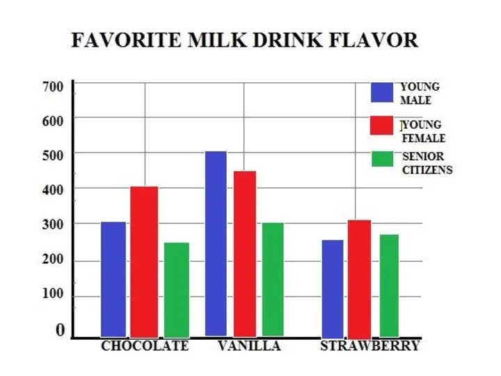
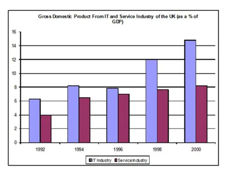
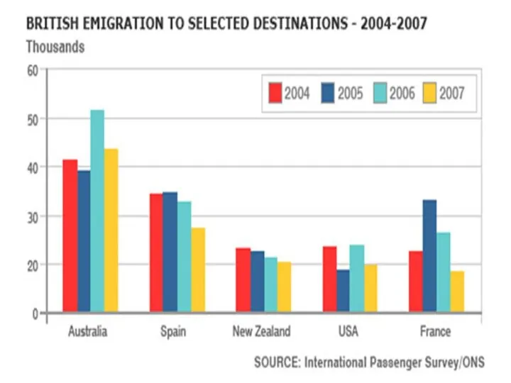
- 12. Bar Graph (Bar Chart) столбчатая диаграмма; гистограмма A bar graph is a chart that uses either
- 13. One axis of the chart shows the specific categories being compared, and the other axis represents
- 14. Language requirements To make comparisons, you need to know the comparatives and superlatives of common adjectives.
- 15. To signal comparison and contrast within a sentence you can use the following conjunctions: as …….
- 16. To signal comparison and contrast between sentences you can use the following words and phrases: Describing
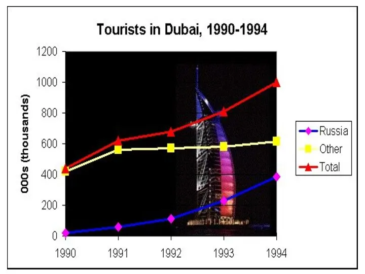
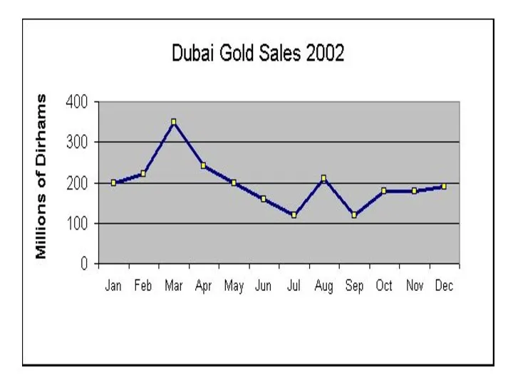
- 17. Read and translate The provided diagram shows data on employment categories in energy producing sectors in
- 18. 3. The chart gives information on expenditures of 4 European countries on six consumer products namely
- 19. 5. The bar graph and the table data depict the water use in different sectors in
- 27. Скачать презентацию
The graph shows the number of cases of X disease in
Someland
The graph shows the number of cases of X disease in
Someland
In 1960, the number of cases stood at approximately 100. That
number
In 1960, the number of cases stood at approximately 100. That
number
In conclusion, the graph shows that the disease was
increasingly prevalent until
In conclusion, the graph shows that the disease was
increasingly prevalent until
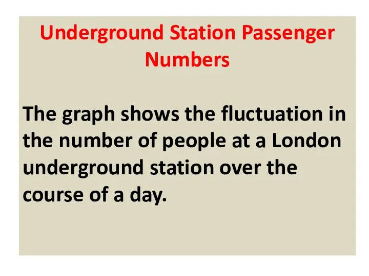
Underground Station Passenger Numbers
The graph shows the fluctuation in the number
Underground Station Passenger Numbers
The graph shows the fluctuation in the number
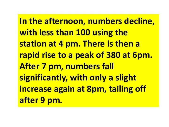
In the afternoon, numbers decline, with less than 100 using the
In the afternoon, numbers decline, with less than 100 using the
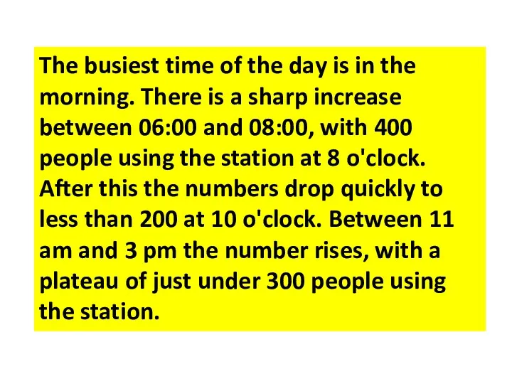
The busiest time of the day is in the morning. There
The busiest time of the day is in the morning. There
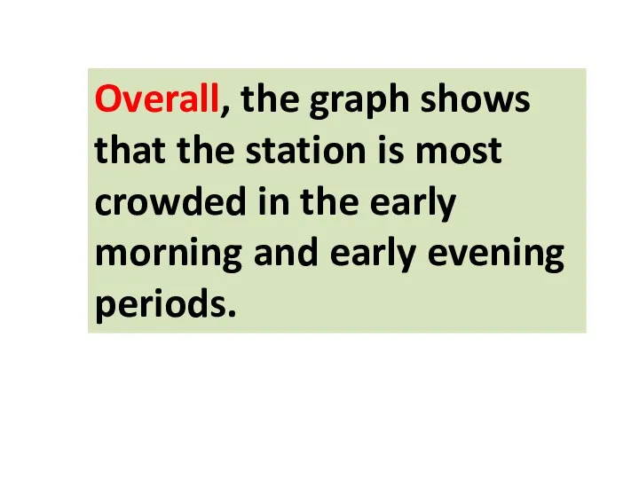
Overall, the graph shows that the station is most crowded in
Overall, the graph shows that the station is most crowded in
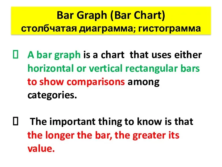
Bar Graph (Bar Chart)
столбчатая диаграмма; гистограмма
A bar graph is a chart
Bar Graph (Bar Chart)
столбчатая диаграмма; гистограмма
A bar graph is a chart
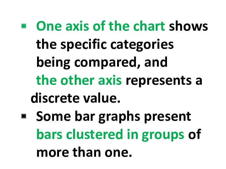
One axis of the chart shows the specific categories being compared,
One axis of the chart shows the specific categories being compared,
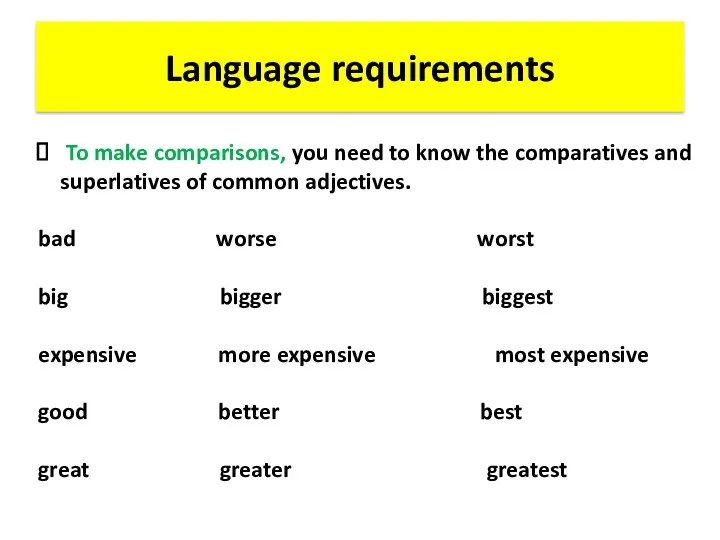
Language requirements
To make comparisons, you need to know the comparatives
Language requirements
To make comparisons, you need to know the comparatives
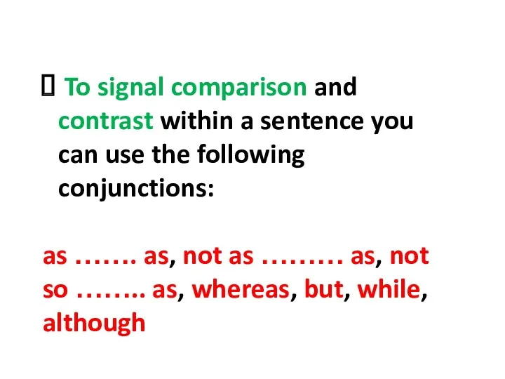
To signal comparison and contrast within a sentence you can
To signal comparison and contrast within a sentence you can
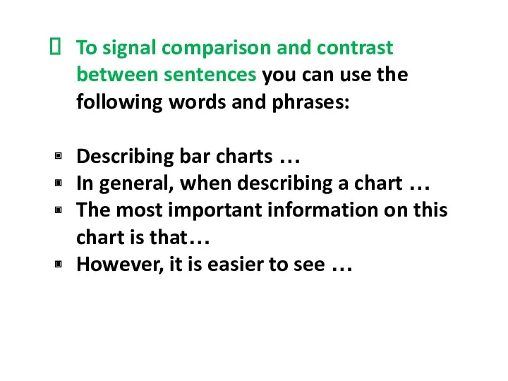
To signal comparison and contrast between sentences you can use the
To signal comparison and contrast between sentences you can use the
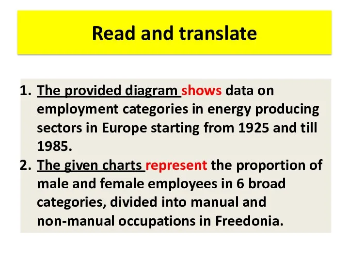
Read and translate
The provided diagram shows data on employment categories in
Read and translate
The provided diagram shows data on employment categories in
3. The chart gives information on expenditures of 4 European countries
3. The chart gives information on expenditures of 4 European countries
5. The bar graph and the table data depict the water
5. The bar graph and the table data depict the water
 Социальные изменения: понятие, сущность и виды
 Халықтық жастық-жыныстық құрылымы
 Моя семья Григорьевы
 Палаточный лагерь Лесные робинзоны
 Социальная реклама
 Структура школьного самоуправления
 Мой папа и мы
 Частный дом Забота для пожилых людей и людей, попавших в трудную жизненную ситуацию
 Общество. Социальные изменения и их формы
 Обществознание. Социальная сфера. 8 класс
 Презентация. Мастерство работника.
 Проблема бездомных домашних животных
 Общие представления о коммуникации
 Природное и общественное в человеке. Мировоззрение
 Моя семья
 Молодежь и электронная активность
 Гендерные проблемы пенсионной системы Республики Молдова
 Социальная стратификация и мобильнолсть
 Чемпионат для людей с инвалидностью Abilympics
 Игры на сплочение первокурсников
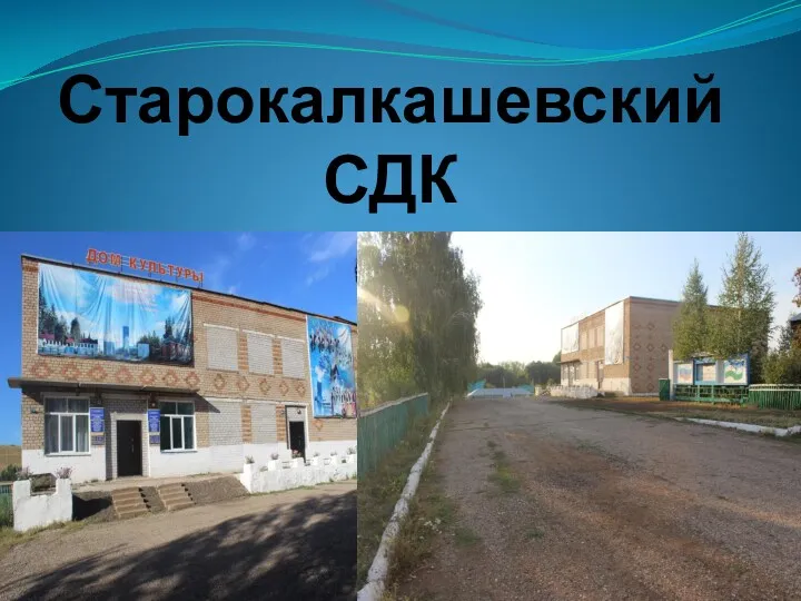 Старокалкашеский селький дом культуры
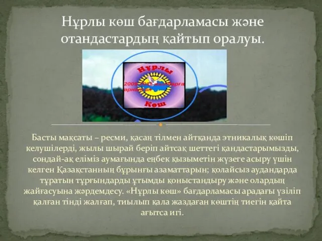 Нұрлы көш бағдарламасы және отандастардың қайтып оралуы
 Образовательный курс для кандидатов в члены экспертного совета Всероссийского конкурса молодежных проектов.Тест
 Я-ребенок! Я-гражданин
 Технологии индивидуальной и групповой социальной работы
 Понятие культуры. Формы и разновидности культуры
 Социальное проектирование как технология реализации ГМП
 Молодежный форум Поделись теплом