- Effectives Presentation Skills

Содержание
- 2. Summary
- 3. Do your best and be successful Conclusion
- 4. Bibliography
- 5. PLAN Making Power Point Slides Speaking skills Funny training
- 6. PURPOSE RELEVANCE If you want: Career opportunities Chief respect Present-day level skills
- 7. 1. Making presentation Slide structure Fonts Colour Background Graphs
- 8. Use 1-2 slides per minute of your presentation Write in point form, not complete sentences Include
- 9. This page contains too many words for a presentation slide. It is not written in point
- 10. At least - 18-point font Secondary points – 24 font Title – 36 font Times New
- 11. If you use a small font, your audience won’t be able to read what you have
- 12. Use a colour of font that contrasts sharply with the background Ex: blue font on white
- 13. Using a font colour that does not contrast with the background colour is hard to read
- 14. Use backgrounds such as this one that are attractive but simple Use backgrounds which are light
- 15. Avoid backgrounds that are distracting or difficult to read from Always be consistent with the background
- 16. Correct Graphs
- 17. Wrong Graphs
- 18. Proof your slides for: speling mistakes the use of of repeated words grammatical errors you might
- 19. 2. Presentation skills
- 20. 3. How many mistakes…
- 22. Скачать презентацию
Summary
Summary
Do your best and be successful
Conclusion
Do your best and be successful
Conclusion
Bibliography
Bibliography
PLAN
Making Power Point Slides
Speaking skills
Funny training
PLAN
Making Power Point Slides
Speaking skills
Funny training
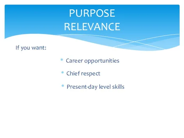
PURPOSE
RELEVANCE
If you want:
Career opportunities
Chief respect
Present-day level skills
PURPOSE
RELEVANCE
If you want:
Career opportunities
Chief respect
Present-day level skills
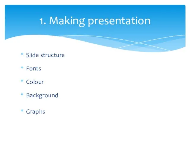
1. Making presentation
Slide structure
Fonts
Colour
Background
Graphs
1. Making presentation
Slide structure
Fonts
Colour
Background
Graphs
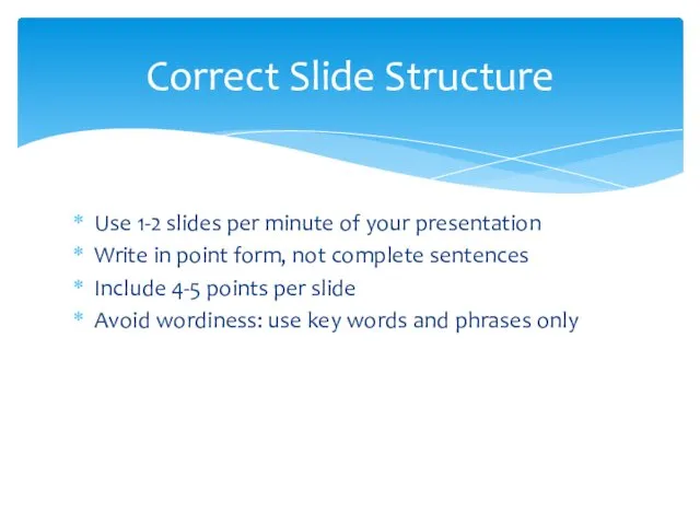
Use 1-2 slides per minute of your presentation
Write in point form,
Use 1-2 slides per minute of your presentation
Write in point form,
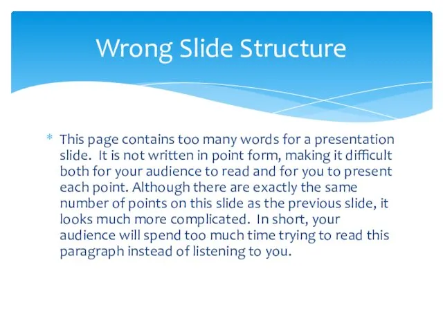
This page contains too many words for a presentation slide. It
This page contains too many words for a presentation slide. It
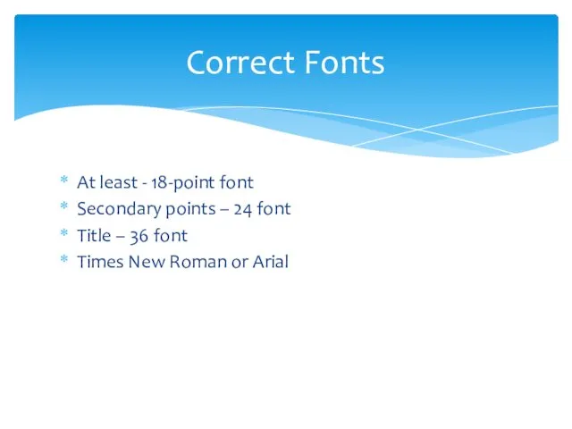
At least - 18-point font
Secondary points – 24 font
Title – 36
At least - 18-point font
Secondary points – 24 font
Title – 36
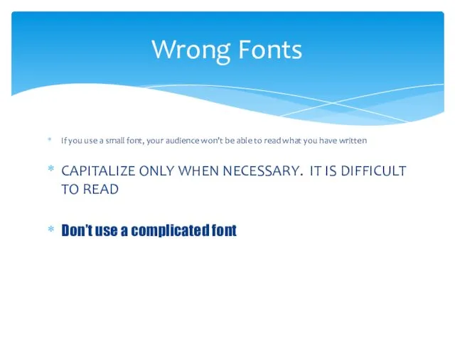
If you use a small font, your audience won’t be able
If you use a small font, your audience won’t be able
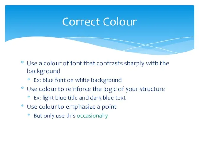
Use a colour of font that contrasts sharply with the background
Ex:
Use a colour of font that contrasts sharply with the background
Ex:
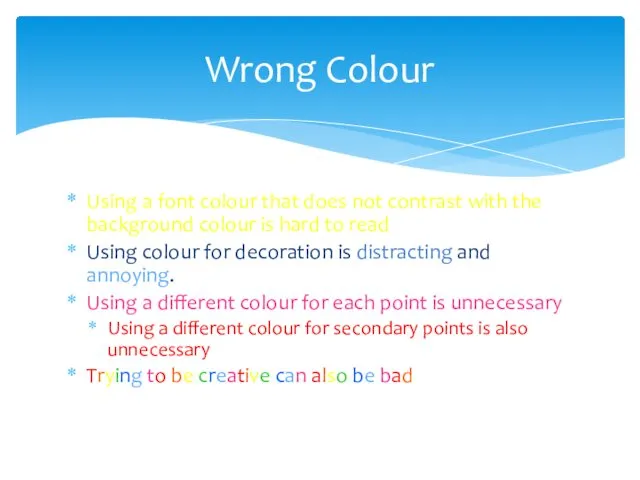
Using a font colour that does not contrast with the background
Using a font colour that does not contrast with the background
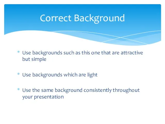
Use backgrounds such as this one that are attractive but simple
Use
Use backgrounds such as this one that are attractive but simple
Use
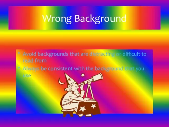
Avoid backgrounds that are distracting or difficult to read from
Always be
Avoid backgrounds that are distracting or difficult to read from
Always be
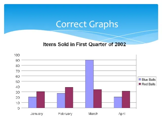
Correct Graphs
Correct Graphs
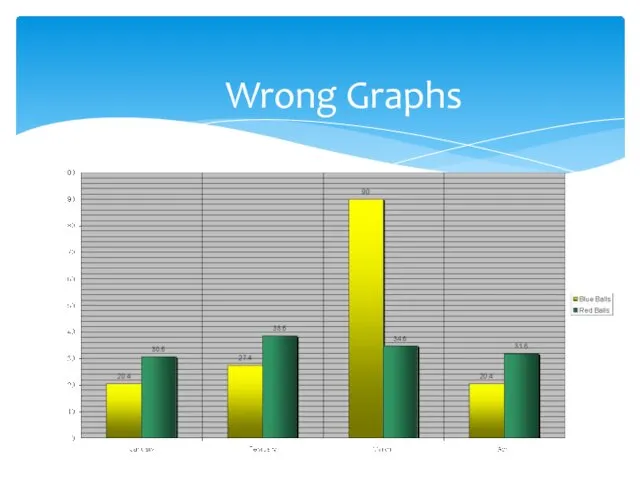
Wrong Graphs
Wrong Graphs
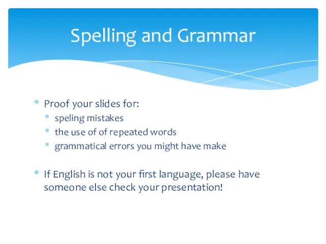
Proof your slides for:
speling mistakes
the use of of repeated words
grammatical errors
Proof your slides for:
speling mistakes
the use of of repeated words
grammatical errors
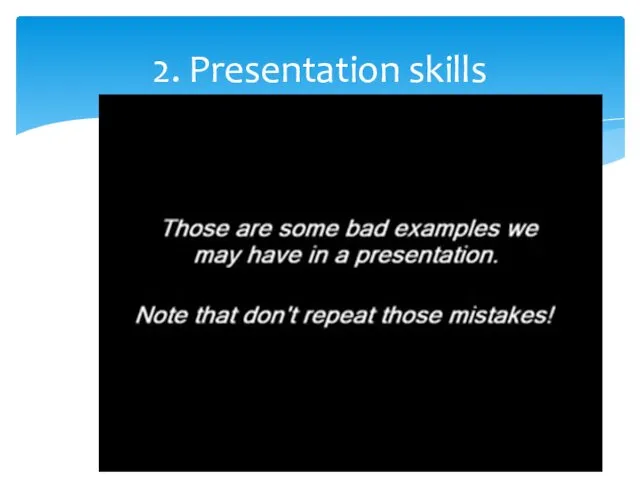
2. Presentation skills
2. Presentation skills
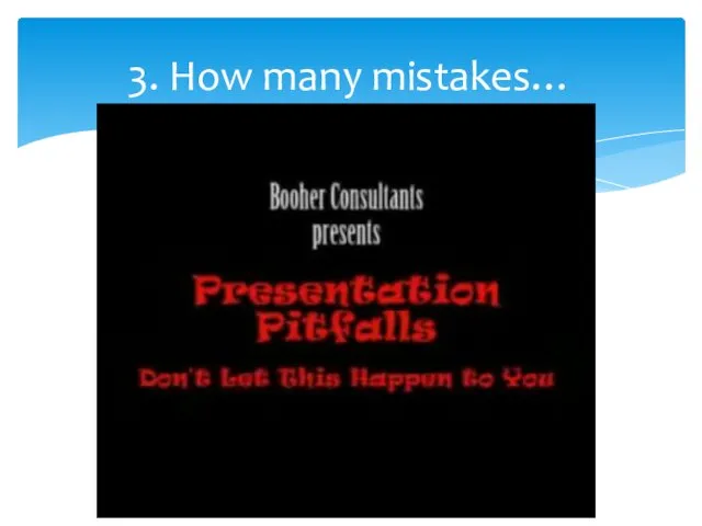
3. How many mistakes…
3. How many mistakes…
 Моё педагогическое кредо
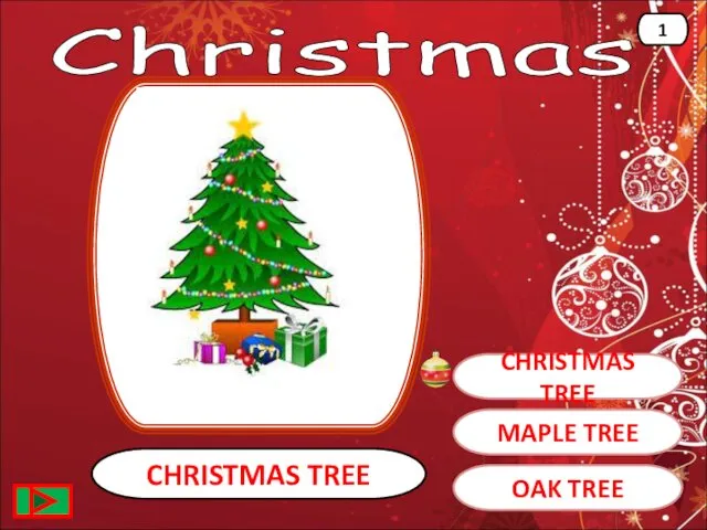 Christmas
 Презентация Дисциплина труда
 Устройство компьютера. Магистрально-модульный принцип построения компьютера
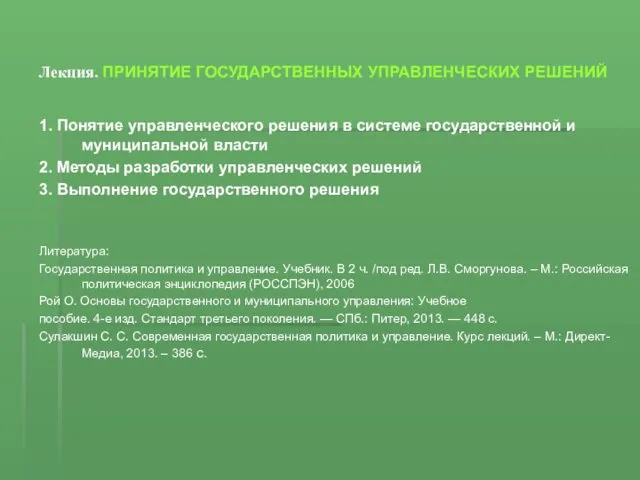 Принятие государственных управленческих решений. Лекция 3
 Обособленные обстоятельства
 Проектная деятельность учащихся на уроках музыки
 Музейная педагогика в ДОУ (презентация)
 Профессиональные компьютеры. Специфика выбора
 Біртекті емес электр µрісіндегі газдыќ күшейту
 Организация финансового планирования
 Диагностика и профилактика девиантного поведения
 Орган зрения. Строение и работа зрительного анализатора
 Добыча, сбор и подготовка нефти и газа к транспорту
 Я знаю РДШ
 РЕЖИМ ДНЯ ДОШКОЛЬНИКА
 Самоподготовка
 С Рождеством Христовым!
 Часть речи существительное
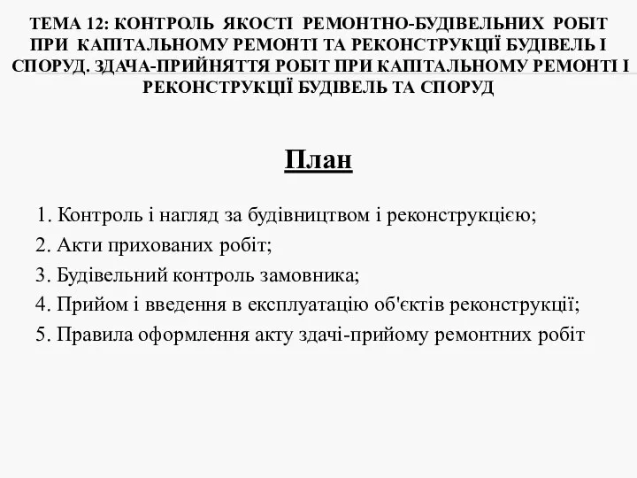 Контроль якості ремонтно-будівельних робіт при капітальному ремонті та реконструкції будівель і споруд
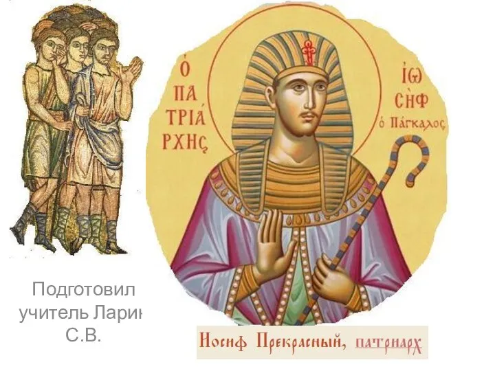 Иосиф прекрасный праотец
 Российская империя при Екатерине II и Павле I
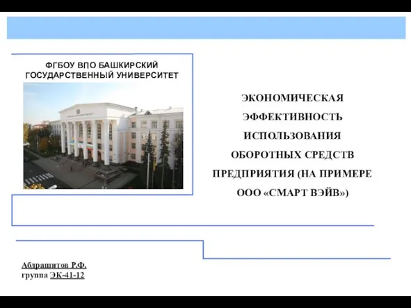 Экономическая эффективность использования оборотных средств предприятия ООО Смарт вэйв
 Отряд Бабочки или Чешуекрылые. Общая характеристика
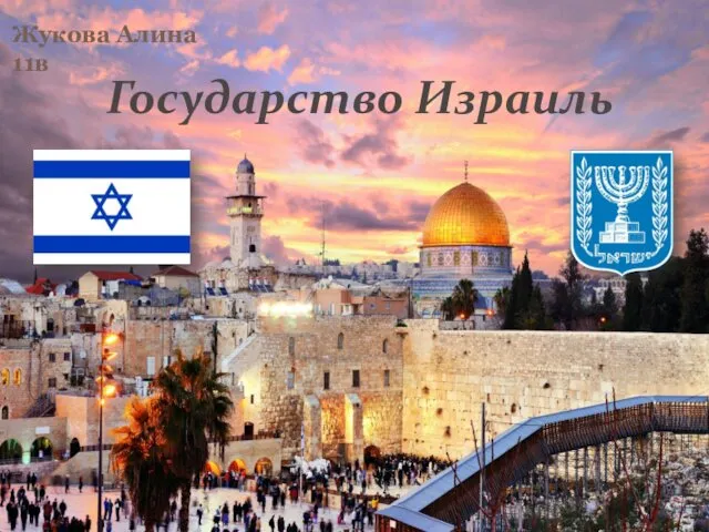 Государство Израиль
 Презентация по технологии Подсолнух 2 класс
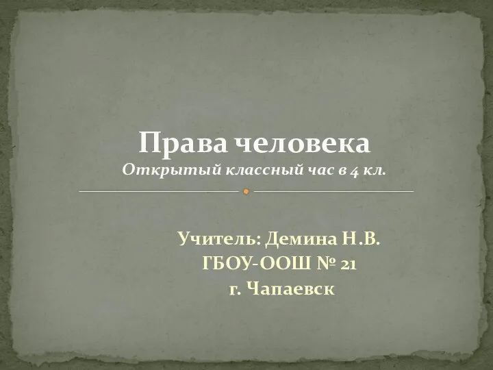 Классный час, 4 класс, Тема Права человека
 Отчёт ДТ 07.02