- Data Mining: Concepts and Techniques

Содержание
- 2. Chapter 2: Getting to Know Your Data Data Objects and Attribute Types Basic Statistical Descriptions of
- 3. Types of Data Sets Record Relational records Data matrix, e.g., numerical matrix, crosstabs Document data: text
- 4. Important Characteristics of Structured Data Dimensionality Curse of dimensionality Sparsity Only presence counts Resolution Patterns depend
- 5. Data Objects Data sets are made up of data objects. A data object represents an entity.
- 6. Attributes Attribute (or dimensions, features, variables): a data field, representing a characteristic or feature of a
- 7. Attribute Types Nominal: categories, states, or “names of things” Hair_color = {auburn, black, blond, brown, grey,
- 8. Numeric Attribute Types Quantity (integer or real-valued) Interval Measured on a scale of equal-sized units Values
- 9. Discrete vs. Continuous Attributes Discrete Attribute Has only a finite or countably infinite set of values
- 10. Chapter 2: Getting to Know Your Data Data Objects and Attribute Types Basic Statistical Descriptions of
- 11. Basic Statistical Descriptions of Data Motivation To better understand the data: central tendency, variation and spread
- 12. Measuring the Central Tendency Mean (algebraic measure) (sample vs. population): Note: n is sample size and
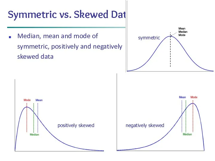
- 13. * Data Mining: Concepts and Techniques Symmetric vs. Skewed Data Median, mean and mode of symmetric,
- 14. Measuring the Dispersion of Data Quartiles, outliers and boxplots Quartiles: Q1 (25th percentile), Q3 (75th percentile)
- 15. Boxplot Analysis Five-number summary of a distribution Minimum, Q1, Median, Q3, Maximum Boxplot Data is represented
- 16. * Data Mining: Concepts and Techniques Visualization of Data Dispersion: 3-D Boxplots
- 17. Properties of Normal Distribution Curve The normal (distribution) curve From μ–σ to μ+σ: contains about 68%
- 18. Graphic Displays of Basic Statistical Descriptions Boxplot: graphic display of five-number summary Histogram: x-axis are values,
- 19. Histogram Analysis Histogram: Graph display of tabulated frequencies, shown as bars It shows what proportion of
- 20. Histograms Often Tell More than Boxplots The two histograms shown in the left may have the
- 21. Data Mining: Concepts and Techniques Quantile Plot Displays all of the data (allowing the user to
- 22. Quantile-Quantile (Q-Q) Plot Graphs the quantiles of one univariate distribution against the corresponding quantiles of another
- 23. Scatter plot Provides a first look at bivariate data to see clusters of points, outliers, etc
- 24. Positively and Negatively Correlated Data The left half fragment is positively correlated The right half is
- 25. Uncorrelated Data
- 26. Chapter 2: Getting to Know Your Data Data Objects and Attribute Types Basic Statistical Descriptions of
- 27. Data Visualization Why data visualization? Gain insight into an information space by mapping data onto graphical
- 28. Pixel-Oriented Visualization Techniques For a data set of m dimensions, create m windows on the screen,
- 29. Laying Out Pixels in Circle Segments To save space and show the connections among multiple dimensions,
- 30. Geometric Projection Visualization Techniques Visualization of geometric transformations and projections of the data Methods Direct visualization
- 31. Data Mining: Concepts and Techniques Direct Data Visualization Ribbons with Twists Based on Vorticity
- 32. Scatterplot Matrices Matrix of scatterplots (x-y-diagrams) of the k-dim. data [total of (k2/2-k) scatterplots] Used by
- 33. news articles visualized as a landscape Used by permission of B. Wright, Visible Decisions Inc. Landscapes
- 34. Parallel Coordinates n equidistant axes which are parallel to one of the screen axes and correspond
- 35. Parallel Coordinates of a Data Set
- 36. Icon-Based Visualization Techniques Visualization of the data values as features of icons Typical visualization methods Chernoff
- 37. Chernoff Faces A way to display variables on a two-dimensional surface, e.g., let x be eyebrow
- 38. Data Mining: Concepts and Techniques A census data figure showing age, income, gender, education, etc. used
- 39. Hierarchical Visualization Techniques Visualization of the data using a hierarchical partitioning into subspaces Methods Dimensional Stacking
- 40. Dimensional Stacking Partitioning of the n-dimensional attribute space in 2-D subspaces, which are ‘stacked’ into each
- 41. Used by permission of M. Ward, Worcester Polytechnic Institute Visualization of oil mining data with longitude
- 42. Worlds-within-Worlds Assign the function and two most important parameters to innermost world Fix all other parameters
- 43. Tree-Map Screen-filling method which uses a hierarchical partitioning of the screen into regions depending on the
- 44. InfoCube A 3-D visualization technique where hierarchical information is displayed as nested semi-transparent cubes The outermost
- 45. Three-D Cone Trees 3D cone tree visualization technique works well for up to a thousand nodes
- 46. Visualizing Complex Data and Relations Visualizing non-numerical data: text and social networks Tag cloud: visualizing user-generated
- 47. Chapter 2: Getting to Know Your Data Data Objects and Attribute Types Basic Statistical Descriptions of
- 48. Similarity and Dissimilarity Similarity Numerical measure of how alike two data objects are Value is higher
- 49. Data Matrix and Dissimilarity Matrix Data matrix n data points with p dimensions Two modes Dissimilarity
- 50. Proximity Measure for Nominal Attributes Can take 2 or more states, e.g., red, yellow, blue, green
- 51. Proximity Measure for Binary Attributes A contingency table for binary data Distance measure for symmetric binary
- 52. Dissimilarity between Binary Variables Example Gender is a symmetric attribute The remaining attributes are asymmetric binary
- 53. Standardizing Numeric Data Z-score: X: raw score to be standardized, μ: mean of the population, σ:
- 54. Example: Data Matrix and Dissimilarity Matrix Dissimilarity Matrix (with Euclidean Distance) Data Matrix
- 55. Distance on Numeric Data: Minkowski Distance Minkowski distance: A popular distance measure where i = (xi1,
- 56. Special Cases of Minkowski Distance h = 1: Manhattan (city block, L1 norm) distance E.g., the
- 57. Example: Minkowski Distance Dissimilarity Matrices Manhattan (L1) Euclidean (L2) Supremum
- 58. Ordinal Variables An ordinal variable can be discrete or continuous Order is important, e.g., rank Can
- 59. Attributes of Mixed Type A database may contain all attribute types Nominal, symmetric binary, asymmetric binary,
- 60. Cosine Similarity A document can be represented by thousands of attributes, each recording the frequency of
- 61. Example: Cosine Similarity cos(d1, d2) = (d1 ∙ d2) /||d1|| ||d2|| , where ∙ indicates vector
- 62. KL Divergence: Comparing Two Probability Distributions The Kullback-Leibler (KL) divergence: Measure the difference between two probability
- 63. How to Compute the KL Divergence? Base on the formula, DKL(P,Q) ≥ 0 and DKL(P ||
- 64. Chapter 2: Getting to Know Your Data Data Objects and Attribute Types Basic Statistical Descriptions of
- 65. Summary Data attribute types: nominal, binary, ordinal, interval-scaled, ratio-scaled Many types of data sets, e.g., numerical,
- 67. Скачать презентацию
Chapter 2: Getting to Know Your Data
Data Objects and Attribute Types
Basic
Chapter 2: Getting to Know Your Data
Data Objects and Attribute Types
Basic
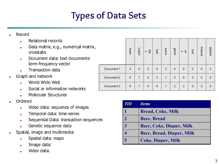
Types of Data Sets
Record
Relational records
Data matrix, e.g., numerical matrix, crosstabs
Document
Types of Data Sets
Record
Relational records
Data matrix, e.g., numerical matrix, crosstabs
Document
Important Characteristics of Structured Data
Dimensionality
Curse of dimensionality
Sparsity
Only presence counts
Resolution
Patterns depend on
Important Characteristics of Structured Data
Dimensionality
Curse of dimensionality
Sparsity
Only presence counts
Resolution
Patterns depend on
Data Objects
Data sets are made up of data objects.
A data object
Data Objects
Data sets are made up of data objects.
A data object
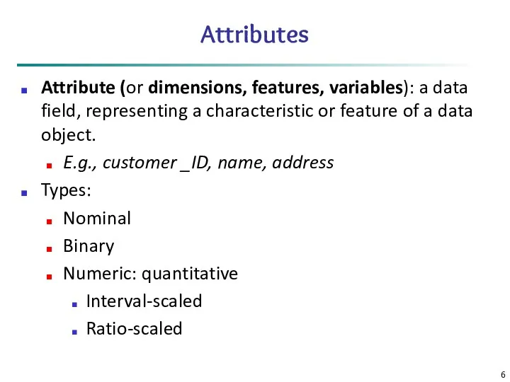
Attributes
Attribute (or dimensions, features, variables): a data field, representing a characteristic
Attributes
Attribute (or dimensions, features, variables): a data field, representing a characteristic
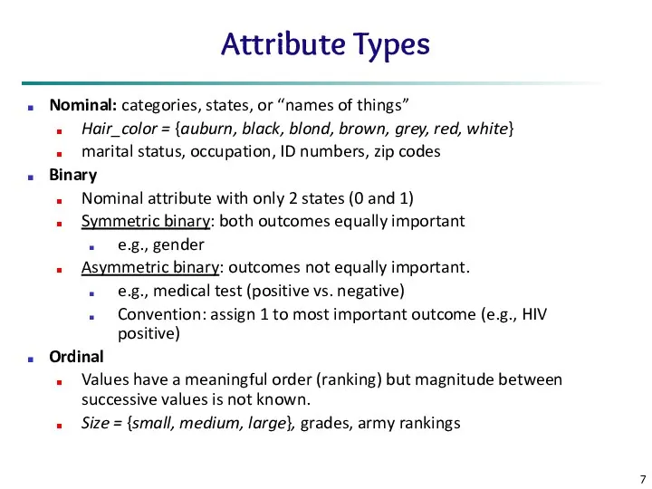
Attribute Types
Nominal: categories, states, or “names of things”
Hair_color = {auburn,
Attribute Types
Nominal: categories, states, or “names of things”
Hair_color = {auburn,
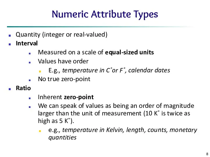
Numeric Attribute Types
Quantity (integer or real-valued)
Interval
Measured on a scale of
Numeric Attribute Types
Quantity (integer or real-valued)
Interval
Measured on a scale of
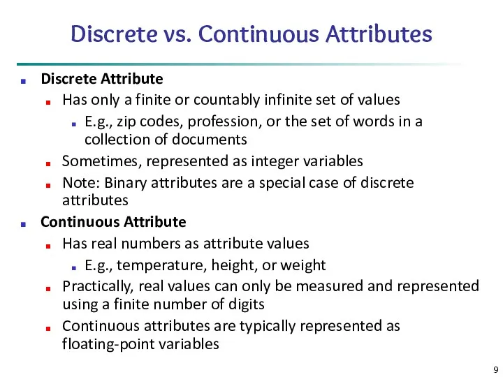
Discrete vs. Continuous Attributes
Discrete Attribute
Has only a finite or countably
Discrete vs. Continuous Attributes
Discrete Attribute
Has only a finite or countably
Chapter 2: Getting to Know Your Data
Data Objects and Attribute Types
Basic
Chapter 2: Getting to Know Your Data
Data Objects and Attribute Types
Basic
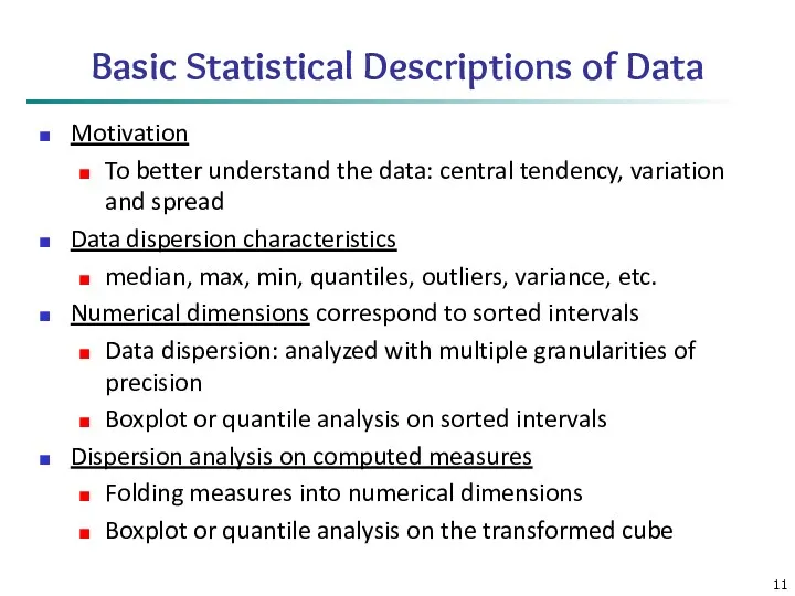
Basic Statistical Descriptions of Data
Motivation
To better understand the data: central tendency,
Basic Statistical Descriptions of Data
Motivation
To better understand the data: central tendency,
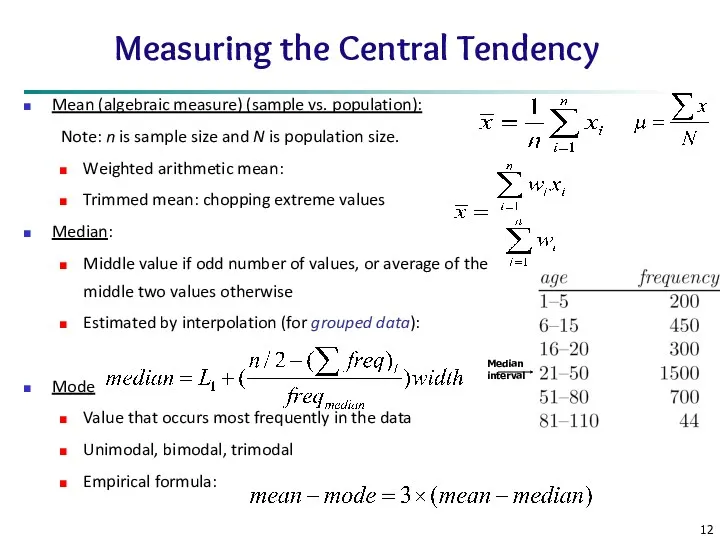
Measuring the Central Tendency
Mean (algebraic measure) (sample vs. population):
Note: n is
Measuring the Central Tendency
Mean (algebraic measure) (sample vs. population):
Note: n is
*
Data Mining: Concepts and Techniques
Symmetric vs. Skewed Data
Median, mean and
*
Data Mining: Concepts and Techniques
Symmetric vs. Skewed Data
Median, mean and
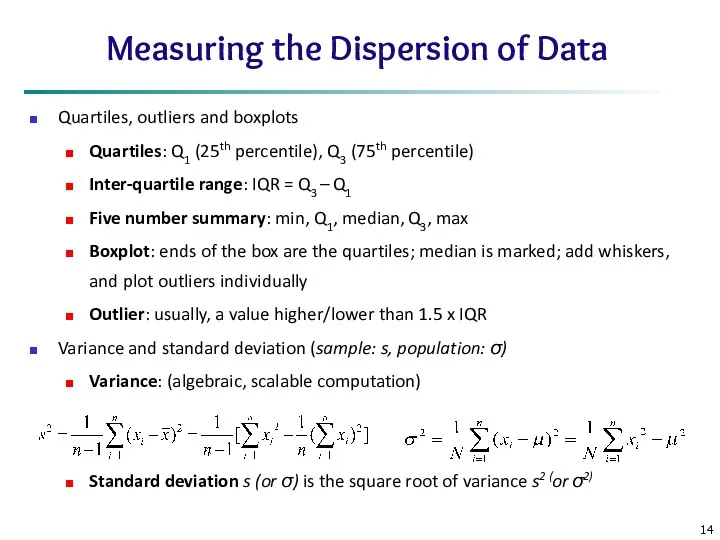
Measuring the Dispersion of Data
Quartiles, outliers and boxplots
Quartiles: Q1 (25th percentile),
Measuring the Dispersion of Data
Quartiles, outliers and boxplots
Quartiles: Q1 (25th percentile),
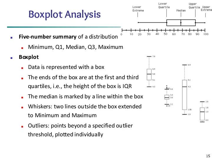
Boxplot Analysis
Five-number summary of a distribution
Minimum, Q1, Median, Q3, Maximum
Boxplot
Data
Boxplot Analysis
Five-number summary of a distribution
Minimum, Q1, Median, Q3, Maximum
Boxplot
Data
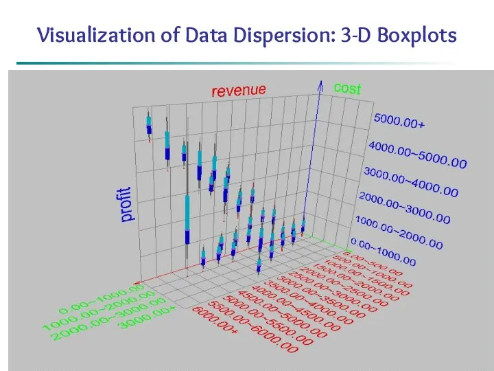
*
Data Mining: Concepts and Techniques
Visualization of Data Dispersion: 3-D Boxplots
*
Data Mining: Concepts and Techniques
Visualization of Data Dispersion: 3-D Boxplots
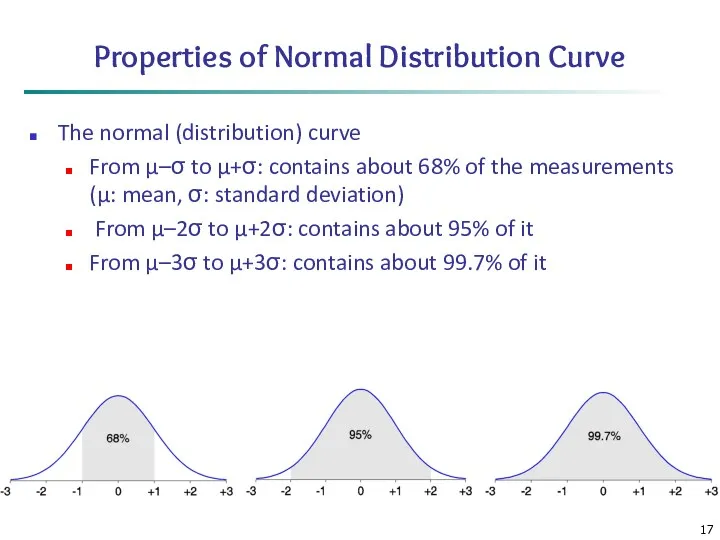
Properties of Normal Distribution Curve
The normal (distribution) curve
From μ–σ to μ+σ:
Properties of Normal Distribution Curve
The normal (distribution) curve
From μ–σ to μ+σ:
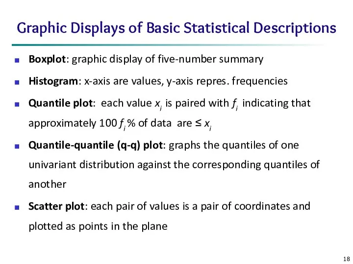
Graphic Displays of Basic Statistical Descriptions
Boxplot: graphic display of five-number summary
Histogram:
Graphic Displays of Basic Statistical Descriptions
Boxplot: graphic display of five-number summary
Histogram:
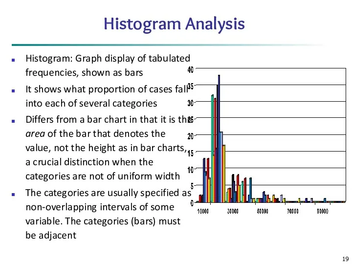
Histogram Analysis
Histogram: Graph display of tabulated frequencies, shown as bars
It shows
Histogram Analysis
Histogram: Graph display of tabulated frequencies, shown as bars
It shows
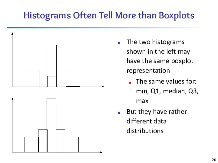
Histograms Often Tell More than Boxplots
The two histograms shown in the
Histograms Often Tell More than Boxplots
The two histograms shown in the
Data Mining: Concepts and Techniques
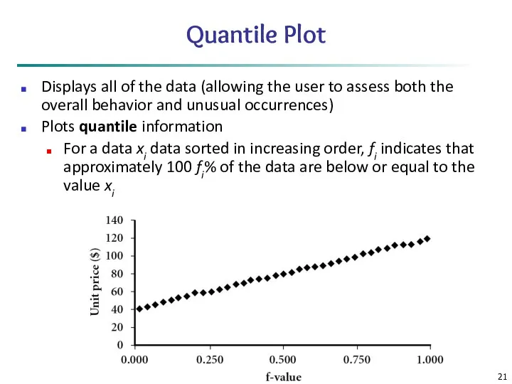
Quantile Plot
Displays all of the data (allowing
Data Mining: Concepts and Techniques
Quantile Plot
Displays all of the data (allowing
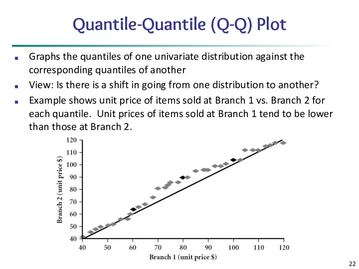
Quantile-Quantile (Q-Q) Plot
Graphs the quantiles of one univariate distribution against the
Quantile-Quantile (Q-Q) Plot
Graphs the quantiles of one univariate distribution against the
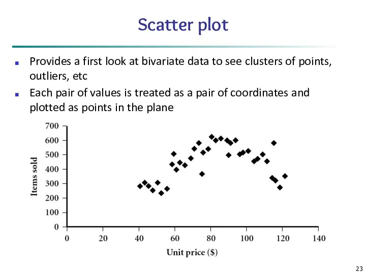
Scatter plot
Provides a first look at bivariate data to see clusters
Scatter plot
Provides a first look at bivariate data to see clusters
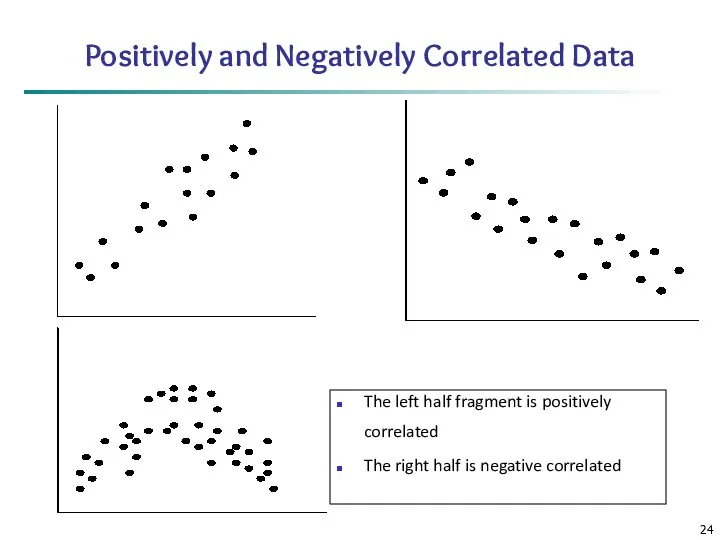
Positively and Negatively Correlated Data
The left half fragment is positively correlated
The
Positively and Negatively Correlated Data
The left half fragment is positively correlated
The
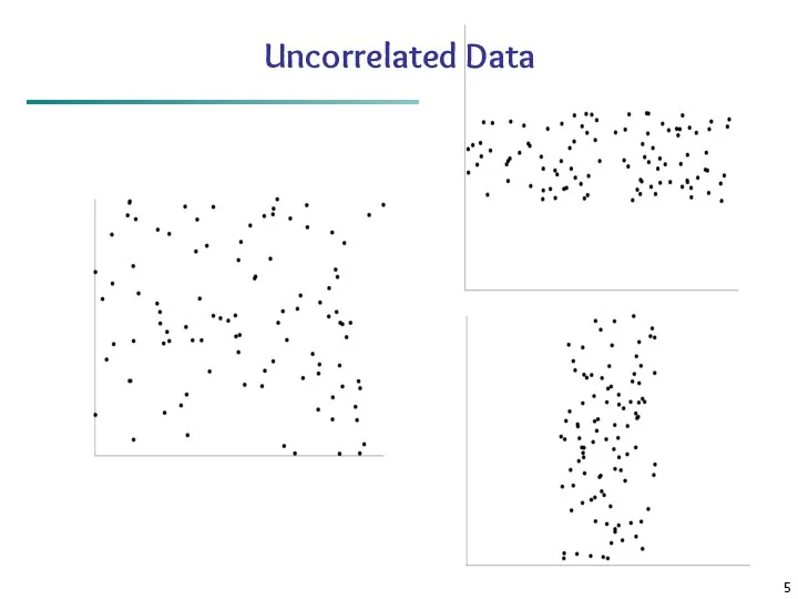
Uncorrelated Data
Uncorrelated Data
Chapter 2: Getting to Know Your Data
Data Objects and Attribute Types
Basic
Chapter 2: Getting to Know Your Data
Data Objects and Attribute Types
Basic
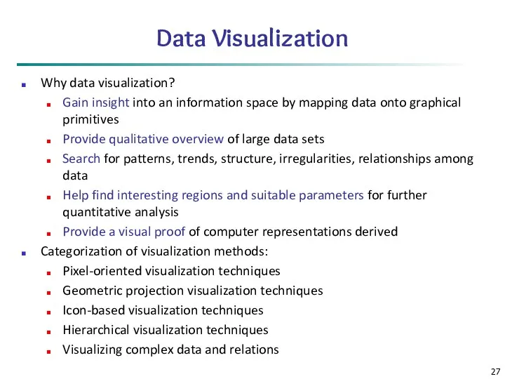
Data Visualization
Why data visualization?
Gain insight into an information space by mapping
Data Visualization
Why data visualization?
Gain insight into an information space by mapping
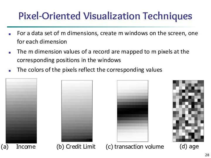
Pixel-Oriented Visualization Techniques
For a data set of m dimensions, create m
Pixel-Oriented Visualization Techniques
For a data set of m dimensions, create m
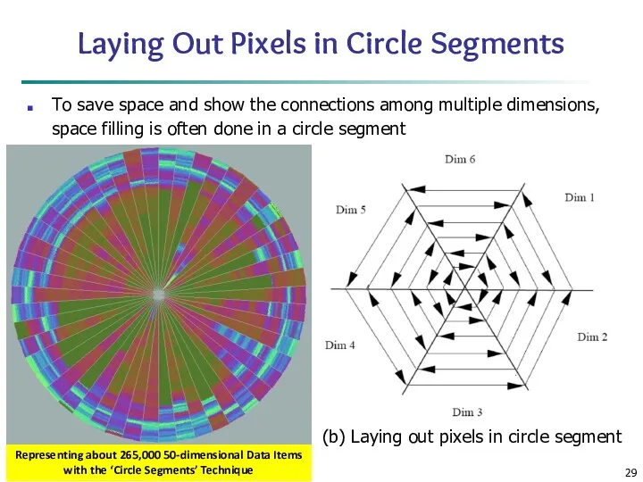
Laying Out Pixels in Circle Segments
To save space and show the
Laying Out Pixels in Circle Segments
To save space and show the
Geometric Projection Visualization Techniques
Visualization of geometric transformations and projections of the
Geometric Projection Visualization Techniques
Visualization of geometric transformations and projections of the
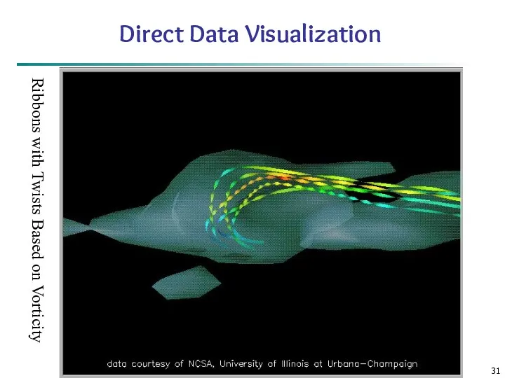
Data Mining: Concepts and Techniques
Direct Data Visualization
Ribbons with Twists Based on
Data Mining: Concepts and Techniques
Direct Data Visualization
Ribbons with Twists Based on
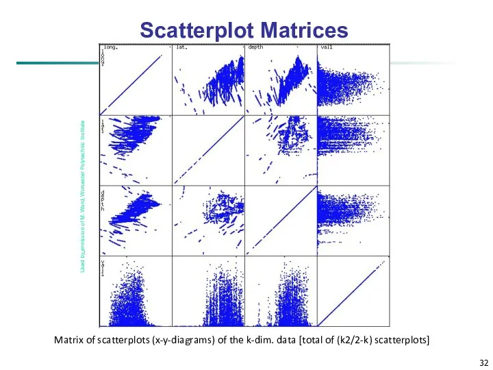
Scatterplot Matrices
Matrix of scatterplots (x-y-diagrams) of the k-dim. data [total of
Scatterplot Matrices
Matrix of scatterplots (x-y-diagrams) of the k-dim. data [total of
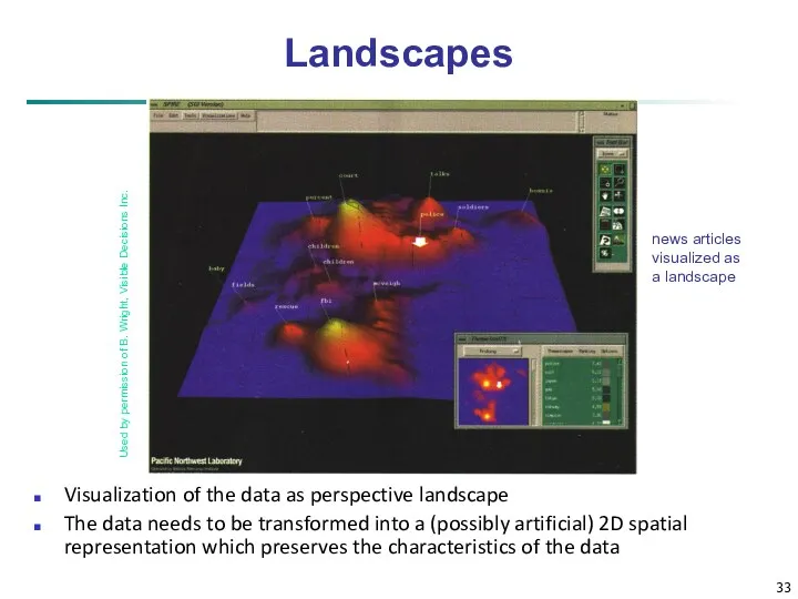
news articles
visualized as
a landscape
Used by permission of B. Wright, Visible Decisions
news articles
visualized as
a landscape
Used by permission of B. Wright, Visible Decisions
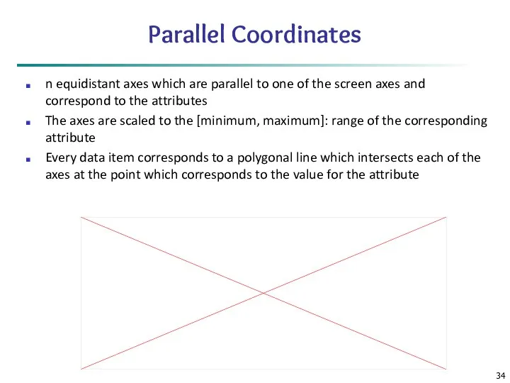
Parallel Coordinates
n equidistant axes which are parallel to one of the
Parallel Coordinates
n equidistant axes which are parallel to one of the
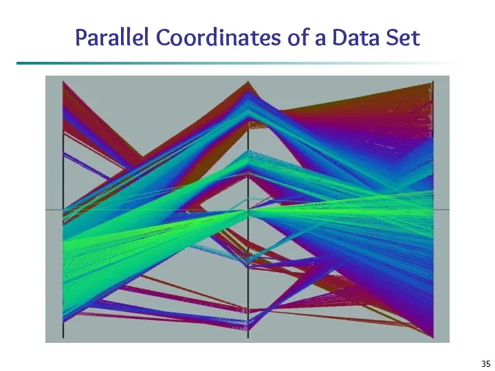
Parallel Coordinates of a Data Set
Parallel Coordinates of a Data Set
Icon-Based Visualization Techniques
Visualization of the data values as features of icons
Typical
Icon-Based Visualization Techniques
Visualization of the data values as features of icons
Typical
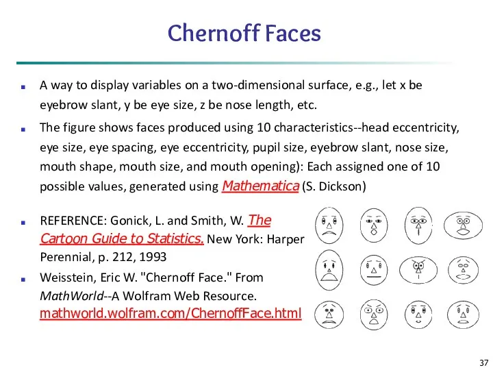
Chernoff Faces
A way to display variables on a two-dimensional surface, e.g.,
Chernoff Faces
A way to display variables on a two-dimensional surface, e.g.,
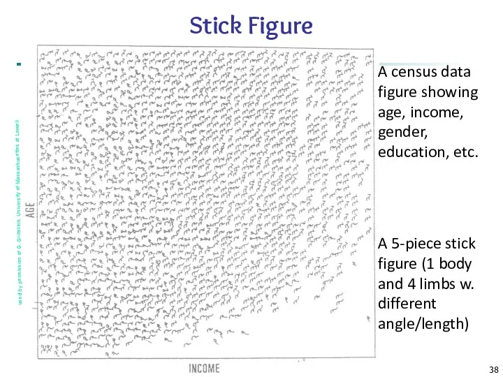
Data Mining: Concepts and Techniques
A census data figure showing age, income,
Data Mining: Concepts and Techniques
A census data figure showing age, income,
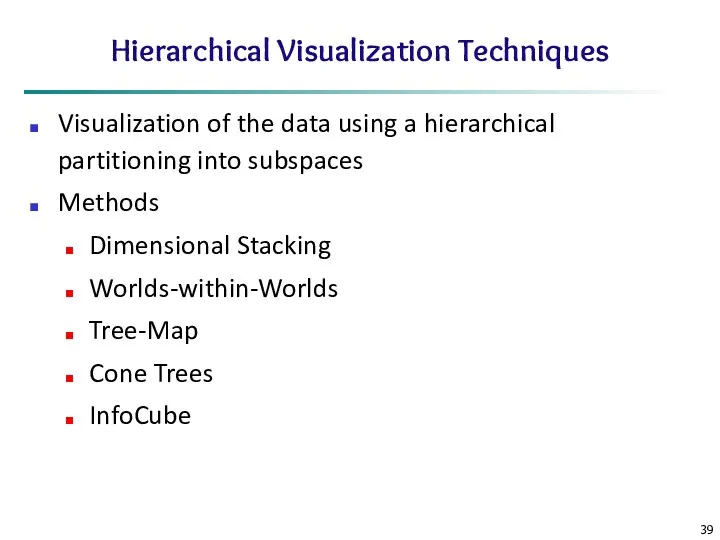
Hierarchical Visualization Techniques
Visualization of the data using a hierarchical partitioning into
Hierarchical Visualization Techniques
Visualization of the data using a hierarchical partitioning into
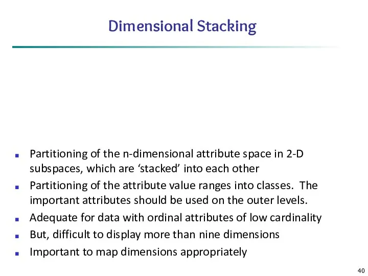
Dimensional Stacking
Partitioning of the n-dimensional attribute space in 2-D subspaces, which
Dimensional Stacking
Partitioning of the n-dimensional attribute space in 2-D subspaces, which
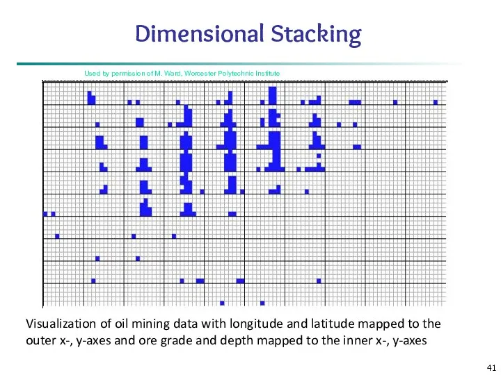
Used by permission of M. Ward, Worcester Polytechnic Institute
Visualization of oil
Used by permission of M. Ward, Worcester Polytechnic Institute
Visualization of oil
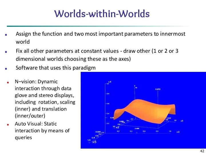
Worlds-within-Worlds
Assign the function and two most important parameters to innermost world
Worlds-within-Worlds
Assign the function and two most important parameters to innermost world
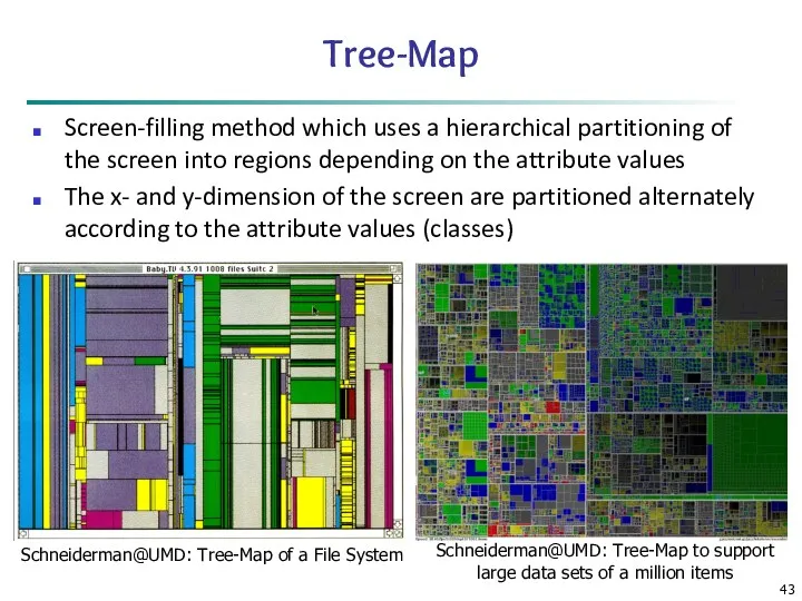
Tree-Map
Screen-filling method which uses a hierarchical partitioning of the screen into
Tree-Map
Screen-filling method which uses a hierarchical partitioning of the screen into
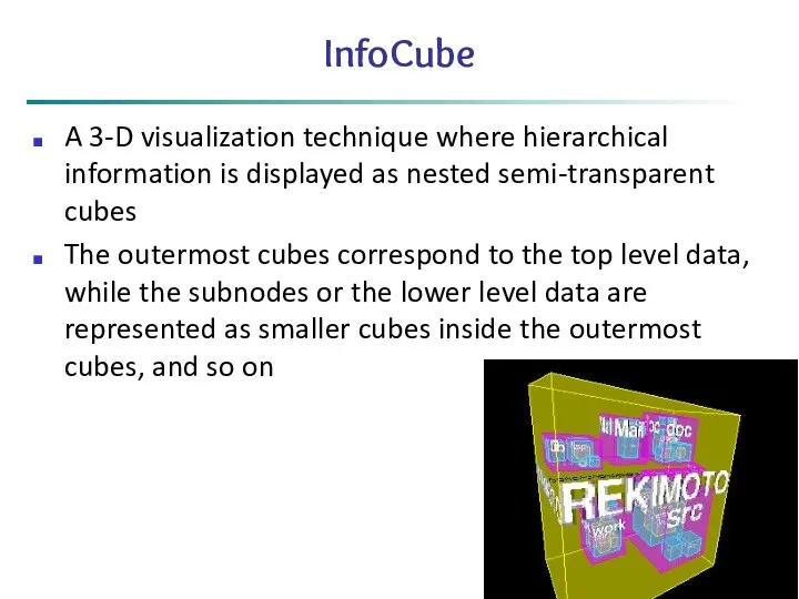
InfoCube
A 3-D visualization technique where hierarchical information is displayed as nested
InfoCube
A 3-D visualization technique where hierarchical information is displayed as nested
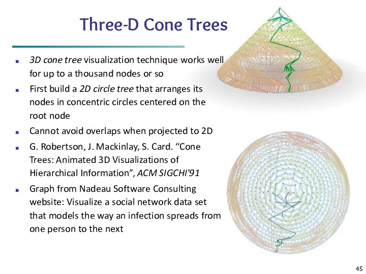
Three-D Cone Trees
3D cone tree visualization technique works well for up
Three-D Cone Trees
3D cone tree visualization technique works well for up
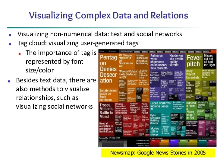
Visualizing Complex Data and Relations
Visualizing non-numerical data: text and social networks
Tag
Visualizing Complex Data and Relations
Visualizing non-numerical data: text and social networks
Tag
Chapter 2: Getting to Know Your Data
Data Objects and Attribute Types
Basic
Chapter 2: Getting to Know Your Data
Data Objects and Attribute Types
Basic
Similarity and Dissimilarity
Similarity
Numerical measure of how alike two data objects are
Value
Similarity and Dissimilarity
Similarity
Numerical measure of how alike two data objects are
Value
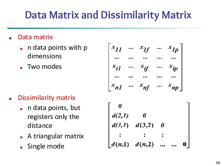
Data Matrix and Dissimilarity Matrix
Data matrix
n data points with p dimensions
Two
Data Matrix and Dissimilarity Matrix
Data matrix
n data points with p dimensions
Two
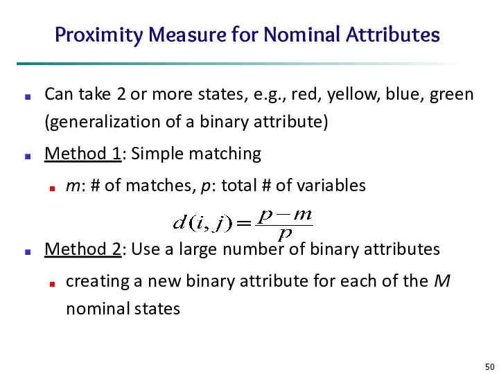
Proximity Measure for Nominal Attributes
Can take 2 or more states, e.g.,
Proximity Measure for Nominal Attributes
Can take 2 or more states, e.g.,
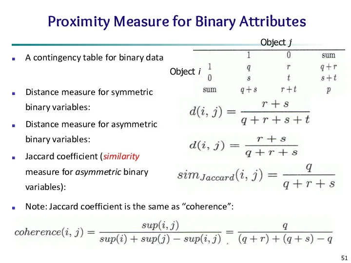
Proximity Measure for Binary Attributes
A contingency table for binary data
Distance measure
Proximity Measure for Binary Attributes
A contingency table for binary data
Distance measure
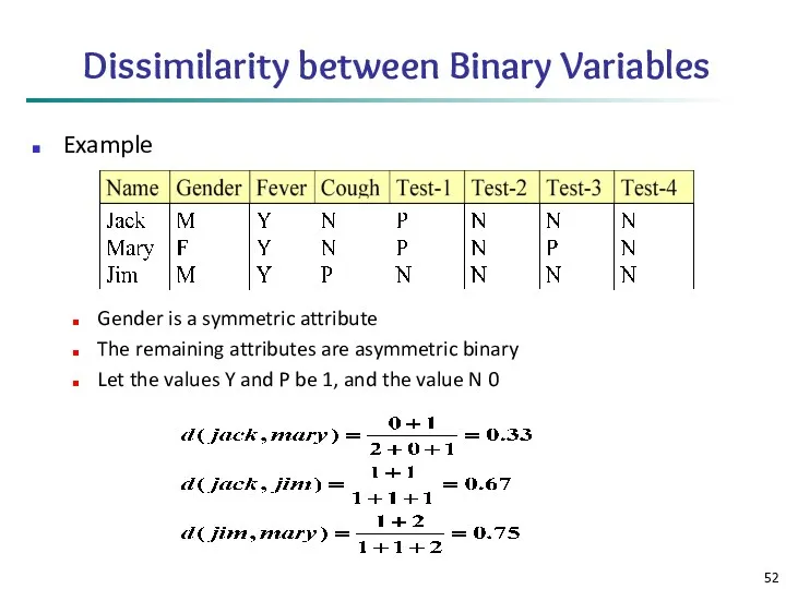
Dissimilarity between Binary Variables
Example
Gender is a symmetric attribute
The remaining attributes are
Dissimilarity between Binary Variables
Example
Gender is a symmetric attribute
The remaining attributes are
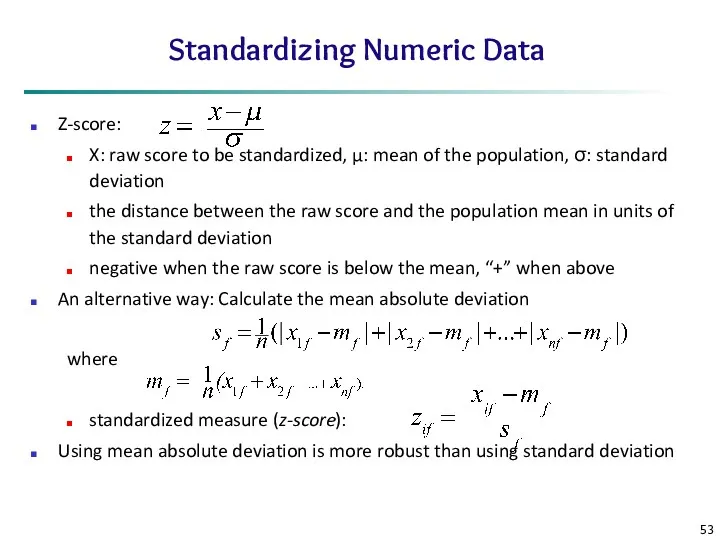
Standardizing Numeric Data
Z-score:
X: raw score to be standardized, μ: mean
Standardizing Numeric Data
Z-score:
X: raw score to be standardized, μ: mean
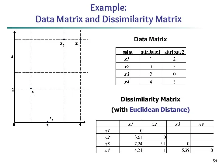
Example:
Data Matrix and Dissimilarity Matrix
Dissimilarity Matrix
(with Euclidean Distance)
Data Matrix
Example:
Data Matrix and Dissimilarity Matrix
Dissimilarity Matrix
(with Euclidean Distance)
Data Matrix
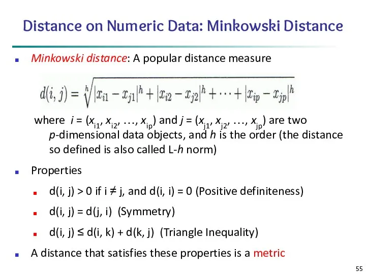
Distance on Numeric Data: Minkowski Distance
Minkowski distance: A popular distance measure
where
Distance on Numeric Data: Minkowski Distance
Minkowski distance: A popular distance measure
where
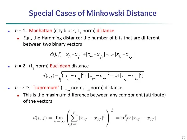
Special Cases of Minkowski Distance
h = 1: Manhattan (city block, L1
Special Cases of Minkowski Distance
h = 1: Manhattan (city block, L1
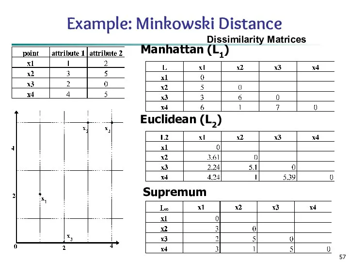
Example: Minkowski Distance
Dissimilarity Matrices
Manhattan (L1)
Euclidean (L2)
Supremum
Example: Minkowski Distance
Dissimilarity Matrices
Manhattan (L1)
Euclidean (L2)
Supremum
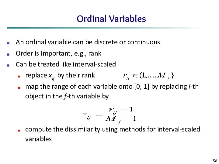
Ordinal Variables
An ordinal variable can be discrete or continuous
Order is important,
Ordinal Variables
An ordinal variable can be discrete or continuous
Order is important,
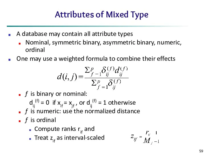
Attributes of Mixed Type
A database may contain all attribute types
Nominal, symmetric
Attributes of Mixed Type
A database may contain all attribute types
Nominal, symmetric
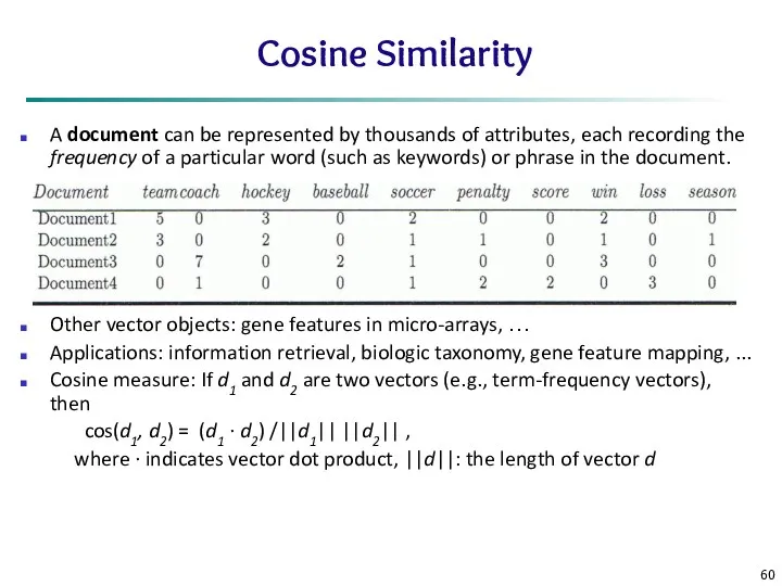
Cosine Similarity
A document can be represented by thousands of attributes,
Cosine Similarity
A document can be represented by thousands of attributes,
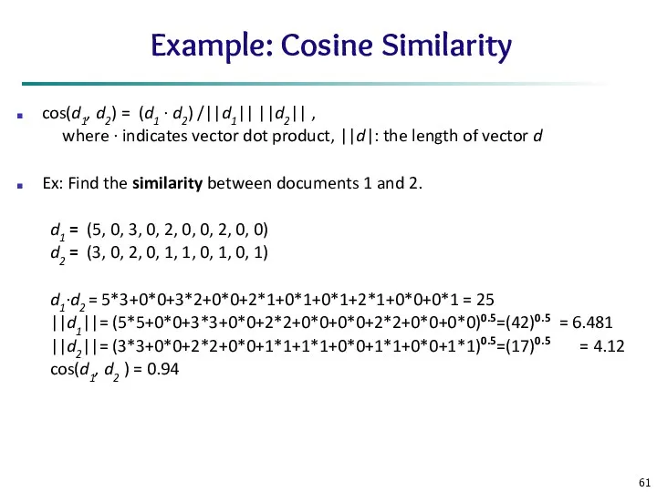
Example: Cosine Similarity
cos(d1, d2) = (d1 ∙ d2) /||d1|| ||d2||
Example: Cosine Similarity
cos(d1, d2) = (d1 ∙ d2) /||d1|| ||d2||
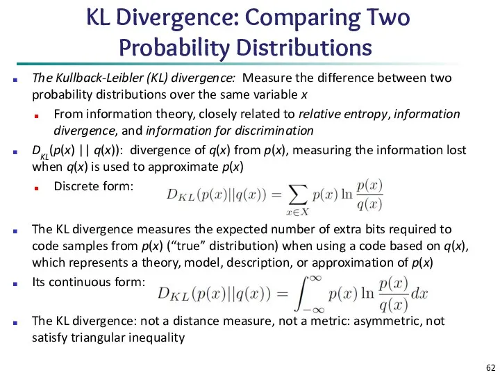
KL Divergence: Comparing Two Probability Distributions
The Kullback-Leibler (KL) divergence:
KL Divergence: Comparing Two Probability Distributions
The Kullback-Leibler (KL) divergence:
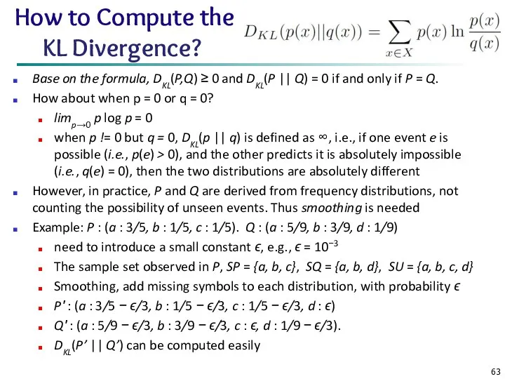
How to Compute the KL Divergence?
Base on the formula, DKL(P,Q)
How to Compute the KL Divergence?
Base on the formula, DKL(P,Q)
Chapter 2: Getting to Know Your Data
Data Objects and Attribute Types
Basic
Chapter 2: Getting to Know Your Data
Data Objects and Attribute Types
Basic
Summary
Data attribute types: nominal, binary, ordinal, interval-scaled, ratio-scaled
Many types of data
Summary
Data attribute types: nominal, binary, ordinal, interval-scaled, ratio-scaled
Many types of data
 Excel. Абсолютная и относительная адресация
 Programming for Engineers in Python. Fall 2018
 Шифрование с открытым ключом. Алгоритм RSA
 Опыт внедрения и реализации в ДОУ программы Кидсмарт.
 Интегрированный урок информатика, технология на тему Олимпийский день
 Платформа learningapps.org, как один из способов дистанционного взаимодействия учителя – логопеда с родителями
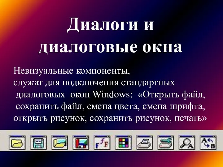 Диалоги и диалоговые окна. Диалоговые окна Windows
 Применение электронной презентации на уроке истории искусств
 Бази даних. Інформаційні системи. (Тема 1)
 Эквивалентность семафоров, мониторов и сообщений
 Основы криптографической защиты информации
 Презентация по информатике Представление переменных целого типа в памяти компьютера
 Тест Электронные таблицы
 ADS:lab session #2
 Основы сетевых технологий. Топологии компьютерных сетей. Часть 1. Лекция 4
 Помехоустойчивое кодирование. Циклические коды – подкласс линейных кодов
 Future of technology and newest inventions
 Алгоритм ветвления. Условный оператор в языке Турбо Паскаль
 Табличная форма представления информации. Урок информатики в 5 классе
 Роскомнадзор. Безопасность несовершеннолетних в сети Интернет
 Partnership System ZORAN
 Смешарики : London Gloom – 3 эпизод
 Главный коммуникационный центр
 Data types and databases
 Оценка стоимости информационной системы
 Жаңа технология жетістіктері
 Алгоритмы и исполнители. Основы алгоритмизации. 8 класс
 О браузерах в интернете