- Download SIMCA software

Содержание
- 2. Background information Drying process after wet granulation Data are from 13 batches One quality attribute –
- 3. What we will do Try to find the correlation between dependent variable and independent variables Y
- 4. Multivariable Regression Multivariable regression enables you to relate one dependent variable to multiple independent variables you've
- 5. Step 1 Launch Microsoft Excel and click on the "File" tab in the ribbon. Select "Options"
- 6. Step 2 Click the "Add-Ins" item in the list on the left side of the dialog
- 7. Step 3 Tick the check box in front of "Analysis ToolPak" in the list of available
- 8. Step 4 & 5 Enter your column headings in row 1 of your worksheet, and input
- 9. Step 6 Scroll through the list of Analysis Tools until you locate "Regression." Click on it
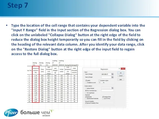
- 10. Step 7 Type the location of the cell range that contains your dependent variable into the
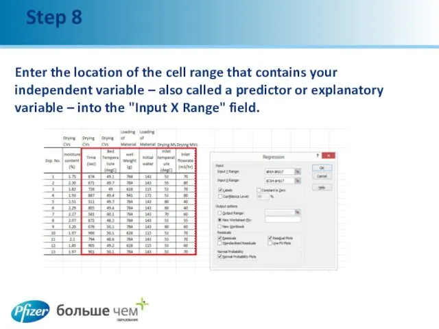
- 11. Step 8 Enter the location of the cell range that contains your independent variable – also
- 12. Step 9 & 10 Click on the "Labels" check box to tell Excel that the first
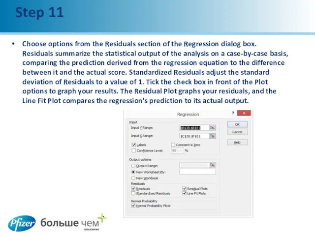
- 13. Step 11 Choose options from the Residuals section of the Regression dialog box. Residuals summarize the
- 14. Step 12 Click on the "OK" button at the right of the Regression dialog box to
- 15. Coefficients The next stage is the coefficients. It gives the coefficient for each parameter, including the
- 16. Different Plots The Residual Plot graphs your residuals The Line Fit Plot compares the regression's prediction
- 17. Inserting a Scatter Diagram into Excel Suppose you have two columns of data in Excel and
- 18. Add a Trendline to Excel You can now add your trendline. Begin by clicking once on
- 19. Formatting an Excel Trendline To format your newly-created trendline, begin by right clicking on the line
- 20. Simple Linear Regression Using an Excel function Open the Microsoft Excel page with the data that
- 21. Simple Linear Regression In array one, fill in the number of variable (named x) Repeat the
- 22. Linear Regression Formula Repeat the same process to get result for Intercept - Correlation and R-
- 23. Linear Regression Formula The intercept point is based on a best-fit regression line plotted through the
- 25. Скачать презентацию
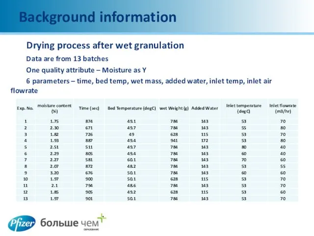
Background information
Drying process after wet granulation
Data are from 13 batches
One quality
Background information
Drying process after wet granulation
Data are from 13 batches
One quality
What we will do
Try to find the correlation between dependent variable
What we will do
Try to find the correlation between dependent variable
Multivariable Regression
Multivariable regression enables you to relate one dependent variable to
Multivariable Regression
Multivariable regression enables you to relate one dependent variable to
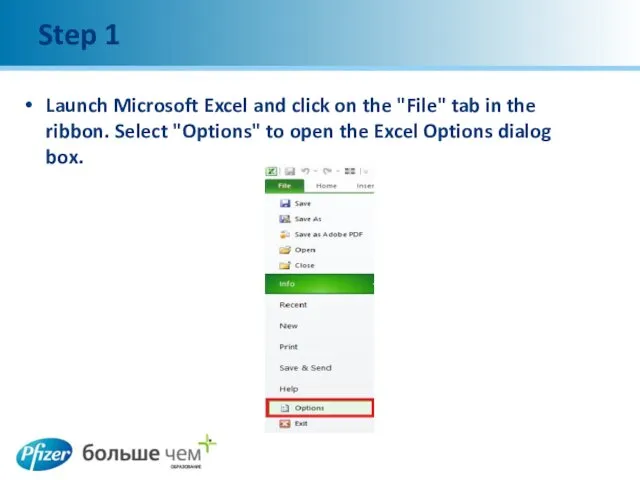
Step 1
Launch Microsoft Excel and click on the "File" tab in
Step 1
Launch Microsoft Excel and click on the "File" tab in
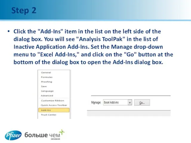
Step 2
Click the "Add-Ins" item in the list on the left
Step 2
Click the "Add-Ins" item in the list on the left
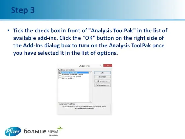
Step 3
Tick the check box in front of "Analysis ToolPak" in
Step 3
Tick the check box in front of "Analysis ToolPak" in
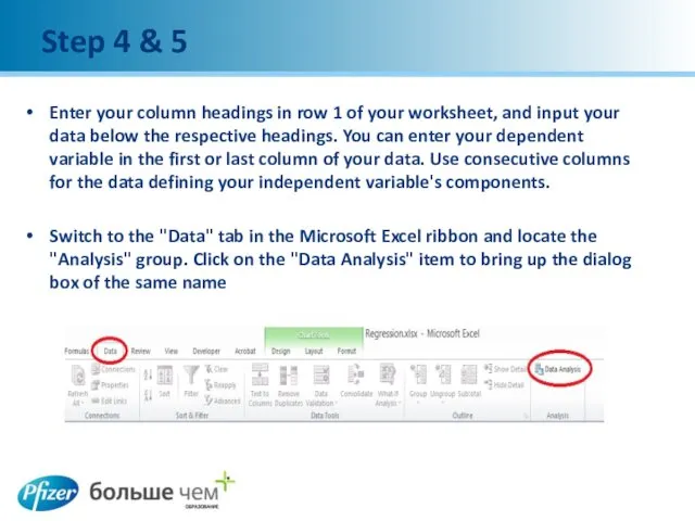
Step 4 & 5
Enter your column headings in row 1 of
Step 4 & 5
Enter your column headings in row 1 of
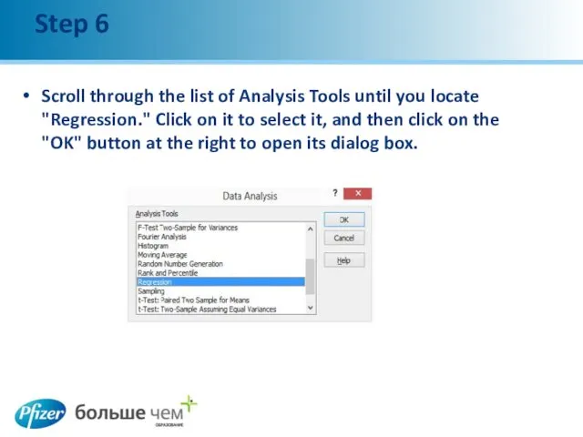
Step 6
Scroll through the list of Analysis Tools until you locate
Step 6
Scroll through the list of Analysis Tools until you locate
Step 7
Type the location of the cell range that contains your
Step 7
Type the location of the cell range that contains your
Step 8
Enter the location of the cell range that contains your
Step 8
Enter the location of the cell range that contains your
Step 9 & 10
Click on the "Labels" check box to tell
Step 9 & 10
Click on the "Labels" check box to tell
Step 11
Choose options from the Residuals section of the Regression dialog
Step 11
Choose options from the Residuals section of the Regression dialog
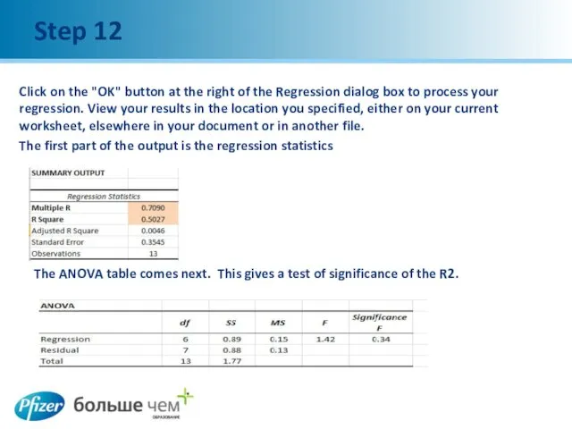
Step 12
Click on the "OK" button at the right of the
Step 12
Click on the "OK" button at the right of the
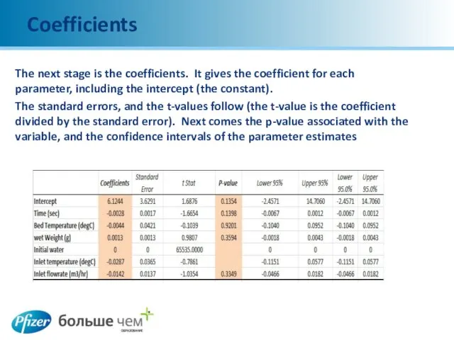
Coefficients
The next stage is the coefficients. It gives the coefficient for
Coefficients
The next stage is the coefficients. It gives the coefficient for
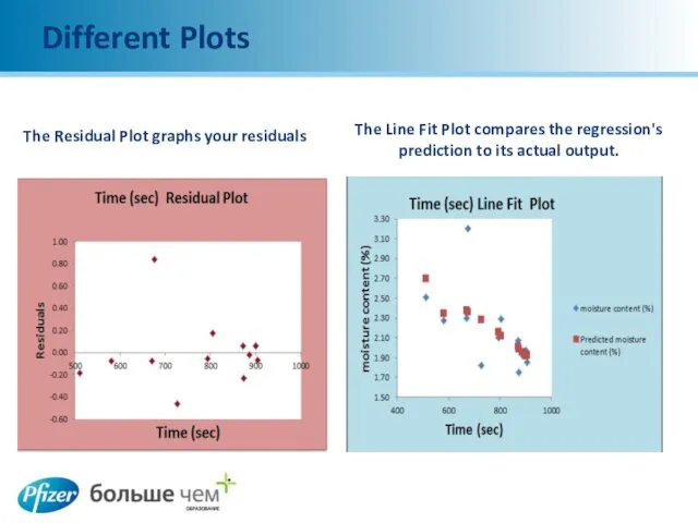
Different Plots
The Residual Plot graphs your residuals
The Line Fit Plot compares
Different Plots
The Residual Plot graphs your residuals
The Line Fit Plot compares
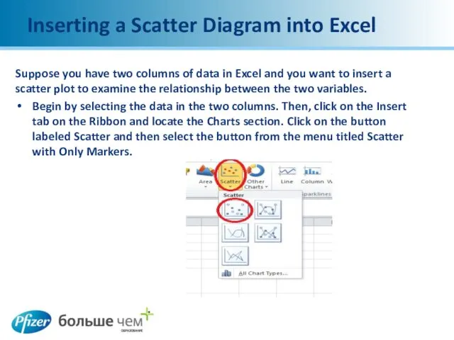
Inserting a Scatter Diagram into Excel
Suppose you have two columns of
Inserting a Scatter Diagram into Excel
Suppose you have two columns of
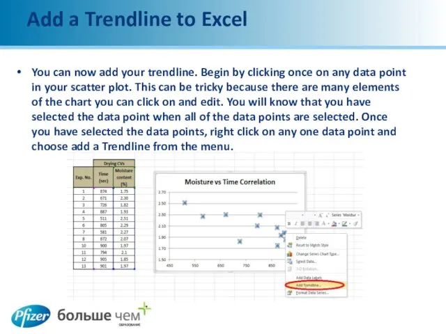
Add a Trendline to Excel
You can now add your trendline. Begin
Add a Trendline to Excel
You can now add your trendline. Begin
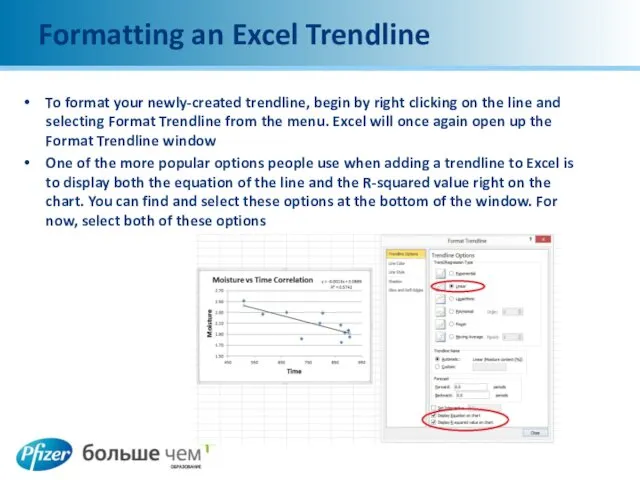
Formatting an Excel Trendline
To format your newly-created trendline, begin by right
Formatting an Excel Trendline
To format your newly-created trendline, begin by right
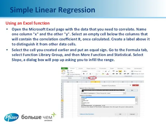
Simple Linear Regression
Using an Excel function
Open the Microsoft Excel page with
Simple Linear Regression
Using an Excel function
Open the Microsoft Excel page with
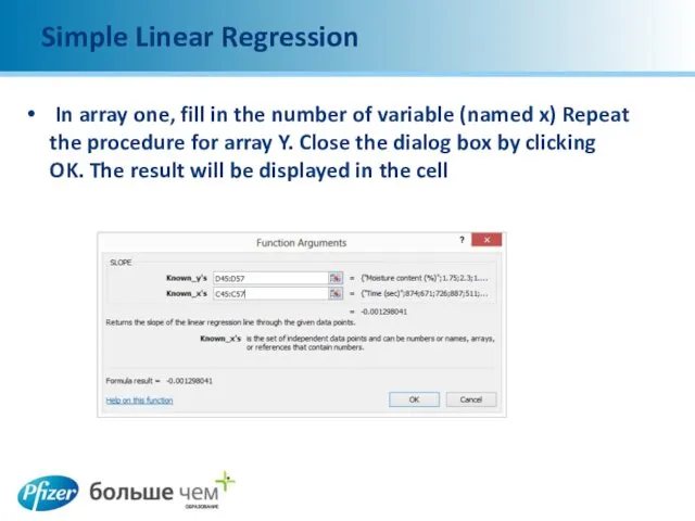
Simple Linear Regression
In array one, fill in the number of variable
Simple Linear Regression
In array one, fill in the number of variable
Linear Regression Formula
Repeat the same process to get result for Intercept
Linear Regression Formula
Repeat the same process to get result for Intercept
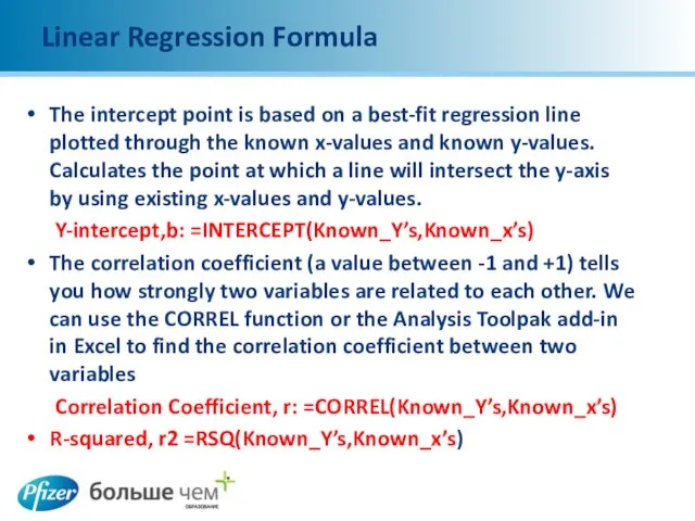
Linear Regression Formula
The intercept point is based on a best-fit regression
Linear Regression Formula
The intercept point is based on a best-fit regression
 Методична система навчання інформатики в середній загальноосвітній школі. (Лекція 1)
 Форматирование текста. Обработка текстовой информации. Информатика. 7 класс
 Hardware Configuration
 Растровая и векторная графика
 Отчет о прохождении учебной практики по модулю Эксплуатация и модификация информационных систем
 Проектирование пользовательского интерфейса. Тема 02
 LoRa™ Technology
 Проблемы виртуального общения
 Kvantobot - телеграм-бот
 Техника безопасности и организация рабочего места в компьютерном классе
 Глубокий массафол и другие методы продвижения аккаунтов инстаграм
 Мережева безпека. Аналіз трафіка та сигнатури атак
 Сборочное моделирование. Решения по управлению жизненным циклом, продукт IBM/Dassault Systemes
 Табличный способ решения логических задач
 Интернет как глобальная информационная система
 Бази даних
 Экспертные системы. Практическая работа №4
 EMUI. Создан для ИИ, обладает бесконечными возможностями
 HTML работа с текстом текст
 Специальные модели данных (Модели пространственных данных). ГИС. Лекция 10
 Математический аппарат для проектирования компьютерных сетей. Нахождение эйлеровых циклов и путей
 Защита беспилотных летательных аппаратов от спуфинг атак
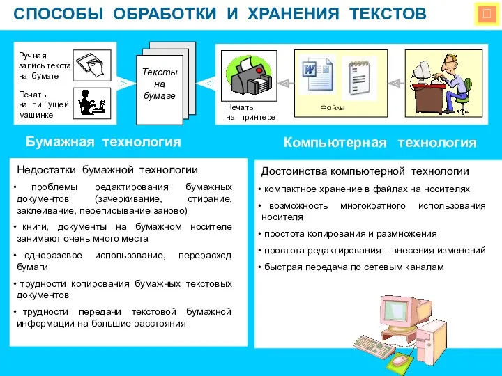 Способы обработки и хранения текстов
 Основные компоненты web-страницы и способы их визуального представления
 Информационные технологии в профессиональной деятельности
 Оцінка курсів у системі Moodle
 Викторина по информатике и математике
 База данных