- User-Centered Website Development: A Human-Computer Interaction Approach

Содержание
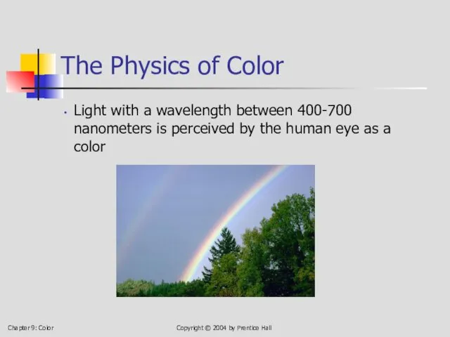
- 2. Chapter 9: Color Copyright © 2004 by Prentice Hall The Physics of Color Light with a
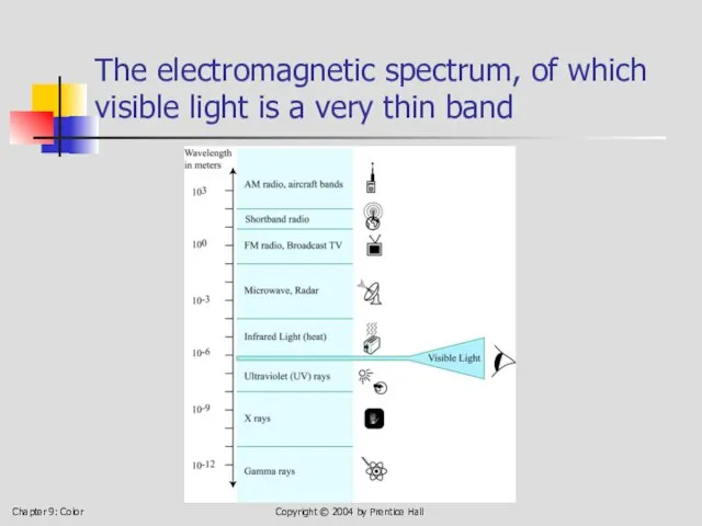
- 3. Chapter 9: Color Copyright © 2004 by Prentice Hall The electromagnetic spectrum, of which visible light
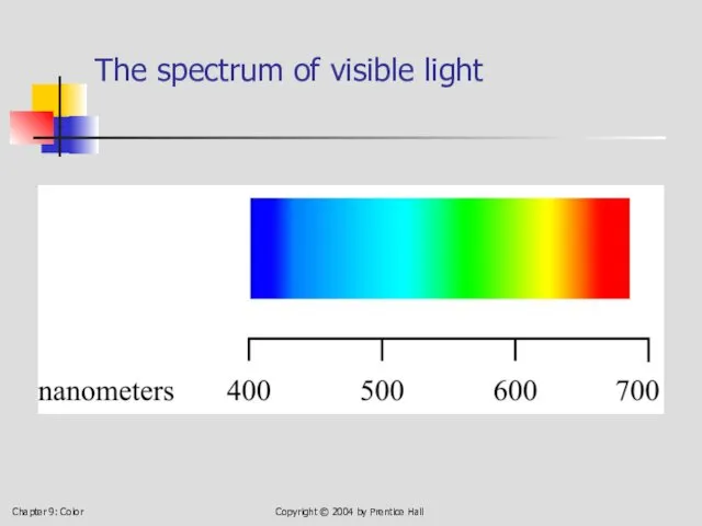
- 4. Chapter 9: Color Copyright © 2004 by Prentice Hall The spectrum of visible light
- 5. Chapter 9: Color Copyright © 2004 by Prentice Hall Human Response to Color (Weakness in seeing
- 6. Chapter 9: Color Copyright © 2004 by Prentice Hall 9.3 Color Models An artist’s color wheel:
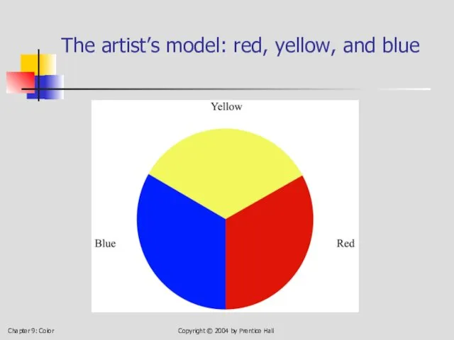
- 7. Chapter 9: Color Copyright © 2004 by Prentice Hall The artist’s model: red, yellow, and blue
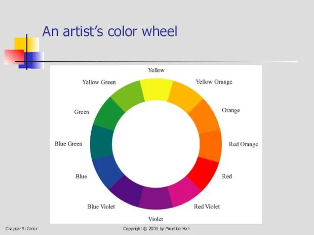
- 8. Chapter 9: Color Copyright © 2004 by Prentice Hall An artist’s color wheel
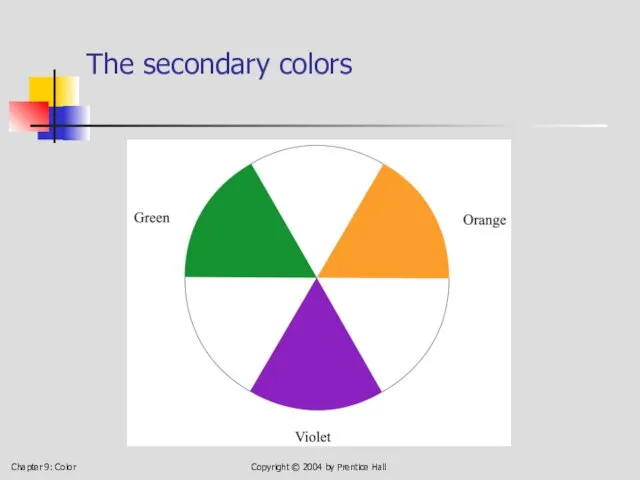
- 9. Chapter 9: Color Copyright © 2004 by Prentice Hall The secondary colors
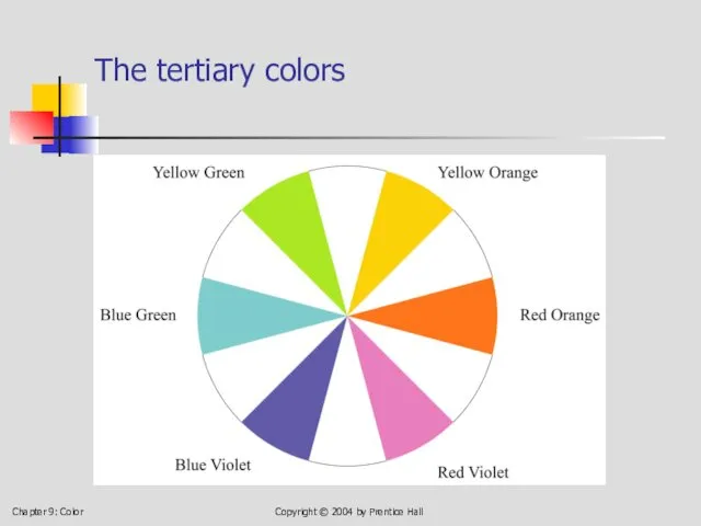
- 10. Chapter 9: Color Copyright © 2004 by Prentice Hall The tertiary colors
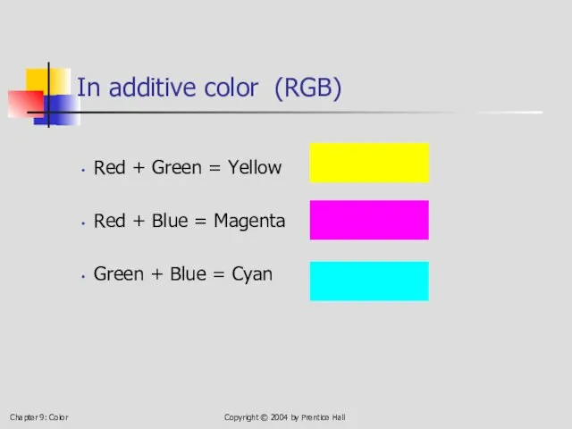
- 11. Chapter 9: Color Copyright © 2004 by Prentice Hall In additive color (RGB) Red + Green
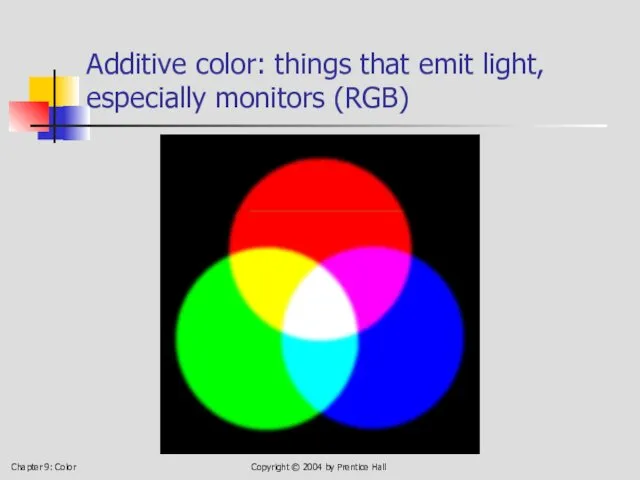
- 12. Chapter 9: Color Copyright © 2004 by Prentice Hall Additive color: things that emit light, especially
- 13. Chapter 9: Color Copyright © 2004 by Prentice Hall In subtractive color . . . Cyan
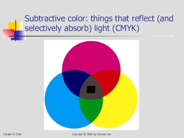
- 14. Chapter 9: Color Copyright © 2004 by Prentice Hall Subtractive color: things that reflect (and selectively
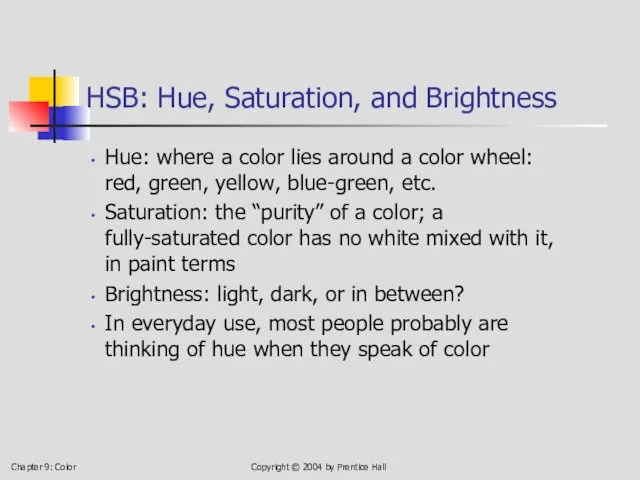
- 15. Chapter 9: Color Copyright © 2004 by Prentice Hall HSB: Hue, Saturation, and Brightness Hue: where
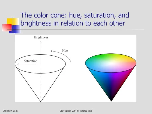
- 16. Chapter 9: Color Copyright © 2004 by Prentice Hall The color cone: hue, saturation, and brightness
- 17. Chapter 9: Color Copyright © 2004 by Prentice Hall HSB: Hue, Saturation, and Brightness
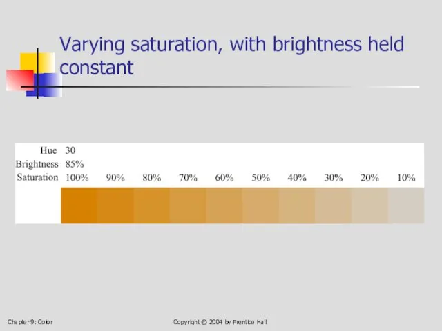
- 18. Chapter 9: Color Copyright © 2004 by Prentice Hall Varying saturation, with brightness held constant
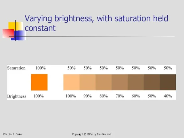
- 19. Chapter 9: Color Copyright © 2004 by Prentice Hall Varying brightness, with saturation held constant
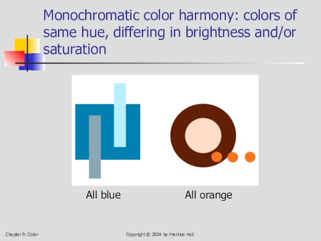
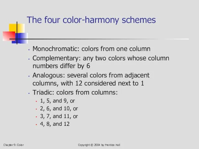
- 20. Chapter 9: Color Copyright © 2004 by Prentice Hall 9.4 Four Color-Harmony Schemes Monochromatic: colors of
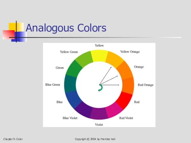
- 21. Chapter 9: Color Copyright © 2004 by Prentice Hall Analogous Colors
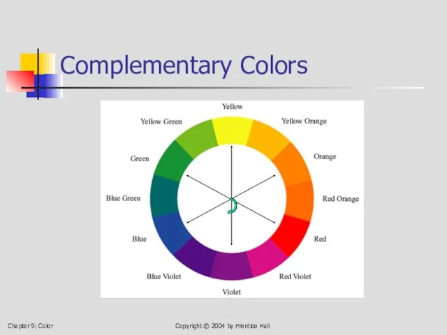
- 22. Chapter 9: Color Copyright © 2004 by Prentice Hall Complementary Colors
- 23. Chapter 9: Color Copyright © 2004 by Prentice Hall Triadic Colors
- 24. Chapter 9: Color Copyright © 2004 by Prentice Hall Monochromatic color harmony: colors of same hue,
- 25. Chapter 9: Color Copyright © 2004 by Prentice Hall Monochromatic example: orange, with variation in brightness
- 26. Chapter 9: Color Copyright © 2004 by Prentice Hall Complementary: red and green
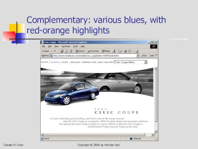
- 27. Chapter 9: Color Copyright © 2004 by Prentice Hall Complementary: various blues, with red-orange highlights
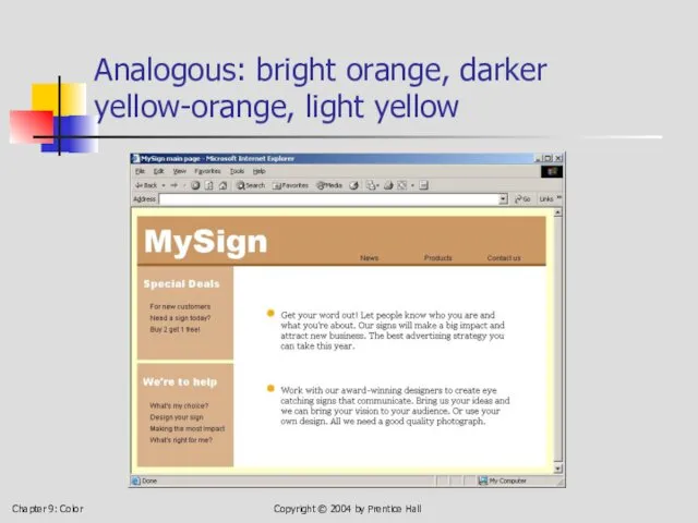
- 28. Chapter 9: Color Copyright © 2004 by Prentice Hall Analogous: bright orange, darker yellow-orange, light yellow
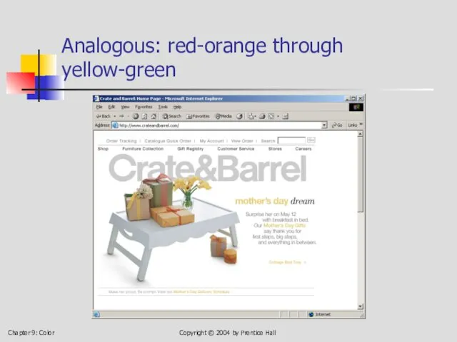
- 29. Chapter 9: Color Copyright © 2004 by Prentice Hall Analogous: red-orange through yellow-green
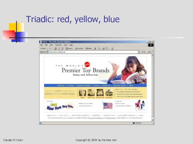
- 30. Chapter 9: Color Copyright © 2004 by Prentice Hall Triadic: red, yellow, blue
- 31. Chapter 9: Color Copyright © 2004 by Prentice Hall Triadic: red, yellow, blue
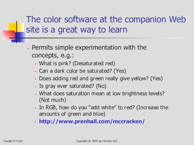
- 32. Chapter 9: Color Copyright © 2004 by Prentice Hall The color software at the companion Web
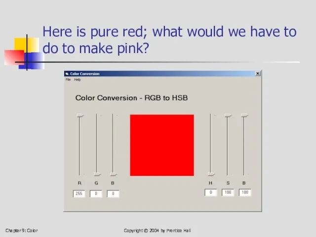
- 33. Chapter 9: Color Copyright © 2004 by Prentice Hall Here is pure red; what would we
- 34. Chapter 9: Color Copyright © 2004 by Prentice Hall Answer: add green and blue Copyright ©
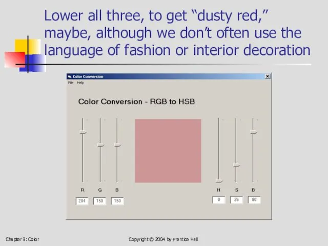
- 35. Chapter 9: Color Copyright © 2004 by Prentice Hall Lower all three, to get “dusty red,”
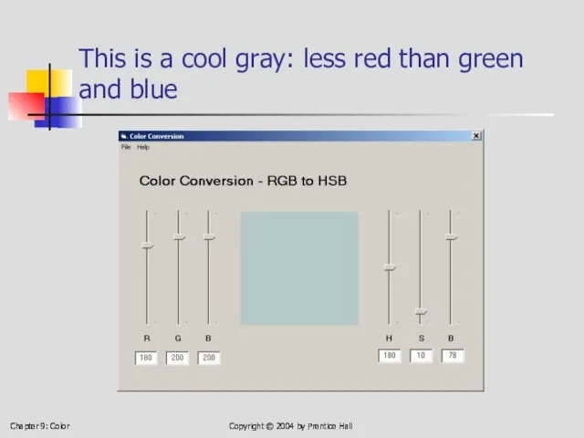
- 36. Chapter 9: Color Copyright © 2004 by Prentice Hall This is a cool gray: less red
- 37. Chapter 9: Color Copyright © 2004 by Prentice Hall This is a warm gray: less blue
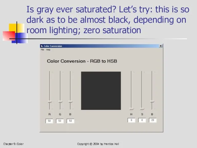
- 38. Chapter 9: Color Copyright © 2004 by Prentice Hall Is gray ever saturated? Let’s try: this
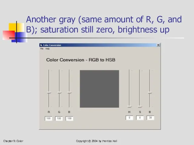
- 39. Chapter 9: Color Copyright © 2004 by Prentice Hall Another gray (same amount of R, G,
- 40. Chapter 9: Color Copyright © 2004 by Prentice Hall A lighter gray Copyright © 2004 by
- 41. Chapter 9: Color Copyright © 2004 by Prentice Hall Gray getting toward white; still zero saturation
- 42. Chapter 9: Color Copyright © 2004 by Prentice Hall Black is completely unsaturated, right? Right. Copyright
- 43. Chapter 9: Color Copyright © 2004 by Prentice Hall Change the amount of blue from zero
- 44. Chapter 9: Color Copyright © 2004 by Prentice Hall Now B = 40; can you distinguish
- 45. Chapter 9: Color Copyright © 2004 by Prentice Hall Now B = 100, and we have
- 46. Chapter 9: Color Copyright © 2004 by Prentice Hall Pure blue; fully saturated by any definition
- 47. Chapter 9: Color Copyright © 2004 by Prentice Hall A little more on color harmony In
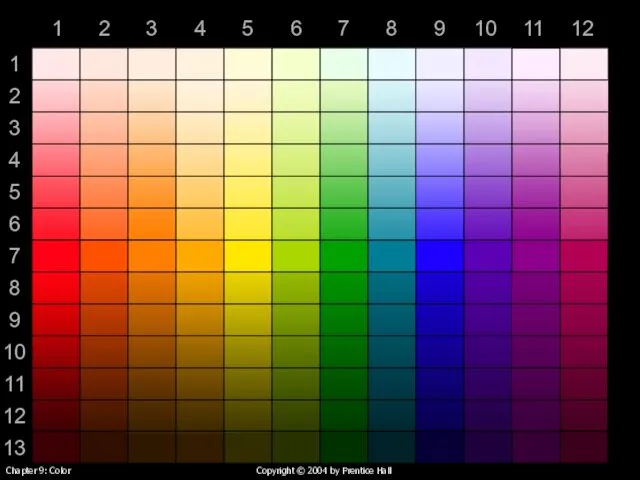
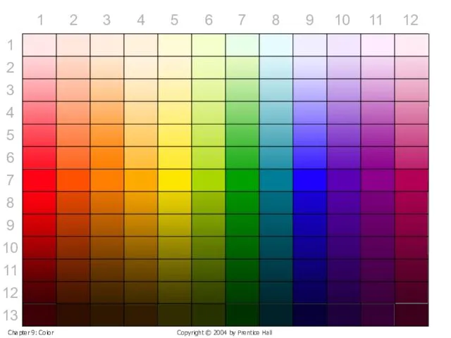
- 48. Chapter 9: Color Copyright © 2004 by Prentice Hall The colors, laid out linearly instead of
- 49. 1 2 3 4 5 6 7 8 9 10 11 12 1 2 3 4
- 50. 1 2 3 4 5 6 7 8 9 10 11 12 1 2 3 4
- 51. Chapter 9: Color Copyright © 2004 by Prentice Hall The four color-harmony schemes Monochromatic: colors from
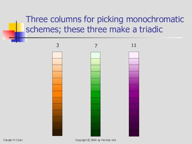
- 52. Chapter 9: Color Copyright © 2004 by Prentice Hall Three columns for picking monochromatic schemes; these
- 53. Chapter 9: Color Copyright © 2004 by Prentice Hall Monochromatic: Column 8, rows 2, 7, 12
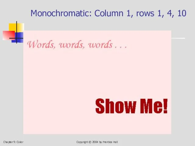
- 54. Chapter 9: Color Copyright © 2004 by Prentice Hall Monochromatic: Column 1, rows 1, 4, 10
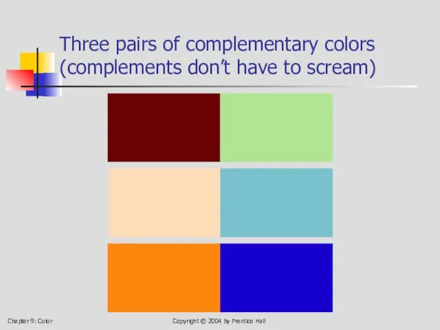
- 55. Chapter 9: Color Copyright © 2004 by Prentice Hall Three pairs of complementary colors (complements don’t
- 56. Chapter 9: Color Copyright © 2004 by Prentice Hall But they can scream, if you wish
- 57. Chapter 9: Color Copyright © 2004 by Prentice Hall A triadic can shout . . .
- 58. Chapter 9: Color Copyright © 2004 by Prentice Hall . . . or whisper . .
- 59. Chapter 9: Color Copyright © 2004 by Prentice Hall . . . or speak conversationally .
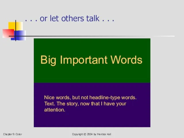
- 60. Chapter 9: Color Copyright © 2004 by Prentice Hall . . . or let others talk
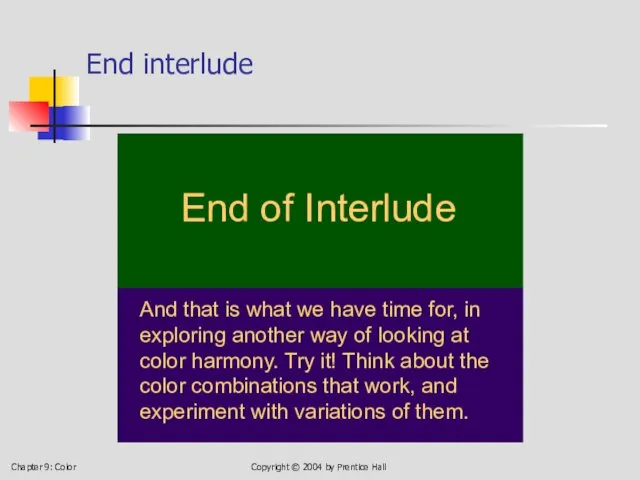
- 61. Chapter 9: Color Copyright © 2004 by Prentice Hall End interlude End of Interlude And that
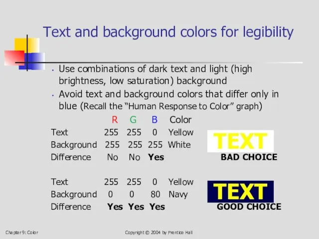
- 62. Chapter 9: Color Copyright © 2004 by Prentice Hall Text and background colors for legibility Use
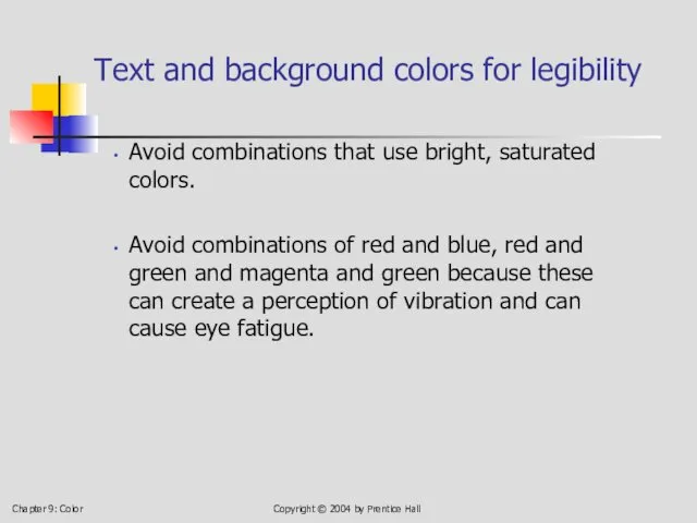
- 63. Chapter 9: Color Copyright © 2004 by Prentice Hall Text and background colors for legibility Avoid
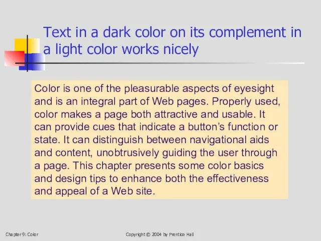
- 64. Chapter 9: Color Copyright © 2004 by Prentice Hall Text in a dark color on its
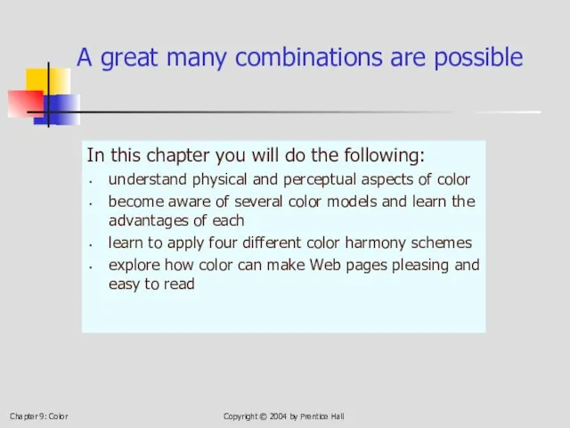
- 65. Chapter 9: Color Copyright © 2004 by Prentice Hall A great many combinations are possible In
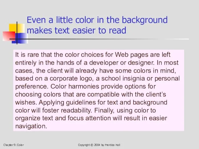
- 66. Chapter 9: Color Copyright © 2004 by Prentice Hall Even a little color in the background
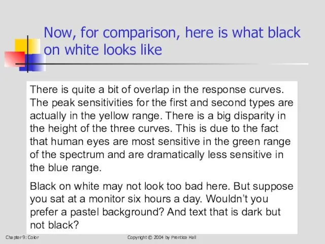
- 67. Chapter 9: Color Copyright © 2004 by Prentice Hall Now, for comparison, here is what black
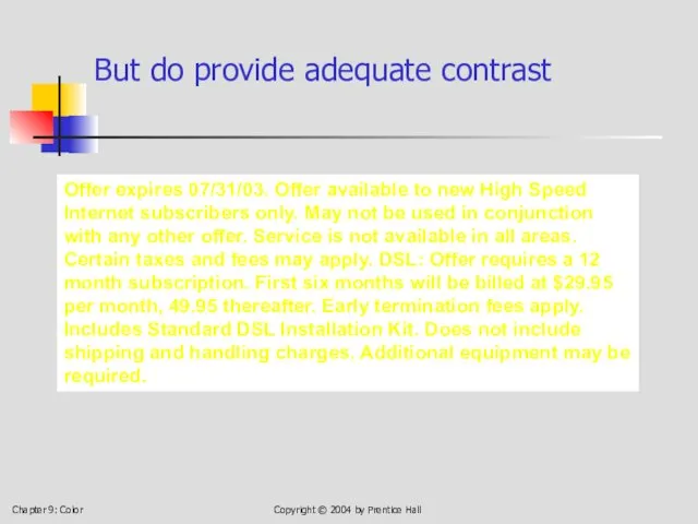
- 68. Chapter 9: Color Copyright © 2004 by Prentice Hall But do provide adequate contrast Offer expires
- 69. Chapter 9: Color Copyright © 2004 by Prentice Hall Always remember how we perceive blue vs.
- 70. Chapter 9: Color Copyright © 2004 by Prentice Hall Don’t use red on blue or vice-versa
- 71. Chapter 9: Color Copyright © 2004 by Prentice Hall Never use bright red on bright green
- 72. Chapter 9: Color Copyright © 2004 by Prentice Hall But change brightness and/or saturation . .
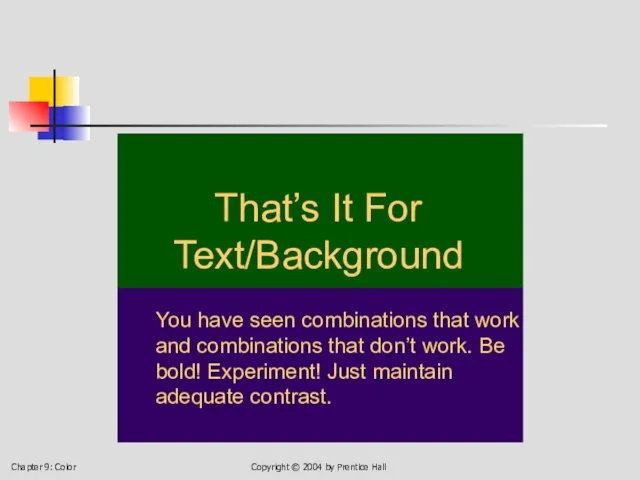
- 73. Chapter 9: Color Copyright © 2004 by Prentice Hall That’s It For Text/Background You have seen
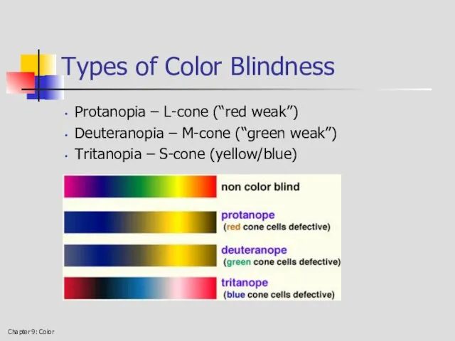
- 74. Chapter 9: Color Types of Color Blindness Protanopia – L-cone (“red weak”) Deuteranopia – M-cone (“green
- 75. Chapter 9: Color What Color Blindness Looks Like Normal Deuteranopia Tritanopia
- 76. Chapter 9: Color What Color Blindness Looks Like Normal Protanopia Deuteranopia Tritanopia
- 77. Chapter 9: Color Designing for Color Blindness Avoid red-on-green or green-on-red at all costs! Consider using
- 79. Скачать презентацию
Chapter 9: Color
Copyright © 2004 by Prentice Hall
The Physics of Color
Light
Chapter 9: Color
Copyright © 2004 by Prentice Hall
The Physics of Color
Light
Chapter 9: Color
Copyright © 2004 by Prentice Hall
The electromagnetic spectrum, of
Chapter 9: Color
Copyright © 2004 by Prentice Hall
The electromagnetic spectrum, of
Chapter 9: Color
Copyright © 2004 by Prentice Hall
The spectrum of visible
Chapter 9: Color
Copyright © 2004 by Prentice Hall
The spectrum of visible

Chapter 9: Color
Copyright © 2004 by Prentice Hall
Human Response to Color
(Weakness
Chapter 9: Color
Copyright © 2004 by Prentice Hall
Human Response to Color (Weakness
Chapter 9: Color
Copyright © 2004 by Prentice Hall
9.3 Color Models
An artist’s
Chapter 9: Color
Copyright © 2004 by Prentice Hall
9.3 Color Models
An artist’s
Chapter 9: Color
Copyright © 2004 by Prentice Hall
The artist’s model: red,
Chapter 9: Color
Copyright © 2004 by Prentice Hall
The artist’s model: red,
Chapter 9: Color
Copyright © 2004 by Prentice Hall
An artist’s color wheel
Chapter 9: Color
Copyright © 2004 by Prentice Hall
An artist’s color wheel
Chapter 9: Color
Copyright © 2004 by Prentice Hall
The secondary colors
Chapter 9: Color
Copyright © 2004 by Prentice Hall
The secondary colors
Chapter 9: Color
Copyright © 2004 by Prentice Hall
The tertiary colors
Chapter 9: Color
Copyright © 2004 by Prentice Hall
The tertiary colors
Chapter 9: Color
Copyright © 2004 by Prentice Hall
In additive color (RGB)
Red
Chapter 9: Color
Copyright © 2004 by Prentice Hall
In additive color (RGB)
Red
Chapter 9: Color
Copyright © 2004 by Prentice Hall
Additive color: things that
Chapter 9: Color
Copyright © 2004 by Prentice Hall
Additive color: things that

Chapter 9: Color
Copyright © 2004 by Prentice Hall
In subtractive color .
Chapter 9: Color
Copyright © 2004 by Prentice Hall
In subtractive color .
Chapter 9: Color
Copyright © 2004 by Prentice Hall
Subtractive color: things that
Chapter 9: Color
Copyright © 2004 by Prentice Hall
Subtractive color: things that
Chapter 9: Color
Copyright © 2004 by Prentice Hall
HSB: Hue, Saturation, and
Chapter 9: Color
Copyright © 2004 by Prentice Hall
HSB: Hue, Saturation, and
Chapter 9: Color
Copyright © 2004 by Prentice Hall
The color cone: hue,
Chapter 9: Color
Copyright © 2004 by Prentice Hall
The color cone: hue,

Chapter 9: Color
Copyright © 2004 by Prentice Hall
HSB: Hue, Saturation, and
Chapter 9: Color
Copyright © 2004 by Prentice Hall
HSB: Hue, Saturation, and
Chapter 9: Color
Copyright © 2004 by Prentice Hall
Varying saturation, with brightness
Chapter 9: Color
Copyright © 2004 by Prentice Hall
Varying saturation, with brightness
Chapter 9: Color
Copyright © 2004 by Prentice Hall
Varying brightness, with saturation
Chapter 9: Color
Copyright © 2004 by Prentice Hall
Varying brightness, with saturation

Chapter 9: Color
Copyright © 2004 by Prentice Hall
9.4 Four Color-Harmony Schemes
Monochromatic:
Chapter 9: Color
Copyright © 2004 by Prentice Hall
9.4 Four Color-Harmony Schemes
Monochromatic:
Chapter 9: Color
Copyright © 2004 by Prentice Hall
Analogous Colors
Chapter 9: Color
Copyright © 2004 by Prentice Hall
Analogous Colors
Chapter 9: Color
Copyright © 2004 by Prentice Hall
Complementary Colors
Chapter 9: Color
Copyright © 2004 by Prentice Hall
Complementary Colors

Chapter 9: Color
Copyright © 2004 by Prentice Hall
Triadic Colors
Chapter 9: Color
Copyright © 2004 by Prentice Hall
Triadic Colors
Chapter 9: Color
Copyright © 2004 by Prentice Hall
Monochromatic color harmony: colors
Chapter 9: Color
Copyright © 2004 by Prentice Hall
Monochromatic color harmony: colors
Chapter 9: Color
Copyright © 2004 by Prentice Hall
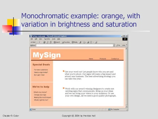
Monochromatic example: orange, with
Chapter 9: Color
Copyright © 2004 by Prentice Hall
Monochromatic example: orange, with
Chapter 9: Color
Copyright © 2004 by Prentice Hall
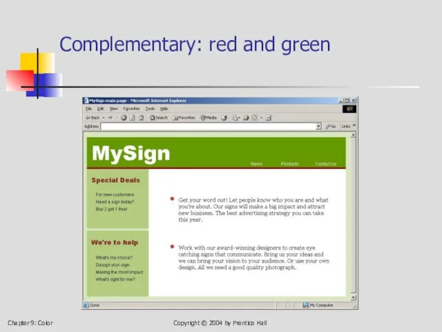
Complementary: red and green
Chapter 9: Color
Copyright © 2004 by Prentice Hall
Complementary: red and green
Chapter 9: Color
Copyright © 2004 by Prentice Hall
Complementary: various blues, with
Chapter 9: Color
Copyright © 2004 by Prentice Hall
Complementary: various blues, with
Chapter 9: Color
Copyright © 2004 by Prentice Hall
Analogous: bright orange, darker
Chapter 9: Color
Copyright © 2004 by Prentice Hall
Analogous: bright orange, darker
Chapter 9: Color
Copyright © 2004 by Prentice Hall
Analogous: red-orange through yellow-green
Chapter 9: Color
Copyright © 2004 by Prentice Hall
Analogous: red-orange through yellow-green

Chapter 9: Color
Copyright © 2004 by Prentice Hall
Triadic: red, yellow, blue
Chapter 9: Color
Copyright © 2004 by Prentice Hall
Triadic: red, yellow, blue
Chapter 9: Color
Copyright © 2004 by Prentice Hall
Triadic: red, yellow, blue
Chapter 9: Color
Copyright © 2004 by Prentice Hall
Triadic: red, yellow, blue
Chapter 9: Color
Copyright © 2004 by Prentice Hall
The color software at
Chapter 9: Color
Copyright © 2004 by Prentice Hall
The color software at
Chapter 9: Color
Copyright © 2004 by Prentice Hall
Here is pure red;
Chapter 9: Color
Copyright © 2004 by Prentice Hall
Here is pure red;

Chapter 9: Color
Copyright © 2004 by Prentice Hall
Answer: add green and
Chapter 9: Color
Copyright © 2004 by Prentice Hall
Answer: add green and
Chapter 9: Color
Copyright © 2004 by Prentice Hall
Lower all three, to
Chapter 9: Color
Copyright © 2004 by Prentice Hall
Lower all three, to
Chapter 9: Color
Copyright © 2004 by Prentice Hall
This is a cool
Chapter 9: Color
Copyright © 2004 by Prentice Hall
This is a cool

Chapter 9: Color
Copyright © 2004 by Prentice Hall
This is a warm
Chapter 9: Color
Copyright © 2004 by Prentice Hall
This is a warm
Chapter 9: Color
Copyright © 2004 by Prentice Hall
Is gray ever saturated?
Chapter 9: Color
Copyright © 2004 by Prentice Hall
Is gray ever saturated?
Chapter 9: Color
Copyright © 2004 by Prentice Hall
Another gray (same amount
Chapter 9: Color
Copyright © 2004 by Prentice Hall
Another gray (same amount
Chapter 9: Color
Copyright © 2004 by Prentice Hall
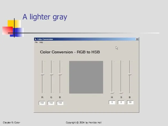
A lighter gray
Copyright ©
Chapter 9: Color
Copyright © 2004 by Prentice Hall
A lighter gray
Copyright ©
Chapter 9: Color
Copyright © 2004 by Prentice Hall
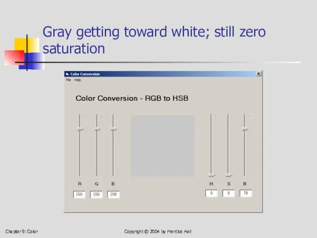
Gray getting toward white;
Chapter 9: Color
Copyright © 2004 by Prentice Hall
Gray getting toward white;
Chapter 9: Color
Copyright © 2004 by Prentice Hall
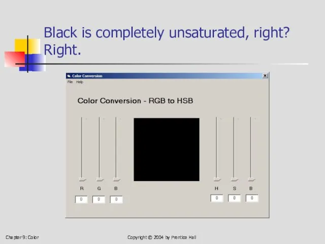
Black is completely unsaturated,
Chapter 9: Color
Copyright © 2004 by Prentice Hall
Black is completely unsaturated,
Chapter 9: Color
Copyright © 2004 by Prentice Hall
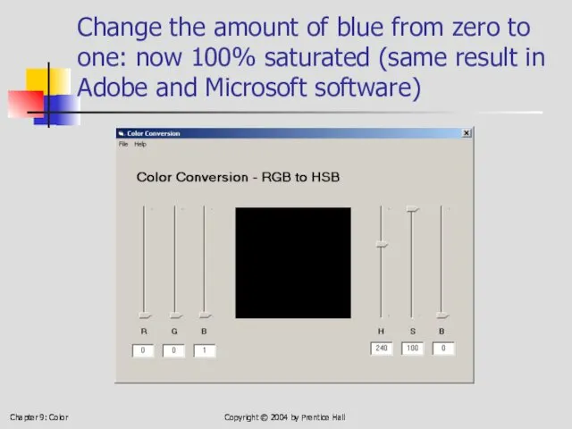
Change the amount of
Chapter 9: Color
Copyright © 2004 by Prentice Hall
Change the amount of
Chapter 9: Color
Copyright © 2004 by Prentice Hall
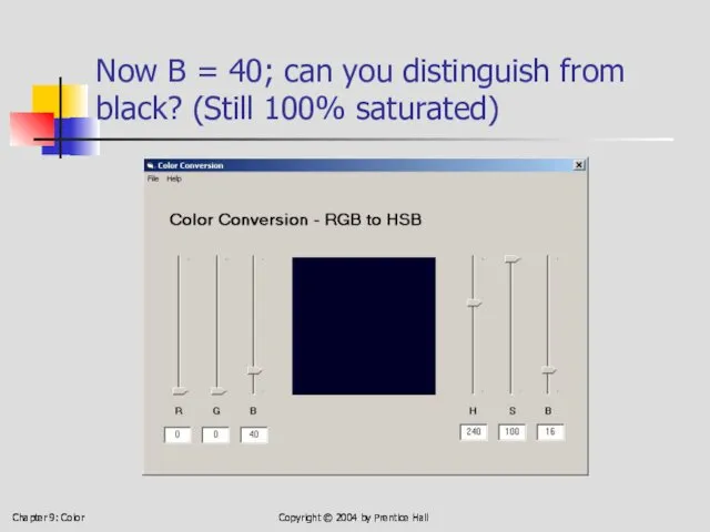
Now B = 40;
Chapter 9: Color
Copyright © 2004 by Prentice Hall
Now B = 40;
Chapter 9: Color
Copyright © 2004 by Prentice Hall
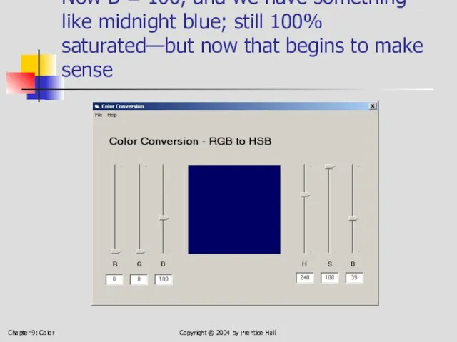
Now B = 100,
Chapter 9: Color
Copyright © 2004 by Prentice Hall
Now B = 100,

Chapter 9: Color
Copyright © 2004 by Prentice Hall
Pure blue; fully saturated
Chapter 9: Color
Copyright © 2004 by Prentice Hall
Pure blue; fully saturated
Chapter 9: Color
Copyright © 2004 by Prentice Hall
A little more on
Chapter 9: Color
Copyright © 2004 by Prentice Hall
A little more on
Chapter 9: Color
Copyright © 2004 by Prentice Hall
The colors, laid out
Chapter 9: Color
Copyright © 2004 by Prentice Hall
The colors, laid out
1
2
3
4
5
6
7
8
9
10
11
12
1
2
3
4
5
6
7
8
9
10
11
12
13
Chapter 9: Color
Copyright © 2004 by Prentice Hall
1
2
3
4
5
6
7
8
9
10
11
12
1
2
3
4
5
6
7
8
9
10
11
12
13
Chapter 9: Color
Copyright © 2004 by Prentice Hall
1
2
3
4
5
6
7
8
9
10
11
12
1
2
3
4
5
6
7
8
9
10
11
12
13
Chapter 9: Color
Copyright © 2004 by Prentice Hall
1
2
3
4
5
6
7
8
9
10
11
12
1
2
3
4
5
6
7
8
9
10
11
12
13
Chapter 9: Color
Copyright © 2004 by Prentice Hall
Chapter 9: Color
Copyright © 2004 by Prentice Hall
The four color-harmony schemes
Monochromatic:
Chapter 9: Color
Copyright © 2004 by Prentice Hall
The four color-harmony schemes
Monochromatic:
Chapter 9: Color
Copyright © 2004 by Prentice Hall
Three columns for picking
Chapter 9: Color
Copyright © 2004 by Prentice Hall
Three columns for picking

Chapter 9: Color
Copyright © 2004 by Prentice Hall
Monochromatic: Column 8, rows
Chapter 9: Color
Copyright © 2004 by Prentice Hall
Monochromatic: Column 8, rows
Chapter 9: Color
Copyright © 2004 by Prentice Hall
Monochromatic: Column 1, rows
Chapter 9: Color
Copyright © 2004 by Prentice Hall
Monochromatic: Column 1, rows
Chapter 9: Color
Copyright © 2004 by Prentice Hall
Three pairs of complementary
Chapter 9: Color
Copyright © 2004 by Prentice Hall
Three pairs of complementary

Chapter 9: Color
Copyright © 2004 by Prentice Hall
But they can scream,
Chapter 9: Color
Copyright © 2004 by Prentice Hall
But they can scream,

Chapter 9: Color
Copyright © 2004 by Prentice Hall
A triadic can shout
Chapter 9: Color
Copyright © 2004 by Prentice Hall
A triadic can shout

Chapter 9: Color
Copyright © 2004 by Prentice Hall
. . . or
Chapter 9: Color
Copyright © 2004 by Prentice Hall
. . . or

Chapter 9: Color
Copyright © 2004 by Prentice Hall
. . . or
Chapter 9: Color
Copyright © 2004 by Prentice Hall
. . . or
Chapter 9: Color
Copyright © 2004 by Prentice Hall
. . . or
Chapter 9: Color
Copyright © 2004 by Prentice Hall
. . . or
Chapter 9: Color
Copyright © 2004 by Prentice Hall
End interlude
End of Interlude
And
Chapter 9: Color
Copyright © 2004 by Prentice Hall
End interlude
End of Interlude
And
Chapter 9: Color
Copyright © 2004 by Prentice Hall
Text and background colors
Chapter 9: Color
Copyright © 2004 by Prentice Hall
Text and background colors
Chapter 9: Color
Copyright © 2004 by Prentice Hall
Text and background colors
Chapter 9: Color
Copyright © 2004 by Prentice Hall
Text and background colors
Chapter 9: Color
Copyright © 2004 by Prentice Hall
Text in a dark
Chapter 9: Color
Copyright © 2004 by Prentice Hall
Text in a dark
Chapter 9: Color
Copyright © 2004 by Prentice Hall
A great many combinations
Chapter 9: Color
Copyright © 2004 by Prentice Hall
A great many combinations
Chapter 9: Color
Copyright © 2004 by Prentice Hall
Even a little color
Chapter 9: Color
Copyright © 2004 by Prentice Hall
Even a little color
Chapter 9: Color
Copyright © 2004 by Prentice Hall
Now, for comparison, here
Chapter 9: Color
Copyright © 2004 by Prentice Hall
Now, for comparison, here
Chapter 9: Color
Copyright © 2004 by Prentice Hall
But do provide adequate
Chapter 9: Color
Copyright © 2004 by Prentice Hall
But do provide adequate
Chapter 9: Color
Copyright © 2004 by Prentice Hall
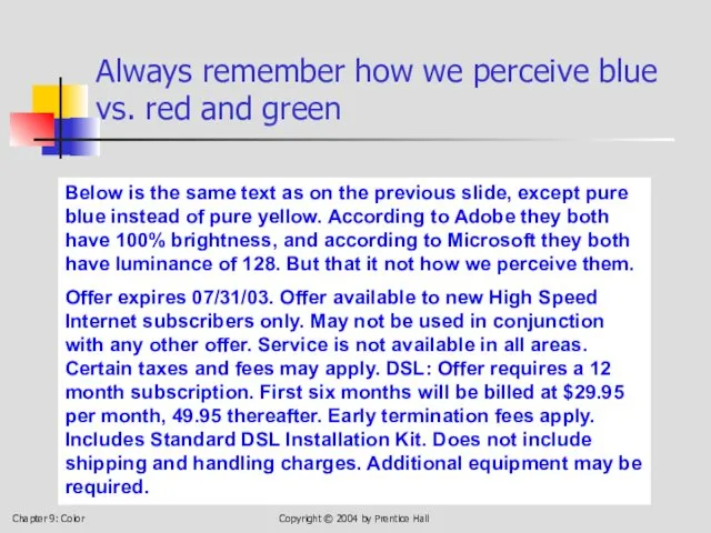
Always remember how we
Chapter 9: Color
Copyright © 2004 by Prentice Hall
Always remember how we
Chapter 9: Color
Copyright © 2004 by Prentice Hall
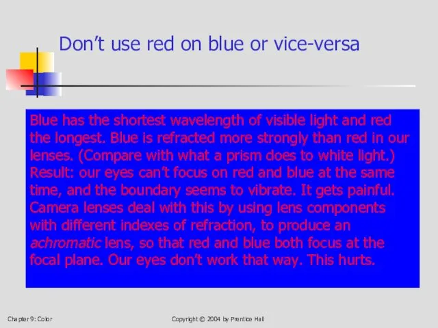
Don’t use red on
Chapter 9: Color
Copyright © 2004 by Prentice Hall
Don’t use red on

Chapter 9: Color
Copyright © 2004 by Prentice Hall
Never use bright red
Chapter 9: Color
Copyright © 2004 by Prentice Hall
Never use bright red
Chapter 9: Color
Copyright © 2004 by Prentice Hall
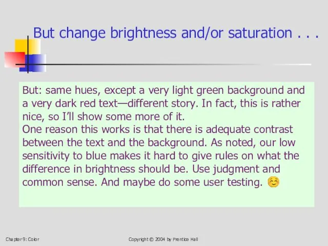
But change brightness and/or
Chapter 9: Color
Copyright © 2004 by Prentice Hall
But change brightness and/or
Chapter 9: Color
Copyright © 2004 by Prentice Hall
That’s It For Text/Background
You
Chapter 9: Color
Copyright © 2004 by Prentice Hall
That’s It For Text/Background
You
Chapter 9: Color
Types of Color Blindness
Protanopia – L-cone (“red weak”)
Deuteranopia –
Chapter 9: Color
Types of Color Blindness
Protanopia – L-cone (“red weak”)
Deuteranopia –

Chapter 9: Color
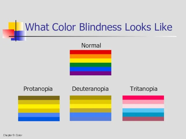
What Color Blindness Looks Like
Normal Deuteranopia Tritanopia
Chapter 9: Color
What Color Blindness Looks Like
Normal Deuteranopia Tritanopia
Chapter 9: Color
What Color Blindness Looks Like
Normal
Protanopia Deuteranopia Tritanopia
Chapter 9: Color
What Color Blindness Looks Like
Normal
Protanopia Deuteranopia Tritanopia
Chapter 9: Color
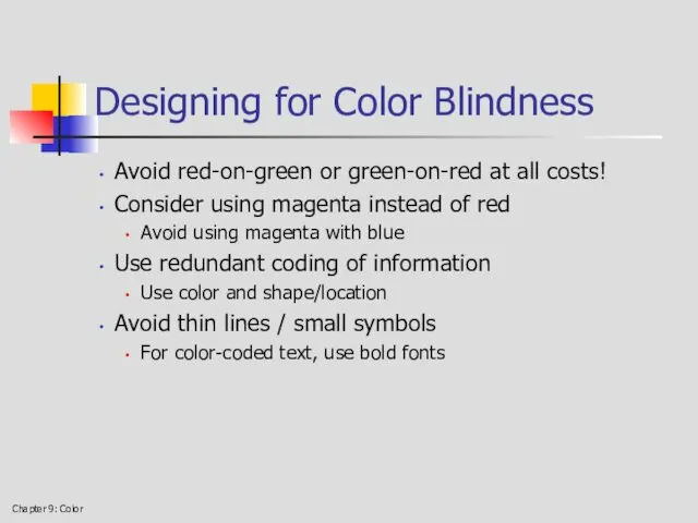
Designing for Color Blindness
Avoid red-on-green or green-on-red at all
Chapter 9: Color
Designing for Color Blindness
Avoid red-on-green or green-on-red at all
 Разработка алгоритмов распознавания дефекта изделия с использованием нейронных сетей
 Сравнительная характеристика операционной системы Windows XP и Vista (11 класс)
 Введение в SMM. Урок №1
 4. Java OOP. 3. Encapsulation
 Паттерн фабричный метод (шаблон)
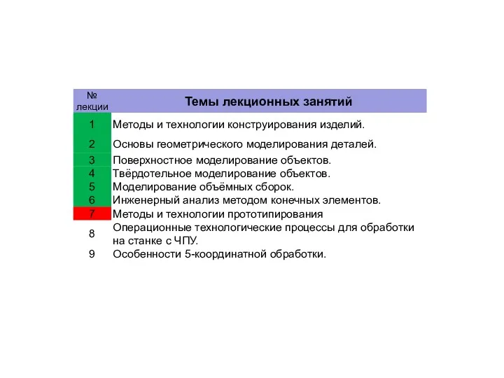 Методы и технологии прототипирования изделий. (Лекция 7)
 Взаимодействие с сервером Oracle
 Технические решения и проектирование подсистем автоматического управления в ЭСБ различного функционального назначения (Часть 6)
 Независимые повторности, как основа для вероятностных выводов о свойствах генеральной совокупности. (Лекция 6)
 Рост эффективности, инвестиционной привлекательности и капитализации бизнеса при использовании ERP-решений фирмы 1С
 Программирование передачи информации между компьютерами по сети. Клиент-серверные приложения
 Instructions for use. Edit in Google slides edit in PowerPoint®
 Связь web-страницы с базой данных
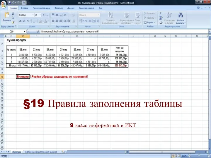 Правила заполнения таблицы
 Структура интернет-рынка в России
 Ресурсы сети в научных исследованиях: преимущества и недостатки
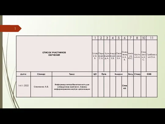 Информационная безопасность для сотрудников компании. Законы информирования внутри организации
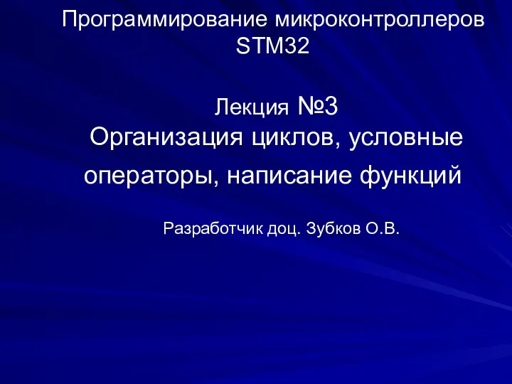 Организация циклов, условные операторы, написание функций
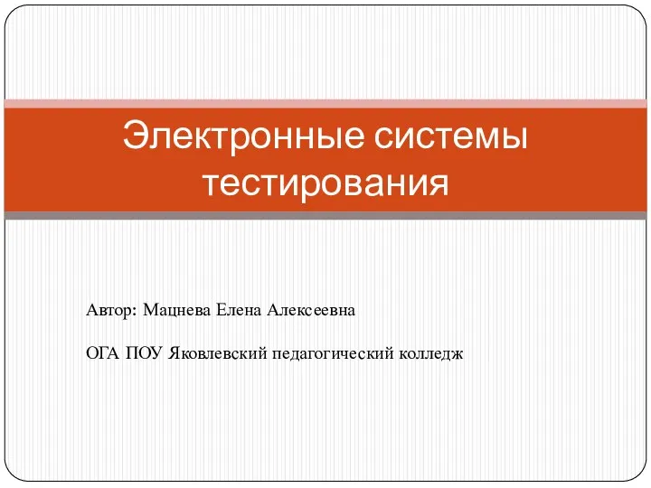 Электронные системы тестирования
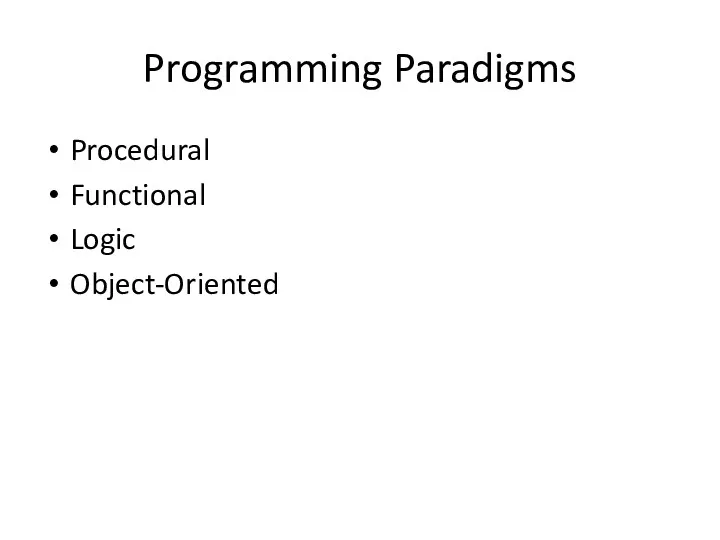 Programming paradigms
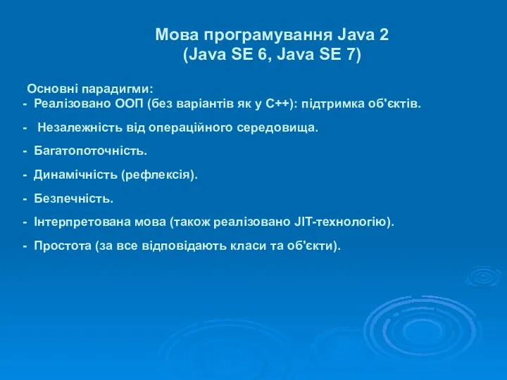 Мова програмування Java 2 (Java SE 6, Java SE 7)
 Отцы и дети онлайн. Чего не знают родители
 Позиционирование, Декоративные элементы
 Индексы в СУБД PostgreSQL
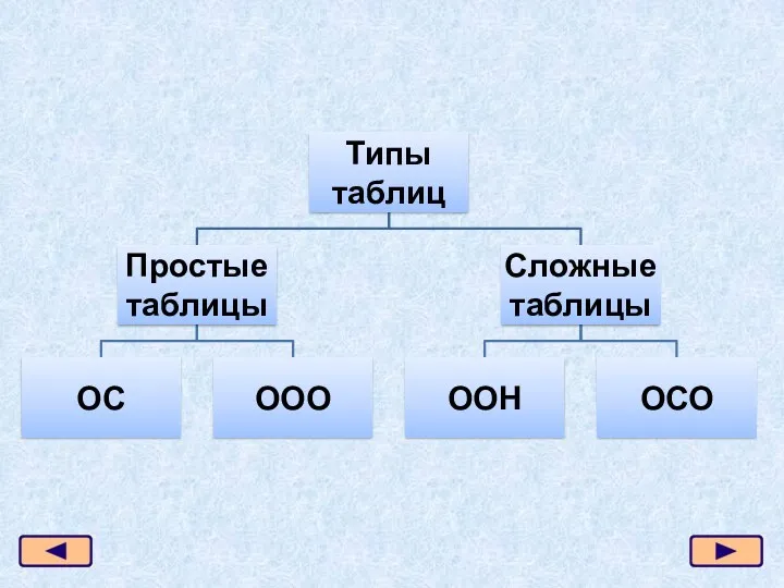 Презентация 7 класс Типы таблиц
 Право и этика СМИ
 Администрирование межсетевых экранов. Лекция 7
 Кейсы и антикейсы: SEO для новых рынков - как продвигаться, если выдача и конкуренция меняется каждый день