- Website quick critique report

Содержание
- 2. Areas of Improvements Hyperlinks (nil or broken links) Consistency in the color harmony/patterns across the website
- 3. UX Aesthetics Brand Logo not visible on the front page About Us on the main page
- 4. UX Aesthetics Home page has too many images and cluttered information Captcha is broken ‘Pass The
- 5. Lead Capture form is broken, immediate attention required to fix as ChainHaus is losing vital leads
- 7. Скачать презентацию
Areas of Improvements
Hyperlinks (nil or broken links)
Consistency in the color harmony/patterns
Areas of Improvements
Hyperlinks (nil or broken links)
Consistency in the color harmony/patterns
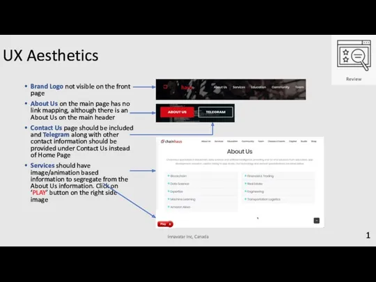
UX Aesthetics
Brand Logo not visible on the front page
About Us on
UX Aesthetics
Brand Logo not visible on the front page
About Us on
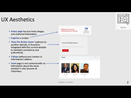
UX Aesthetics
Home page has too many images and cluttered information
Captcha is
UX Aesthetics
Home page has too many images and cluttered information
Captcha is
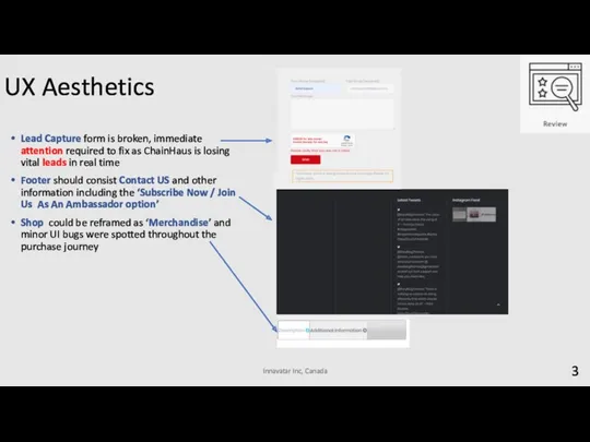
Lead Capture form is broken, immediate attention required to fix as
Lead Capture form is broken, immediate attention required to fix as
 Персональный компьютер как система
 Мультимедия и области его применения
 Free PPT templates
 Инновационная политика государства. (Тема 16)
 Разнообразие задач обработки информации
 Строки в Pascal. Решение задач
 Графический дизайнер
 Разработка Web-сайтов с использованием языка разметки гипертекста HTML
 Изображения и формы в HTML. 3 определения
 Моя будущая профессия - разработчик игр
 Прикладная среда табличного процессора EXCEL
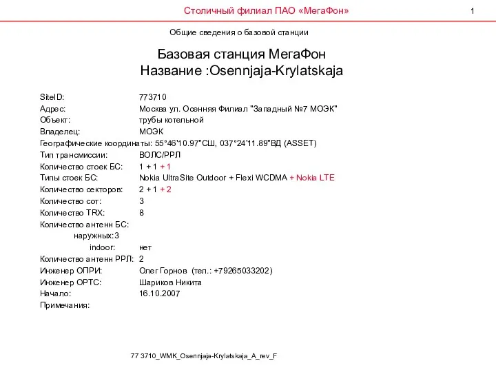 Базовая станция МегаФон
 Методическая разработка внеклассного мероприятия Турнир знатоков Информатики Внеклассное мероприятие по информатике для учащихся 6-го класса Внеклассное мероприятие по информатике для учащихся 6-го класса Турнир знатоков ИНФОРМАТ
 Двумерные массивы
 Впровадження бітрікс24
 Безпека в Інтернеті. Безпечне зберігання даних
 Урок-подорож у безпечний інтернет
 Новое библиографическое описание документа
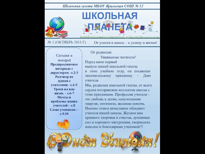 Школьная газета МБОУ Ярцевская СОШ № 12 № 1 (октябрь 2018)
 Устройство ПК
 Медведи – дружная ватага
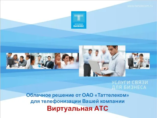 Виртуальная АТС
 Switch - оператор множественного выбора
 Что такое информационная система
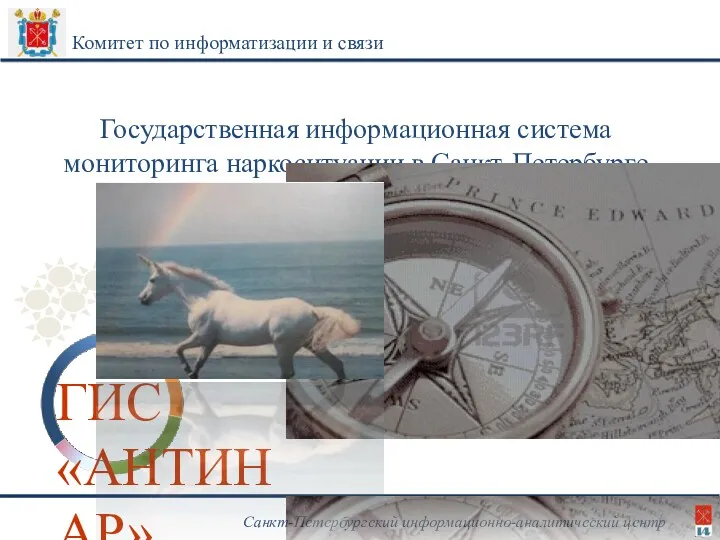 Государственная информационная система мониторинга наркоситуации в Санкт-Петербурге ГИС Антинар
 HMI - парадигмы взаимодействия
 Операции и стандартные функции Turbo Pascal 7.0
 Цифровой дневник. Проект “Поселок городского типа в Нижнем Тагиле’’