- Python. Основы. Визуализация данных. Лекция 8

Содержание
- 2. Matplotlib — библиотека на языке программирования Python для визуализации данных двумерной 2D и трехмерной графики 3D.
- 3. Пакет поддерживает многие виды графиков и диаграмм: Графики (line plot) Диаграммы разброса (scatter plot) Столбчатые диаграммы
- 4. Библиотека Matplotlib является одним из самых популярных средств визуализации данных на Python. Она отлично подходит как
- 5. Для построения графиков из библиотеки Matplotlib нужно импортировать модуль Pyplot. Pyplot это набор команд, созданных для
- 6. Примеры применения Matplotlib – Gallery
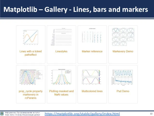
- 7. Matplotlib – Gallery - Lines, bars and markers https://matplotlib.org/stable/gallery/index.html
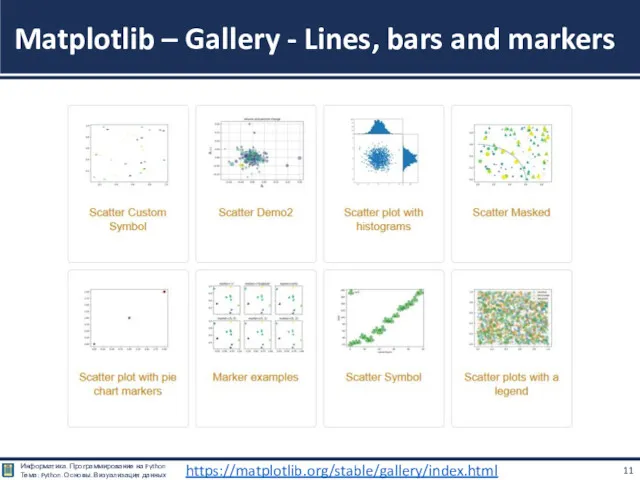
- 8. Matplotlib – Gallery - Lines, bars and markers https://matplotlib.org/stable/gallery/index.html
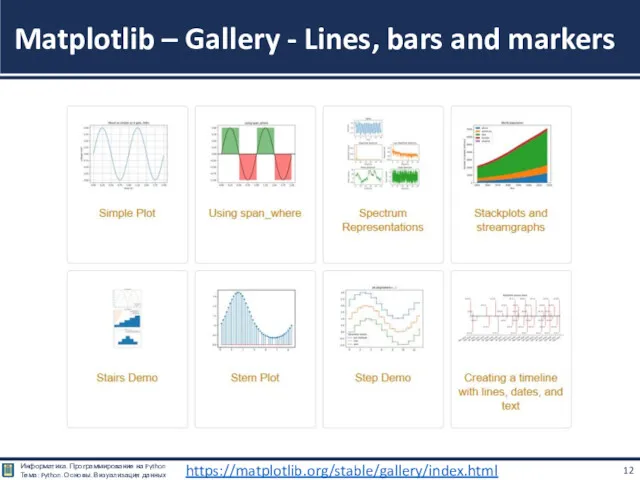
- 9. Matplotlib – Gallery - Lines, bars and markers https://matplotlib.org/stable/gallery/index.html
- 10. Matplotlib – Gallery - Lines, bars and markers https://matplotlib.org/stable/gallery/index.html
- 11. Matplotlib – Gallery - Lines, bars and markers https://matplotlib.org/stable/gallery/index.html
- 12. Matplotlib – Gallery - Lines, bars and markers https://matplotlib.org/stable/gallery/index.html
- 13. Matplotlib – Gallery - Lines, bars and markers https://matplotlib.org/stable/gallery/index.html
- 14. Matplotlib – Gallery - Images, contours and fields https://matplotlib.org/stable/gallery/index.html
- 15. Matplotlib – Gallery - Images, contours and fields https://matplotlib.org/stable/gallery/index.html
- 16. Matplotlib – Gallery - Images, contours and fields https://matplotlib.org/stable/gallery/index.html
- 17. Matplotlib – Gallery - Images, contours and fields https://matplotlib.org/stable/gallery/index.html
- 18. Matplotlib – Gallery - Images, contours and fields https://matplotlib.org/stable/gallery/index.html
- 19. Matplotlib – Gallery - Images, contours and fields https://matplotlib.org/stable/gallery/index.html
- 20. Matplotlib – Gallery - Subplots, axes and figures https://matplotlib.org/stable/gallery/index.html
- 21. Matplotlib – Gallery - Subplots, axes and figures https://matplotlib.org/stable/gallery/index.html
- 22. Matplotlib – Gallery - Subplots, axes and figures https://matplotlib.org/stable/gallery/index.html
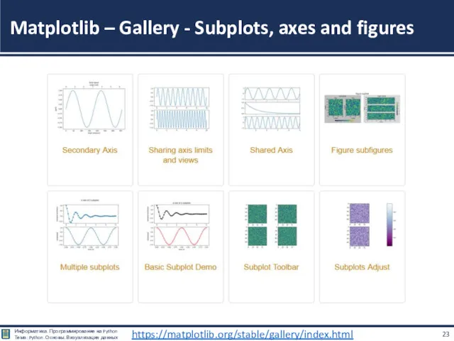
- 23. Matplotlib – Gallery - Subplots, axes and figures https://matplotlib.org/stable/gallery/index.html
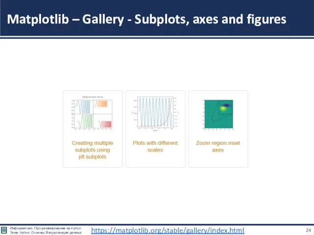
- 24. Matplotlib – Gallery - Subplots, axes and figures https://matplotlib.org/stable/gallery/index.html
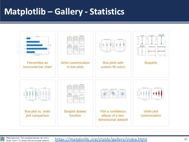
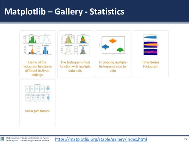
- 25. Matplotlib – Gallery - Statistics https://matplotlib.org/stable/gallery/index.html
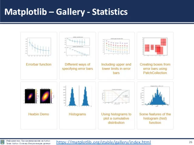
- 26. Matplotlib – Gallery - Statistics https://matplotlib.org/stable/gallery/index.html
- 27. Matplotlib – Gallery - Statistics https://matplotlib.org/stable/gallery/index.html
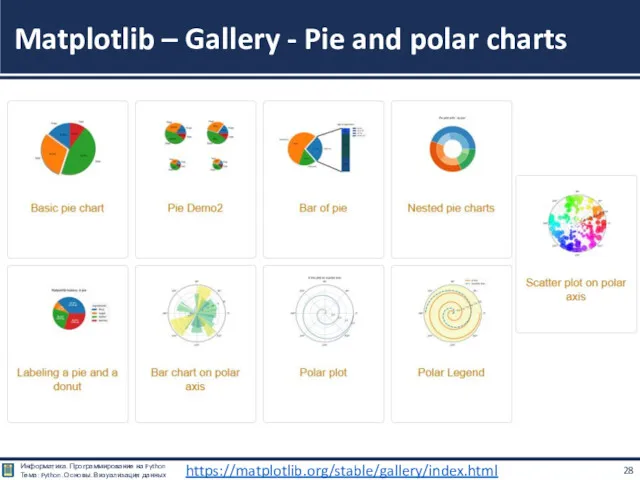
- 28. Matplotlib – Gallery - Pie and polar charts https://matplotlib.org/stable/gallery/index.html
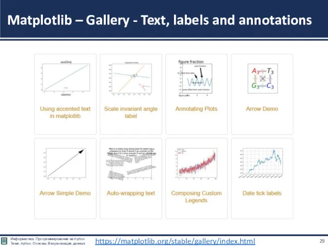
- 29. Matplotlib – Gallery - Text, labels and annotations https://matplotlib.org/stable/gallery/index.html
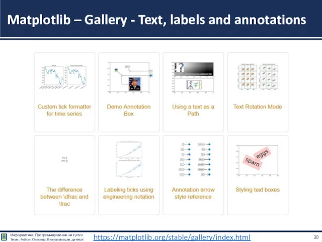
- 30. Matplotlib – Gallery - Text, labels and annotations https://matplotlib.org/stable/gallery/index.html
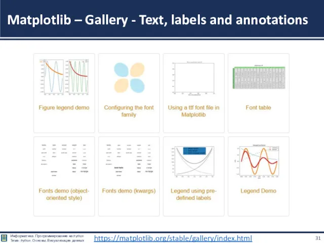
- 31. Matplotlib – Gallery - Text, labels and annotations https://matplotlib.org/stable/gallery/index.html
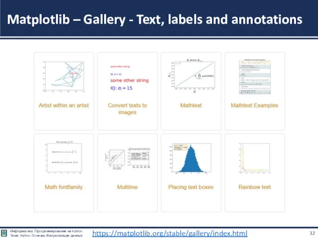
- 32. Matplotlib – Gallery - Text, labels and annotations https://matplotlib.org/stable/gallery/index.html
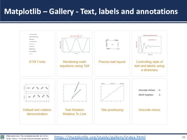
- 33. Matplotlib – Gallery - Text, labels and annotations https://matplotlib.org/stable/gallery/index.html
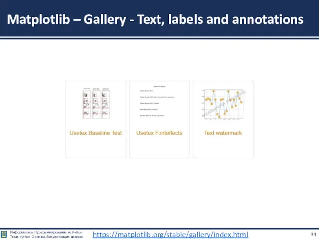
- 34. Matplotlib – Gallery - Text, labels and annotations https://matplotlib.org/stable/gallery/index.html
- 35. Matplotlib – Gallery - Pyplot https://matplotlib.org/stable/gallery/index.html
- 36. Matplotlib – Gallery - Pyplot https://matplotlib.org/stable/gallery/index.html
- 37. Matplotlib – Gallery - Pyplot https://matplotlib.org/stable/gallery/index.html
- 38. Matplotlib – Gallery - Color https://matplotlib.org/stable/gallery/index.html
- 39. Matplotlib – Gallery - Shapes and collections https://matplotlib.org/stable/gallery/index.html
- 40. Matplotlib – Gallery - Shapes and collections https://matplotlib.org/stable/gallery/index.html
- 41. Matplotlib – Gallery - Style sheets https://matplotlib.org/stable/gallery/index.html
- 42. Matplotlib – Gallery - Axes Grid https://matplotlib.org/stable/gallery/index.html
- 43. Matplotlib – Gallery - Axes Grid https://matplotlib.org/stable/gallery/index.html
- 44. Matplotlib – Gallery - Axes Grid https://matplotlib.org/stable/gallery/index.html
- 45. Matplotlib – Gallery - Axis Artist https://matplotlib.org/stable/gallery/index.html
- 46. Matplotlib – Gallery - Axis Artist https://matplotlib.org/stable/gallery/index.html
- 47. Matplotlib – Gallery - Showcase https://matplotlib.org/stable/gallery/index.html
- 48. Matplotlib – Gallery - Animation https://matplotlib.org/stable/gallery/index.html
- 49. Matplotlib – Gallery - Animation https://matplotlib.org/stable/gallery/index.html
- 50. Matplotlib – Gallery - Front Page https://matplotlib.org/stable/gallery/index.html
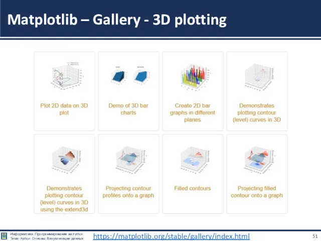
- 51. Matplotlib – Gallery - 3D plotting https://matplotlib.org/stable/gallery/index.html
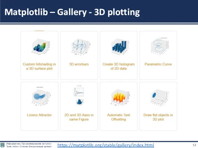
- 52. Matplotlib – Gallery - 3D plotting https://matplotlib.org/stable/gallery/index.html
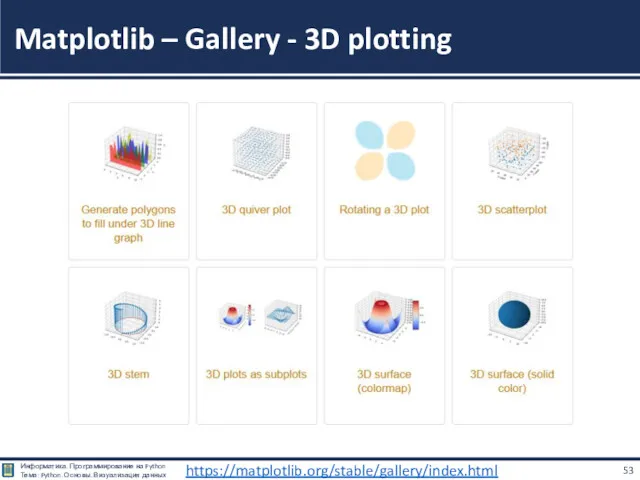
- 53. Matplotlib – Gallery - 3D plotting https://matplotlib.org/stable/gallery/index.html
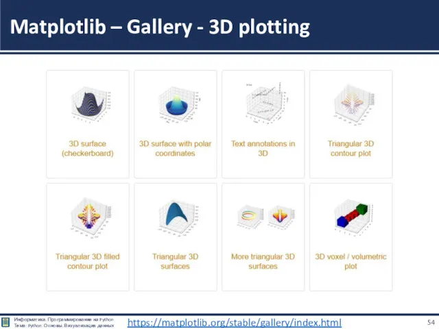
- 54. Matplotlib – Gallery - 3D plotting https://matplotlib.org/stable/gallery/index.html
- 55. Matplotlib – Gallery - 3D plotting https://matplotlib.org/stable/gallery/index.html
- 56. Matplotlib – Gallery - Scales https://matplotlib.org/stable/gallery/index.html
- 57. Matplotlib – Gallery - Specialty Plots https://matplotlib.org/stable/gallery/index.html
- 58. Matplotlib – Gallery - Specialty Plots https://matplotlib.org/stable/gallery/index.html
- 59. Matplotlib – Gallery - Ticks and spines https://matplotlib.org/stable/gallery/index.html
- 60. Matplotlib – Gallery - Ticks and spines https://matplotlib.org/stable/gallery/index.html
- 61. Matplotlib – Gallery - Ticks and spines https://matplotlib.org/stable/gallery/index.html
- 62. Примеры – Галерея MatplotLib https://matplotlib.org/stable/gallery/index.html Скачать все примеры - Python исходники программ: gallery_python.zip https://matplotlib.org/stable/_downloads/63b34a63fc35d506739b9835d7e98958/gallery_python.zip Скачать все
- 63. Matplotlib Создание графиков
- 64. # подключение набор команд для работы с графиками из библиотеки matplotlib import matplotlib.pyplot as plt #
- 65. Matplotlib - Основные элементы графика
- 66. Matplotlib - Основные элементы графика
- 67. plt.scatter(x, y, params) — нарисовать точки с координатами из x по горизонтальной оси и из y
- 68. plt.figure(figsize=(x, y)) — создать график размера (x,y); plt.show() — показать график; plt.subplot(...) — добавить подграфик; plt.xlim(x_min,
- 69. plt.plot(x, y, params) — нарисовать график по точкам с координатами из x по горизонтальной оси и
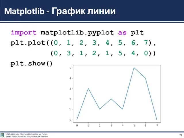
- 70. Метод построения линии очень прост: есть массив абсцис (x); есть массив ординат (y); элементы с одинаковым
- 71. import matplotlib.pyplot as plt plt.plot((0, 1, 2, 3, 4, 5, 6, 7), (0, 3, 1, 2,
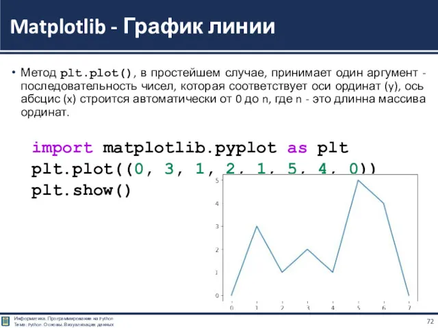
- 72. Метод plt.plot(), в простейшем случае, принимает один аргумент - последовательность чисел, которая соответствует оси ординат (y),
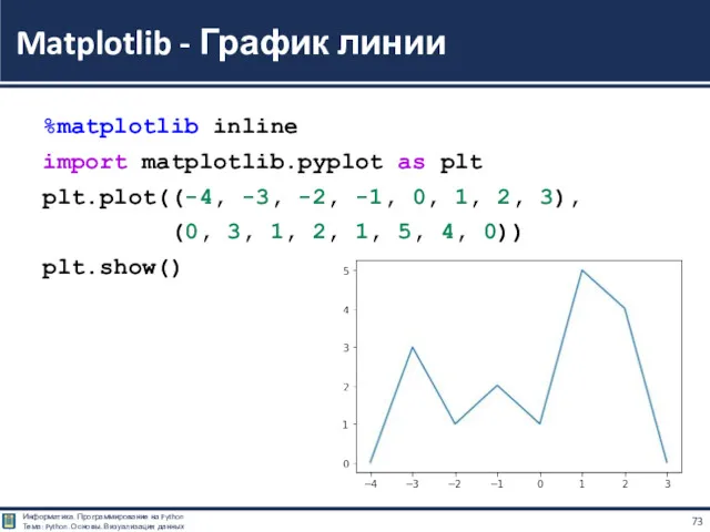
- 73. %matplotlib inline import matplotlib.pyplot as plt plt.plot((-4, -3, -2, -1, 0, 1, 2, 3), (0, 3,
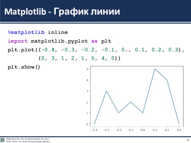
- 74. %matplotlib inline import matplotlib.pyplot as plt plt.plot((-0.4, -0.3, -0.2, -0.1, 0., 0.1, 0.2, 0.3), (0, 3,
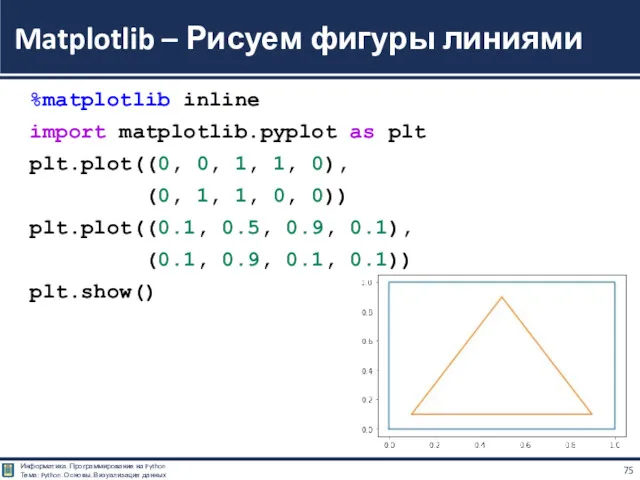
- 75. %matplotlib inline import matplotlib.pyplot as plt plt.plot((0, 0, 1, 1, 0), (0, 1, 1, 0, 0))
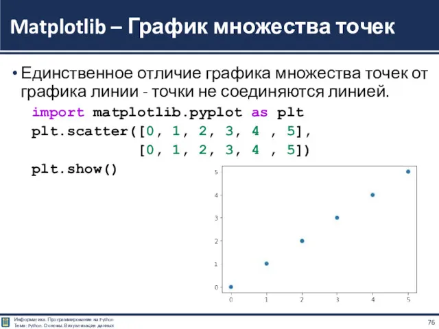
- 76. Единственное отличие графика множества точек от графика линии - точки не соединяются линией. import matplotlib.pyplot as
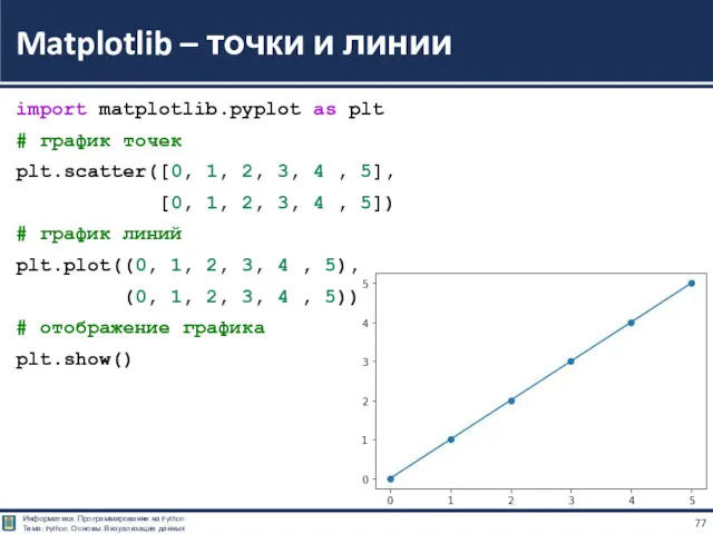
- 77. import matplotlib.pyplot as plt # график точек plt.scatter([0, 1, 2, 3, 4 , 5], [0, 1,
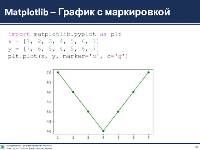
- 78. Matplotlib – График с маркировкой import matplotlib.pyplot as plt x = [1, 2, 3, 4, 5,
- 79. Matplotlib – Линейный график import matplotlib.pyplot as plt import numpy as np # Независимая (x) и
- 80. Matplotlib – Линейный график import matplotlib.pyplot as plt import numpy as np # Независимая (x) и
- 81. Цвет линии графика задаётся через параметр color (или c, если использовать сокращённый вариант). Значение может быть
- 82. Matplotlib - Стили линии линейного графика import matplotlib.pyplot as plt import numpy as np x =
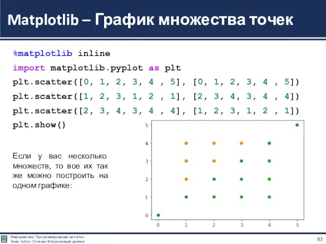
- 83. %matplotlib inline import matplotlib.pyplot as plt plt.scatter([0, 1, 2, 3, 4 , 5], [0, 1, 2,
- 84. Matplotlib – Легенда на графике import matplotlib.pyplot as plt x = [1, 5, 10, 15, 20]
- 85. Matplotlib – Легенда на графике import matplotlib.pyplot as plt x = [1, 5, 10, 15, 20]
- 86. import matplotlib.pyplot as plt import numpy as np x = np.linspace(0, 2, 100) plt.figure() plt.plot(x, x,
- 87. Matplotlib - Несколько графиков на одном поле import matplotlib.pyplot as plt import numpy as np #
- 88. import matplotlib.pyplot as plt import numpy as np x = np.linspace(0, 4 * np.pi, 100) plt.figure()
- 89. import matplotlib.pyplot as plt import numpy as np x = np.linspace(0, 1, 11) plt.figure() plt.plot(x, x
- 90. import matplotlib.pyplot as plt import numpy as np x = np.linspace(0, 2 * np.pi, 100) plt.figure(figsize=(10,
- 91. Matplotlib - sin(x), cos(x)
- 92. Matplotlib - График с большим количеством маркеров import matplotlib.pyplot as plt import numpy as np x
- 93. Различные варианты маркировки import matplotlib.pyplot as plt import numpy as np x = np.arange(0.0, 5, 0.01)
- 94. Различные варианты маркировки
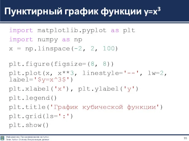
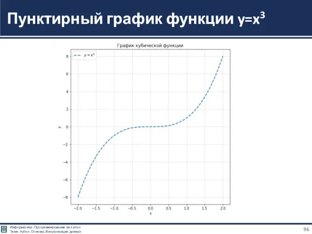
- 95. import matplotlib.pyplot as plt import numpy as np x = np.linspace(-2, 2, 100) plt.figure(figsize=(8, 8)) plt.plot(x,
- 96. Пунктирный график функции y=x3
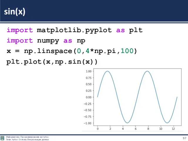
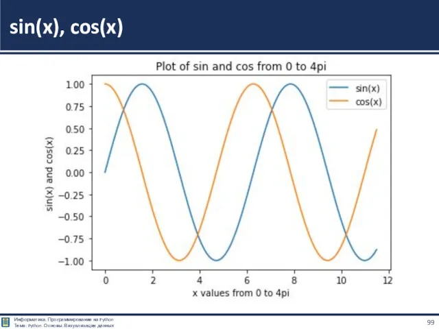
- 97. import matplotlib.pyplot as plt import numpy as np x = np.linspace(0,4*np.pi,100) plt.plot(x,np.sin(x)) sin(x)
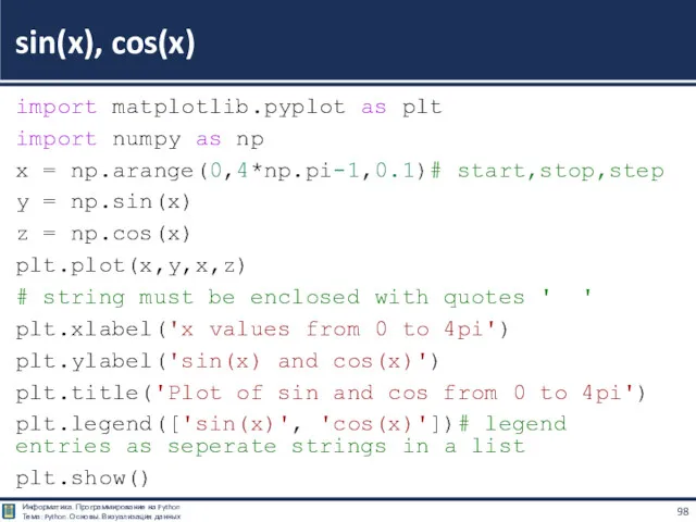
- 98. import matplotlib.pyplot as plt import numpy as np x = np.arange(0,4*np.pi-1,0.1)# start,stop,step y = np.sin(x) z
- 99. sin(x), cos(x)
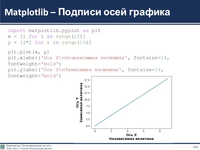
- 100. Matplotlib – Подписи осей графика import matplotlib.pyplot as plt x = [i for i in range(10)]
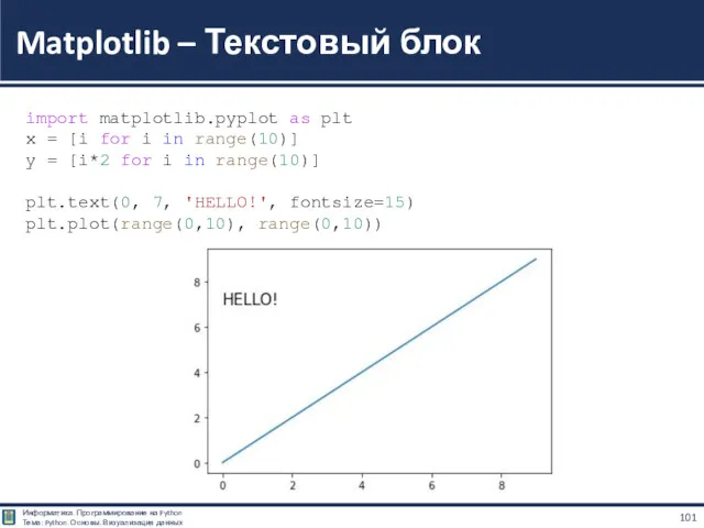
- 101. Matplotlib – Текстовый блок import matplotlib.pyplot as plt x = [i for i in range(10)] y
- 102. Столбчатые и круговые диаграммы
- 103. Для визуализации категориальных данных хорошо подходят столбчатые диаграммы. Для их построения используются функции: bar() — вертикальная
- 104. import matplotlib.pyplot as plt plt.bar([6, 7, 8], [10, 15, 21]) plt.show() Гистограммы
- 105. import matplotlib.pyplot as plt plt.barh([6, 7, 8], [10, 15, 21]) plt.show() Гистограммы
- 106. import matplotlib.pyplot as plt plt.bar([6, 7, 8], [10, 15, 21]) plt.bar([6, 7, 8], [6, 12, 21])
- 107. import matplotlib.pyplot as plt plt.bar([5.9, 6.9, 7.9], [10, 15, 21], width = 0.2) plt.bar([6.1, 7.1, 8.1],
- 108. import matplotlib.pyplot as plt plt.bar([5.9, 6.9, 7.9], [10, 15, 21], width = 0.8) plt.bar([6.1, 7.1, 8.1],
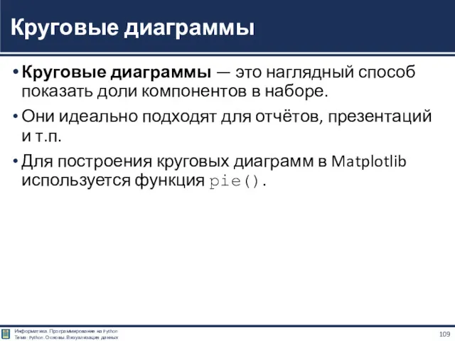
- 109. Круговые диаграммы — это наглядный способ показать доли компонентов в наборе. Они идеально подходят для отчётов,
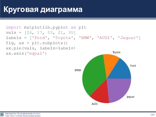
- 110. Круговая диаграмма import matplotlib.pyplot as plt vals = [24, 17, 53, 21, 35] labels = ['Ford',
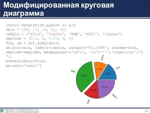
- 111. Модифицированная круговая диаграмма import matplotlib.pyplot as plt vals = [24, 17, 53, 21, 35] labels =
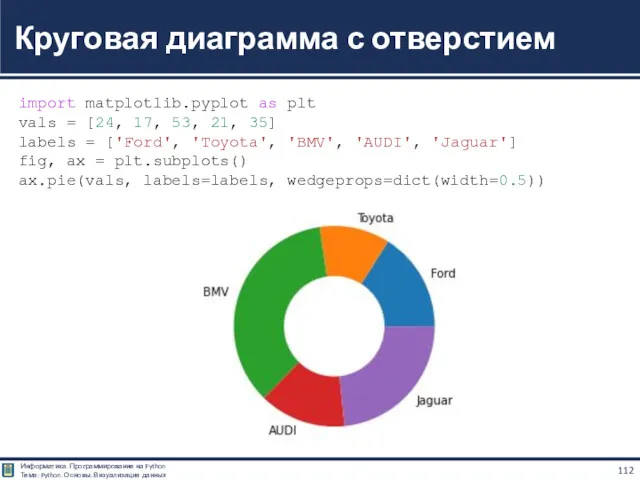
- 112. Круговая диаграмма с отверстием import matplotlib.pyplot as plt vals = [24, 17, 53, 21, 35] labels
- 113. Визуализация двумерных массивов
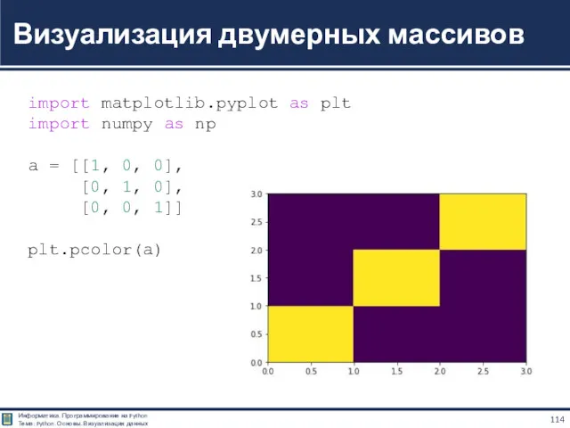
- 114. Визуализация двумерных массивов import matplotlib.pyplot as plt import numpy as np a = [[1, 0, 0],
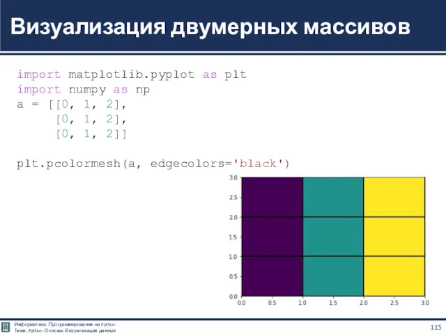
- 115. Визуализация двумерных массивов import matplotlib.pyplot as plt import numpy as np a = [[0, 1, 2],
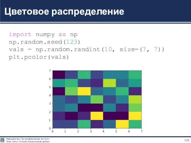
- 116. Цветовое распределение import numpy as np np.random.seed(123) vals = np.random.randint(10, size=(7, 7)) plt.pcolor(vals)
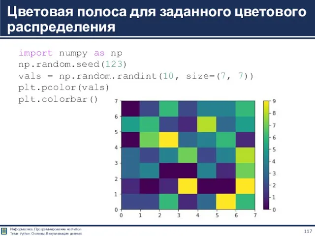
- 117. Цветовая полоса для заданного цветового распределения import numpy as np np.random.seed(123) vals = np.random.randint(10, size=(7, 7))
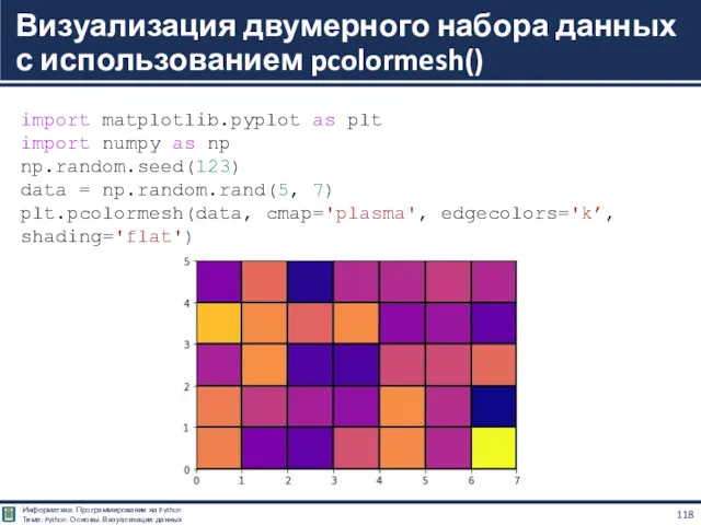
- 118. Визуализация двумерного набора данных с использованием pcolormesh() import matplotlib.pyplot as plt import numpy as np np.random.seed(123)
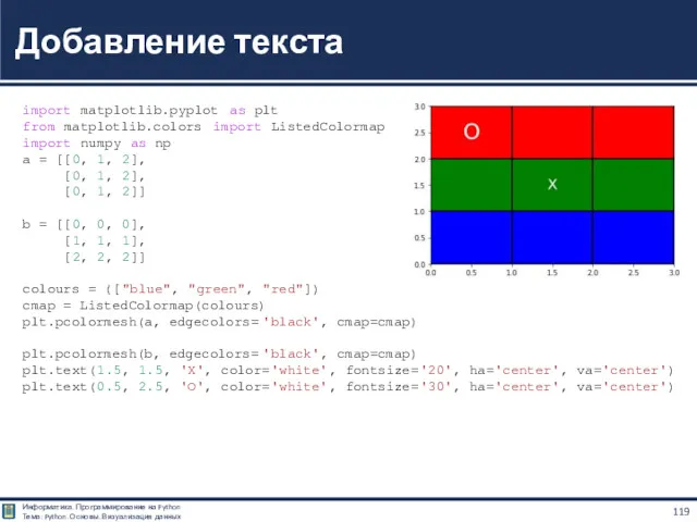
- 119. Добавление текста import matplotlib.pyplot as plt from matplotlib.colors import ListedColormap import numpy as np a =
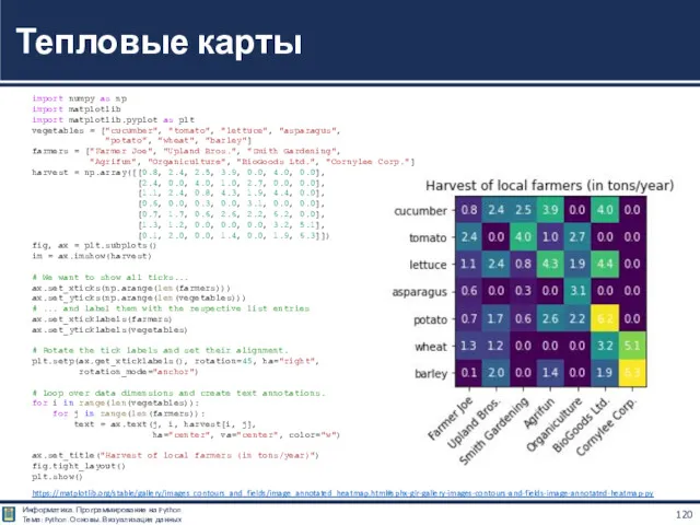
- 120. Тепловые карты import numpy as np import matplotlib import matplotlib.pyplot as plt vegetables = ["cucumber", "tomato",
- 121. Компоновка нескольких графиков вместе
- 122. Вариант подключения import matplotlib import matplotlib.pyplot as plt import matplotlib.gridspec as gridspec Примеры https://matplotlib.org/stable/tutorials/intermediate/gridspec.html Компоновка нескольких
- 123. Модуль gridspec библиотеки matplotlib открывает расширенные возможности для настройки объектов под графиком. subplot2grid() отлично взаимодействует с
- 124. import matplotlib.pyplot as plt gridsize = (3, 2) fig = plt.figure(figsize=(12, 8)) ax1 = plt.subplot2grid(gridsize, (0,
- 125. Matplotlib – Различные варианты расположения легенды на графике import matplotlib.pyplot as plt locs = ['best', 'upper
- 126. Matplotlib – Различные варианты расположения легенды на графике
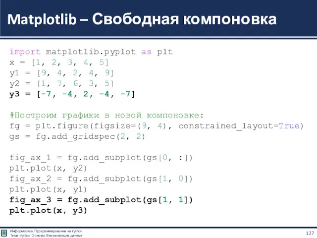
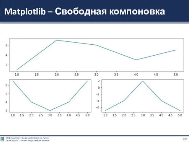
- 127. Matplotlib – Свободная компоновка import matplotlib.pyplot as plt x = [1, 2, 3, 4, 5] y1
- 128. Matplotlib – Свободная компоновка
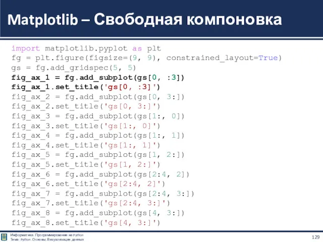
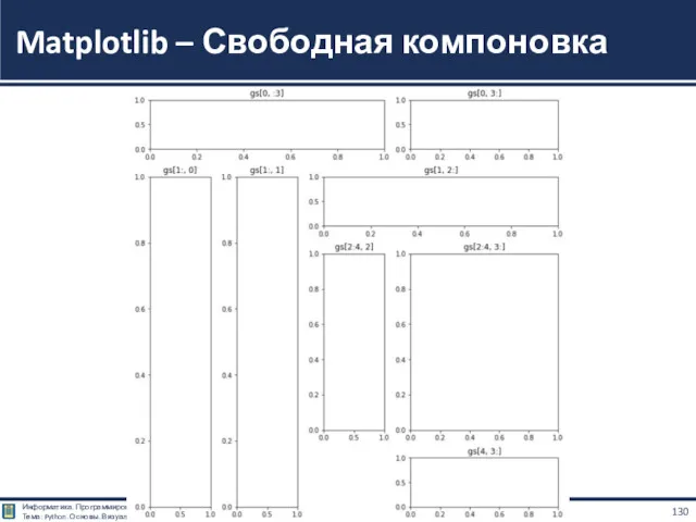
- 129. Matplotlib – Свободная компоновка import matplotlib.pyplot as plt fg = plt.figure(figsize=(9, 9), constrained_layout=True) gs = fg.add_gridspec(5,
- 130. Matplotlib – Свободная компоновка
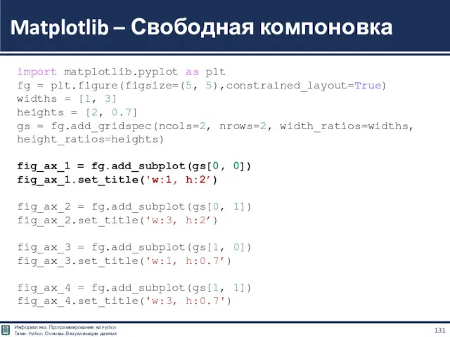
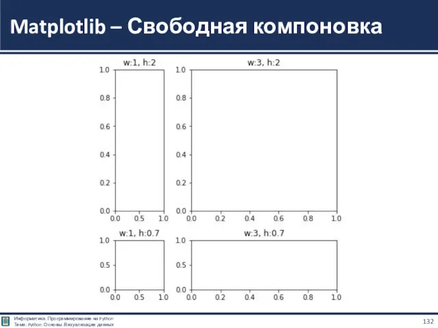
- 131. Matplotlib – Свободная компоновка import matplotlib.pyplot as plt fg = plt.figure(figsize=(5, 5),constrained_layout=True) widths = [1, 3]
- 132. Matplotlib – Свободная компоновка
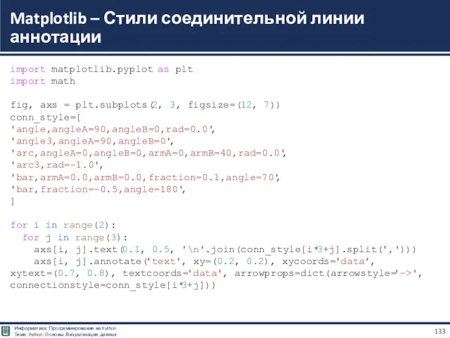
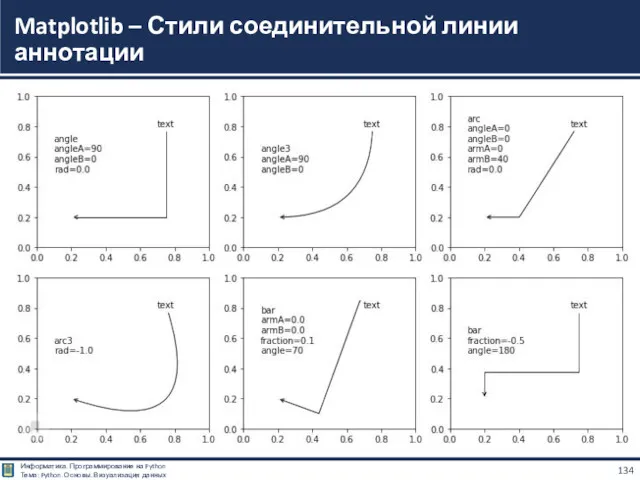
- 133. Matplotlib – Стили соединительной линии аннотации import matplotlib.pyplot as plt import math fig, axs = plt.subplots(2,
- 134. Matplotlib – Стили соединительной линии аннотации
- 135. КУТУЗОВ Виктор Владимирович Благодарю за внимание Белорусско-Российский университет, Республика Беларусь, Могилев, 2021 Информатика. Программирование на Python
- 136. Python https://www.python.org/ Google Colaboratory https://colab.research.google.com/ Matplotlib: Visualization with Python https://matplotlib.org/ Matplotlib User's Guide https://matplotlib.org/stable/Matplotlib.pdf Библиотека matplotlib
- 137. Абдрахманов М.И. Python. Визуализация данных. Matplotlib. - Devpractice Team, 2020 – 413 с. https://by1lib.org/book/7229033/21176f?id=7229033&secret=21176f Plotting sine
- 139. Скачать презентацию
Matplotlib — библиотека на языке программирования Python для визуализации данных двумерной
Matplotlib — библиотека на языке программирования Python для визуализации данных двумерной
Пакет поддерживает многие виды графиков и диаграмм:
Графики (line plot)
Диаграммы разброса (scatter
Пакет поддерживает многие виды графиков и диаграмм:
Графики (line plot)
Диаграммы разброса (scatter
Библиотека Matplotlib является одним из самых популярных средств визуализации данных на
Библиотека Matplotlib является одним из самых популярных средств визуализации данных на
Для построения графиков из библиотеки Matplotlib нужно импортировать модуль Pyplot.
Pyplot это
Для построения графиков из библиотеки Matplotlib нужно импортировать модуль Pyplot.
Pyplot это
Примеры применения
Matplotlib – Gallery
Примеры применения
Matplotlib – Gallery
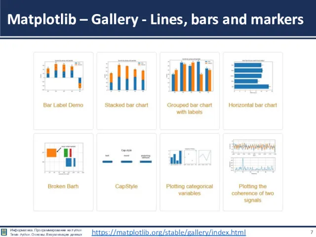
Matplotlib – Gallery - Lines, bars and markers
https://matplotlib.org/stable/gallery/index.html
Matplotlib – Gallery - Lines, bars and markers
https://matplotlib.org/stable/gallery/index.html
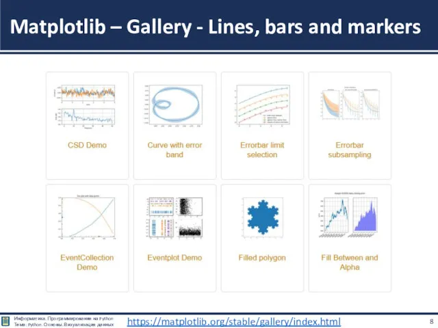
Matplotlib – Gallery - Lines, bars and markers
https://matplotlib.org/stable/gallery/index.html
Matplotlib – Gallery - Lines, bars and markers
https://matplotlib.org/stable/gallery/index.html
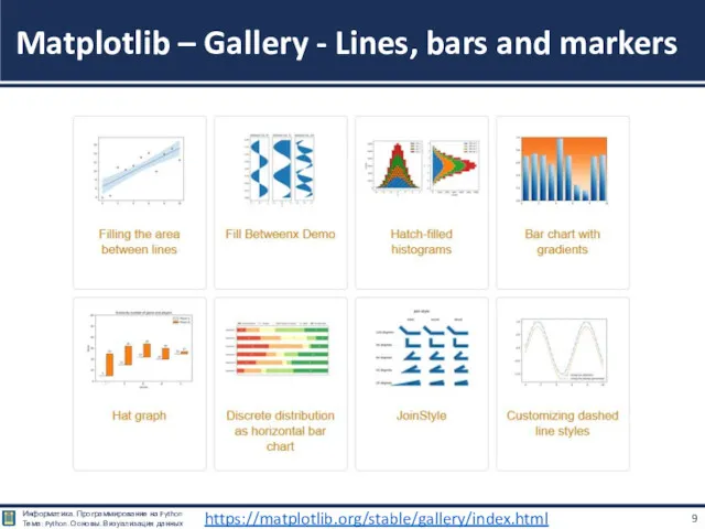
Matplotlib – Gallery - Lines, bars and markers
https://matplotlib.org/stable/gallery/index.html
Matplotlib – Gallery - Lines, bars and markers
https://matplotlib.org/stable/gallery/index.html
Matplotlib – Gallery - Lines, bars and markers
https://matplotlib.org/stable/gallery/index.html
Matplotlib – Gallery - Lines, bars and markers
https://matplotlib.org/stable/gallery/index.html
Matplotlib – Gallery - Lines, bars and markers
https://matplotlib.org/stable/gallery/index.html
Matplotlib – Gallery - Lines, bars and markers
https://matplotlib.org/stable/gallery/index.html
Matplotlib – Gallery - Lines, bars and markers
https://matplotlib.org/stable/gallery/index.html
Matplotlib – Gallery - Lines, bars and markers
https://matplotlib.org/stable/gallery/index.html
Matplotlib – Gallery - Lines, bars and markers
https://matplotlib.org/stable/gallery/index.html
Matplotlib – Gallery - Lines, bars and markers
https://matplotlib.org/stable/gallery/index.html
Matplotlib – Gallery - Images, contours and fields
https://matplotlib.org/stable/gallery/index.html
Matplotlib – Gallery - Images, contours and fields
https://matplotlib.org/stable/gallery/index.html
Matplotlib – Gallery - Images, contours and fields
https://matplotlib.org/stable/gallery/index.html
Matplotlib – Gallery - Images, contours and fields
https://matplotlib.org/stable/gallery/index.html
Matplotlib – Gallery - Images, contours and fields
https://matplotlib.org/stable/gallery/index.html
Matplotlib – Gallery - Images, contours and fields
https://matplotlib.org/stable/gallery/index.html
Matplotlib – Gallery - Images, contours and fields
https://matplotlib.org/stable/gallery/index.html
Matplotlib – Gallery - Images, contours and fields
https://matplotlib.org/stable/gallery/index.html
Matplotlib – Gallery - Images, contours and fields
https://matplotlib.org/stable/gallery/index.html
Matplotlib – Gallery - Images, contours and fields
https://matplotlib.org/stable/gallery/index.html

Matplotlib – Gallery - Images, contours and fields
https://matplotlib.org/stable/gallery/index.html
Matplotlib – Gallery - Images, contours and fields
https://matplotlib.org/stable/gallery/index.html
Matplotlib – Gallery - Subplots, axes and figures
https://matplotlib.org/stable/gallery/index.html
Matplotlib – Gallery - Subplots, axes and figures
https://matplotlib.org/stable/gallery/index.html
Matplotlib – Gallery - Subplots, axes and figures
https://matplotlib.org/stable/gallery/index.html
Matplotlib – Gallery - Subplots, axes and figures
https://matplotlib.org/stable/gallery/index.html
Matplotlib – Gallery - Subplots, axes and figures
https://matplotlib.org/stable/gallery/index.html
Matplotlib – Gallery - Subplots, axes and figures
https://matplotlib.org/stable/gallery/index.html
Matplotlib – Gallery - Subplots, axes and figures
https://matplotlib.org/stable/gallery/index.html
Matplotlib – Gallery - Subplots, axes and figures
https://matplotlib.org/stable/gallery/index.html
Matplotlib – Gallery - Subplots, axes and figures
https://matplotlib.org/stable/gallery/index.html
Matplotlib – Gallery - Subplots, axes and figures
https://matplotlib.org/stable/gallery/index.html
Matplotlib – Gallery - Statistics
https://matplotlib.org/stable/gallery/index.html
Matplotlib – Gallery - Statistics
https://matplotlib.org/stable/gallery/index.html
Matplotlib – Gallery - Statistics
https://matplotlib.org/stable/gallery/index.html
Matplotlib – Gallery - Statistics
https://matplotlib.org/stable/gallery/index.html
Matplotlib – Gallery - Statistics
https://matplotlib.org/stable/gallery/index.html
Matplotlib – Gallery - Statistics
https://matplotlib.org/stable/gallery/index.html
Matplotlib – Gallery - Pie and polar charts
https://matplotlib.org/stable/gallery/index.html
Matplotlib – Gallery - Pie and polar charts
https://matplotlib.org/stable/gallery/index.html
Matplotlib – Gallery - Text, labels and annotations
https://matplotlib.org/stable/gallery/index.html
Matplotlib – Gallery - Text, labels and annotations
https://matplotlib.org/stable/gallery/index.html
Matplotlib – Gallery - Text, labels and annotations
https://matplotlib.org/stable/gallery/index.html
Matplotlib – Gallery - Text, labels and annotations
https://matplotlib.org/stable/gallery/index.html
Matplotlib – Gallery - Text, labels and annotations
https://matplotlib.org/stable/gallery/index.html
Matplotlib – Gallery - Text, labels and annotations
https://matplotlib.org/stable/gallery/index.html
Matplotlib – Gallery - Text, labels and annotations
https://matplotlib.org/stable/gallery/index.html
Matplotlib – Gallery - Text, labels and annotations
https://matplotlib.org/stable/gallery/index.html
Matplotlib – Gallery - Text, labels and annotations
https://matplotlib.org/stable/gallery/index.html
Matplotlib – Gallery - Text, labels and annotations
https://matplotlib.org/stable/gallery/index.html
Matplotlib – Gallery - Text, labels and annotations
https://matplotlib.org/stable/gallery/index.html
Matplotlib – Gallery - Text, labels and annotations
https://matplotlib.org/stable/gallery/index.html
Matplotlib – Gallery - Pyplot
https://matplotlib.org/stable/gallery/index.html
Matplotlib – Gallery - Pyplot
https://matplotlib.org/stable/gallery/index.html
Matplotlib – Gallery - Pyplot
https://matplotlib.org/stable/gallery/index.html
Matplotlib – Gallery - Pyplot
https://matplotlib.org/stable/gallery/index.html
Matplotlib – Gallery - Pyplot
https://matplotlib.org/stable/gallery/index.html
Matplotlib – Gallery - Pyplot
https://matplotlib.org/stable/gallery/index.html
Matplotlib – Gallery - Color
https://matplotlib.org/stable/gallery/index.html
Matplotlib – Gallery - Color
https://matplotlib.org/stable/gallery/index.html
Matplotlib – Gallery - Shapes and collections
https://matplotlib.org/stable/gallery/index.html
Matplotlib – Gallery - Shapes and collections
https://matplotlib.org/stable/gallery/index.html
Matplotlib – Gallery - Shapes and collections
https://matplotlib.org/stable/gallery/index.html
Matplotlib – Gallery - Shapes and collections
https://matplotlib.org/stable/gallery/index.html
Matplotlib – Gallery - Style sheets
https://matplotlib.org/stable/gallery/index.html
Matplotlib – Gallery - Style sheets
https://matplotlib.org/stable/gallery/index.html
Matplotlib – Gallery - Axes Grid
https://matplotlib.org/stable/gallery/index.html
Matplotlib – Gallery - Axes Grid
https://matplotlib.org/stable/gallery/index.html
Matplotlib – Gallery - Axes Grid
https://matplotlib.org/stable/gallery/index.html
Matplotlib – Gallery - Axes Grid
https://matplotlib.org/stable/gallery/index.html
Matplotlib – Gallery - Axes Grid
https://matplotlib.org/stable/gallery/index.html
Matplotlib – Gallery - Axes Grid
https://matplotlib.org/stable/gallery/index.html
Matplotlib – Gallery - Axis Artist
https://matplotlib.org/stable/gallery/index.html
Matplotlib – Gallery - Axis Artist
https://matplotlib.org/stable/gallery/index.html
Matplotlib – Gallery - Axis Artist
https://matplotlib.org/stable/gallery/index.html
Matplotlib – Gallery - Axis Artist
https://matplotlib.org/stable/gallery/index.html
Matplotlib – Gallery - Showcase
https://matplotlib.org/stable/gallery/index.html
Matplotlib – Gallery - Showcase
https://matplotlib.org/stable/gallery/index.html
Matplotlib – Gallery - Animation
https://matplotlib.org/stable/gallery/index.html
Matplotlib – Gallery - Animation
https://matplotlib.org/stable/gallery/index.html
Matplotlib – Gallery - Animation
https://matplotlib.org/stable/gallery/index.html
Matplotlib – Gallery - Animation
https://matplotlib.org/stable/gallery/index.html
Matplotlib – Gallery - Front Page
https://matplotlib.org/stable/gallery/index.html
Matplotlib – Gallery - Front Page
https://matplotlib.org/stable/gallery/index.html
Matplotlib – Gallery - 3D plotting
https://matplotlib.org/stable/gallery/index.html
Matplotlib – Gallery - 3D plotting
https://matplotlib.org/stable/gallery/index.html
Matplotlib – Gallery - 3D plotting
https://matplotlib.org/stable/gallery/index.html
Matplotlib – Gallery - 3D plotting
https://matplotlib.org/stable/gallery/index.html
Matplotlib – Gallery - 3D plotting
https://matplotlib.org/stable/gallery/index.html
Matplotlib – Gallery - 3D plotting
https://matplotlib.org/stable/gallery/index.html
Matplotlib – Gallery - 3D plotting
https://matplotlib.org/stable/gallery/index.html
Matplotlib – Gallery - 3D plotting
https://matplotlib.org/stable/gallery/index.html
Matplotlib – Gallery - 3D plotting
https://matplotlib.org/stable/gallery/index.html
Matplotlib – Gallery - 3D plotting
https://matplotlib.org/stable/gallery/index.html
Matplotlib – Gallery - Scales
https://matplotlib.org/stable/gallery/index.html
Matplotlib – Gallery - Scales
https://matplotlib.org/stable/gallery/index.html
Matplotlib – Gallery - Specialty Plots
https://matplotlib.org/stable/gallery/index.html
Matplotlib – Gallery - Specialty Plots
https://matplotlib.org/stable/gallery/index.html
Matplotlib – Gallery - Specialty Plots
https://matplotlib.org/stable/gallery/index.html
Matplotlib – Gallery - Specialty Plots
https://matplotlib.org/stable/gallery/index.html
Matplotlib – Gallery - Ticks and spines
https://matplotlib.org/stable/gallery/index.html
Matplotlib – Gallery - Ticks and spines
https://matplotlib.org/stable/gallery/index.html
Matplotlib – Gallery - Ticks and spines
https://matplotlib.org/stable/gallery/index.html
Matplotlib – Gallery - Ticks and spines
https://matplotlib.org/stable/gallery/index.html
Matplotlib – Gallery - Ticks and spines
https://matplotlib.org/stable/gallery/index.html
Matplotlib – Gallery - Ticks and spines
https://matplotlib.org/stable/gallery/index.html
Примеры – Галерея MatplotLib
https://matplotlib.org/stable/gallery/index.html
Скачать все примеры - Python исходники программ:
Примеры – Галерея MatplotLib
https://matplotlib.org/stable/gallery/index.html
Скачать все примеры - Python исходники программ:
Matplotlib
Создание графиков
Matplotlib
Создание графиков
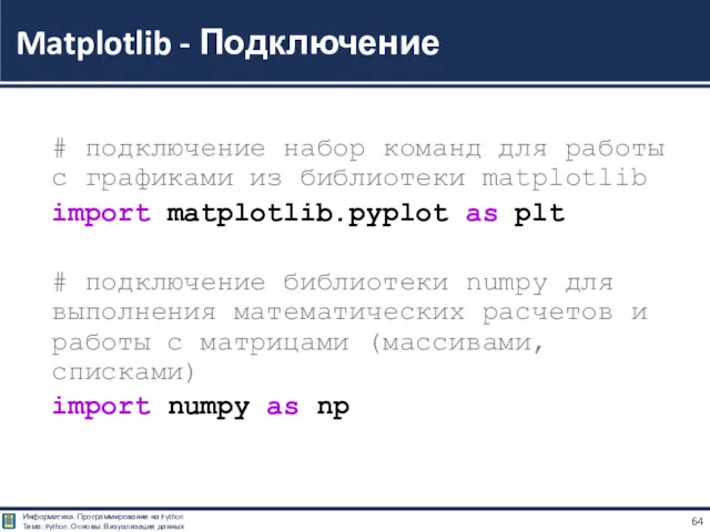
# подключение набор команд для работы с графиками из библиотеки matplotlib
import matplotlib.pyplot as plt
#
import matplotlib.pyplot as plt
#
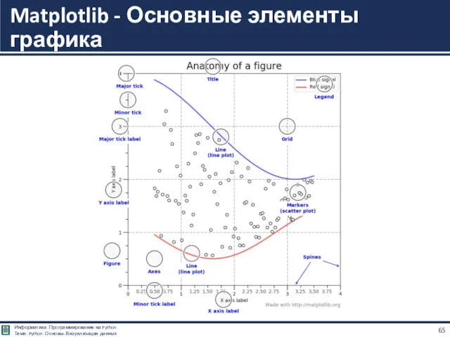
Matplotlib - Основные элементы графика
Matplotlib - Основные элементы графика
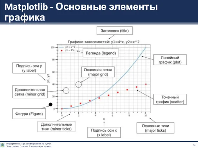
Matplotlib - Основные элементы графика
Matplotlib - Основные элементы графика
plt.scatter(x, y, params) — нарисовать точки с координатами из x по
plt.scatter(x, y, params) — нарисовать точки с координатами из x по
plt.figure(figsize=(x, y)) — создать график размера (x,y);
plt.show() — показать график;
plt.subplot(...) —
plt.figure(figsize=(x, y)) — создать график размера (x,y);
plt.show() — показать график;
plt.subplot(...) —
plt.plot(x, y, params) — нарисовать график по точкам с координатами из
Метод построения линии очень прост:
есть массив абсцис (x);
есть массив ординат (y);
элементы
Метод построения линии очень прост:
есть массив абсцис (x);
есть массив ординат (y);
элементы
import matplotlib.pyplot as plt
plt.plot((0, 1, 2, 3, 4, 5, 6, 7),
(0, 3, 1, 2, 1, 5, 4, 0))
plt.show()
Matplotlib - График линии
import matplotlib.pyplot as plt
plt.plot((0, 1, 2, 3, 4, 5, 6, 7),
(0, 3, 1, 2, 1, 5, 4, 0))
plt.show()
Matplotlib - График линии
Метод plt.plot(), в простейшем случае, принимает один аргумент - последовательность чисел,
Метод plt.plot(), в простейшем случае, принимает один аргумент - последовательность чисел,
%matplotlib inline
import matplotlib.pyplot as plt
plt.plot((-4, -3, -2, -1, 0, 1, 2, 3),
(0, 3, 1, 2, 1, 5, 4, 0))
plt.show()
Matplotlib - График линии
%matplotlib inline
import matplotlib.pyplot as plt
plt.plot((-4, -3, -2, -1, 0, 1, 2, 3),
(0, 3, 1, 2, 1, 5, 4, 0))
plt.show()
Matplotlib - График линии
%matplotlib inline
import matplotlib.pyplot as plt
plt.plot((-0.4, -0.3, -0.2, -0.1, 0., 0.1, 0.2, 0.3),
(0, 3, 1, 2, 1, 5, 4, 0))
plt.show()
Matplotlib - График линии
%matplotlib inline
import matplotlib.pyplot as plt
plt.plot((-0.4, -0.3, -0.2, -0.1, 0., 0.1, 0.2, 0.3),
(0, 3, 1, 2, 1, 5, 4, 0))
plt.show()
Matplotlib - График линии
%matplotlib inline
import matplotlib.pyplot as plt
plt.plot((0, 0, 1, 1, 0),
(0, 1, 1, 0, 0))
plt.plot((0.1, 0.5, 0.9, 0.1),
(0.1, 0.9, 0.1, 0.1))
plt.show()
Matplotlib – Рисуем фигуры линиями
%matplotlib inline
import matplotlib.pyplot as plt
plt.plot((0, 0, 1, 1, 0),
(0, 1, 1, 0, 0))
plt.plot((0.1, 0.5, 0.9, 0.1),
(0.1, 0.9, 0.1, 0.1))
plt.show()
Matplotlib – Рисуем фигуры линиями
Единственное отличие графика множества точек от графика линии - точки не
Единственное отличие графика множества точек от графика линии - точки не
import matplotlib.pyplot as plt
# график точек
plt.scatter([0, 1, 2, 3, 4 , 5],
[0, 1, 2, 3, 4 , 5])
# график линий
plt.plot((0, 1, 2, 3, 4 , 5),
(0, 1, 2, 3, 4 , 5))
# отображение графика
plt.show()
Matplotlib – точки и линии
import matplotlib.pyplot as plt
# график точек
plt.scatter([0, 1, 2, 3, 4 , 5],
[0, 1, 2, 3, 4 , 5])
# график линий
plt.plot((0, 1, 2, 3, 4 , 5),
(0, 1, 2, 3, 4 , 5))
# отображение графика
plt.show()
Matplotlib – точки и линии
Matplotlib – График с маркировкой
import matplotlib.pyplot as plt
x = [1, 2, 3, 4, 5, 6, 7]
y = [7, 6, 5, 4, 5, 6, 7]
plt.plot(x, y, marker='o', c='g')
Matplotlib – График с маркировкой
import matplotlib.pyplot as plt
x = [1, 2, 3, 4, 5, 6, 7]
y = [7, 6, 5, 4, 5, 6, 7]
plt.plot(x, y, marker='o', c='g')
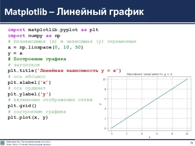
Matplotlib – Линейный график
import matplotlib.pyplot as plt
import numpy as np
# Независимая (x) и зависимая (y) переменные
x = np.linspace(0, 10, 50)
y = x
# Построение графика
# заголовок
plt.title('Линейная зависимость y = x’)
# ось абсцисс
plt.xlabel('x’)
# ось ординат
plt.ylabel('y')
# включение отображения сетки
plt.grid()
# построение графика
plt.plot(x, y)
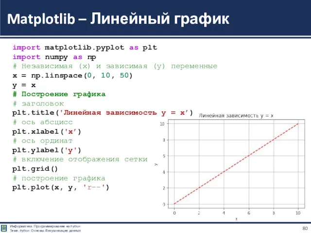
Matplotlib – Линейный график
import matplotlib.pyplot as plt
import numpy as np
# Независимая (x) и зависимая (y) переменные
x = np.linspace(0, 10, 50)
y = x
# Построение графика
# заголовок
plt.title('Линейная зависимость y = x’)
# ось абсцисс
plt.xlabel('x’)
# ось ординат
plt.ylabel('y')
# включение отображения сетки
plt.grid()
# построение графика
plt.plot(x, y, 'r--')
Цвет линии графика задаётся через параметр color (или c, если использовать
Цвет линии графика задаётся через параметр color (или c, если использовать
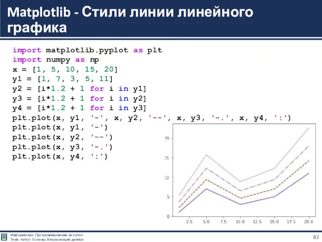
Matplotlib - Стили линии линейного графика
import matplotlib.pyplot as plt
import numpy as np
x = [1, 5, 10, 15, 20]
y1 = [1, 7, 3, 5, 11]
y2 = [i*1.2 + 1 for i in y1]
y3 = [i*1.2 + 1 for i in y2]
y4 = [i*1.2 + 1 for i in y3]
plt.plot(x, y1, '-', x, y2, '--', x, y3, '-.', x, y4, ':')
plt.plot(x, y1, '-')
plt.plot(x, y2, '--')
plt.plot(x, y3, '-.')
plt.plot(x, y4, ':')
%matplotlib inline
import matplotlib.pyplot as plt
plt.scatter([0, 1, 2, 3, 4 , 5], [0, 1, 2, 3, 4 , 5])
plt.scatter([1, 2, 3, 1, 2 , 1], [2, 3, 4, 3, 4 , 4])
plt.scatter([2, 3, 4, 3, 4 , 4], [1, 2, 3, 1, 2 , 1])
plt.show()
Matplotlib – График множества точек
Если у вас несколько множеств, то
%matplotlib inline
import matplotlib.pyplot as plt
plt.scatter([0, 1, 2, 3, 4 , 5], [0, 1, 2, 3, 4 , 5])
plt.scatter([1, 2, 3, 1, 2 , 1], [2, 3, 4, 3, 4 , 4])
plt.scatter([2, 3, 4, 3, 4 , 4], [1, 2, 3, 1, 2 , 1])
plt.show()
Matplotlib – График множества точек
Если у вас несколько множеств, то
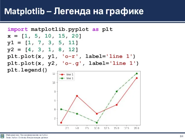
Matplotlib – Легенда на графике
import matplotlib.pyplot as plt
x = [1, 5, 10, 15, 20]
y1 = [1, 7, 3, 5, 11]
y2 = [4, 3, 1, 8, 12]
plt.plot(x, y1, 'o-r', label='line 1')
plt.plot(x, y2, 'o-.g', label='line 1')
plt.legend()
Matplotlib – Легенда на графике
import matplotlib.pyplot as plt
x = [1, 5, 10, 15, 20]
y1 = [1, 7, 3, 5, 11]
y2 = [4, 3, 1, 8, 12]
plt.plot(x, y1, 'o-r', label='line 1')
plt.plot(x, y2, 'o-.g', label='line 1')
plt.legend()
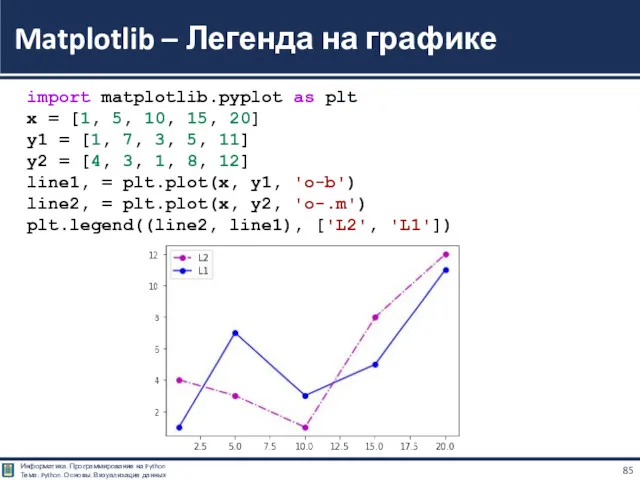
Matplotlib – Легенда на графике
import matplotlib.pyplot as plt
x = [1, 5, 10, 15, 20]
y1 = [1, 7, 3, 5, 11]
y2 = [4, 3, 1, 8, 12]
line1, = plt.plot(x, y1, 'o-b')
line2, = plt.plot(x, y2, 'o-.m')
plt.legend((line2, line1), ['L2', 'L1'])
Matplotlib – Легенда на графике
import matplotlib.pyplot as plt
x = [1, 5, 10, 15, 20]
y1 = [1, 7, 3, 5, 11]
y2 = [4, 3, 1, 8, 12]
line1, = plt.plot(x, y1, 'o-b')
line2, = plt.plot(x, y2, 'o-.m')
plt.legend((line2, line1), ['L2', 'L1'])
import matplotlib.pyplot as plt
import numpy as np
x = np.linspace(0, 2, 100)
plt.figure()
plt.plot(x, x, x, x**2, x, x**3)
plt.show()
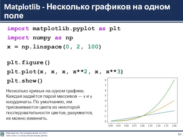
Matplotlib - Несколько графиков на одном поле
Несколько кривых на одном графике.
import matplotlib.pyplot as plt
import numpy as np
x = np.linspace(0, 2, 100)
plt.figure()
plt.plot(x, x, x, x**2, x, x**3)
plt.show()
Matplotlib - Несколько графиков на одном поле
Несколько кривых на одном графике.
Matplotlib - Несколько графиков на одном поле
import matplotlib.pyplot as plt
import numpy as np
# Линейная зависимость
x = np.linspace(0, 10, 50)
y1 = x
# Квадратичная зависимость
y2 = [i**2 for i in x]
# Построение графика
# заголовок
plt.title('Зависимости: y1 = x, y2 = x^2’)
# ось абсцисс
plt.xlabel('x')
# ось ординат
plt.ylabel('y1, y2')
# включение отображения сетки
plt.grid()
# построение графика
plt.plot(x, y1, x, y2)
import matplotlib.pyplot as plt
import numpy as np
x = np.linspace(0, 4 * np.pi, 100)
plt.figure()
plt.plot(x, np.sin(x), 'r-')
plt.plot(x, np.cos(x), 'b--')
plt.show()
Matplotlib - sin(x), cos(x)
Для простой регулировки цветов и типов линий после
import matplotlib.pyplot as plt
import numpy as np
x = np.linspace(0, 4 * np.pi, 100)
plt.figure()
plt.plot(x, np.sin(x), 'r-')
plt.plot(x, np.cos(x), 'b--')
plt.show()
Matplotlib - sin(x), cos(x)
Для простой регулировки цветов и типов линий после
import matplotlib.pyplot as plt
import numpy as np
x = np.linspace(0, 1, 11)
plt.figure()
plt.plot(x, x ** 2, 'ro')
plt.plot(x, 1 - x, 'gs')
plt.show()
Matplotlib
Если в качестве "типа линии" указано 'o', то это означает рисовать
import matplotlib.pyplot as plt
import numpy as np
x = np.linspace(0, 1, 11)
plt.figure()
plt.plot(x, x ** 2, 'ro')
plt.plot(x, 1 - x, 'gs')
plt.show()
Matplotlib
Если в качестве "типа линии" указано 'o', то это означает рисовать
import matplotlib.pyplot as plt
import numpy as np
x = np.linspace(0, 2 * np.pi, 100)
plt.figure(figsize=(10, 5))
plt.plot(x, np.sin(x), linewidth=2, color='g', dashes=[8, 4], label=r'$\sin x$')
plt.plot(x, np.cos(x), linewidth=2, color='r', dashes=[8, 4, 2, 4], label=r'$\cos x$')
plt.axis([0, 2 * np.pi, -1, 1])
plt.xticks(np.linspace(0, 2 * np.pi, 9), # Где сделать отметки
('0',r'$\frac{1}{4}\pi$',r'$\frac{1}{2}\pi$', # Как подписать
r'$\frac{3}{4}\pi$',r'$\pi$',r'$\frac{5}{4}\pi$',
r'$\frac{3}{2}\pi$',r'$\frac{7}{4}\pi$',r'$2\pi$'),
fontsize=20)
plt.yticks(fontsize=12)
plt.xlabel(r'$x$', fontsize=20)
plt.ylabel(r'$y$', fontsize=20)
plt.title(r'$\sin x$, $\cos x$', fontsize=20)
plt.legend(fontsize=20, loc=0)
plt.show()
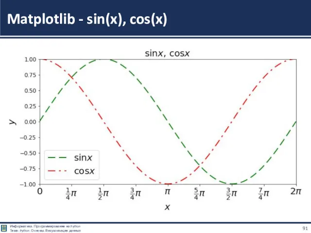
Matplotlib - sin(x), cos(x)
import matplotlib.pyplot as plt
import numpy as np
x = np.linspace(0, 2 * np.pi, 100)
plt.figure(figsize=(10, 5))
plt.plot(x, np.sin(x), linewidth=2, color='g', dashes=[8, 4], label=r'$\sin x$')
plt.plot(x, np.cos(x), linewidth=2, color='r', dashes=[8, 4, 2, 4], label=r'$\cos x$')
plt.axis([0, 2 * np.pi, -1, 1])
plt.xticks(np.linspace(0, 2 * np.pi, 9), # Где сделать отметки
('0',r'$\frac{1}{4}\pi$',r'$\frac{1}{2}\pi$', # Как подписать
r'$\frac{3}{4}\pi$',r'$\pi$',r'$\frac{5}{4}\pi$',
r'$\frac{3}{2}\pi$',r'$\frac{7}{4}\pi$',r'$2\pi$'),
fontsize=20)
plt.yticks(fontsize=12)
plt.xlabel(r'$x$', fontsize=20)
plt.ylabel(r'$y$', fontsize=20)
plt.title(r'$\sin x$, $\cos x$', fontsize=20)
plt.legend(fontsize=20, loc=0)
plt.show()
Matplotlib - sin(x), cos(x)
Matplotlib - sin(x), cos(x)
Matplotlib - sin(x), cos(x)
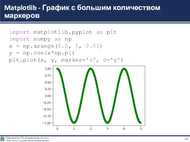
Matplotlib - График с большим количеством маркеров
import matplotlib.pyplot as plt
import numpy as np
x = np.arange(0.0, 5, 0.01)
y = np.cos(x*np.pi)
plt.plot(x, y, marker='o', c='g')
Matplotlib - График с большим количеством маркеров
import matplotlib.pyplot as plt
import numpy as np
x = np.arange(0.0, 5, 0.01)
y = np.cos(x*np.pi)
plt.plot(x, y, marker='o', c='g')
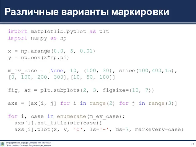
Различные варианты маркировки
import matplotlib.pyplot as plt
import numpy as np
x = np.arange(0.0, 5, 0.01)
y = np.cos(x*np.pi)
m_ev_case = [None, 10, (100, 30), slice(100,400,15),
[0, 100, 200, 300],[10, 50, 100]]
fig, ax = plt.subplots(2, 3, figsize=(10, 7))
axs = [ax[i, j] for i in range(2) for j in range(3)]
for i, case in enumerate(m_ev_case):
axs[i].set_title(str(case))
axs[i].plot(x, y, 'o', ls='-', ms=7, markevery=case)
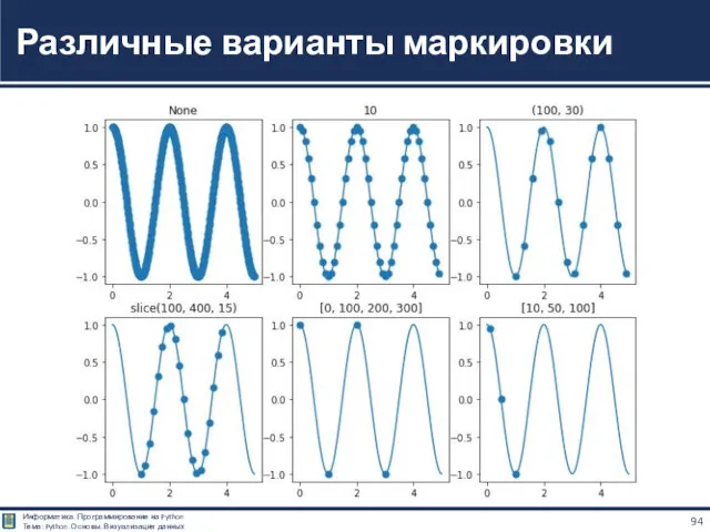
Различные варианты маркировки
Различные варианты маркировки
import matplotlib.pyplot as plt
import numpy as np
x = np.linspace(-2, 2, 100)
plt.figure(figsize=(8, 8))
plt.plot(x, x**3, linestyle='--', lw=2, label='$y=x^3$')
plt.xlabel('x'), plt.ylabel('y')
plt.legend()
plt.title('График кубической функции')
plt.grid(ls=':')
plt.show()
Пунктирный график функции y=x3
Пунктирный график функции y=x3
Пунктирный график функции y=x3
import matplotlib.pyplot as plt
import numpy as np
x = np.linspace(0,4*np.pi,100)
plt.plot(x,np.sin(x))
sin(x)
import matplotlib.pyplot as plt
import numpy as np
x = np.linspace(0,4*np.pi,100)
plt.plot(x,np.sin(x))
sin(x)
import matplotlib.pyplot as plt
import numpy as np
x = np.arange(0,4*np.pi-1,0.1)# start,stop,step
y = np.sin(x)
z = np.cos(x)
plt.plot(x,y,x,z)
# string must be enclosed with quotes ' '
plt.xlabel('x values from 0 to 4pi')
plt.ylabel('sin(x) and cos(x)')
plt.title('Plot of sin and cos from 0 to 4pi')
plt.legend(['sin(x)', 'cos(x)'])# legend
entries as seperate strings in a list
plt.show()
sin(x), cos(x)
sin(x), cos(x)
sin(x), cos(x)
Matplotlib – Подписи осей графика
import matplotlib.pyplot as plt
x = [i for i in range(10)]
y = [i*2 for i in range(10)]
plt.plot(x, y)
plt.xlabel('Ось X\nНезависимая величина', fontsize=14,
fontweight='bold')
plt.ylabel('Ось Y\nЗависимая величина', fontsize=14,
fontweight='bold')
Matplotlib – Подписи осей графика
import matplotlib.pyplot as plt
x = [i for i in range(10)]
y = [i*2 for i in range(10)]
plt.plot(x, y)
plt.xlabel('Ось X\nНезависимая величина', fontsize=14,
fontweight='bold')
plt.ylabel('Ось Y\nЗависимая величина', fontsize=14,
fontweight='bold')
Matplotlib – Текстовый блок
import matplotlib.pyplot as plt
x = [i for i in range(10)]
y = [i*2 for i in range(10)]
plt.text(0, 7, 'HELLO!', fontsize=15)
plt.plot(range(0,10), range(0,10))
Matplotlib – Текстовый блок
import matplotlib.pyplot as plt
x = [i for i in range(10)]
y = [i*2 for i in range(10)]
plt.text(0, 7, 'HELLO!', fontsize=15)
plt.plot(range(0,10), range(0,10))

Столбчатые и круговые
диаграммы
Столбчатые и круговые
диаграммы
Для визуализации категориальных данных хорошо подходят столбчатые диаграммы.
Для их построения
Для визуализации категориальных данных хорошо подходят столбчатые диаграммы.
Для их построения
![import matplotlib.pyplot as plt plt.bar([6, 7, 8], [10, 15, 21]) plt.show() Гистограммы](/_ipx/f_webp&q_80&fit_contain&s_1440x1080/imagesDir/jpg/143855/slide-103.jpg)
import matplotlib.pyplot as plt
plt.bar([6, 7, 8],
[10, 15, 21])
plt.show()
Гистограммы
import matplotlib.pyplot as plt
plt.bar([6, 7, 8],
[10, 15, 21])
plt.show()
Гистограммы
![import matplotlib.pyplot as plt plt.barh([6, 7, 8], [10, 15, 21]) plt.show() Гистограммы](/_ipx/f_webp&q_80&fit_contain&s_1440x1080/imagesDir/jpg/143855/slide-104.jpg)
import matplotlib.pyplot as plt
plt.barh([6, 7, 8],
[10, 15, 21])
plt.show()
Гистограммы
import matplotlib.pyplot as plt
plt.barh([6, 7, 8],
[10, 15, 21])
plt.show()
Гистограммы
![import matplotlib.pyplot as plt plt.bar([6, 7, 8], [10, 15, 21])](/_ipx/f_webp&q_80&fit_contain&s_1440x1080/imagesDir/jpg/143855/slide-105.jpg)
import matplotlib.pyplot as plt
plt.bar([6, 7, 8], [10, 15, 21])
plt.bar([6, 7, 8], [6, 12, 21])
plt.show()
Гистограммы с несколькими наборами данных
import matplotlib.pyplot as plt
plt.bar([6, 7, 8], [10, 15, 21])
plt.bar([6, 7, 8], [6, 12, 21])
plt.show()
Гистограммы с несколькими наборами данных
![import matplotlib.pyplot as plt plt.bar([5.9, 6.9, 7.9], [10, 15, 21],](/_ipx/f_webp&q_80&fit_contain&s_1440x1080/imagesDir/jpg/143855/slide-106.jpg)
import matplotlib.pyplot as plt
plt.bar([5.9, 6.9, 7.9], [10, 15, 21], width = 0.2)
plt.bar([6.1, 7.1, 8.1], [6, 12, 28], width = 0.2)
plt.show()
Гистограммы с несколькими наборами данных
import matplotlib.pyplot as plt
plt.bar([5.9, 6.9, 7.9], [10, 15, 21], width = 0.2)
plt.bar([6.1, 7.1, 8.1], [6, 12, 28], width = 0.2)
plt.show()
Гистограммы с несколькими наборами данных
![import matplotlib.pyplot as plt plt.bar([5.9, 6.9, 7.9], [10, 15, 21],](/_ipx/f_webp&q_80&fit_contain&s_1440x1080/imagesDir/jpg/143855/slide-107.jpg)
import matplotlib.pyplot as plt
plt.bar([5.9, 6.9, 7.9], [10, 15, 21], width = 0.8)
plt.bar([6.1, 7.1, 8.1], [6, 12, 28], width = 0.1)
plt.show()
Гистограммы с несколькими наборами данных
import matplotlib.pyplot as plt
plt.bar([5.9, 6.9, 7.9], [10, 15, 21], width = 0.8)
plt.bar([6.1, 7.1, 8.1], [6, 12, 28], width = 0.1)
plt.show()
Гистограммы с несколькими наборами данных
Круговые диаграммы — это наглядный способ показать доли компонентов в наборе.
Круговые диаграммы — это наглядный способ показать доли компонентов в наборе.
Круговая диаграмма
import matplotlib.pyplot as plt
vals = [24, 17, 53, 21, 35]
labels = ['Ford', 'Toyota', 'BMW', 'AUDI', 'Jaguar']
fig, ax = plt.subplots()
ax.pie(vals, labels=labels)
ax.axis('equal')
Круговая диаграмма
import matplotlib.pyplot as plt
vals = [24, 17, 53, 21, 35]
labels = ['Ford', 'Toyota', 'BMW', 'AUDI', 'Jaguar']
fig, ax = plt.subplots()
ax.pie(vals, labels=labels)
ax.axis('equal')
Модифицированная круговая диаграмма
import matplotlib.pyplot as plt
vals = [24, 17, 53, 21, 35]
labels = ['Ford', 'Toyota', 'BMW', 'AUDI', 'Jaguar']
explode = (0.1, 0, 0.15, 0, 0)
fig, ax = plt.subplots()
ax.pie(vals, labels=labels, autopct='%1.1f%%', shadow=True,
explode=explode, wedgeprops={'lw':1, 'ls':'--','edgecolor':'k'},
rotatelabels=True)
ax.axis('equal')
Круговая диаграмма с отверстием
import matplotlib.pyplot as plt
vals = [24, 17, 53, 21, 35]
labels = ['Ford', 'Toyota', 'BMV', 'AUDI', 'Jaguar']
fig, ax = plt.subplots()
ax.pie(vals, labels=labels, wedgeprops=dict(width=0.5))
Круговая диаграмма с отверстием
import matplotlib.pyplot as plt
vals = [24, 17, 53, 21, 35]
labels = ['Ford', 'Toyota', 'BMV', 'AUDI', 'Jaguar']
fig, ax = plt.subplots()
ax.pie(vals, labels=labels, wedgeprops=dict(width=0.5))

Визуализация
двумерных массивов
Визуализация
двумерных массивов
Визуализация двумерных массивов
import matplotlib.pyplot as plt
import numpy as np
a = [[1, 0, 0],
[0, 1, 0],
[0, 0, 1]]
plt.pcolor(a)
Визуализация двумерных массивов
import matplotlib.pyplot as plt
import numpy as np
a = [[1, 0, 0],
[0, 1, 0],
[0, 0, 1]]
plt.pcolor(a)
Визуализация двумерных массивов
import matplotlib.pyplot as plt
import numpy as np
a = [[0, 1, 2],
[0, 1, 2],
[0, 1, 2]]
plt.pcolormesh(a, edgecolors='black')
Визуализация двумерных массивов
import matplotlib.pyplot as plt
import numpy as np
a = [[0, 1, 2],
[0, 1, 2],
[0, 1, 2]]
plt.pcolormesh(a, edgecolors='black')
Цветовое распределение
import numpy as np
np.random.seed(123)
vals = np.random.randint(10, size=(7, 7))
plt.pcolor(vals)
Цветовое распределение
import numpy as np
np.random.seed(123)
vals = np.random.randint(10, size=(7, 7))
plt.pcolor(vals)
Цветовая полоса для заданного цветового распределения
import numpy as np
np.random.seed(123)
vals = np.random.randint(10, size=(7, 7))
plt.pcolor(vals)
plt.colorbar()
Цветовая полоса для заданного цветового распределения
import numpy as np
np.random.seed(123)
vals = np.random.randint(10, size=(7, 7))
plt.pcolor(vals)
plt.colorbar()
Визуализация двумерного набора данных с использованием pcolormesh()
import matplotlib.pyplot as plt
import numpy as np
np.random.seed(123)
data = np.random.rand(5, 7)
plt.pcolormesh(data, cmap='plasma', edgecolors='k’,
shading='flat')
Визуализация двумерного набора данных с использованием pcolormesh()
import matplotlib.pyplot as plt
import numpy as np
np.random.seed(123)
data = np.random.rand(5, 7)
plt.pcolormesh(data, cmap='plasma', edgecolors='k’,
shading='flat')
Добавление текста
import matplotlib.pyplot as plt
from matplotlib.colors import ListedColormap
import numpy as np
a = [[0, 1, 2],
[0, 1, 2],
[0, 1, 2]]
b = [[0, 0, 0],
[1, 1, 1],
[2, 2, 2]]
colours = (["blue", "green", "red"])
cmap = ListedColormap(colours)
plt.pcolormesh(a, edgecolors='black', cmap=cmap)
plt.pcolormesh(b, edgecolors='black', cmap=cmap)
plt.text(1.5, 1.5, 'X', color='white', fontsize='20', ha='center', va='center')
plt.text(0.5, 2.5, 'O', color='white', fontsize='30', ha='center', va='center')
Тепловые карты
import numpy as np
import matplotlib
import matplotlib.pyplot as plt
vegetables = ["cucumber", "tomato", "lettuce", "asparagus",
"potato", "wheat", "barley"]
farmers = ["Farmer Joe", "Upland Bros.", "Smith Gardening",
"Agrifun", "Organiculture", "BioGoods Ltd.", "Cornylee Corp."]
harvest = np.array([[0.8, 2.4, 2.5, 3.9, 0.0, 4.0, 0.0],
[2.4, 0.0, 4.0, 1.0, 2.7, 0.0, 0.0],
[1.1, 2.4, 0.8, 4.3, 1.9, 4.4, 0.0],
[0.6, 0.0, 0.3, 0.0, 3.1, 0.0, 0.0],
[0.7, 1.7, 0.6, 2.6, 2.2, 6.2, 0.0],
[1.3, 1.2, 0.0, 0.0, 0.0, 3.2, 5.1],
[0.1, 2.0, 0.0, 1.4, 0.0, 1.9, 6.3]])
fig, ax = plt.subplots()
im = ax.imshow(harvest)
# We want to show all ticks...
ax.set_xticks(np.arange(len(farmers)))
ax.set_yticks(np.arange(len(vegetables)))
# ... and label them with the respective list entries
ax.set_xticklabels(farmers)
ax.set_yticklabels(vegetables)
# Rotate the tick labels and set their alignment.
plt.setp(ax.get_xticklabels(), rotation=45, ha="right",
rotation_mode="anchor")
# Loop over data dimensions and create text annotations.
for i in range(len(vegetables)):
for j in range(len(farmers)):
text = ax.text(j, i, harvest[i, j],
ha="center", va="center", color="w")
ax.set_title("Harvest of local farmers (in tons/year)")
fig.tight_layout()
plt.show()
https://matplotlib.org/stable/gallery/images_contours_and_fields/image_annotated_heatmap.html#sphx-glr-gallery-images-contours-and-fields-image-annotated-heatmap-py

Компоновка
нескольких графиков
вместе
Компоновка
нескольких графиков
вместе
Вариант подключения
import matplotlib
import matplotlib.pyplot as plt
import matplotlib.gridspec as gridspec
Примеры
https://matplotlib.org/stable/tutorials/intermediate/gridspec.html
Компоновка нескольких графиков вместе
Вариант подключения
import matplotlib
import matplotlib.pyplot as plt
import matplotlib.gridspec as gridspec
Примеры
https://matplotlib.org/stable/tutorials/intermediate/gridspec.html
Компоновка нескольких графиков вместе
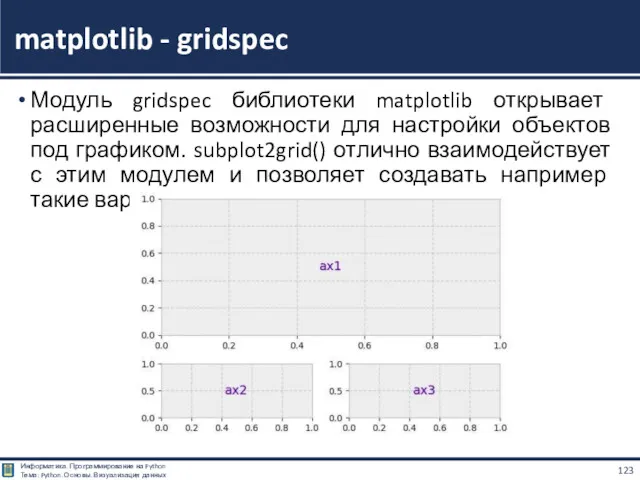
Модуль gridspec библиотеки matplotlib открывает расширенные возможности для настройки объектов под
Модуль gridspec библиотеки matplotlib открывает расширенные возможности для настройки объектов под
import matplotlib.pyplot as plt
gridsize = (3, 2)
fig = plt.figure(figsize=(12, 8))
ax1 = plt.subplot2grid(gridsize, (0, 0), colspan=2, rowspan=2)
ax2 = plt.subplot2grid(gridsize, (2, 0))
ax3 = plt.subplot2grid(gridsize, (2, 1))
plt.show()
matplotlib - gridspec
subplot2grid() – это (ряд, строка) локация объекта Axes со
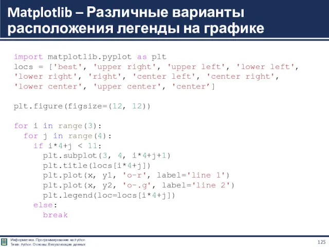
Matplotlib – Различные варианты расположения легенды на графике
import matplotlib.pyplot as plt
locs = ['best', 'upper right', 'upper left', 'lower left',
'lower right', 'right', 'center left', 'center right',
'lower center', 'upper center', 'center’]
plt.figure(figsize=(12, 12))
for i in range(3):
for j in range(4):
if i*4+j < 11:
plt.subplot(3, 4, i*4+j+1)
plt.title(locs[i*4+j])
plt.plot(x, y1, 'o-r', label='line 1')
plt.plot(x, y2, 'o-.g', label='line 2')
plt.legend(loc=locs[i*4+j])
else:
break
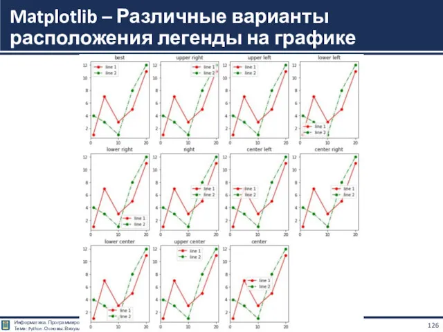
Matplotlib – Различные варианты расположения легенды на графике
Matplotlib – Различные варианты расположения легенды на графике
Matplotlib – Свободная компоновка
import matplotlib.pyplot as plt
x = [1, 2, 3, 4, 5]
y1 = [9, 4, 2, 4, 9]
y2 = [1, 7, 6, 3, 5]
y3 = [-7, -4, 2, -4, -7]
#Построим графики в новой компоновке:
fg = plt.figure(figsize=(9, 4), constrained_layout=True)
gs = fg.add_gridspec(2, 2)
fig_ax_1 = fg.add_subplot(gs[0, :])
plt.plot(x, y2)
fig_ax_2 = fg.add_subplot(gs[1, 0])
plt.plot(x, y1)
fig_ax_3 = fg.add_subplot(gs[1, 1])
plt.plot(x, y3)
Matplotlib – Свободная компоновка
Matplotlib – Свободная компоновка
Matplotlib – Свободная компоновка
import matplotlib.pyplot as plt
fg = plt.figure(figsize=(9, 9), constrained_layout=True)
gs = fg.add_gridspec(5, 5)
fig_ax_1 = fg.add_subplot(gs[0, :3])
fig_ax_1.set_title('gs[0, :3]')
fig_ax_2 = fg.add_subplot(gs[0, 3:])
fig_ax_2.set_title('gs[0, 3:]')
fig_ax_3 = fg.add_subplot(gs[1:, 0])
fig_ax_3.set_title('gs[1:, 0]')
fig_ax_4 = fg.add_subplot(gs[1:, 1])
fig_ax_4.set_title('gs[1:, 1]')
fig_ax_5 = fg.add_subplot(gs[1, 2:])
fig_ax_5.set_title('gs[1, 2:]')
fig_ax_6 = fg.add_subplot(gs[2:4, 2])
fig_ax_6.set_title('gs[2:4, 2]')
fig_ax_7 = fg.add_subplot(gs[2:4, 3:])
fig_ax_7.set_title('gs[2:4, 3:]')
fig_ax_8 = fg.add_subplot(gs[4, 3:])
fig_ax_8.set_title('gs[4, 3:]')
Matplotlib – Свободная компоновка
Matplotlib – Свободная компоновка
Matplotlib – Свободная компоновка
import matplotlib.pyplot as plt
fg = plt.figure(figsize=(5, 5),constrained_layout=True)
widths = [1, 3]
heights = [2, 0.7]
gs = fg.add_gridspec(ncols=2, nrows=2, width_ratios=widths,
height_ratios=heights)
fig_ax_1 = fg.add_subplot(gs[0, 0])
fig_ax_1.set_title('w:1, h:2’)
fig_ax_2 = fg.add_subplot(gs[0, 1])
fig_ax_2.set_title('w:3, h:2’)
fig_ax_3 = fg.add_subplot(gs[1, 0])
fig_ax_3.set_title('w:1, h:0.7’)
fig_ax_4 = fg.add_subplot(gs[1, 1])
fig_ax_4.set_title('w:3, h:0.7')
Matplotlib – Свободная компоновка
Matplotlib – Свободная компоновка
Matplotlib – Стили соединительной линии аннотации
import matplotlib.pyplot as plt
import math
fig, axs = plt.subplots(2, 3, figsize=(12, 7))
conn_style=[
'angle,angleA=90,angleB=0,rad=0.0',
'angle3,angleA=90,angleB=0',
'arc,angleA=0,angleB=0,armA=0,armB=40,rad=0.0',
'arc3,rad=-1.0',
'bar,armA=0.0,armB=0.0,fraction=0.1,angle=70',
'bar,fraction=-0.5,angle=180',
]
for i in range(2):
for j in range(3):
axs[i, j].text(0.1, 0.5, '\n'.join(conn_style[i*3+j].split(',')))
axs[i, j].annotate('text', xy=(0.2, 0.2), xycoords='data’,
xytext=(0.7, 0.8), textcoords='data', arrowprops=dict(arrowstyle='->',
connectionstyle=conn_style[i*3+j]))
Matplotlib – Стили соединительной линии аннотации
Matplotlib – Стили соединительной линии аннотации
КУТУЗОВ Виктор Владимирович
Благодарю
за внимание
Белорусско-Российский университет, Республика Беларусь, Могилев, 2021
Информатика. Программирование
КУТУЗОВ Виктор Владимирович
Благодарю
за внимание
Белорусско-Российский университет, Республика Беларусь, Могилев, 2021
Информатика. Программирование
Python
https://www.python.org/
Google Colaboratory
https://colab.research.google.com/
Matplotlib: Visualization with Python
https://matplotlib.org/
Matplotlib User's
Python
https://www.python.org/
Google Colaboratory
https://colab.research.google.com/
Matplotlib: Visualization with Python
https://matplotlib.org/
Matplotlib User's
Абдрахманов М.И. Python. Визуализация данных. Matplotlib. - Devpractice Team, 2020 –
Абдрахманов М.И. Python. Визуализация данных. Matplotlib. - Devpractice Team, 2020 –
 Анализ еженедельного вечернего выпуска новостей телеканала НТВ
 Инструменты. Frontend - разработчик
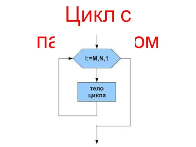 Цикл с параметром
 Система контроля версий Git
 Polymorphism (Polimorfizm)
 Основы трехмерного моделирования в САПР КОМПАС - 3D
 Измерение информации. Информация и информационные процессы. Информатика. 7 класс
 Operating systems. Threads. (Section 4)
 ИКТО-2014
 Программный продукт VirtualBOX
 Дистанционное обучение. Регистрация на вебинаре
 Регистрация в компанию New millennium centre LTD
 Сетевое программное обеспечение
 Алгоритмы поиска. Поиск в линейных структурах
 Информация в науке: оценка качества, судьба, цитирование
 Переменная. Использование переменной
 План-сценарий внеурочного мероприятия Безопасный Интернет
 Структурное программирование. Тема 03
 Practical Data Compression for Memory Hierarchies and Applications
 Router for Wi-Fi
 Растровая и векторная графика
 Programming in haskell. Рекурсия и функции высших порядков
 Официальные издания
 Современные проблемы информационной эпохи: новые вызовы для человека и общества
 ЭВМ и периферийные устройства. Порты, интерфейсы ПЭВМ. (Лекция 7)
 Основы языка HTML
 Виды программного обеспечения.Назначение основных видов ПО
 Понятие модели. Назначение и свойства моделей