- Descriptive statistics. Frequency distributions and their graphs. (Section 2.1)

Содержание
- 2. Frequency Distributions and Their Graphs Section 2.1
- 3. Frequency Distributions 102 124 108 86 103 82 71 104 112 118 87 95 103 116
- 4. Frequency Distributions Classes - the intervals used in the distribution Class width - the range divided
- 5. Frequency Distributions Midpoint - the sum of the limits divided by 2 lower class limit +
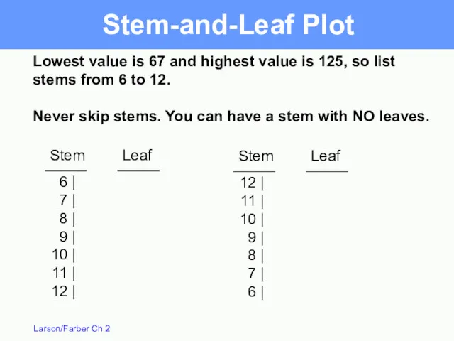
- 6. 78 90 102 114 126 3 5 8 9 5 67 79 91 103 115 Do
- 7. 67 - 78 79 - 90 91 - 102 103 - 114 115 - 126 3
- 8. Frequency Histogram A bar graph that represents the frequency distribution of the data set horizontal scale
- 9. 1 2 6 . 5 1 1 4 . 5 1 0 2 . 5 9
- 10. Relative Frequency Histogram A bar graph that represents the relative frequency distribution of the data set
- 11. Relative Frequency Histogram Time on Phone minutes Relative frequency on vertical scale Relative frequency
- 12. Frequency Polygon A line graph that emphasizes the continuous change in frequencies horizontal scale uses class
- 13. Frequency Polygon 9 8 7 6 5 4 3 2 1 0 5 9 8 5
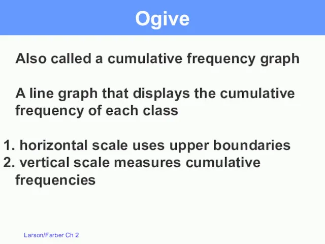
- 14. Ogive Also called a cumulative frequency graph A line graph that displays the cumulative frequency of
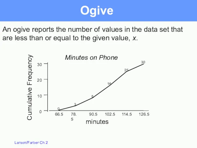
- 15. Ogive An ogive reports the number of values in the data set that are less than
- 16. More Graphs and Displays Section 2.2
- 17. Stem-and-Leaf Plot 102 124 108 86 103 82 71 104 112 118 87 95 103 116
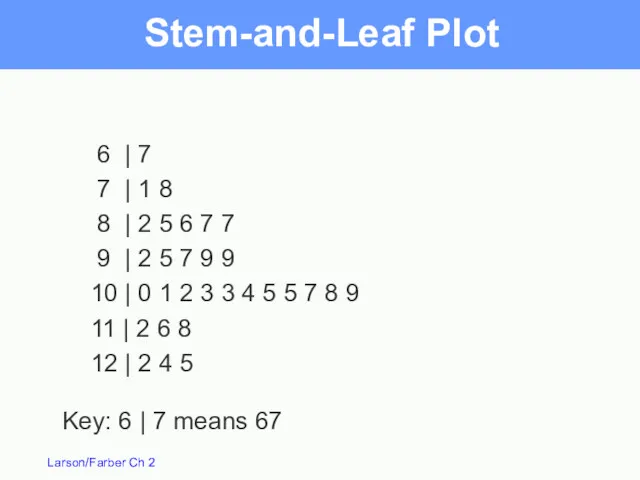
- 18. Stem-and-Leaf Plot 6 | 7 | 8 | 9 | 10 | 11 | 12 |
- 19. 6 | 7 7 | 1 8 8 | 2 5 6 7 7 9 |
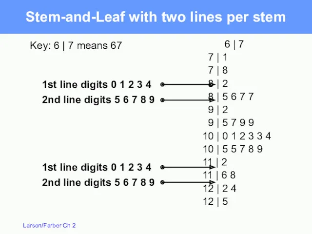
- 20. Stem-and-Leaf with two lines per stem 6 | 7 7 | 1 7 | 8 8
- 21. Dot Plot 66 76 86 96 106 116 126 -contains all original data -easy way to
- 22. NASA budget (billions of $) divided among 3 categories. Pie Chart / Circle Graph Used to
- 23. Total Pie Chart Billions of $ Human Space Flight 5.7 Technology 5.9 Mission Support 2.7 14.3
- 24. Pareto Chart -A vertical bar graph in which the height of the bar represents frequency or
- 25. Scatter Plot Absences Grade Absences (x) x 8 2 5 12 15 9 6 y 78
- 26. Time Series Chart / Line Graph - Quantitative entries taken at regular intervals over a period
- 27. Measures of Central Tendency Section 2.3
- 28. Measures of Central Tendency Mean: The sum of all data values divided by the number of
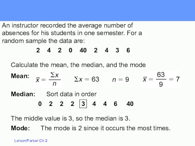
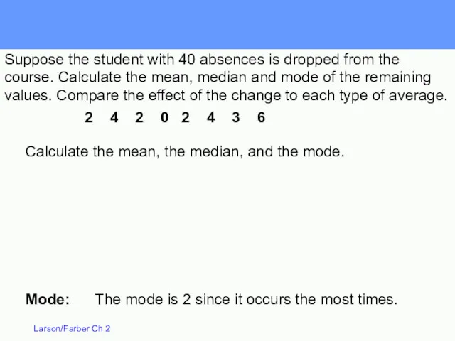
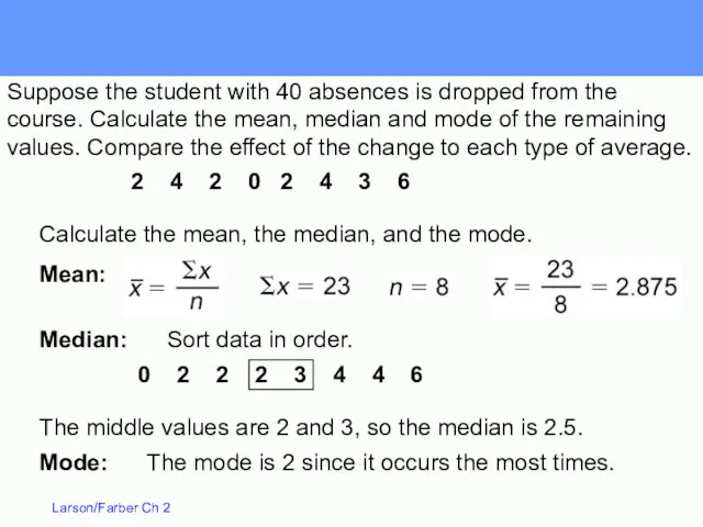
- 29. 2 4 2 0 40 2 4 3 6 Calculate the mean, the median, and the
- 30. 0 2 2 2 3 4 4 6 40 2 4 2 0 40 2 4
- 31. Mode: The mode is 2 since it occurs the most times. Calculate the mean, the median,
- 32. Median: Sort data in order. Mode: The mode is 2 since it occurs the most times.
- 33. Uniform Symmetric Skewed right positive Skewed left negative Mean = Median Mean > Median Mean Shapes
- 34. A weighted mean is the mean of a data set whose entries have varying weights X
- 35. Weighted Mean A student receives the following grades, A worth 4 points, B worth 3 points,
- 36. The mean of a frequency distribution for a sample is approximated by X = where x
- 37. Mean of Grouped Data The heights of 16 students in a physical ed. class: Height Frequency
- 38. Measures of Variation Section 2.4
- 39. Closing prices for two stocks were recorded on ten successive Fridays. Calculate the mean, median and
- 40. Closing prices for two stocks were recorded on ten successive Fridays. Calculate the mean, median and
- 41. Range for A = 67 – 56 = $11 Range = Maximum value – Minimum value
- 42. The deviation for each value x is the difference between the value of x and the
- 43. – 5.5 – 5.5 – 4.5 – 3.5 – 0.5 1.5 1.5 5.5 5.5 5.5 56
- 44. Population Variance Sum of squares – 5.5 – 5.5 – 4.5 – 3.5 – 0.5 1.5
- 45. Population Standard Deviation Population Standard Deviation: The square root of the population variance. The population standard
- 46. Sample Variance and Standard Deviation To calculate a sample variance divide the sum of squares by
- 47. Interpreting Standard Deviation Standard deviation is a measure of the typical amount an entry deviates (is
- 48. Summary Range = Maximum value – Minimum value
- 49. Data with symmetric bell-shaped distribution have the following characteristics. About 68% of the data lies within
- 50. The mean value of homes on a certain street is $125,000 with a standard deviation of
- 51. The mean value of homes on a certain street is $125,000 with a standard deviation of
- 52. Chebychev’s Theorem For k = 3, at least 1 – 1/9 = 8/9 = 88.9% of
- 53. Chebychev’s Theorem The mean time in a women’s 400-meter dash is 52.4 seconds with a standard
- 54. Chebychev’s Theorem The mean time in a women’s 400-meter dash is 52.4 seconds with a standard
- 55. Standard Deviation of Grouped Data Sample standard deviation = See example on pg 82 f is
- 56. Estimates with Classes When a frequency distribution has classes, you can estimate the sample mean and
- 57. Measures of Position Section 2.5
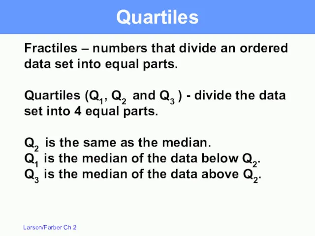
- 58. Fractiles – numbers that divide an ordered data set into equal parts. Quartiles (Q1, Q2 and
- 59. You are managing a store. The average sale for each of 27 randomly selected days in
- 60. The data in ranked order (n = 27) are: 17 19 20 23 27 28 30
- 61. Interquartile Range – the difference between the third and first quartiles IQR = Q3 – Q1
- 62. Box and Whisker Plot 55 45 35 25 15 A box and whisker plot uses 5
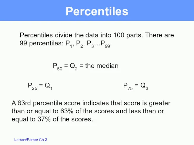
- 63. Percentiles Percentiles divide the data into 100 parts. There are 99 percentiles: P1, P2, P3…P99. A
- 64. Percentiles 114.5 falls on or above 25 of the 30 values. 25/30 = 83.33. So you
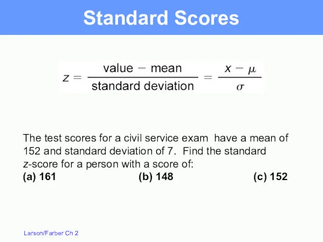
- 65. Standard Scores Standard score or z-score - represents the number of standard deviations that a data
- 66. Standard Scores The test scores for a civil service exam have a mean of 152 and
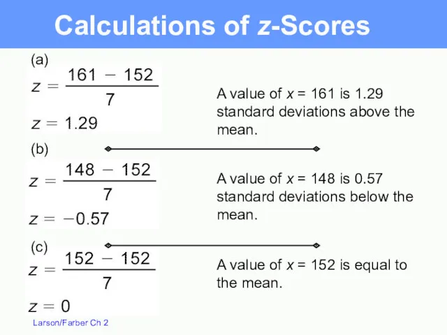
- 67. (c) (a) (b) A value of x = 161 is 1.29 standard deviations above the mean.
- 69. Скачать презентацию
Frequency Distributions and Their Graphs
Section 2.1
Frequency Distributions and Their Graphs
Section 2.1
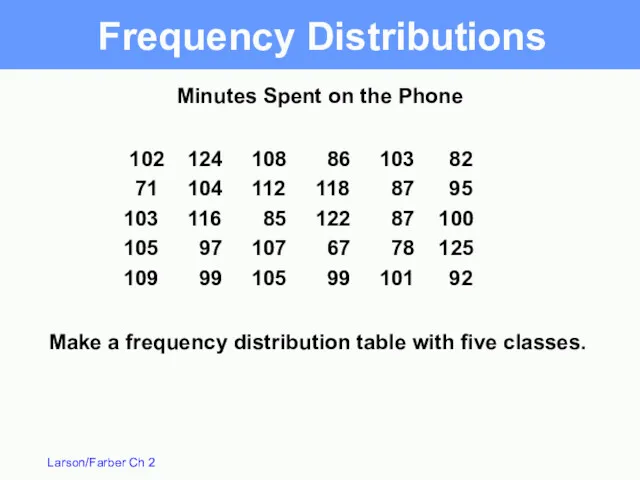
Frequency Distributions
102 124 108 86 103 82
71 104 112 118 87 95
103 116 85 122 87 100
105
Frequency Distributions
102 124 108 86 103 82
71 104 112 118 87 95
103 116 85 122 87 100
105
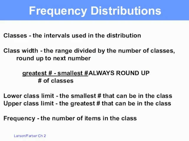
Frequency Distributions
Classes - the intervals used in the distribution
Class width -
Frequency Distributions
Classes - the intervals used in the distribution
Class width -
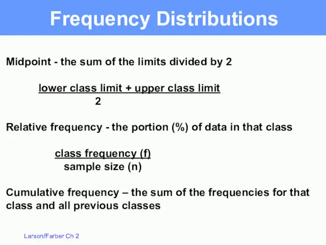
Frequency Distributions
Midpoint - the sum of the limits divided by 2
lower
Frequency Distributions
Midpoint - the sum of the limits divided by 2
lower
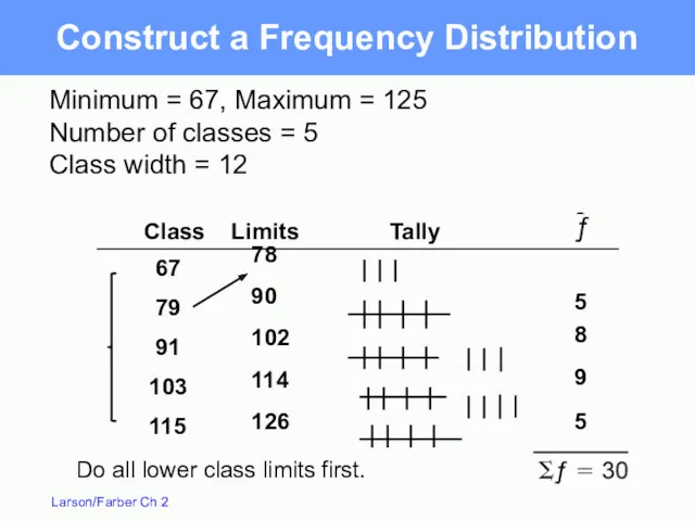
78
90
102
114
126
3
5
8
9
5
67
79
91
103
115
Do all lower class limits first.
Class Limits
78
90
102
114
126
3
5
8
9
5
67
79
91
103
115
Do all lower class limits first.
Class Limits
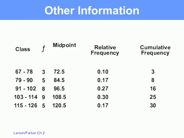
67 - 78
79 - 90
91 - 102
103 -
67 - 78
79 - 90
91 - 102
103 -
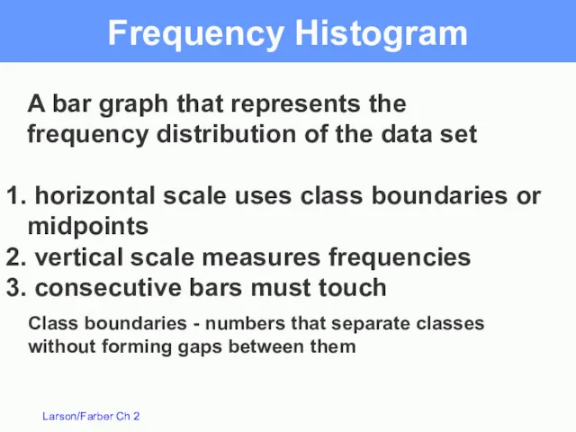
Frequency Histogram
A bar graph that represents the
frequency distribution of the
Frequency Histogram
A bar graph that represents the
frequency distribution of the
1
2
6
.
5
1
1
4
.
5
1
0
2
.
5
9
0
.
5
7
8
.
5
6
6
.
5
9
8
7
6
5
4
3
2
1
0
5
9
8
5
3
Boundaries
66.5 - 78.5
78.5 - 90.5
90.5 - 102.5
102.5
1
2
6
.
5
1
1
4
.
5
1
0
2
.
5
9
0
.
5
7
8
.
5
6
6
.
5
9
8
7
6
5
4
3
2
1
0
5
9
8
5
3
Boundaries
66.5 - 78.5
78.5 - 90.5
90.5 - 102.5
102.5
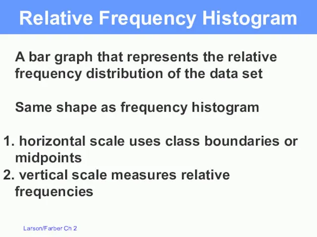
Relative Frequency Histogram
A bar graph that represents the relative
frequency distribution
Relative Frequency Histogram
A bar graph that represents the relative
frequency distribution
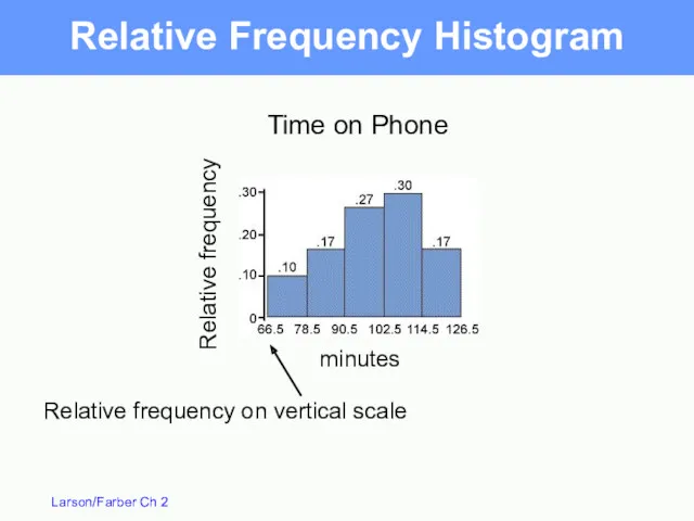
Relative Frequency Histogram
Time on Phone
minutes
Relative frequency on vertical scale
Relative frequency
Relative Frequency Histogram
Time on Phone
minutes
Relative frequency on vertical scale
Relative frequency
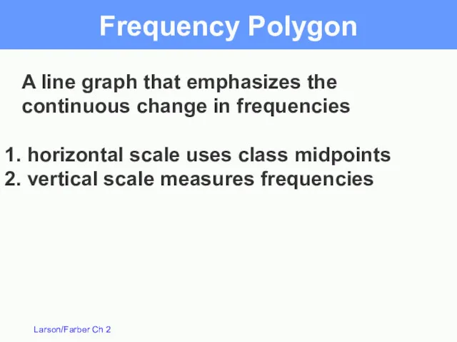
Frequency Polygon
A line graph that emphasizes the continuous change in frequencies
Frequency Polygon
A line graph that emphasizes the continuous change in frequencies
Frequency Polygon
9
8
7
6
5
4
3
2
1
0
5
9
8
5
3
Time on Phone
minutes
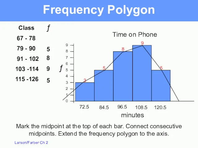
Class
67 - 78
79 -
Frequency Polygon
9
8
7
6
5
4
3
2
1
0
5
9
8
5
3
Time on Phone
minutes
Class
67 - 78
79 -
Ogive
Also called a cumulative frequency graph
A line graph that displays
Ogive
Also called a cumulative frequency graph
A line graph that displays
Ogive
An ogive reports the number of values in the data set
Ogive
An ogive reports the number of values in the data set
More Graphs and Displays
Section 2.2
More Graphs and Displays
Section 2.2
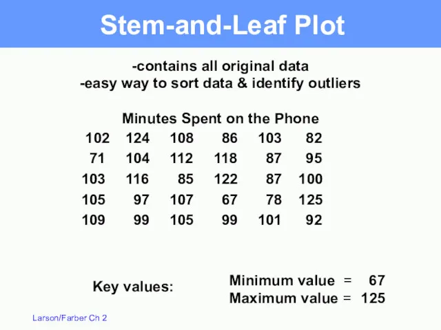
Stem-and-Leaf Plot
102 124 108 86 103 82
71 104 112 118 87 95
103 116 85 122 87 100
105
Stem-and-Leaf Plot
102 124 108 86 103 82
71 104 112 118 87 95
103 116 85 122 87 100
105
Stem-and-Leaf Plot
6 |
7 |
8 |
9 |
10 |
11
Stem-and-Leaf Plot
6 |
7 |
8 |
9 |
10 |
11
6 | 7
7 | 1 8
8 | 2
6 | 7
7 | 1 8
8 | 2
Stem-and-Leaf with two lines per stem
6 | 7
7 |
Stem-and-Leaf with two lines per stem
6 | 7
7 |
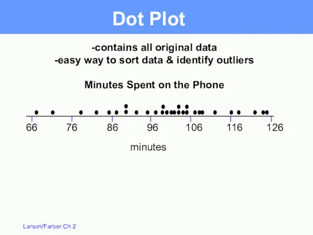
Dot Plot
66
76
86
96
106
116
126
-contains all original data
-easy way to sort data & identify
Dot Plot
66
76
86
96
106
116
126
-contains all original data
-easy way to sort data & identify
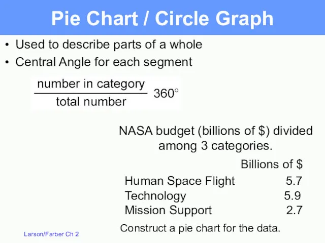
NASA budget (billions of $) divided among 3 categories.
Pie Chart /
NASA budget (billions of $) divided among 3 categories.
Pie Chart /
Total
Pie Chart
Billions of $
Human Space Flight
5.7
Technology
5.9
Mission Support
2.7
14.3
Degrees
143
149
68
360
Mission
Support
19%
Technology
41%
Total
Pie Chart
Billions of $
Human Space Flight
5.7
Technology
5.9
Mission Support
2.7
14.3
Degrees
143
149
68
360
Mission
Support
19%
Technology
41%
Pareto Chart
-A vertical bar graph in which the height of the
Pareto Chart
-A vertical bar graph in which the height of the
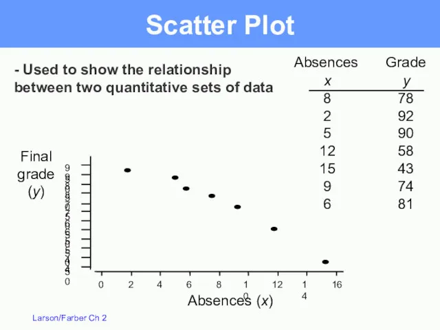
Scatter Plot
Absences
Grade
Absences (x)
x
8
2
5
12
15
9
6
y
78
92
90
58
43
74
81
Final
grade
(y)
- Used to show the relationship
between two quantitative
Scatter Plot
Absences
Grade
Absences (x)
x
8
2
5
12
15
9
6
y
78
92
90
58
43
74
81
Final
grade
(y)
- Used to show the relationship
between two quantitative
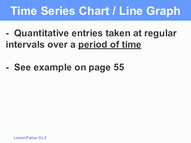
Time Series Chart / Line Graph
- Quantitative entries taken at regular
Time Series Chart / Line Graph
- Quantitative entries taken at regular
Measures of Central Tendency
Section 2.3
Measures of Central Tendency
Section 2.3
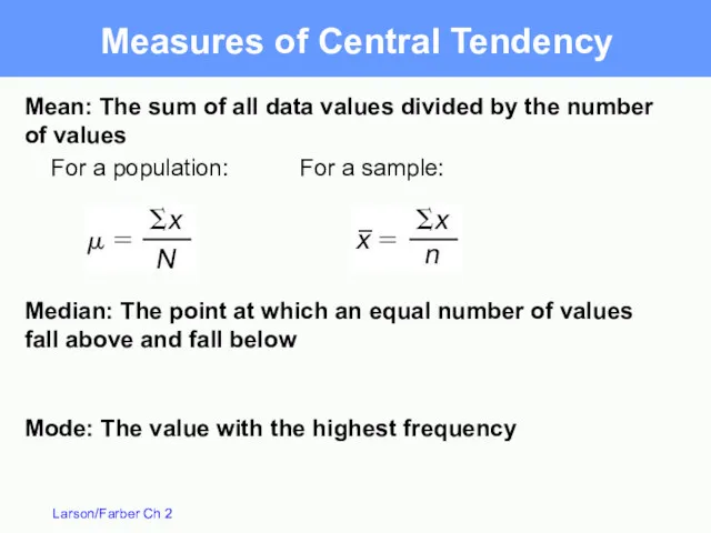
Measures of Central Tendency
Mean: The sum of all data values divided
Measures of Central Tendency
Mean: The sum of all data values divided
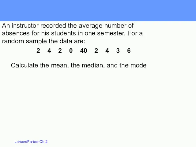
2 4 2 0 40 2 4 3 6
Calculate the mean,
2 4 2 0 40 2 4 3 6
Calculate the mean,
0 2 2 2 3 4 4 6 40
2 4
0 2 2 2 3 4 4 6 40
2 4
Mode: The mode is 2 since it occurs the most times.
Calculate
Mode: The mode is 2 since it occurs the most times.
Calculate
Median: Sort data in order.
Mode: The mode is 2 since it
Median: Sort data in order.
Mode: The mode is 2 since it
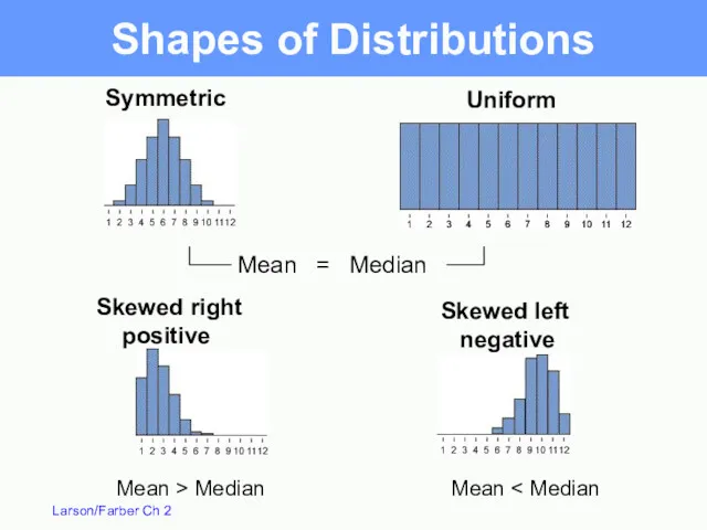
Uniform
Symmetric
Skewed right
positive
Skewed left
negative
Mean = Median
Mean > Median
Mean <
Uniform
Symmetric
Skewed right
positive
Skewed left
negative
Mean = Median
Mean > Median
Mean <
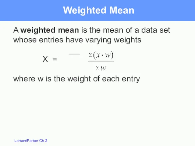
A weighted mean is the mean of a data set whose
A weighted mean is the mean of a data set whose
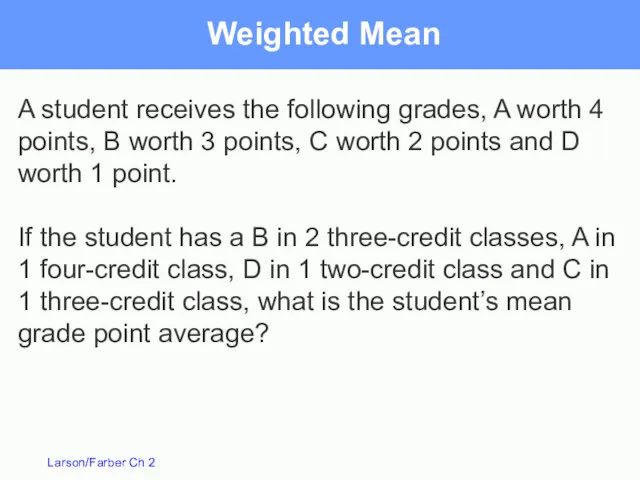
Weighted Mean
A student receives the following grades, A worth 4 points,
Weighted Mean
A student receives the following grades, A worth 4 points,
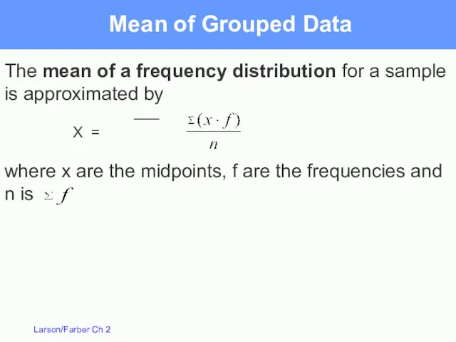
The mean of a frequency distribution for a sample is approximated
The mean of a frequency distribution for a sample is approximated
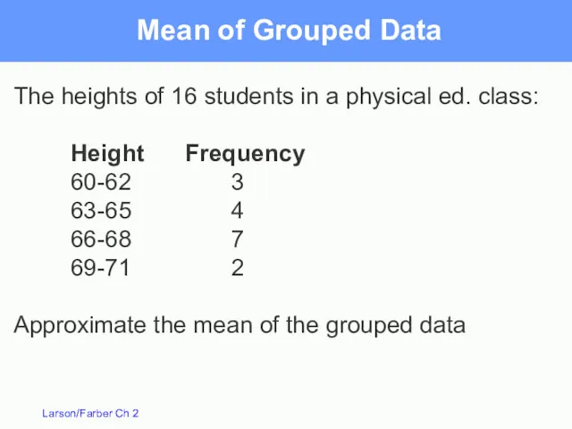
Mean of Grouped Data
The heights of 16 students in a physical
Mean of Grouped Data
The heights of 16 students in a physical
Measures of Variation
Section 2.4
Measures of Variation
Section 2.4
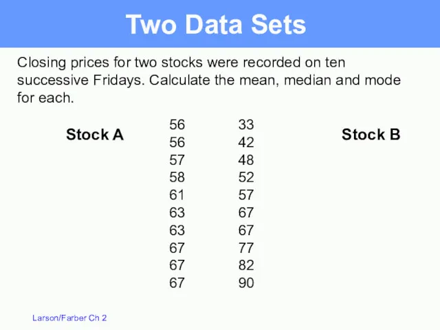
Closing prices for two stocks were recorded on ten successive Fridays.
Closing prices for two stocks were recorded on ten successive Fridays.
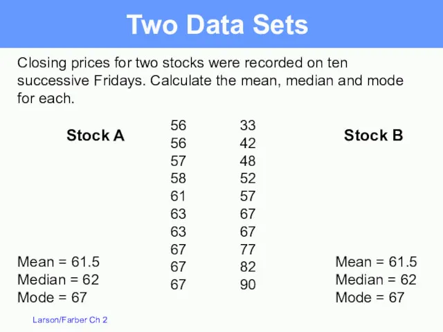
Closing prices for two stocks were recorded on ten successive Fridays.
Closing prices for two stocks were recorded on ten successive Fridays.
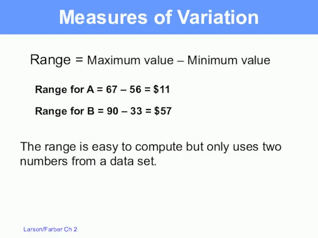
Range for A = 67 – 56 = $11
Range = Maximum
Range for A = 67 – 56 = $11
Range = Maximum
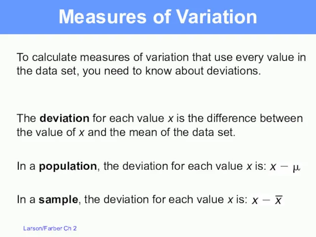
The deviation for each value x is the difference between the
The deviation for each value x is the difference between the
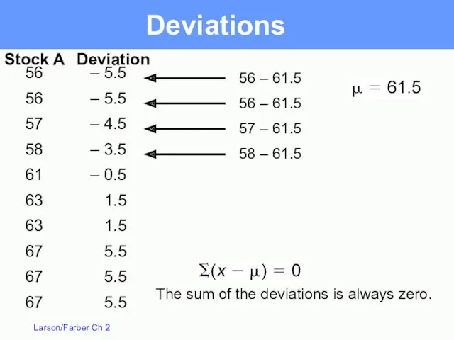
– 5.5
– 5.5
– 4.5
– 3.5
– 0.5
1.5
1.5
5.5
5.5
5.5
56
56
57
58
61
63
63
67
67
67
Deviations
56 – 61.5
56 – 61.5
57 –
– 5.5
– 5.5
– 4.5
– 3.5
– 0.5
1.5
1.5
5.5
5.5
5.5
56
56
57
58
61
63
63
67
67
67
Deviations
56 – 61.5
56 – 61.5
57 –
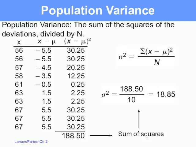
Population Variance
Sum of squares
– 5.5
– 5.5
– 4.5
– 3.5
– 0.5
1.5
1.5
5.5
5.5
5.5
x
56
56
57
58
61
63
63
67
67
67
30.25
30.25
20.25
12.25
0.25
2.25
2.25
30.25
30.25
30.25
188.50
Population Variance:
Population Variance
Sum of squares
– 5.5
– 5.5
– 4.5
– 3.5
– 0.5
1.5
1.5
5.5
5.5
5.5
x
56
56
57
58
61
63
63
67
67
67
30.25
30.25
20.25
12.25
0.25
2.25
2.25
30.25
30.25
30.25
188.50
Population Variance:
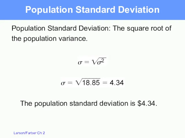
Population Standard Deviation
Population Standard Deviation: The square root of the
Population Standard Deviation
Population Standard Deviation: The square root of the
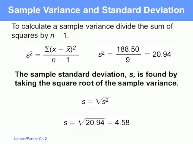
Sample Variance and Standard Deviation
To calculate a sample variance divide
Sample Variance and Standard Deviation
To calculate a sample variance divide
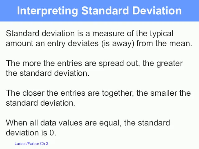
Interpreting Standard Deviation
Standard deviation is a measure of the typical amount
Interpreting Standard Deviation
Standard deviation is a measure of the typical amount
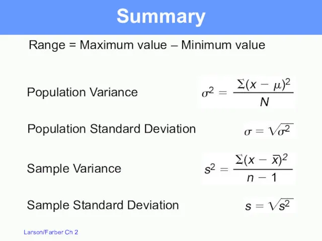
Summary
Range = Maximum value – Minimum value
Summary
Range = Maximum value – Minimum value
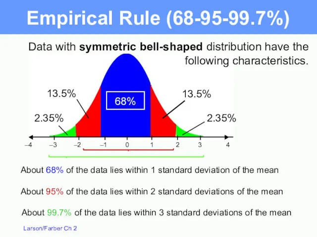
Data with symmetric bell-shaped distribution have the following characteristics.
About 68% of
Data with symmetric bell-shaped distribution have the following characteristics.
About 68% of
The mean value of homes on a certain street is $125,000
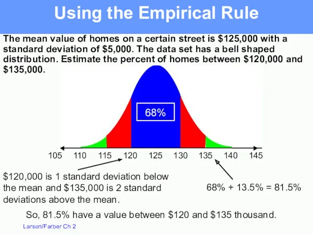
The mean value of homes on a certain street is $125,000
The mean value of homes on a certain street is $125,000
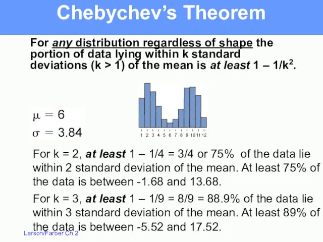
Chebychev’s Theorem
For k = 3, at least 1 – 1/9 =
Chebychev’s Theorem
For k = 3, at least 1 – 1/9 =
Chebychev’s Theorem
The mean time in a women’s 400-meter dash is 52.4
Chebychev’s Theorem
The mean time in a women’s 400-meter dash is 52.4
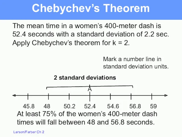
Chebychev’s Theorem
The mean time in a women’s 400-meter dash is 52.4
Chebychev’s Theorem
The mean time in a women’s 400-meter dash is 52.4
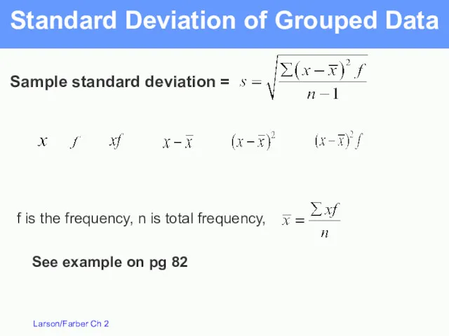
Standard Deviation of Grouped Data
Sample standard deviation =
See example on
Standard Deviation of Grouped Data
Sample standard deviation =
See example on
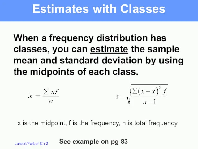
Estimates with Classes
When a frequency distribution has classes, you can estimate
Estimates with Classes
When a frequency distribution has classes, you can estimate
Measures of Position
Section 2.5
Measures of Position
Section 2.5
Fractiles – numbers that divide an ordered data set into equal
Fractiles – numbers that divide an ordered data set into equal
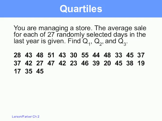
You are managing a store. The average sale for each of
You are managing a store. The average sale for each of
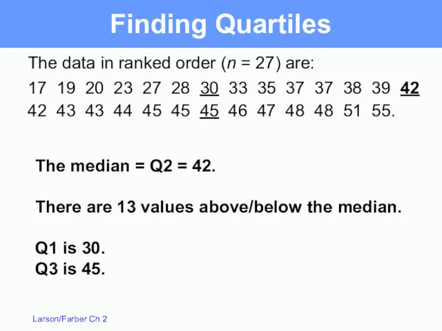
The data in ranked order (n = 27) are:
17 19 20
The data in ranked order (n = 27) are:
17 19 20
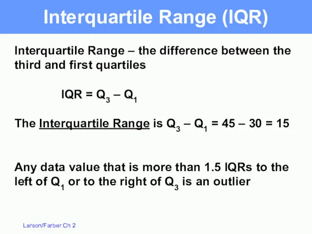
Interquartile Range – the difference between the third and first quartiles
IQR
Interquartile Range – the difference between the third and first quartiles
IQR
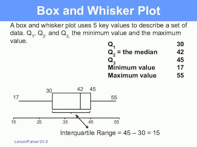
Box and Whisker Plot
55
45
35
25
15
A box and whisker plot uses 5 key
Box and Whisker Plot
55
45
35
25
15
A box and whisker plot uses 5 key
Percentiles
Percentiles divide the data into 100 parts. There are 99 percentiles:
Percentiles
Percentiles divide the data into 100 parts. There are 99 percentiles:
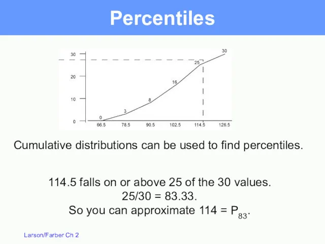
Percentiles
114.5 falls on or above 25 of the 30 values.
25/30
Percentiles
114.5 falls on or above 25 of the 30 values.
25/30
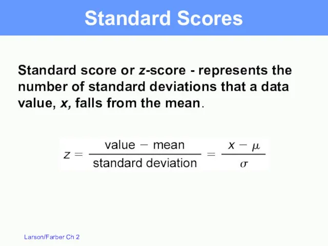
Standard Scores
Standard score or z-score - represents the number of standard
Standard Scores
Standard score or z-score - represents the number of standard
Standard Scores
The test scores for a civil service exam have a
Standard Scores
The test scores for a civil service exam have a
(c)
(a)
(b)
A value of x = 161 is 1.29 standard deviations above
(c)
(a)
(b)
A value of x = 161 is 1.29 standard deviations above
 Метод математической индукции
 урок математики в 1 классе по теме Зависимость между компонентами вычитания (УМК Перспектива) Диск
 Геометричні перетворення графіків функцій
 тест по математике №2 - 2 класс
 Санкт-Петербург. Приморский район
 Абсолютные и относительные статистические показатели
 Вычитание числа с переходом через десяток, вида 13-
 Сложение и вычитание десятков
 20231001_2._komplanarnye_vektory
 Деление с остатком
 Степени и корни
 Центральные и вписанные углы
 Окружность вписанная, описанная, вневписанная
 Последовательность и образование чисел второго десятка
 Равнобедренный треугольник. Геометрия 7 класс
 Формулы двойного аргумента
 Анимашки для оформления презентаций в Microsoft Power Point. Сборник №3
 презентация Веселая неделя
 Чётные и нечётные функции. Периодические функции
 Математическая игра Поле чудес
 Слагаемые. Сумма
 Гарфилд изучает дроби
 Математическая разминка для 1 класса
 Прямоугольник и квадрат
 Состав чисел в приделах 10. Страничка для любознательных
 Зерттеу мәліметтерді негізгі статистикалық өңдеу әдістері
 Решение задач, масса одного предмета, количество, масса всех предметов
 Алгоритм умножения. 4 класс