- Главная
- Менеджмент
- General Style Guide

Содержание
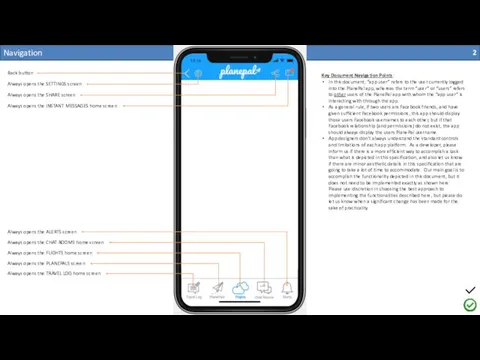
- 2. Navigation Always opens the SETTINGS screen Back button Always opens the SHARE screen Always opens the
- 3. Login screen Image asset filename: Logo1.png Image asset filename: FacebookLogin.png Image asset filename: GoogleLogin.png Image asset
- 4. About
- 5. Create Profile (1 of 2) Image asset filename: DefaultUserProfile.png Plus button: #1AA2FF Username is only required
- 6. Create Profile (2 of 2) When user presses “Save Profile” button (after entering a valid username)
- 7. Select Flight “Welcome! How it works…” Might be the same as the About screen…
- 8. Select Flight (1 of 2) (you have no joined flights) (you have no saved flights) ?
- 9. Select Flight (2 of 2) Flights the user has joined or saved should appear as shown
- 10. Join Flight (1 of 3) Font / Size / Color: Roboto / size to fit /
- 11. Join Flight (2 of 3) This screen depicts what should be displayed below the “Join this
- 12. Join Flight (3 of 3) This screen depicts what should be displayed below the “Join this
- 13. View Flight Filter logic: by default, this screen displays ALL of the PlanePal users who have
- 14. View Joined Flight Dev note: the “View Flight”, “View Joined Flight” and “View Saved Flight” screens
- 15. View Saved Flight Dev note: the “View Flight”, “View Joined Flight” and “View Saved Flight” screens
- 16. View Profile (1 of 2) Font / Size / Color: Roboto / 12 / #666666 Font
- 17. View Profile (2 of 2) The “Send PlanePal Request” button should send a PlanePal request to
- 18. PlanePals Home Search by PlanePal username only. Search should be “contains” so it returns any PlanePals
- 19. PlanePal Requests The ‘Accept Request’ text button should (1) add the user to the app user’s
- 20. PlanePal Advanced Search This is the airports list found in other places within this app This
- 21. Messages Home This screen should display the 20 most recent messages. If there are more than
- 22. Messages Individual All of the bottom navigation buttons should be grey when the user is navigating
- 23. Alerts Alerts should be sorted chronologically, with the newest on top. This screen should show the
- 24. Chat Rooms Home First line displays the Airline, Flight #, and flight date. Second line displays
- 25. Chat Room Flight When the user is on this screen, the “Chat Rooms” navigation button should
- 26. Travel Log Home (1 of 2) This screen depicts what should be displayed below the “Go!”
- 27. Travel Log Home (2 of 2) This screen depicts what should be displayed below the “Go!”
- 28. Travel Log Create New (1 of 2)
- 29. Travel Log Create New (2 of 2) Image carousel does not need to look like this,
- 30. Travel Logs Home (Author View) View drafts (1) The ‘View drafts’ link button should only be
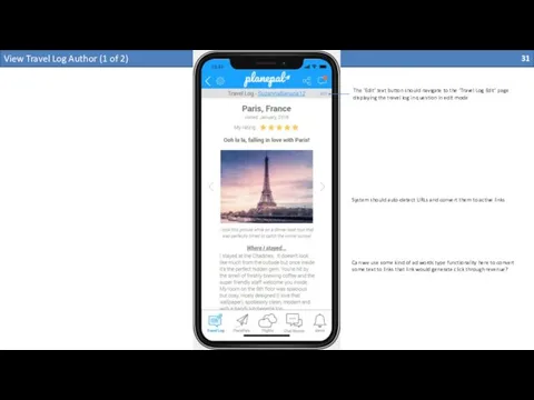
- 31. View Travel Log Author (1 of 2) The ‘Edit’ text button should navigate to the ‘Travel
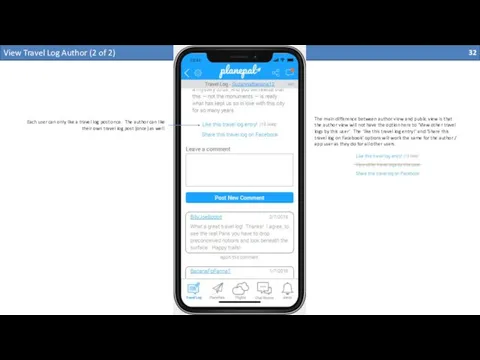
- 32. View Travel Log Author (2 of 2) The main difference between author view and public view
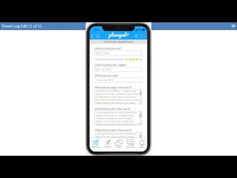
- 33. Travel Log Edit (1 of 1)
- 34. Travel Logs Home Public View
- 35. View Single Travel Log Public View (1 of 2)
- 36. View Single Travel Log Public View (2 of 2)
- 37. Settings
- 38. Edit Profile
- 40. Share
- 52. Скачать презентацию
Navigation
Always opens the SETTINGS screen
Back button
Always opens the SHARE screen
Always opens
Navigation
Always opens the SETTINGS screen
Back button
Always opens the SHARE screen
Always opens
Always opens the TRAVEL LOG home screen
Always opens the PLANEPALS screen
Always opens the FLIGHTS home screen
Always opens the CHAT ROOMS home screen
Always opens the ALERTS screen
Key Document Navigation Points:
In this document, “app user” refers to the user currently logged into the PlanePal app, whereas the term “user” or “users” refers to other users of the PlanePal app with whom the “app user” is interacting with through the app.
As a general rule, if two users are Facebook friends, and have given sufficient Facebook permissions, this app should display those users Facebook usernames to each other, but if that Facebook relationship (and permissions) do not exist, the app should always display the users PlanePal username.
App designers don’t always understand the standard controls and limitations of each app platform. As a developer, please inform us if there is a more efficient way to accomplish a task than what is depicted in this specification, and also let us know if there are minor aesthetic details in this specification that are going to take a lot of time to accommodate. Our main goal is to accomplish the functionality depicted in this document, but it does not need to be implemented exactly as shown here. Please use discretion in choosing the best approach to implementing the functionalities described here, but please do let us know when a significant change has been made for the sake of practicality.
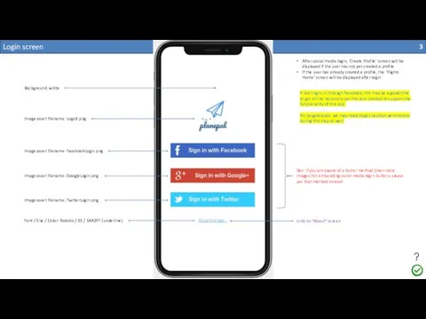
Login screen
Image asset filename: Logo1.png
Image asset filename: FacebookLogin.png
Image asset
Login screen
Image asset filename: Logo1.png
Image asset filename: FacebookLogin.png
Image asset
Image asset filename: TwitterLogin.png
Background: white
Font / Size / Color: Roboto / 11 / 1AA2FF (underline)
Dev: if you are aware of a better method (than static images) for embedding social media login buttons please use that method instead
Links to “About” screen
After social media login, ‘Create Profile’ screen will be displayed if the user has not yet created a profile.
If the user has already created a profile, the ‘Flights Home’ screen will be displayed after login
If user signs in through Facebook, this may be a good time to get all the necessary permissions needed to support the functionality of this app.
For targeted ads, we may need to get location permissions during this step as well.

About
About
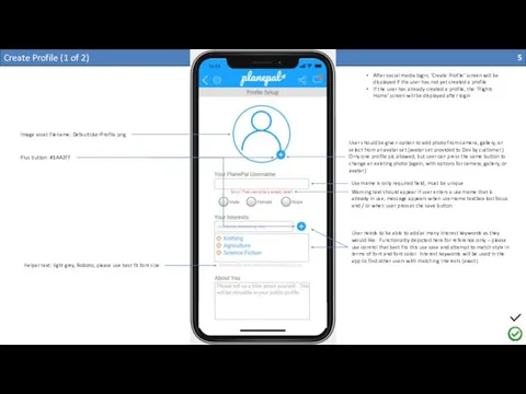
Create Profile (1 of 2)
Image asset filename: DefaultUserProfile.png
Plus button: #1AA2FF
Username
Create Profile (1 of 2)
Image asset filename: DefaultUserProfile.png
Plus button: #1AA2FF
Username
Warning text should appear if user enters a username that is already in use, message appears when username textbox lost focus and / or when user presses the save button
User should be given option to add photo from camera, gallery, or select from an avatar set (avatar set provided to Dev by customer.) Only one profile pic allowed, but user can press the same button to change an existing photo (again, with options for camera, gallery, or avatar.)
Helper text: light grey, Roboto, please use best fit font size
User needs to be able to add as many interest keywords as they would like. Functionality depicted here for reference only – please use control that best fits this use case and attempt to match style in terms of font and font color. Interest keywords will be used in the app to find other users with matching interests (exact)
After social media login, ‘Create Profile’ screen will be displayed if the user has not yet created a profile.
If the user has already created a profile, the ‘Flights Home’ screen will be displayed after login

Create Profile (2 of 2)
When user presses “Save Profile” button (after
Create Profile (2 of 2)
When user presses “Save Profile” button (after
Select Flight “Welcome! How it works…”
Might be the same as the
Select Flight “Welcome! How it works…”
Might be the same as the
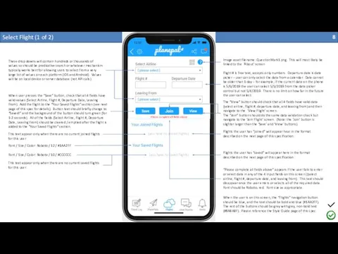
Select Flight (1 of 2)
(you have no joined flights)
(you have no
Select Flight (1 of 2)
(you have no joined flights)
(you have no
?
Image asset filename: QuestionMark1.png. This will most likely be linked to the ‘About’ screen
These drop downs will contain hundreds or thousands of values so should be predicative search or whatever mechanism typically works best for allowing users to select from a very large list of values on each platform (iOS and Android). Values will be on local device or server database (not API calls)
Flight # is free text, accepts only numbers. Departure date is date picker – user can only select the date from a calendar. Date cannot be older than 1 day – for example, if the current date on the phone is 5/6/2019 the user can select 5/5/2019 from the date picker control but not 5/4/2019. There is no limit on how far in the future the user can select.
When user presses the “Save” button, check that all 4 fields have valid values (Select Airline, Flight #, Departure Date, Leaving From). Add the flight to the “Your Saved Flights” section (see next page of this spec for details). Button text should briefly change to “Saved!” and the background of the button should turn green (for 1-2 seconds). All of the fields (Select Airline, Flight #, Departure Date, Leaving From) should be cleared / emptied after the flight is added to the “Your Saved Flights” section.
Flights the user has “joined” will appear hear in the format described on the next page of this specification.
Flights the user has “saved” will appear here in the format described on the next page of this specification.
When the user is on this screen, the “Flights” navigation button should be blue, and the text should be bold and blue (#1AA2FF). The rest of the buttons should be grey with grey, non-bold text (#8A8A8F). Please reference the Style Guide page of this spec.
Font / Size / Color: Roboto / 12 / #1AA2FF
Font / Size / Color: Roboto / 10 / #CCCCCC
This text appear only when there are no current joined flights for this user
This text appear only when there are no current saved flights for this user
The “View” button should check that all 4 fields have valid data (select airline, flight #, departure date, and leaving from) and then navigate to the ‘View Flight’ screen.
The “Join” button should do the same data validation check but navigate to the ‘Join Flight’ screen. (Note: the ‘Join’ button is slighter larger than the ‘Save’ and ‘View’ buttons).
Please complete all fields above
“Please complete all fields above” appears if the user fails to enter or select data in any of the 4 input fields on this screen ((select airline, flight #, departure date, and leaving from). This text should disappear once the user enters or selects all of the required data. Font should be Roboto, red. Font size as appropriate.
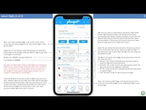
Select Flight (2 of 2)
Flights the user has joined or saved
Select Flight (2 of 2)
Flights the user has joined or saved
Airline logos will be provided, with one “default” logo if a particular airline logo is not available.
Border color: #1AA2FF (rounded preferred)
Font: Roboto, 8, #666666
The data in this row for each badge should refresh every time the user visits this screen.
Matches: The number of PlanePal users who have joined or saved this flight with matching interests
PlanePals: The number of users who have joined or saved this flight who the user has added as a “PlanePal”
Fb: The number of the user’s Facebook friends who have joined or saved this flight
Chat: The total number of chat entries for this flight
When the user presses the red circle with an X button app should ask for confirmation that the user wants to remove the flight. If user selects yes, app should remove the flight from the respective list (joined or saved).
After the user enters or selects data in all 4 of the “flight” fields (airline, flight #, departure date, and leaving from) this data should appear with data for matches, planepals, fb, and chat. See below for descriptions of each of these 4 data elements. When this text appears, it should push the 3 buttons (Save, Join, View) down to make space for the “Flight Info” control.
There should be no limit to the number of flights a user can join or save. However, flights that are older than 2 days past the local date on the phone should not appear unless the user presses the “view history” text button. View history should load the 5 most recent Joined and saved flights and should show 5 more most recent joined and saved flights each time it is pressed.
When user clicks any flight badge in the ‘Saved’ sections of this screen the app should navigate to the “View Saved Flight” screen for that flight.
When user clicks any flight badge in the ‘Joined’ section of this screen the app should navigate to the “View Joined Flight” screen for that flight.
Dev note: the “View Flight”, “View Joined Flight” and “View Saved Flight” screens are very similar (only the buttons at the top of the screen are different). You may be able to reuse the same screen but change the button options depending on whether the user clicked on a saved flight or a joined flight…

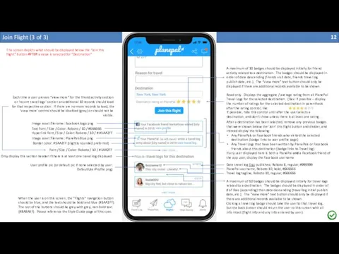
Join Flight (1 of 3)
Font / Size / Color: Roboto /
Join Flight (1 of 3)
Font / Size / Color: Roboto /
User needs to be able to add as many seats as they would like. Functionality depicted here for reference only – please use control that best fits this use case and attempt to match style in terms of font and font color. Character limit: 5, alphanumeric only
Status will be a drop down, but this field should allow free text as well (if possible). Character limit: 50, alphanumeric only
None of the fields on this page are mandatory.
‘Reason for travel’ is a free text field. Character limit: 50
Destination is a dropdown field with the same values as the destination field on the ‘Join Flight’ and ‘Create Travel Log’ screens.
The rating control used here is not for input. On this screen, the rating control is using to display the aggregate / average rating from all PlanePal Travel Logs for the selected destination.
[see next page of this specification document]
Displays the airline, the flight #, flight date, and ‘departing from’ airport selected or entered on the ‘Select Flight’ screen
When the user is on this screen, the “Flights” navigation button should be blue, and the text should be bold and blue (#1AA2FF). The rest of the buttons should be grey with grey, non-bold text (#8A8A8F). Please reference the Style Guide page of this spec.

Join Flight (2 of 3)
This screen depicts what should be displayed
Join Flight (2 of 3)
This screen depicts what should be displayed
Your Facebook friend [Facebook username] has saved this flight
Below the ‘Join this flight’ button there should be a light grey dividing line as depicted here, and below that the app should display the following as soon as this screen is loaded:
Any of the app user’s PlanePals that have joined this flight
Any of the app user’s PlanePals that have saved this flight
Any of the app user’s Facebook friends that have joined this flight
Any of the app user’s Facebook friends that have saved this flight
If any user displayed here is both a PlanePal and a Facebook friend of the app user, display the Facebook username
Text Font / Size / Color: Roboto / 10 / #666666
User Hyperlink Font / Size / Color: Roboto / 10 / #1AA2FF
Username hyperlink should navigate to the user view profile page. Back button at top of app should return user to this screen with all entered info intact.
If a user joins a flight and the same flight is already in the user’s saved flight list, the logic should remove the flight from the saved flights list once the flight has been added to the user’s joined flight list.
If a user attempts to add a flight to their saved flight list and that flight is already in the user’s joined flight list, the app should inform the user that they have already joined the flight and ask the user whether they would like to move the flight to their saved flight list.
When the user presses the ‘Join this flight’ button the app should navigate to the ‘View joined flight’ screen for this flight.
Your PlanePal [PlanePal username] has joined this flight.
When the user is on this screen, the “Flights” navigation button should be blue, and the text should be bold and blue (#1AA2FF). The rest of the buttons should be grey with grey, non-bold text (#8A8A8F). Please reference the Style Guide page of this spec.
Border color: #1AA2FF (slightly rounded preferred)
If possible, don’t show the rating control until a destination is selected and even then only show if there is at least one rating for that destination.
When the rating control is made visible, move the “Join this flight” button down to make space for the rating control.
Share on Facebook
Add a “Share on Facebook” checkbox near the “Join this flight” button.
Join Flight (3 of 3)
This screen depicts what should be displayed
Join Flight (3 of 3)
This screen depicts what should be displayed
Read only. Displays the aggregate / average rating from all PlanePal Travel Logs for the selected destination. (Dev: if possible – display the number of ratings for the selected destination in parenthesis after the rating control, like:
(17)
Text Font / Size / Color: Roboto / 10 / #666666
Hyperlink Font / Size / Color: Roboto / 10 / # #1AA2FF
After a destination has been selected, remove any previous badges that were shown below the ‘Join’ this flight button and divider, and instead display the following:
Any PlanePals or Facebook friends who visited the selected destination (badge links to user profile page)
Any Travel Logs that have been written by PlanePals or Facebook friends about this destination (badge links to Travel log)
If any user displayed here is both a PlanePal and a Facebook friend of the app user, display the Facebook username
Image asset filename: facebook logo.png
Image asset filename: PlanePalsBlue.png
Font / Size / Color: Roboto / 10 / #1AA2FF
User profile pic (or default pic if none selected by user: DefaultUserProfile.png)
Only display this section header if there is at least one travel log displayed
A maximum of 10 badges should be displayed initially for friend activity related to a destination. The badges should be displayed in order of date descending (friends visit date, friends travel log publish date, etc.). The “view more” text button should only be displayed if there are additional records available to be shown.
PlanePal username, Roboto 10, bold, #666666
Travel log tagline, Roboto 10, regular, #666666
Date travel log first published, Roboto 8, regular, #999999
A maximum of 10 badges should be displayed initially for travel logs related to a destination. The badges should be displayed in order of # of likes (ascending) then date descending (travel log initial publish date, etc.). The “view more” text button should only be displayed if there are additional records available to be shown.
Clicking a travel log badge should take the user to that travel log, but the back button should return the user to this screen with all info intact (flight info and any info entered by user)
Each time a user presses “view more” for the friend activity section or ‘recent travel logs’ section an additional 10 records should load for that respective section. If there are no more records to load, the ‘view more’ control should be disabled (grey) or should not be visible.
DavidSmavid
When the user is on this screen, the “Flights” navigation button should be blue, and the text should be bold and blue (#1AA2FF). The rest of the buttons should be grey with grey, non-bold text (#8A8A8F). Please reference the Style Guide page of this spec.
Popular
If possible, hide this control until after the user selects a destination, and don’t show unless there is at least one rating…
Border color: #1AA2FF (slightly rounded preferred)
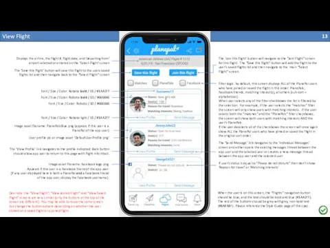
View Flight
Filter logic: by default, this screen displays ALL of the
View Flight
Filter logic: by default, this screen displays ALL of the
When user selects any of the filter checkboxes the list is filtered by the selection. For example, if the user selects the “matches” filter the screen will only show users with matching interests. If the user selects both the “matches” and the “PlanePals” filter checkboxes, the screen will show both users with matching interests AND the user’s PlanePals.
If the user deselects all of the checkboxes the screen will once again show ALL the PlanePal users who have joined or saved the flight in the original sort order.
Image asset filename: facebook logo.png
Font / Size / Color: Roboto bold / 11 / #1AA2FF
The ‘Join this flight’ button will navigate to the “Join Flight” screen for this flight. The “Save this flight” button will add the flight to the user’s saved flights list and then navigate to the main “Select Flight” screen.
The ‘Save this flight’ button will save this flight to the users saved flights list and then navigate back to the “Select Flight” screen
Image asset filename: PlanePalsBlue.png (appears if this user is a PlanePal of the app user)
User profile pic or image asset ‘DefaultUserProfile.png’
Font / Size / Color: Roboto bold / 10 / #666666
Font / Size / Color: Roboto / 10 / #666666
Font / Size / Color: Roboto light / 11 / #1AA2FF
If user’s status is equal to “Please do not disturb” then don’t show ‘Reason for travel’ or ‘Matching interests’
Displays the airline, the flight #, flight date, and ‘departing from’ airport selected or entered on the ‘Select Flight’ screen
Appears if this user is a Facebook friend of the app user.
(If any user displayed here is both a PlanePal and a Facebook friend of the app user, display the Facebook username).
The ‘View Profile’ link navigates to the profile indicated. Back button should allow app user to return to this page with flight info intact.
The ‘Send Message’ link navigates to the ‘Individual Messages’ screen and either opens the existing messages thread between the app user and the selected user or creates a new message thread between the app user and the selected user.
When the user is on this screen, the “Flights” navigation button should be blue, and the text should be bold and blue (#1AA2FF). The rest of the buttons should be grey with grey, non-bold text (#8A8A8F). Please reference the Style Guide page of this spec.
Dev note: the “View Flight”, “View Joined Flight” and “View Saved Flight” screens are very similar (only the buttons at the top of the screen are different). You may be able to reuse the same screen but change the button options depending on whether the user clicked on a saved flight or a joined flight…

View Joined Flight
Dev note: the “View Flight”, “View Joined Flight” and
View Joined Flight
Dev note: the “View Flight”, “View Joined Flight” and
Most elements identical to the ‘View Flight’ screen. Please reference that screen for fonts, colors, logic, etc. Only the buttons on this page differ from the ‘View Flight’ screen.
When the user is on this screen, the “Flights” navigation button should be blue, and the text should be bold and blue (#1AA2FF). The rest of the buttons should be grey with grey, non-bold text (#8A8A8F). Please reference the Style Guide page of this spec.
The ‘Remove flight’ button will remove the flight from the users joined flights list and navigate the user to the “Select Flight” screen.
The ‘Chat room’ button will navigate to the “Chat Room Flight” screen for this flight.
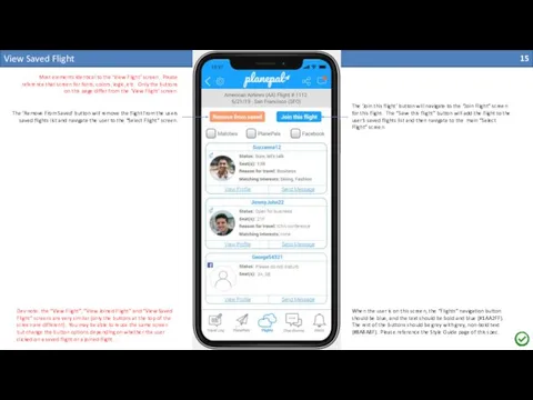
View Saved Flight
Dev note: the “View Flight”, “View Joined Flight” and
View Saved Flight
Dev note: the “View Flight”, “View Joined Flight” and
Most elements identical to the ‘View Flight’ screen. Please reference that screen for fonts, colors, logic, etc. Only the buttons on this page differ from the ‘View Flight’ screen.
When the user is on this screen, the “Flights” navigation button should be blue, and the text should be bold and blue (#1AA2FF). The rest of the buttons should be grey with grey, non-bold text (#8A8A8F). Please reference the Style Guide page of this spec.
The ‘Remove From Saved’ button will remove the flight from the users saved flights list and navigate the user to the “Select Flight” screen.
The ‘Join this flight’ button will navigate to the “Join Flight” screen for this flight. The “Save this flight” button will add the flight to the user’s saved flights list and then navigate to the main “Select Flight” screen.

View Profile (1 of 2)
Font / Size / Color: Roboto /
View Profile (1 of 2)
Font / Size / Color: Roboto /
Font / Size / Color: Roboto light / 11 / # 666666
User’s profile pic or image asset “DefaultUserProfile.png” if none provided by user
When the user is on this screen all of the buttons should be grey with grey, non-bold text (#8A8A8F). Please reference the Style Guide page of this spec.
If user did not enter any text in the profile fields ‘Interests’, ‘About’, or ‘Ideal Seatmate’ then exclude the section from their public profile view (including the header).
Essentially, this means that if the user only provided a user name on their profile page then this public view of their profile will only show their username in the header, their profile picture (if provided, otherwise show default image), and the action buttons that are detailed in the next page if this spec.
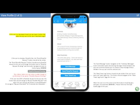
View Profile (2 of 2)
The “Send PlanePal Request” button should send
View Profile (2 of 2)
The “Send PlanePal Request” button should send
The ‘Send Message’ button navigates to the ‘Individual Messages’ screen and either opens the existing messages thread between the app user and the selected user or creates a new message thread between the app user and the selected user.
When the user is on this screen all of the buttons should be grey with grey, non-bold text (#8A8A8F). Please reference the Style Guide page of this spec.
The ‘View Travel Log’ button should only be visible if the user has at least one Travel Log entry. This button should navigate to the “View Travel Log Public” page for this user.
Dev: please make sure the button is wide enough to comfortably fit the words “PlanePal Request Pending”
If the user is already a PlanePal then the “Send PlanePal Request” button should not be visible.
If this user has SENT a PlanePal request to the app user the button text should change to “Accept PlanePal Request” and when the user presses the button it should disappear.
Or change to “Request Accepted!” for 3 seconds then disappear…
If this user is a Facebook friend, can we have a button that takes the app user to this user’s facebook page?

PlanePals Home
Search by PlanePal username only. Search should be “contains” so
PlanePals Home
Search by PlanePal username only. Search should be “contains” so
When the app user presses the “minus” icon, the app should ask for confirmation that the app user wants to remove the user from their PlanePals list. If the app user indicates “Yes” then the user should be removed from the app user’s PlanePals list.
Image Asset Name: blog.png
This icon should only appear if the user has one or more blog entries. When the app user presses this icon the app should navigate to the “View Travel Logs Public” screen for the user indicated.
Font / Size / Color: Roboto bold / 11 / #1AA2FF
Font / Size / Color: Roboto bold / 10 / #666666
Font / Size / Color: Roboto / 10 / #666666
Font / Size / Color: Roboto light / 11 / #1AA2FF
The ‘View Profile’ link navigates to the profile indicated. Back button should allow app user to return to this page with flight info intact.
The ‘Send Message’ link navigates to the ‘Individual Messages’ screen and either opens the existing messages thread between the app user and the selected user or creates a new message thread between the app user and the selected user.
The ‘Requests’ text button should navigate the user to the ‘PlanePal Requests’ screen. The number of pending requests should be shown in parenthesis after then word ‘Requests’ as shown. If there are no requests, the button should still be visible as “Requests (0)”
The Facebook logo should appear if the user is also a Facebook friend
The ‘Advanced PlanePals Search’ text button should navigate the user to the ‘PlanePal Advanced Search’ screen.
The ‘Recommended PlanePals’ section always appears below the list of confirmed PlanePals and displays no more than 5 users who are either (1) Facebook friends of the app user (but not yet PlanePals of the app user) or (2) have matching interests AND the same home airport. Facebook friends should always be listed before users who only match interests and home airport.
All users on this screen listed in alphabetical order in both sections.
When the user is on this screen, the “PlanePals” navigation button should be blue, and the text should be bold and blue (#1AA2FF). The rest of the buttons should be grey with grey, non-bold text (#8A8A8F). Please reference the Style Guide page of this spec.
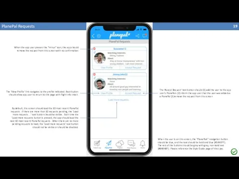
PlanePal Requests
The ‘Accept Request’ text button should (1) add the user
PlanePal Requests
The ‘Accept Request’ text button should (1) add the user
The ‘View Profile’ link navigates to the profile indicated. Back button should allow app user to return to this page with flight info intact.
When the app user presses the “minus” icon, the app should remove the request from this screen with no confirmation
By default, this screen should load the 10 most recent PlanePal requests. If there are more than 10 requests pending, the ‘Load more requests…’ text button should be visible. Each time the ‘Load more requests button is pressed, the app should load the next 10 most recent PlanePal requests. When there are no more pending requests to load, the ‘Load more requests’ text button should not be visible or should be disabled.
When the user is on this screen, the “PlanePals” navigation button should be blue, and the text should be bold and blue (#1AA2FF). The rest of the buttons should be grey with grey, non-bold text (#8A8A8F). Please reference the Style Guide page of this spec.

PlanePal Advanced Search
This is the airports list found in other places
PlanePal Advanced Search
This is the airports list found in other places
This is the cities / destinations list found in other places within this app
If only a single date is provided by the user, the app should use that data as the start and stop date and find records matching that date. The search should be inclusive of the dates entered regardless.
This search should return both PlanePals and Facebook friends who meet the search criteria. Sort should be alphabetical. If the user returned is only a Facebook friend (not a PlanePal) then only the Facebook logo should be displayed to the bottom left of the profile pic. If the user is only a Planepal then the Planepal logo should be displayed to the top left of the profile pic as shown. If the user is both a PlanePal and a Facebook friend then both the PlanePal logo and the Facebook logo should be displayed as shown.
This area should be blank until the user presses the search button
When the user is on this screen, the “PlanePals” navigation button should be blue, and the text should be bold and blue (#1AA2FF). The rest of the buttons should be grey with grey, non-bold text (#8A8A8F). Please reference the Style Guide page of this spec.
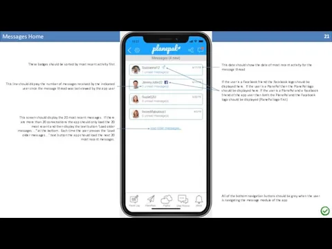
Messages Home
This screen should display the 20 most recent messages. If
Messages Home
This screen should display the 20 most recent messages. If
These badges should be sorted by most recent activity first
This date should show the date of most recent activity for the message thread
If the user is a Facebook friend the Facebook logo should be displayed here. If the user is a PlanePal then the PlanePal logo should be displayed here. If the user is a PlanePal and a Facebook friend of the app user then both the PlanePal and the Facebook logo should be displayed (PlanePal logo first)
This line should display the number of messages received by the indicated user since the message thread was last viewed by the app user
All of the bottom navigation buttons should be grey when the user is navigating the message module of the app
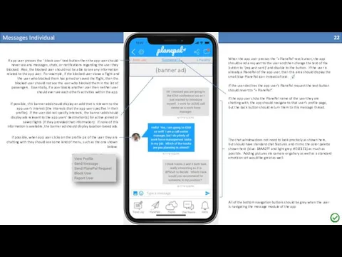
Messages Individual
All of the bottom navigation buttons should be grey when
Messages Individual
All of the bottom navigation buttons should be grey when
If app user presses the ‘-block user’ text button then the app user should never see any messages, chats, or notifications regarding the user they blocked. Also, the blocked user should not be able to see any information related to the app user. For example, if the blocked user views a flight and the user who blocked them has joined or saved the flight, then the blocked user should not see the user who blocked them in the list of passengers. Essentially, if a user blocks another user then neither user should ever see each other’s activities within the app.
When the app user presses the ‘+ PlanePal’ text button, the app should send a request to the user and then change the text of the button to ‘(request sent)’ and disable to the button. If the user is already a PlanePal of the app user, then this area should display the small blue PlanePal icon instead of text:
If the user declines the app user’s PlanePal request the text button should revert to “+ PlanePal”.
The chat window does not need to look precisely as shown here, but should have standard chat features and mimic the color palette shown here (blue: 1#AA2FF and light grey: #E1E1E1) as much as possible. Adding pictures via camera or gallery as well as a standard emoticon set would be great as well.
(banner ad)
If possible, this banner add should display an add that is relevant to the app user’s interest (the interests that the app user specifies in their profile). If the user did not specify interests, the banner add should display ads relevant to the app users’ destination(s) for active joined or saved flights (if they provided that information). If none of this information is available, the banner ad should display location-based ads.
If the app user clicks the PlanePal name of the user they are chatting with, the app should navigate to that user’s profile page, but the back button should return them to this message thread.
If possible, when app user clicks on the profile pic of the user they are chatting with they should see some kind of menu, such as the one shown below:
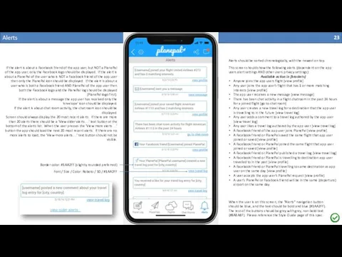
Alerts
Alerts should be sorted chronologically, with the newest on top.
This screen
Alerts
Alerts should be sorted chronologically, with the newest on top.
This screen
Available action in [brackets]
Anyone joins the app users flight [view profile]
Any user joins the app user’s flight that has 1 or more matching interests [view profile]
The app user receives a new message [view message]
There has been chat activity in a flight chatroom in the past 24 hours for a joined flight [go to chat room]
Any user creates a new travel log for a destination that the app user is travelling to in the future [view travel log]
Any user adds a comment to a travel log authored by the app user [view travel log]
Any user likes a travel log authored by the app user [view travel log]
A Facebook friend of the app user joins PlanePal [view profile]
A Facebook friend or PlanePal saved the same flight that app user joined or saved [view profile]
A Facebook friend or PlanePal joined the same flight that app user joined or saved [view profile]
A Facebook friend or PlanePal published a travel log [view travel log]
A Facebook friend or PlanePal is travelling to destination app user travelled to in the past [view profile]
A Facebook friend or PlanePal travelling to same destination as app user on the same day [view profile]
A user accepts the app user’s PlanePal request [view profile]
A user’s PlanePal or Facebook friend will be in the same (departure) airport on the same day
If the alert is about a Facebook friend of the app user, but NOT a PlanePal of the app user, only the Facebook logo should be displayed. If the alert is about a PlanePal of the user who is NOT a Facebook friend of the app user then only the PlanePal icon should be displayed. If the alert is about a user who is both a Facebook friend AND PlanePal of the app user then both the Facebook logo and the PlanePal log should be displayed (PlanePal logo first).
If the alert is about a message the app user has received only the ‘envelope’ icon should be displayed.
If the alert is about chat room activity, the chat room icon should be displayed.
Screen should always display the 20 most recent alerts. If there are more than 20 alerts there should be a ‘View older alerts…’ text button at the bottom of the alerts list. When the user presses the ‘View more alerts…’ button the app should load the next 20 most recent alerts. If there are no more alerts to load, the ‘View more alerts…’ text button should not be visible.
Border color: #1AA2FF (slightly rounded preferred)
Font / Size / Color: Roboto / 10 / #1AA2FF
When the user is on this screen, the “Alerts” navigation button should be blue, and the text should be bold and blue (#1AA2FF). The rest of the buttons should be grey with grey, non-bold text (#8A8A8F). Please reference the Style Guide page of this spec.

Chat Rooms Home
First line displays the Airline, Flight #, and flight
Chat Rooms Home
First line displays the Airline, Flight #, and flight
This screen displays chat room badges for all of the user’s current joined or saved flights.
Only chat rooms for flights that are within 2 days of the current date should be displayed.
Chat rooms should “expire” after 2 days (meaning, the app user can no longer post in chat rooms that are > 2 days old from the device date).
However, user can load older chats in read only mode by pressing the ‘View older chats…’ text button. Each time the user presses the ‘View older chats…’ text button, the app should load the 10 most recent expired chat rooms. Once the user has loaded all of the archived chat rooms the ‘View older chats…’ text button should no longer be visible.
The icon of the airline should be displayed as depicted here. If the icon / logo for the airline is not available, the generic icon should be displayed here (a generic icon will be provided along with the set of branded icons).
Chat room general concept:
In effect, there should be a separate chatroom for each flight. From a technical standpoint, I don’t think there actually needs to be distinct chatrooms for each flight, but each chat room should effectively filter messages so that it only shows chat messages for a particular flight when you are in that flight’s chatroom.
A chatroom badge will be displayed here for each of the flights that the app user has joined or saved. When the user clicks on a flight chatroom badge the user is taken to the chatroom for that flight.
Font / Size / Color: Roboto Bold / 10 / #666666
Font / Size / Color: Roboto Bold / 9 / #999999
Font / Size / Color: Roboto Light / 11 / # 1AA2FF
Border: color = #1AA2FF (rounded, 1 pixel)
When the user is on this screen, the “Chat Rooms” navigation button should be blue, and the text should be bold and blue (#1AA2FF). The rest of the buttons should be grey with grey, non-bold text (#8A8A8F). Please reference the Style Guide page of this spec.

Chat Room Flight
When the user is on this screen, the “Chat
Chat Room Flight
When the user is on this screen, the “Chat
When the app user selects a username on this screen (other than their own username) the following options should appear:
View Profile: navigates to the “View Profile” screen for the selected user.
Send Message: Navigates to the “Messages Individual” screen for the selected user.
Send Plane Pal Request: Sends a PlanePal request to the selected user. Alerts app user that the request was send. If the request is pending, the text will change to “Request Pending” and option will not be clickable.
Block User: This action will block the selected user. When selected, app will ask the app user if they are sure they want to block the selected user. If yes, selected user will be added to the app user’s block list. App user will no longer see any messages or chats from the blocked user.
Report User: App will display a report form pop up asking the app user to briefly describe why they are reporting the selected user. If user submits report, app will display “User reported” confirmation message.
Each “chat room” will only display chat messages for the respective flight. Newer messages will always be at the bottom. When the ap user enters this page, they will see the most recent messages, and will have to scroll to see older messages.
Banner ad will always display at the top of the chat window.
Messages will appear in the format shown here, with: hyperlinked username, date and time of message, and the chat message entered.
Messages should be in real time.
Font / Size / Color: Roboto Bold Underline / 10 / #1AA2FF
Font / Size / Color: Roboto / 10 / #666666
Border: color = #1AA2FF (rounded, 1 pixel)
User should have option to select photo / take a camera picture, select an emoticon, and enter text.
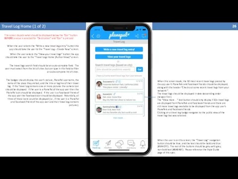
Travel Log Home (1 of 2)
This screen depicts what should be
Travel Log Home (1 of 2)
This screen depicts what should be
When this screen loads, the 10 most recent travel logs posted by the app user’s PlanePals and Facebook friends should be displayed, along with the header “Check out some recent travel logs from your network!”.
The travel logs should be displayed in date descending order (newest first)
The “View more…” text button should only display if 10+ travel logs are displayed from PlanePals and Facebook friends and there are still more travel logs available to be displayed from the app user’s PlanePals and Facebook friends.
Clicking on a travel log badge navigates to the public view of the travel log that was selected.
When the user is on this screen, the “Travel Log” navigation button should be blue, and the text should be bold and blue (#1AA2FF). The rest of the buttons should be grey with grey, non-bold text (#8A8A8F). Please reference the Style Guide page of this spec.
When the user selects the “Write a new travel log entry” button the app should take the user to the “Travel Log – Create New” screen.
When the user selects the “View your travel logs” button the app should take the user to the “Travel Logs Home (Author View)” screen.
The travel logs search field should be an auto-complete field. The user must select from the list of cities but can type in this field to filter an auto-complete list of cities.
The badges should display the user’s picture, PlanePal username, the name of the place they visited, and the title or tagline of their travel log. If the Travel Log contains one or more pictures the camera icon should be displayed. If the user is a PlanePal of the app user then the PlanePal icon should be displayed. If the user is a Facebook friend of the app user the Facebook icon should be displayed. Potentially, all three of these icons could be displayed (i.e., if the user is a PlanePal and Facebook friend of the app user and their travel log contains pictures).

Travel Log Home (2 of 2)
This screen depicts what should be
Travel Log Home (2 of 2)
This screen depicts what should be

Travel Log Create New (1 of 2)
Travel Log Create New (1 of 2)

Travel Log Create New (2 of 2)
Image carousel does not need
Travel Log Create New (2 of 2)
Image carousel does not need
Add new images from phone gallery
Remove images
Replace image with new image from phone gallery
Add image captions for each image
Maximum of 10 images
If the user selects the option to add the post to their Facebook page, the app should present the user with the appropriate screen with previews and/or permission options similar to what other apps present to the user when sharing content. If the content needs to be a URL, please let me know so I can get a web developer to create a web version of these travel logs that we can then link to for sharing purposes…
When the user presses the ‘Publish’ button, the app should save the travel log and navigate the user to the ‘View Travel Log Author’ to view their travel log on that screen.
App should ask the user to confirm delete. If user confirms, app should delete the travel log and navigate to the ‘Travel Log Home’ screen
When user presses the ‘Save Draft’ button, app should save draft, display a message confirming that the draft is saved, and then navigate the user to the ‘Travel Log Home’ screen
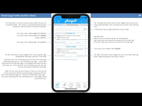
Travel Logs Home (Author View)
View drafts (1)
The ‘View drafts’ link button
Travel Logs Home (Author View)
View drafts (1)
The ‘View drafts’ link button
The ‘+ New log’ text button should simply navigate the app user to the ‘Travel Log Create New’ screen to allow them to create a new travel log entry.
Border: #1AA2FF
Font / Size / Color: Roboto bold / 11 / #1AA2FF
Font / Size / Color: Roboto light / 11 / #1AA2FF
Stats definition:
Views: how many unique views has the travel log had?
Likes: how many users pressed the like option for this travel log?
Comments: how many comments are there for this travel log?
Font / Size / Color: Roboto bold / 10 / #666666
Font / Size / Color: Roboto / 10 / #666666
Should search by city, tagline keywords, month or year
The ‘View’ text button should navigate the user to the ‘View Travel Log Author’ page displaying the travel log in question
The ‘Edit’ text button should navigate to the ‘Travel Log Edit’ page displaying the travel log in question in edit mode
By default this screen should display the 10 most recent travel logs published by the app user. The ‘View older travel logs…’ text button should load the next 10 travel logs in chronological order when pressed by the app user. There should be no limit to how many times the user can press the button to load older travel logs.
When the user uses the search feature, if there are more than 10 results, only the first 10 results should display, showing the 10 most recent matching travel logs first. Likewise, the ‘View older travel logs…’ text button should load 10 more matching results in chronological order (most recent first).
View Travel Log Author (1 of 2)
The ‘Edit’ text button should
View Travel Log Author (1 of 2)
The ‘Edit’ text button should
System should auto-detect URLs and convert them to active links
Can we use some kind of ad words type functionality here to convert some text to links that link would generate click through revenue?
View Travel Log Author (2 of 2)
The main difference between author
View Travel Log Author (2 of 2)
The main difference between author
Each user can only like a travel log post once. The author can like their own travel log post (once) as well.
Travel Log Edit (1 of 1)
Travel Log Edit (1 of 1)

Travel Logs Home Public View
Travel Logs Home Public View
View Single Travel Log Public View (1 of 2)
View Single Travel Log Public View (1 of 2)

View Single Travel Log Public View (2 of 2)
View Single Travel Log Public View (2 of 2)
Settings
Settings
Edit Profile
Edit Profile

Share
Share


 Автоматизированное управление машиностроительным предприятием
 Контроль как функция управления
 Структура та управління підприємством
 Стратегическое планирование
 Всеобщее управление качеством
 Интеграция в управлении цепями поставок
 Визуальное управление
 Советы по тайм-менеджменту для студентов на дистанционном обучении
 Концепция современного склада
 Управління якістю води у виробництві харчових продуктів. Лекції № 9-10
 Современные тенденции в менеджменте
 Управление и самоорганизация. (Тема 1)
 Что такое иерархия
 Управление качеством на основе стандартов ИСО
 Управление временем. Тайм-менеджмент. Основы
 Подбор, отбор, наём персонала. Источники, методы подбора персонала. Организации найма персонала. Лекция 3
 Разработка модели предметной области ИС
 Коучинг және оның құндылықтары туралы түсінік қалыптастыру
 Ризики та надзвичайні ситуації в соціальних та екологічних системах. (Лекція 3)
 Мониторинг качества проектного управления в колледже
 Мораль и нравы. Специфика национальных нравов и их роль в сфере управления
 Загальні принципи управління якістю. Теорія Всезагальногоуправління якістю (TQM)
 Основная цель компании
 Методы стандартизации
 Теории Х и Y мотивационных потребностей персонала
 Исследование экскурсионного потенциала города Красноярска
 Основные нормативные документы, регламентирующие требования к грузам при перевозке по железным дорогам РФ
 Человеческий капитал