- Chapter 5: Statistics

Содержание
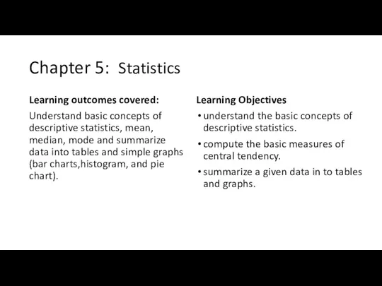
- 2. Chapter 5: Statistics Learning outcomes covered: Understand basic concepts of descriptive statistics, mean, median, mode and
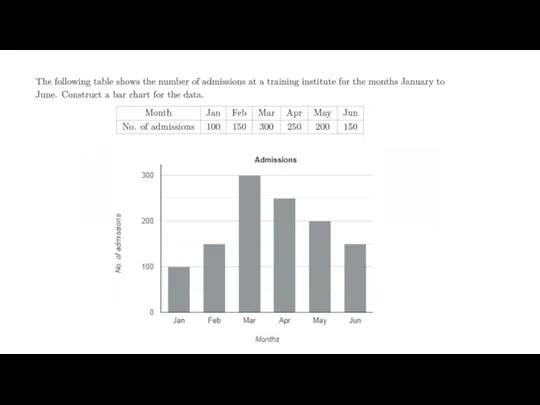
- 3. 5.2 Summarizing Data into Tables and Graphs In statistics we use various tables and diagrams to
- 4. Constructing a grouped frequency distribution Step 1. Form the classes/class intervals. Pick out the highest and
- 5. Example 1: Seventeen students were asked how many hours they studied per day. Their responses, in
- 6. Example:2 Twenty students were asked how many hours they worked per day. Their responses, in hours,
- 8. 5.2.1 Representing Data Using Graphs and Charts • Bar Charts Bar charts (Bar Graphs/ Bar Diagrams)
- 10. In a college there are 400 students in the Foundation Program, 450 in the First Year
- 12. Скачать презентацию
Chapter 5: Statistics
Learning outcomes covered:
Understand basic concepts of descriptive statistics, mean,
Chapter 5: Statistics
Learning outcomes covered:
Understand basic concepts of descriptive statistics, mean,
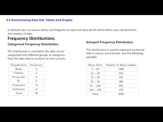
5.2 Summarizing Data into Tables and Graphs
In statistics we use various
5.2 Summarizing Data into Tables and Graphs
In statistics we use various
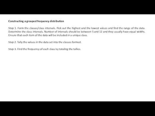
Constructing a grouped frequency distribution
Step 1. Form the classes/class intervals. Pick
Constructing a grouped frequency distribution
Step 1. Form the classes/class intervals. Pick
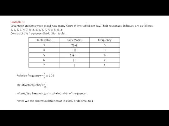
Example 1:
Seventeen students were asked how many hours they studied per
Example 1:
Seventeen students were asked how many hours they studied per
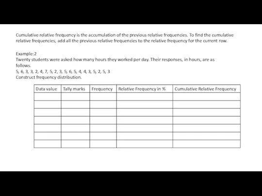
Example:2
Twenty students were asked how many hours they worked per day.
Example:2
Twenty students were asked how many hours they worked per day.

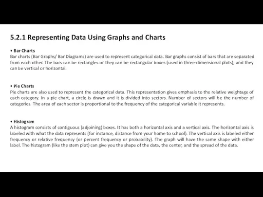
5.2.1 Representing Data Using Graphs and Charts
• Bar Charts
Bar charts (Bar
• Bar Charts
Bar charts (Bar
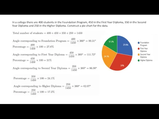
In a college there are 400 students in the Foundation Program,
In a college there are 400 students in the Foundation Program,
 Деятельность отдела кадров университета
 Файлы и файловые структуры. Компьютер как универсальное устройство для работы с информацией. Информатика. 7 класс
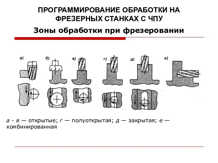 Программирование обработки на фрезерных станках с ЧПУ (08)
 Russia – Global ATM Interoperability
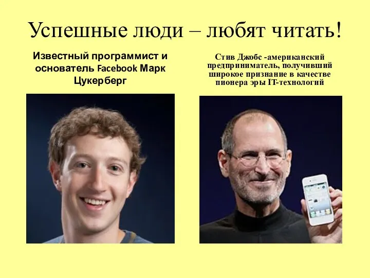 Успешные люди любят читать
 Введение в Matlab
 Способы адресации в микропроцессорных системах
 Интерактивті құрылғылар
 Графические примитивы. Lazarus. Урок 18
 Програмування та прикладні інформаційні системи
 Как создать компьютерный тест-пособие
 Урок-игра по информатике Турнир программистов для 10 класса
 Моделирование сложных 3D-моделей с помощью 3D-редакторов по алгоритму. Основы трехмерного моделирования в Компас 3D
 ZOOM в картинках. Часть 1 (регистрация и настройка)
 Продвижение ВФСК ГТО в социальных сетях
 HTML формы
 Занятие 1. Знакомство с программой Adobe Photoshop
 Программы профессиональной переподготовки по информационной безопасности и технической защите информации
 Базы данных и системы управления базами данных
 Основы сетевых технологий. Модели сетевого взаимодействия. Часть 1. Лекция 2
 Веб-приложение для организации процесса обучения в средней школе
 Файлы и папки
 Компьютерная графика. Дизайн шрифтов
 Технологические этапы создания и использования имитационных моделей
 Операторы циклов
 Модуль Контекстная реклама Youtube
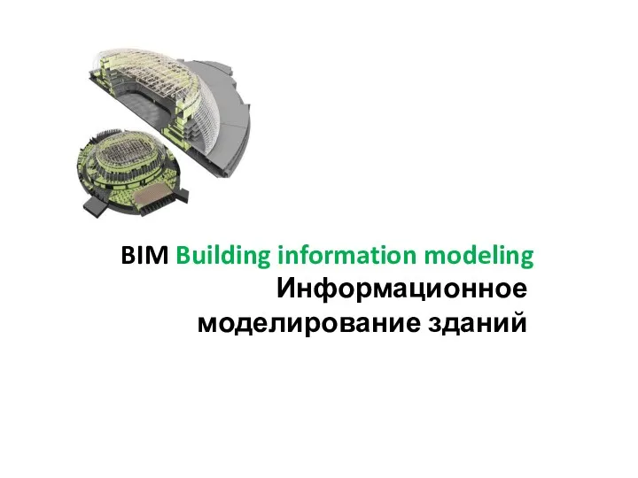 Информационное моделирование зданий
 Основные компоненты компьютера и их функции